Library comms are like tapas: lots of small elements make an effective whole


A tweet from Matt Imrie alerted me to this blogpost from Scott Pack. It's about book reviewing and whether or not blogs about books make any difference to the sales of books.

It really resonated with me, because his conclusions mirror my own about library communication:

...those sort of sales [from blog posts] combined WITH sales prompted by newspaper reviews AND other bloggers AND tweeters AND further word-of-mouth from people who subsequently read it COULD make a difference. Which is why we do need all sorts of book reviewing in all formats across all platforms.
— Me & My Big Mouth blog

This is the absolute nub. No single method of communication carries THAT much weight on its own anymore - we live in a fragmented world and we have to adapt to that. Even compared with two or three years ago, there's less of a chance to use one platform to reach all the people. And crucially, even if it you DO reach all the people, seeing a message once is for the most part not enough to get people to do anything different to what they were going to do anyway.

We need to be nudged a number of times before we act.

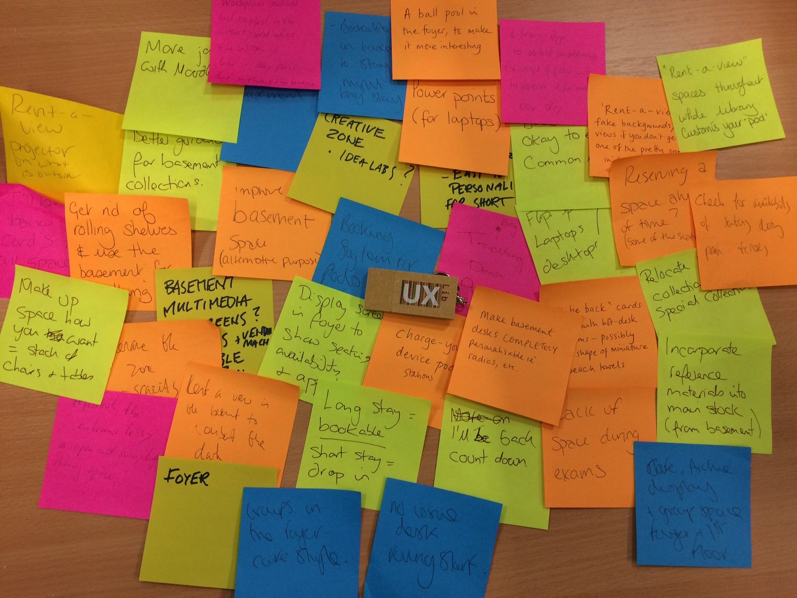
Sometimes a library will set up a blog, and try really hard with it, and after 6 months be really disappointed that they're only getting 100 views for each post. But the thing is, it's a few people seeing messages from the Library AND on Twitter AND on a digital screen in the building which tips people over into thinking or acting differently. Click the little stats icon on any one of your library's tweets and be stunned at just how few people actually saw it. But that's okay too, because all of your communications channels combine into a holistic presence. It's about building ambient awareness rather than trying to hit loads of people with a one-off message and expecting that to produce a significant result.

It feels like you're doing a lot of work for not that much reward across a series of channels, but actually the reward comes from how they work together rather than individually. Which is why having a strategic approach to coordinate your messages and to know what each platform is really for, is ultimately worth the time it takes to prepare...

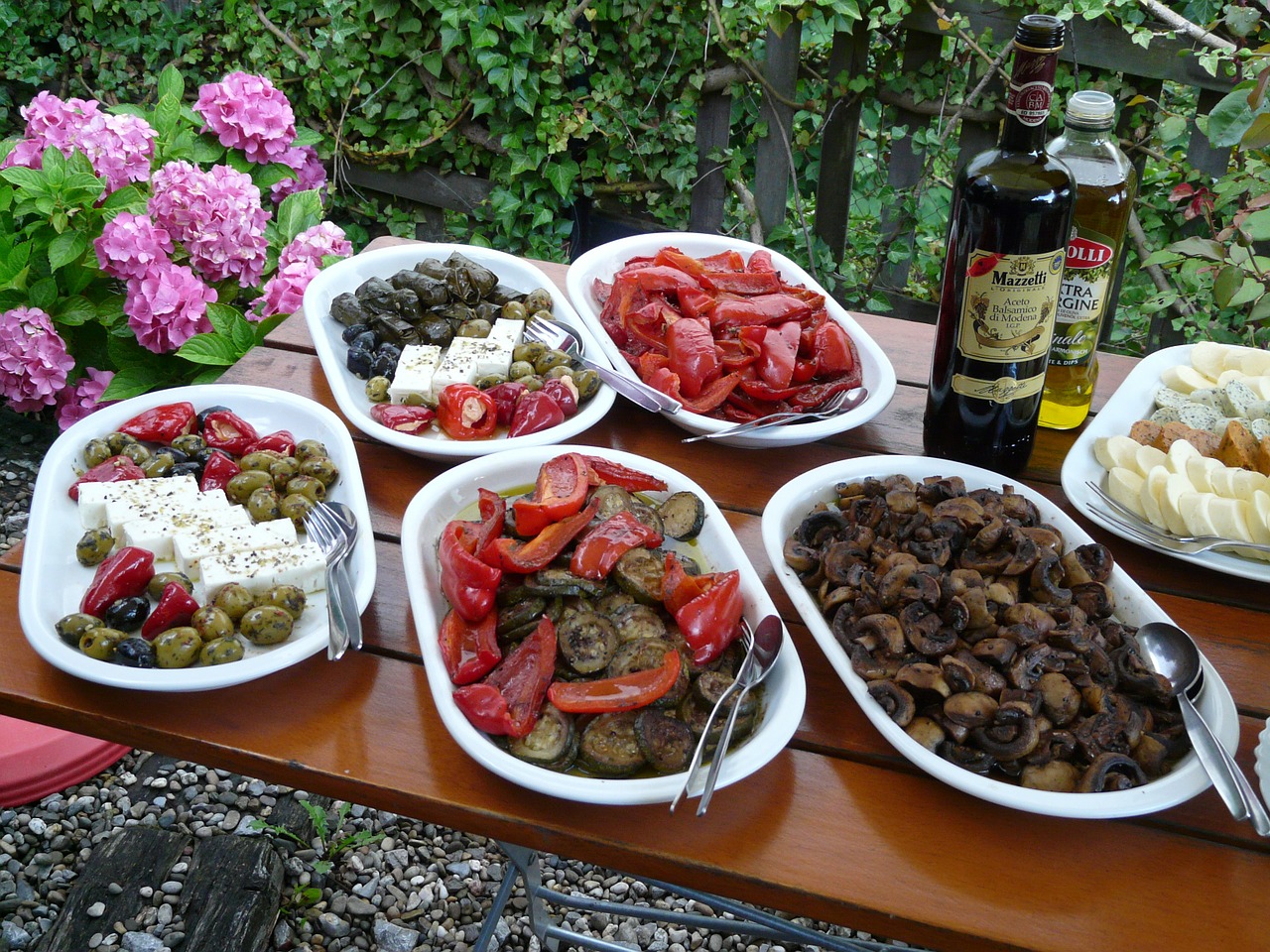
If you want an analogy, think of communication as being like tapas! No single dish is that significant on its own, but taken as a whole it's a really nice meal.

Marketing = this

Marketing = this

#UXLibs 5 | Ideation, Pitching, and Responsive Study Space

My final post about the UXLibs Conference (see all five posts in one place, here) is about the pitch. It's also about the concept we came up with for the pitch, which I think is a genuinely useful idea...

At UXLibs we were all split into teams. Across the three days we had a specific aim:

Create a product, concept, or service that you could implement which increases awareness and use of library resources and services. Your proposal could solve a specific problem, offer an alternative approach, meet an unmet need, or completely re-imagine an existing service.

On the final day, we had to pitch our idea, Apprentice / Dragon's Den style, to Lord Priestner and his assistants

I was in Team Space Grey. Everyone was lovely. We initially found things hard going, ethnography-wise, because the library we'd been assigned simply didn't have any problems which needed solving. Our field work was showing happy students in a well used building. But when we did the 6-8-5 process of ideation, it all came together really well and there was a clear idea of what we should focus on, which was arrived at with everyone able to contribute and have their voice heard. 

In short, if I've understood it right, the 6-8-5 method involves a bunch of people (in our case there were 9 of us) having 5 minutes to each write 6 to 8 post-it notes with an idea on each one. So between us we had around 60 post-its after 5 minutes, which we talked through and then sorted into themes. Then you have another 5 minutes to do the same again, either honing existing ideas other people have mentioned, or your own, or creating something new based on the discussion. Eventually patterns emerge and a common-ground idea rises to the top.

Here are a bunch of our post-its, which we then arranged into themes:

After this process it was clear we were all thinking about transforming the basement of the college we'd been assigned, and from there we were able to come up with a really good concept.

Team Space Grey didn't make the final of the pitch-off, and it was basically my fault that we didn't do better because I made a fundamental error. An error which, a bit frustratingly, anyone who has been on one of my presentation skills workshops will have heard me banging on about not doing, at length.

(NB: I'm not saying we'd've got to the final if I hadn't made the mistake I'm about to describe, by the way; Blue Steel were ace and deserved to be there. Just that I prevented us from doing as good a job as we might have been able to...)

On Day 1 when we did the ethnographic field work but before we'd done any ideation, we really didn't have anything to pitch. The students simply didn't complain about problems for us to find solutions to. So when I woke up really early on Day 2 my mind was churning about the WAY to pitch, because I didn't know WHAT to pitch. I had this idea in my mind that we could use the iPad app Paper to draw our presentation in real time, because that somehow reflected the organic nature of ethnographic work whereas PowerPoint reflected the sterile nature of traditional data collection methods (like surveys). But no one could draw, so that ruled that out. Then I remembered VideoScribe, which I had on my iPad (although it no longer appears to be available as an app, sadly) - you give it pictures and it 'draws' them for you. It's great, and can hugely increase both engagement and data retention in audiences when used well. I got really excited about this and started to play around, putting in a heat map I'd made of where users were walking, and having the app draw them. It looked really good.

So I presented this to my team the next day. I very much hope I didn't steamroll anyone into it, and no one said 'I don't think we should use this', but I was probably so enthusiastic about it that no one wanted to protest! It was pretty cool. On Day 3 we used VideoScribe to make our presentation - never have I made so much in so little time, when it comes to presentation materials. We worked HARD. Below is an edited version of our presentation, adjusted to make more sense without us speaking over the top of it.

It looks nice, I think. It's certainly good as a video. But there was a fundamental problem with what we were then doing for the pitch at the conference.

After our pitch in the heats, on the way back to the main hall for the pitch Final, lots of people said nice things. Some people said we'd've got there vote, if they'd've had one. All of them asked about the tool, and how we made the presentation. It was generally agreed that VideoScribe was pretty brilliant.

Not one of them mentioned our concept.

(Ugh, I thought the above was important enough to need its own line. But I can't write single sentence paragraphs without feeling like Dan Brown. Still. At least I'm not writing whole sections in italics.)

I had committed an absolue cardinal sin of presenting: I'd let the tool become the content! I'd let the medium obscure - well, if not obscure the message exactly, certainly not allowed the message the room it needed to breathe. This became brutally clear to me when I watched the 3 finalists doing their pitches. Our pitch had drama and a twist, and a really engaging piece of software at its heart. But their pitches, all presented with nice slides, were all about the concepts and they had the time to explore them properly. I really wanted our presentation to stand-out, and it did, but not for the reasons which really counted in the context of the conference pitching competition...

So, apologies, Space Grey teammates. I'm convinced we could have done a lot more justice to our pretty brilliant concept if we'd just gone with a good old fashioned PowerPoint presentation. It was a good learning experience for me. Although, I have to say, when they announced Blue Steel as the winners of the heat, LeMurph and I did breath a sigh of relief that, after the most exhausting of conferences, we could finally stop, and just sit there and relax for the remainder of our time. But in future I'll be more careful to heed my own advice.

The winning pitch, from Purple Haze, was brilliant. It was great to hear David Jenkins speak - I'd heard he was fantastic at it, and he was. (As was Angus.) David's a natural - his enthusiasm and dynamicism energised me even though I was completely knackered! I'm very glad they won.

If you've watched the video above, I'd be interested to hear what you think of the Responsive Study Space idea. I reckon the basic principles - use ethnographic techniques to identify the dead space in your library, then convert that space into a study area which changes its nature according to where abouts you are in the academic year, based on student need - are pretty sound. The idea is that just as a Responsive Design website takes all the same elements and re-arranges them to be the best fit for the size of screen, Responsive Study Space takes the same elements of the room but maximises number of study spaces at Exam time, collaborative study spaces in term time, provides induction information in October and November, and so on depending on what your ethnography reveals. I really do think it's a good idea!


(Header image copyright of the UXLibs photographer, jtilleyphotographic, used by permission. View the original on Flickr, here. It features me and various others voting for Purple Haze as the pitch-off champions!)


#UxLibs 4: Ethnography You Can Try At Home


Post 4 about the UXLibs Conference. This one is about the actual ethnography we went there to learn about. If you're interested, there's a post about the conference organisation and format here, plus a post about the Usability keynote here, and a post about the Ethnography and Design keynotes here.

But first, the Conference badge. This genuinely was the best user experience I've ever had from a badge. The attention to detail was symptomatic of the whole approach to the conference, I felt - it was designed to be a good experience. Timetable, maps, where your accommodation is, which parallel sessions you were in, name, institution, Twitter name, the conference hashtag AND it was reversible so it could face either way and still be useful. All little things but together they made a real difference.

Badge magique!

Badge magique!

Before attending this conference my knowledge of ethnography was limited to having read about it. I'd not done any. I knew it was useful, and I knew why I felt we needed to make use of it - but if someone had caught me by surprise with the question 'So what IS ethnography in libraries?' I would have crumbled... But not anymore!

Here are some of the techniques we learned about ethnography - in the final post next time I'll cover the process of designing a service or product off the back of what you learn.

Cognitive Mapping

I've put this one first because it's my favourite. I didn't actually get to do this one (on Team Space Grey we all went to different workshops, and mine was the Observation one), but I really loved the results of it. If you're reading this thinking "I did do this and you've misunderstood it" then correct me in a comment!

Cognitive Mapping is in essence asking your subject (student, staff or whoever) to draw a map of the library - or, ideally, of their wider learning landscape - in order to understand how they perceive the space, what they actually use, what they value and see as most important and so on. Often the subject is asked to change colour of pens every 2 minutes, for a total of 3 colours over 6 minutes, so you can later see which order the items were drawn in, an indicator of their importance.

Here's a map which Team Space Grey got one of our students to draw (thanks for sending me this Kristin!):

We got two maps overall - what was particularly interesting for us is that one of them mentioned the basement area of the library as being dark and scary, and another didn't put the basement on the map at all! This was a big part of the idea we later pitched (which I'll cover in the next post).

There are some examples from Donna Lanclos of congitive maps, here.

What we didn't really have a chance to do at the conference itself was code the findings. To quote library anthropologist Andrew Asher - one of only two people to hold that position in libraries, the other being Donna Lanclos - here's how you might go about it:

Coding these images basically involves counting the elements drawn in order to construct two indexes: a identification index, which is the number of times that an element is drawn divided by the total number of individuals participating (i.e. the percentage of the time the element occurs), and representativeness index, which is the number of times an element is drawn divided by the number of times that category of element is drawn (e.g. the number of times a study room on the first floor is drawn divided by the number of times all study rooms are drawn) (See Colette Cauvin’s “Cognitive and cartographic representations : towards a comprehensive approach” for additional discussion). I also constructed a temporal index for each element by coding the three colors in order (1 = Blue, 2 = Green, 3 = Red) and calculating the mean value for each element (you could do more complicated things by combining the indexes if you are mathematically inclined, however, I’ve found that these three get at most questions).
— Andrew Asher | www.andrewasher.net

Observation

Observation is exactly what it sounds like - you occupy a space in the library or wider campus and you note exactly what's going on and how people use the space. In our workshop we were encouraged to focus on the location itself, the pathways users took through it, the interactions they had (both with other people and the objects and machinery), and the tools they used.

I drew a heat-map, or rather a behavioural map, using the Paper app on my iPad - tracing the lines of every single user who came through the library over a set period of time. You quickly get a picture of how people move through the space. (Not a single person went down to the basement...)

I can't draw at the best of times, and this was done using my finger - so my handwriting which is usually terrible is now completely unusable, and the weird mass of colours near the bottom left is me repeatedly trying to get the action right to bring up the colour selection tool - but I really enjoyed making this!

The idea of course is to build an understanding of how the space is used, and then adapt the space to better suit the reality for the users. For example, at Judge Business School they moved the digital display screens so they were easily viewable from the 'desire line' - the path most students took through the library. There's more on this in slides 13 - 19 of Andy Priestner's deck here. (That presentation is also a great introduction to ethnography generally.)

Interviews

The key thing about interviews in this context (as opposed to the more traditional focus group methods libraries often use) is asking completely open ended questions. I mentioned this in my post about Donna's keynote: if you ask how a student writes an essay, you get a potentially more illuminating answer than if you ask 'what library resources do you use for an essay' or 'how do you use the library'. All of this makes the data you get messy and harder to process, but ultimately in my view more worthwhile.

Touchstone Tours

Just as the Cognitive Mapping gets the user to draw the map rather than view the library's own, Touchstone Tours ask the user to take the librarian on a tour of the library, rather than the other way around. By the user telling you how the tools, systems, building and spaces work, you get to truly understand how it feels to be a user without the in-built knowledge and understanding we have as library staff. (Our tour subjects didn't take us down to the basement because, for them, it really didn't matter.)

Love-letter / break-up letter

I'm reluctant to try and describe this one in too much detail as I wasn't in the relevant session and we didn't end up using it in my team. But it involves writing a love-letter to the library if you like it, or a break-up letter if you don't. When it works well it gets to the heart of the user experience, and helps understand the emotions Matt Reidsma talked about in his Keynote on usability.

There is more info on interview techniques, touchstone tours, and the love letters, in Georgina's workshop slides.

Anything I've forgotten, let me know!

#UXLibs 3 | The Art of the Keynote: Donna Lanclos and Paul-Jervis Heath


After yesterday's post about Matthew Reidsma's Keynote on Day 3 of the User Experience in Libraries Conference, here's an account of Donna and Paul's keynotes from Days 1 and 2 respectively.

Donna Lanclos | Once Upon a Time: a story about ethnography and possibility in libraries

Donna is completely passionate about what she does, it's infectious, and she's a very powerful communicator. There were times listening to this when I felt like I was hearing a better informed and more articulate version of my own interior monologue about certain things I get frustrated about... I agreed the heck out of it.

But it challenged me too, which is part of the art of the keynote. Contrast is what makes a presentation engaging. We like the feeling of hearing what we know and agree with, and are made uncomfortable by hearing things which challenge us or that we don't agree with. This push and pull is what moves a great presentation forward. Too much of one and not enough of the other diminishes the potential impact of a presentation. If Donna had just come out and said a bunch of stuff I already knew and agreed with, I would have enjoyed it a lot but it wouldn't have stayed with me. A keynote must, on some level, provoke (but not for provocation's sake).

One of the particular things I was aware of Donna doing and aware that I don't do enough (or basically at all) is allowing us the audience to connect up the dots for ourselves, so we were learning rather than just being told. The use of stories, analogies, and flat-out asking questions, helped us to provide our own answers, which is much more powerful and long-lasting than just hearing people say the answer off the bat.

She also used something I mention in presentation skills sessions but have never done myself - The Black Screen! The idea of this is it focuses the attention on the speaker by, in contrasts to the normal picture-heavy slides around it, being completely blank. It's a device which says, okay, let's have a serious conversation now, for which I want your full attention. One person didn't understand this and actually called out 'Can we have the slides back please!' and when Donna said 'what?' they changed it to 'Is there anything on the slides..?' Donna said 'no'. She then stopped the poor guy feeling too awkward by saying 'you talkin' to me?' in mock indignance / aggression, which made the moment pass less painfully and more humorously than it might have done...

There were a few really key themes that emerged for me.

  • Simply asking people what they think, and what they want, is a pretty unreliable process. This has always troubled me. We KNOW it doesn't work (people often don't know what they want, and they often simply take the path of least resistance through surveys and focus groups) yet we do it anyway and base decisions and even policies off the back of it. This method of gathering feedback is not enough on its own. We need find out what our users understand, rather than what they say they want. 

  • So ask open ended questions. As soon as you say 'what resources do you use when you're writing your essay?' you're limiting what you can learn from the interaction. It's like asking someone to take you to a destination and then putting them on rails which only go one way. Ask them 'what does it look like when you write an essay? Talk me through the whole thing'. Then you learn where the library fits in with a larger process or life-cycle. You learn what the true user experience is. You (in a totally non-creepy way!) follow the user home.

  • Ethnography is messy and uncertain. You need institutional support for that uncertainty. You need to try things out, try and provide a better experience but it's ITERATIVE. Don't wait for all the answers, just go for it. Fail. Then do it again, more effectively.

  • If we have to show people how to use the resources - in Donna's words, spend time telling people how to click a link on our websites - then we're doing it all wrong. The User Experience has failed. I am painfully aware of how much time I spend doing this, in one form or another. I once made a VIDEO about how to use the catalogue. Aaaargh.

  • Donna asked us to 'dispense with the idea that all important things in education are measurable'. I don't think, sadly, we can do this and still be as accountable for our impact as we need to be in this day and age. My hope is that if we ethnographise the heck out of everything, we will actually, possibly for the first time, truly understand the student experience, our role in it, and how to make it better. As a result of what we do about it, all the countable measures (like the NSS scores and the LibQual Surveys etc) will go up anyhow. At the moment I feel like I spend a lot of time trying very specifically to address certain issues which will mean the things we measure are more favourably assessed. That's all wrong. The tail is wagging the dog. The results of the stuff we count should make our superiors happy as a BY-PRODUCT of us truly understanding our users.

  • You need to know enough to ask good questions, but be happy to admit you don't know much more than that. It's really the opposite of 'We're thinking of introducing X, Y and Z. Which would you prefer?'

Donna asks a lot of us. I hope we can take what we learned from her and start to deliver.

Paul-Jervis Heath | Transforming insights into services

I really, really enjoyed Paul's talk because it took something which I was aware of but which was ambiguous to me, and broke it down into smaller concepts I could understand. We all know roughly what 'design' is, but what are the structures that facilitate its success? Paul told us, so now we know.

So here are the rules of design, as I took them from Paul's talk:

  • Brainstorming is but one method of generating ideas, and not a particularly good one at that. In fact, people working alone come with twice as many ideas as groups doing brainstorming!

  • Using a 'yes and' method to build on group ideas - making things better rather than shooting them down - is the way to work together. 20% more ideas are generated when people constructively critique and discuss ideas

  • You need both divergent and convergent thinking. It's a process of widening out the scope of ideas, then focusing in on where the common ground lies and developing something from there

  • Implement by making. There's no eureka moment, so don't sit around waiting for inspiration to strike. Go out there and DO stuff

  • You can get fixated too early on one idea, and if you put all your energies into pursuing it, you might be missing out on better ideas that never get a chance to come to fruition

  • People's goals are key. Mostly they will stay the same, even if the tasks they need to complete to accomplish them change

  • Students have a triangle between spaces they habitually use. Anything outside that triangle feels inconvenient and far away, even if technically it isn't...

  • If you can't draw your idea, it's not worth having (I personally didn't buy in to this one, but the rest I found really useful)


#UXLibs 2 | The Art of the Keynote: Matthew Reidsma


My second and third posts about the User Experience in Libraries conference are about the Keynote speeches. (Email subscribers, there's a load of embedded content in this one - here's the link if you want to read it online.)

There were three, and they were all brilliant. I found them not only very informative (as someone new to UX) but also fascinating and educational in their delivery (as someone who teaches presentation skills workshops). I want to cover both aspects here.

A keynote is very different to a regular conference talk. It has a different role. You can't just report back on a project you've done, in a keynote - it has to address wider or more fundamental issues, and be transcendent somehow. But for me the best keynotes still give people something to DO with the information they've been given. It's a real challenge. It's an art.

Matthew Riedsma | More than usable: library services for humans

All of the keynotes were fantastic. Matt's in particular, I thought, taught me a lot about the art of the keynote. He had so much TIME. He left long pauses.

He let things sink in.

He allowed us to digest what he was saying.

And of course, allowing pauses is all about having confidence in your material. When I'm doing an infolit talk a Department has asked me to do, with them selecting the content, I tend to keep the momentum up and move quickly through it, because I'm not always convinced the audience is enjoying it. It needs urgency to work. But if I'm doing a talk at a conference, a talk of my own choosing, I believe in it a lot more so I try and leave more gaps. But not as longer gaps as Matt did. This was a masterclass of pause-leaving. It was awesome. No one was shuffling their feet or wondering what was going on. We were all captivated by the talk.

Matt's slides were the perfect example of how to create a visual theme without using a template. They did what a template is supposed to do: keep the audience aware they were part of a certain landscape, that all the information they were seeing is connected and of a piece. But without all the bad stuff templates also do: because all the slides didn't actually look the SAME, they were able to express their contents uniquely, and be formatted for the best method of communicating that particular set of information.

Matt used blue, black and white as the colour scheme. This meant blue and white text, black backgrounds, pictures with a lot of black in (the night sky, for example), and, a really nice idea this, black and white pictures of the people he was quoting, behind their quotes.

A selection of Matt's slides to illustrate his visual theme. All of a piece but no template in sight.

A selection of Matt's slides to illustrate his visual theme. All of a piece but no template in sight.

The visual theme was cemented by the use of fonts:

Three fonts, which is the maximum you should use in one presentation, generally. Two of which worked together and complemented each other nicely: in effect, Raleway is for the set up and Montserrat for the punchlines, so we as the audience are being guided to what is most important about each slide. The other font, Berio, contrasted to denote that something different was happening (quoting others' words rather than creating his own).

The slides were pretty. But that was a by-product of them being EFFECTIVE. Big fonts that everyone could read, and which guided us as to the key messages. Pictures which helped us learn and told a story. One point per slide so we never had to decide if we should continue reading or continue listening. The presentation supported and enriched, and possibly prompted (although Matt seemed to know exactly what he was going to say without using the slides) - but not duplicated. Slides and presenter working together, not competing.

Here's Matt's full presentation:

If you have three-quarters of an hour to spare, there's a recording (slides and audio) on Vimeo - it's well worth watching!

Matt's talk was ostensibly about usability. It covered a lot more - philosophy, immigration videos, chair awareness, urine in space.

I've created a Storify of the tweets people wrote during the Matthew Reidsma keynote, which goes some way to capturing what is was all about, and which I won't embed here as this post is already taking up a lot of space, but I'd recommend you follow the link and have a look.

To try and boil it down, the phrase that summed up the essence of the talk for me is 'Libraries are PEOPLE, all the way down'. Usability is all about putting people and their experiences first. Experience is messy and complicated. How someone experiences something can be affected by the kind of day they're having (the kind of LIFE they're having), rather than just, as we might assume, the tools they're using in our libraries. Our users are not coming from an emotionally neutral place. A task based approach to usability assumes they are; an experience based approach better allows for an emotional experience. The Andromeda Yelton quote in the slides above is key: often people talk about libraries as being about information, and access to information, and more frequently these days we talk about people in that equation too. But not just librarians. Other users. Libraries let people transform themselves through access not just to information but to each other.  

And, absolutely crucially, we need to rethink usability from being an attempt to produce a perfect experience, to instead an attempt to design for breakdown. Accept things will do wrong. The key is the user's ability to self-right them.

Design our services (online and in person) so when they breakdown, it is intuitive to rescue them and carry on working. Matt used the analogy of using a mouse on a small table: at some point you may move the mouse too far and it falls off the table. At that point, no one goes 'oh it's broken' and seeks help - they just put the mouse back on the table and go back to work, very quickly forgetting the 'task' of using the mouse and getting back to the 'experience' of the technology being an extension to themselves. This is what we need to aim for.

This is far more revelatory to me than it probably should be. I feel I should have been more aware of this before. But I wasn't. I frequently try to get everything to just WORK - but when I think about what works for me outside the library, it's the procedures or technology which I can correct, on my own, when they break down. I've been designing everything as task based, forever. Now I can focus on transitioning to designing for experience and usability.

It was a brilliant talk. It had stories (that were relevant), humour (but no jokes), philosophy (which underpinned the practical stuff), and calls to action. Ace.

(As an aside, we also challenged Matt to get the words 'sac magique' into his presentation - a reference to 90s classic Tots TV - which he managed to do so brilliantly as to satisfy our juvenile need to get him to do something silly, but in such a way that no one else saw them so it didn't detract from the professionalism of his presentation... They were in the search box of an American Citizenship website he showed us a print-screen of. I mention this because although I was trying to spot the reference, I kept forgetting about doing so and getting engrossed in Matt's talk - which is actually a neat metaphor for a lot of what he was talking about. I had a task - spot the sac magique - but actually the experience was so good I forgot all about it...)