About

This one is for the subscribers...

Hello all. My feedburner RSS feed has finally given up the ghost (after a valiant 14 years of serving my blog!) so I have shifted the delivery method for subscribers to be direct from my website. If you’re reading this in your inbox, it’s worked!

I wanted to flag up a couple of quick things:

So there we go. I very much hope people who want the emails are getting them, and people who don’t are not! It’s amazing that several hundred people still subscribe to this blog after all these years, especially considering how seldom I actually blog - if you’re a subscriber, thank you very much.

(If you’re reading this on my site and you’re not a subscriber, you can become one below. Cheers!)

[Wildly off topic]: Drums and Drumming

This is very much a one-off post, I think, in that it's nothing to do with communication or libraries, but is instead about drumming, my other passion. I only ever get to play drums in rehearsals or gigs because I can't set a kit up at home, but I think about drums and music about 90% of the time... 

I started drumming when I was about 15 or 16, having previously played trumpet, and found it the most liberating and exciting thing I'd ever done. It all felt very natural and I got quite good quite quickly - sadly because I've not had lessons and don't have much self-discipline, I've not really improved that much since then!

I've played in all sorts of bands, spanning all sorts of musical styles - including a live drum & bass / jungle group, which was amazing - and for the last few years it's been nice to go back to where I started: a good old fashioned rock'n'roll covers band, called Lightbulb Moment. We're actually playing the prime 9pm slot at a small festival this weekend, and amazingly my favourite ever originals band that I've been in, Western Scifi, are reforming for this gig only to celebrate 15 years since we recorded our album. I cannot wait.

Western Scifi & Lightbulb Moment are playing at 8pm and 9pm on the main stage

Western Scifi & Lightbulb Moment are playing at 8pm and 9pm on the main stage

In Lightbulb Moment we play the songs we really like rather than the usual party band stuff, and in Feb we went into the studio to record four videos - live takes of some great covers. They're finally online and I'm so excited about them I'm writing this drumming blogpost, and embedding them below.

I recently created a Drums section to this website. It's hidden in that it's not listed in the main navigation along the top, but if you're interested there's more videos, audio, and a drum related bio, all accessable via the Drums homepage: ned-potter.com/drums/home.

Here are the vids. The first is Grace by Jeff Buckley - it's one of my favourite songs of all time (and that was the case before I had a daughter called Grace!) and because it's Jeff Buckley it's a really hard song to do well. But our vocalist, Chris Harte, is pretty amazing on this track and I'm so happy with how it came out. Unlike the other vids below this one has a very Ned-cam heavy visual mix! Thanks to Dave (our keyboard player, co-lead singer, 2nd guitarist and video creator...) for making this for me.

The next tune is something a little more conventional - Don't Matter by Kings of Leon. A short, sharp burst of rock.

I've never been a particular fan of Ocean Colour Scene but Dave brought this tune in for us to do and I really like it. It has twin vocals all the way through, it rocks along, and we made a nice stabby ending for the drums to mess about over the top of... This is called Hundred Mile High City.

And finally the last tune we recorded was Message in a Bottle by the Police. We were all a bit ragged by this point, and we'd only learned the song the previous night, and it's actually a different arrangement to the original version which complicates things further! But in the end it turned out okay. I even sing some of the 'Sending out an S.O.S's at the end...

So there are the new videos. If you've got this far, thank you for sticking with me on this drumming tangent... My entirely-drum-focused Instagram is @ned_potter, the same name as my Twitter.

Any other librarian musicans out there? Leave me a comment with some links to your stuff!

Gallery Block
This is an example. To display your Instagram posts, double-click here to add an account or select an existing connected account. Learn more

And finally, if you've made it this far, here's the header pic in full, which is my favourite picture of my drums which, forgive me, I really, really, love...

A photo posted by Ned Potter (@ned_potter) on

A decade in Libraries: it's more fragmented now, but that's okay


10 years ago last month, I started my first job in the Information profession.

This is the New Horizons space probe, which launched in the same month as my own journey through librarianship (**HONKINGLY TRITE JOURNEY METAPHOR KLAXON**) trying to get to Pluto. It got there last year - my daughter was 2 that day and I deeply reg…

This is the New Horizons space probe, which launched in the same month as my own journey through librarianship (**HONKINGLY TRITE JOURNEY METAPHOR KLAXON**) trying to get to Pluto. It got there last year - my daughter was 2 that day and I deeply regretted not taking annual leave for her birthday. Other things that happened in my first month in this profession included Charlie Kennedy resigning from the Lib Dems and a whale swimming in the Thames. #AbsoluteScenes

It was a Customer Services role at the University of Leeds: back then I was fine with the term 'customer' in a library context, actively pleased about it in fact, and right away my Dad began the process of helping me understand how wrong I was... I had no intention to stay in library work - it was a temporary measure, and I wasn't even first choice for the job: I'd been interviewed months earlier and was first reserve for if anything came up! But it turned out to be about a million times more interesting than I expected, so I stuck around. (There's more on my library roots here. Remember the Library Routes Project? That was great. The wiki has gone but you can still find people's blog posts about how they got into this profession.)

A lot has happened to the industry and the profession in the last 10 years (there are many fewer libraries open, for a start), and there are people who'd be much better at documenting it than me. One thing I think we can all agree on is that the profession has become much more fragmented. There are many groups and sub-groups and splinter groups, and we don't speak with one voice very often. This is undoubtedly sad, but it's also completely inevitable.

People tend to regress towards the mean, by which I mean most of us see what's normal and that at least influences our thinking. The great thing about social media and the connected world is that there are so MANY means, so many normals - everyone can find their tribe. (This, of course, has its downsides in the wider context - idiots and hateful people can find other idiots to legitimise their hate. But that's not what this post is about.) So if you have a set of views, and you find others who share them, then you can DEVELOP those views rather have your rough edges smoothed off and your rebellion derailed... So I don't think we can really bemoan our fragmented profession - in a way it should always have been like this, but people couldn't find each other so easily before. Views and voices were more homogenised than they are now. It's true it would be easier to get things done if we all felt the same and agreed on everything - but given that isn't going to happen, we can all make progress on a local level, making our services the best they can be, and contributing to our communities in meaningful ways.

Over the last 10 years I've fallen in and out of love with various library organisations, I've said and done some things I'm proud of and some I cringe when I remember, and I've had amazing experiences I could never have predicted. The constant through all this has been the people - librarians are, for the most part, a magnificent community to be a part of. We are supportive. We share things. We talk openly about failures so others can learn from them, and we don't closely guard our successes so others can benefit from them too. We build meaningful networks online and in person and help each other get things done.

Of course there are exceptions to this happy picture, but that's the case in any large group of people. The trick is to work out who needs to blend into the background noise, and who might be on to something useful that can change the way you think...

If you read this blog, or are / have been part of my Twitter network, or if I've chatted to you at conferences or via email, thank you for helping shape my views and experiences over the last 10 years.


Image by National Aeronautics and Space Administration (NASA), Applied Physics Laboratory - "PEPSSI Instrument Tastes Pluto's Atmosphere" from the Applied Physics Laboratory New Horizons website., Public Domain, commons.wikimedia.org/w/index.php?curid=41340864


NLPN Interview on what matters and what doesn't

I'm a big fan of the New Library Professionals Network (which is distinct from LISNPN, incidentally!) so I was very happy to answer a few questions for them on their blog.

You can read the whole interview here.

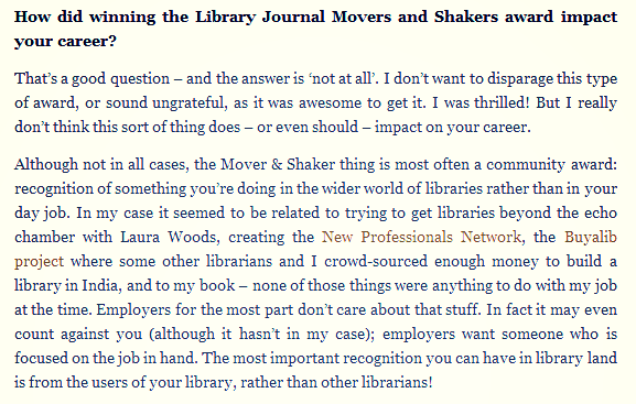
I enjoyed the perceptive questions and it allowed me to talk about some things I feel quite strongly about. The screen-shot below shows one such question, about whether awards really matter for career progression. They don't (in my experience) and nor should they.

New Professionals are my favourite library group and I don't really get to work with them much these days, so thank you NLPN for inviting me to be an interview subject!

Squarespace: A comprehensive review of the website building platform


If you listen to any podcasts at all, you'll have heard of Squarespace.com - they seem to sponsor every single one. If you don't do podcasts and you're not familiar with them, Squarespace offer a complete website publishing package: you build it using attractive templates, they host it, and you pay them an annual fee.

After mulling it over for ages, and building a mock site using their free-trial, I eventually made the switch from my old wordpress.org site to this new squarespace.com site in August, and overall I'm very glad I did. So, for those I've spoken to online and in person who are wondering about making the switch, here's a (fairly long and comprehensive!) review of Squarespace.

The Design

One of the big reasons I switched to Squarespace was their designs. Their sites are above all clean - I find them engaging to look at and interact with. I spend most of my working life on the internet so I do appreciate when a site looks nice and is easy to use. Squarespace designs make great use of images and the full width of the screen. They allow you to highlight key information - your website may contain a lot but you can still direct people primarily to just a little of it, allowing those who want to go deeper easily to do so.

Squarespace uses a template system, but in the best possible use of the word 'template' - loads of different ways to present information which are easy to customise and make your own. At the time of writing there are 32 templates to choose from - here's a selection:

Click the pic to go to Squarespace's templates page

Click the pic to go to Squarespace's templates page

For each template there are a number of example websites (from actual Squarespace users) so you can see how they work in the real world. I chose 'Bedford' for this site because I liked the large image at the top of the page (if you're reading this blogpost on its own direct URL you won't be able to see this - have a look at the blog homepage in a new window, or the Past Talks page for example, to see how the site normally looks with a featured image)  and because I could see examples of the Blogging side of it working well; Squarespace is NOT primarily a blogging platform, so I needed to know I could still have columns, subscription options, and other things which a totally minimalist design might get rid of in the name of style over substance.

Essentially there are templates which allow you to present most types of information engagingly. Some are very commerce orientated, some are detailed, some are extremely sparse, some are designed to work as an online CV or portfolio. They all look lovely (and can all be completely changed as part of the customisation process anyhow) so you can choose one to suit the type of content you wish to have on your site.

There's no comparison between the way my old site looked and the new one looks. One is dated and the other is fresh. In fairness that's partly because I designed my old site myself using my limited html skills - there are plenty of Wordpress themes which look a lot more contemporary and usable (albeit, in my opinion, not on the same level as the Squarespace designs).

Mobile Ready and Responsive

The other key thing about the design is they're all Responsive Design sites. This means they recalibrate their content to suit whatever size of screen you look at them on. This is much, much better than an Adaptive Design site (which basically means having a mobile-friendly version and a desktop friendly version) in a number of ways, but primarily 1) you don't lose any content like you do with Adaptive; it's just rearranged to suit the screen, 2) it looks brilliant and works well on any device and 3) you don't have to limit the width of the screen because it responds to any width of screen, meaning it makes the most of widescreens. (My previous site was 1000px across, meaning anyone looking on a wider screen than that just saw wasted white space either side of the content.)

We all know being mobile-ready is essential these days. So far since August a bit over 3,200 people have visited this site on their mobile devices, which is relatively small as a proportion of the total visitors, but nevertheless I'm glad each one (hopefully) found it a useable experience.

Building the Site

Building the site is done via Squarespace's drag and drop content system. Once you get the hang of it it is much easier to use than any other system I've come across. I can write code but it takes me ages and I can't do anything flash with it, and Blogger and Wordpress simply don't the flexibility and power of the Squarespace engine.

Here's what this part of the blog post looks like in edit view, when I go to add a new piece of content. The things I use all the time from the Basic section are Text and Image (obviously), and I use Quote on the Training pages. From the More section I use the Code section to embed presentations, Storifys etc (it seems to work better than the Embed tool, for me) and the Spacer tool which basically allows you to arrange elements of your site precisely where you want them, for example by filling up the left hand side of the screen with a Spacer so your content appears on the right. There are more features you can't see in the screengrab, some of which I used in the building of the site but don't have cause to come back to when writing posts like this one. Squarespace provides clear instructions and some nicely illustrative videos that explain how it all works.

As well as types of content and tool, there are overall Page types. Clearly this section is on the 'Blog' type, but I use the regular 'Page' for most of the rest of the site. For the Upcoming Events page I use the 'Events' page type, which is terrifically useful; it makes it very easy to create actually useable events pages which have timings, maps and so on built in. Although I don't have use for the 'Gallery' page type it's also very nice and works really well.

squarespace2.png

As you can see in the screenshot above, my site is visible in the background in edit mode. This is because there is one interface which does both Content and Style - you edit the site as it appears to viewers rather than in a separate edit view with a preview mode. What You See is very literally What You Get.

The Bottom Line

Squarespace costs money and, as previously discussed in various posts on this site, it is perfectly possible to create an excellent blog or full website for free.

At the time of writing there are three Squarespace plans: Personal, Professional and Business. Rather than list the differences here's a screengrab:

Click to go to Squarespace's Pricing page

Click to go to Squarespace's Pricing page

I've got the Professional package - the dollar per month pricing works out as about £120 per year (billed annually), although I got 10% off by using an offer code from a podcast. Listen to any episode of Football Weekly, WTF, This American Life, I'd Hit That (for the drummers!), Freakonomics, Serial - basically any popular podcast - and you'll hear an ad with an offer code you can use to get the saving.

The reason I went for this plan rather than Personal is the unlimited bandwidth. Bandwidth stresses me out because you can't really control how much of it you use - there are things you can do to influence it but ultimately it comes down to how many people visit your site. Every time someone views a webpage it uses up bandwidth. I've had to spend extra money before to get extra bandwidth allowance on the old site, so I wanted an entirely hassle-free experience where I know I'll never need to change my current package - 500gig may well have been enough, but I prefer not having to think about it. (More on understand bandwidth requirements here.)

So £108 each year with the discount, or £55ish if you go for the Personal spec. Is it worth spending that kind of money on a website? Clearly the answer will vary depending on what you use your website for and how important it is to what you do.

I used to spend around £60 per year on hosting for my wordpress.org website, so Squarespace is more of a cost - I decided it was worth the extra cost for me because of the simplicity of the way it works, and the ease of maintenance / lack of upkeep, and because it looks a lot better. I also, quite honestly, wanted an excuse and the motivation to completely redo my website - next year I'm part-time in my main job so I can do more training for organisations, so as this website acts as a sort of HQ for my freelance work I figured it was worth the investment.

The other reason I think it's worth the money to me is that I think it's extraordinary that you can have a fully hosted, fully responsive to mobiles, fully SEO optimised, contemporary looking website for this amount of money. The amount of time it would take me to make something like this from scratch I can't even imagine - weeks and weeks. I think for what it is, it represents great value. Imagine how much you'd have to spend to build, or have built for you, a website like a Squarespace site even just two years ago! An absolute fortune by comparison. A feel bad for web developers.

Finally, a brief summary of the good and the bad of the platform.

Cons

So what are the downsides of Squarespace? Here's my take:

  • It's a relatively new company, so who knows what its long term future is? (Squarespace has actually been around since 2004, but only in its current form and with its current high level of popularity and use since 2012.) Wordpress, which I used previously, had been around for a long term and was sustained by input from the developer community as well as its own employees. It's free and open-source. There's every reason to expect it to be here and usable for a long time. We just don't know enough about Squarespace to be able to say it'll be around for a long time - and it's a for-profit company which means it could go bankrupt. So there's a risk.
  • It's a relatively new company so they change stuff all the time - features you like may disappear. In the short time I've been using it they migrated to Squarespace 7, an all new version which, as described in the Building the Site part above, essentially allows you to design your site without using a separate edit interface. This is great for site design but once your site is up and running and you're no longer tweaking it, I actually find it gets in the way somewhat. Also since I've been using it they've got rid of the option to add an image via a Flickr URL - you now have to save the image to your PC and upload it. It's a minor inconvenience but it's a feature I used to use but can't anymore - there may be more of those to come...
  • It represents great value for money - for now. By which I mean, if Squarespace turn around and hike my yearly payment by 100% next time around, what do I do? I can export all my data of course, and build a new site on another platform using all the words and images from this one, but that would be a LOT of hassle. So I'm relying on them not getting evil and greedy.
  • It's not a blogging platform. Blogging still a central part of what my site is for but it's not the be all and end all like it used to be, so this isn't so much of an issue for me. But not being a dedicated blogging platform, Squarespace does lack features which wordpress.org had that made life easier - more details statistics, useful plugins and so on.
The top statistics are from Squarespace (which sadly doesn't provide 'All Time' stats so this is just for the last month); as you can see, search engines not nearly as important as they were in the Wordpress days, which are the lower stats.

The top statistics are from Squarespace (which sadly doesn't provide 'All Time' stats so this is just for the last month); as you can see, search engines not nearly as important as they were in the Wordpress days, which are the lower stats.

One final thing is that I was unable to switch over without losing some SEO. This almost certainly isn't Squarespace's fault (it is, after all, 'SEO optmized'), but rather due to changing my site's URL to something brand new at the same time. I used to get at least 300 people a day finding my site via Google etc even if I didn't post anything - that no longer happens, and I effectively have to generate traffic myself via Twitter or it's a much smaller figure. (I am trying not to be sad about this! Changing to a proper URL was still worth it, I think.) I've put redirects on but that doesn't seem to have counted for that much - however as I say I think it's probably something which would have happened whether I'd switched to Squarespace or not. I just can't be 100% sure because I don't know enough about this sort of thing.

Weirdly the number 1 source of traffic for the new site is 'Direct' which presumably means people typing the URL directly into thier browsers - I'm baffled by this and can't help thinking something has got lost in translation between what's actually happening and how Squarespace is rendering the statistics.


Pros

  • Everything is included. For me the main pro is that using Squarespace makes things simple and unambiguous. I have the editor, the published site, the custom URL, the hosting, the unlimited bandwidth (and also unlimited storage and unlimited pages) and the ability to do other stuff I don't currently need to like add Podcasting or Commerce options - this is all in the same package, with no ambiguity or add-ons. I like this a lot.
  • It looks great: contemporary and nice to use. The interface is easy to work with and I love the way the website looks on all devices. The content is engaging and usable. Should I tire of this design I can just choose one of the other 32 templates and it'll completely rejig my site in one fell swoop.
  • It is amazing value for money. As I mentioned above, the idea a few years ago that you could get basically any kind of website you wanted, beautifully rendered, for just over a hundred quid a year, would have been bonkers.
  • The Support is very good. Squarespace are based on New York and Dublin and that's where their support teams are too. They get back to request for help within a couple of hours, they know what they're doing, they speak perfect English... All that stuff helps. Also the developer community are great - they helped me with the fact that wordpress.org uses a different style of URL to Squarespace, so all my URLs have to be redone individually for the old thewikiman links to work, and they wrote some easily editable java script which allows me to have the feature images take up the exact proportion of the screen I want them to (by default in this template they took up too much of the vertical space, and when I tested my proto-site on my wife she said people might not even realise you can scroll down to find more content) - whatever you need to do the chances are someone on there knows how to do it...
  • It's constantly evolving: I mentioned this as a con above, but it can be a pro too - they've added loads of new templates just in the time I've been using Squarespace, so you can always stay ahead of the web-design curve.

So that's the end of a pretty epic-length post by my standards. If you have experience with Squarespace (good or bad!) or have any questions about it from a user's point of view please leave a comment. If you fancy trying it out, sign up for the free trial and play around - it's not one of those free trials where you give your credit card details and it automatically starts unless you cancel it, so there's no harm in giving it a look. And if you build your own Squarespace site, let me know!