We're putting together a guide to various infographic software for our students, so I've had cause to play around with a few. I find a lot of tools recomended on the web just don't quite work for educational stuff (or, indeed, library stuff); they're just too much style and not enough substance.
Also, all the articles about infographic tools are entitled things like '61 GREAT INFOGRAPHIC PACKAGES!' which always baffles me somewhat. Maybe it's the information professional in me, but I think if you're going to write something recommending a set of tools, you should at least narrow the number down to a recommended few...
So what are the most effective tools for creating meaningful infographics?
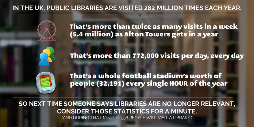
1) Great for stats and figures: Piktochart
I really like Piktochart. It's the tool we use most often at work. My colleagues have used the templates to create infographics, for example this one has been used to explain library processes to users in a way that is engaging and easy to understand:

An example of a Piktochart template
It's simple to take something like the template above and change the images (there's a huge built in library of icons, or you can use your own) and the colours etc to suit whatever you wish to express. Piktochart also has seperate templates for Reports, which are nice.
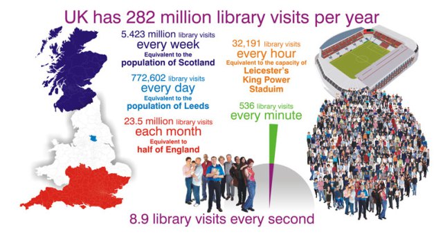
For me, though, the way it integrates very easily with your own data from Excel or Google Sheets, which you can import from a .CSV file, is the best thing about this tool. So it takes what you already have and makes it visually appealing, which helps prevent the all-style-no-substance issue that afflicts a lot of infographics.
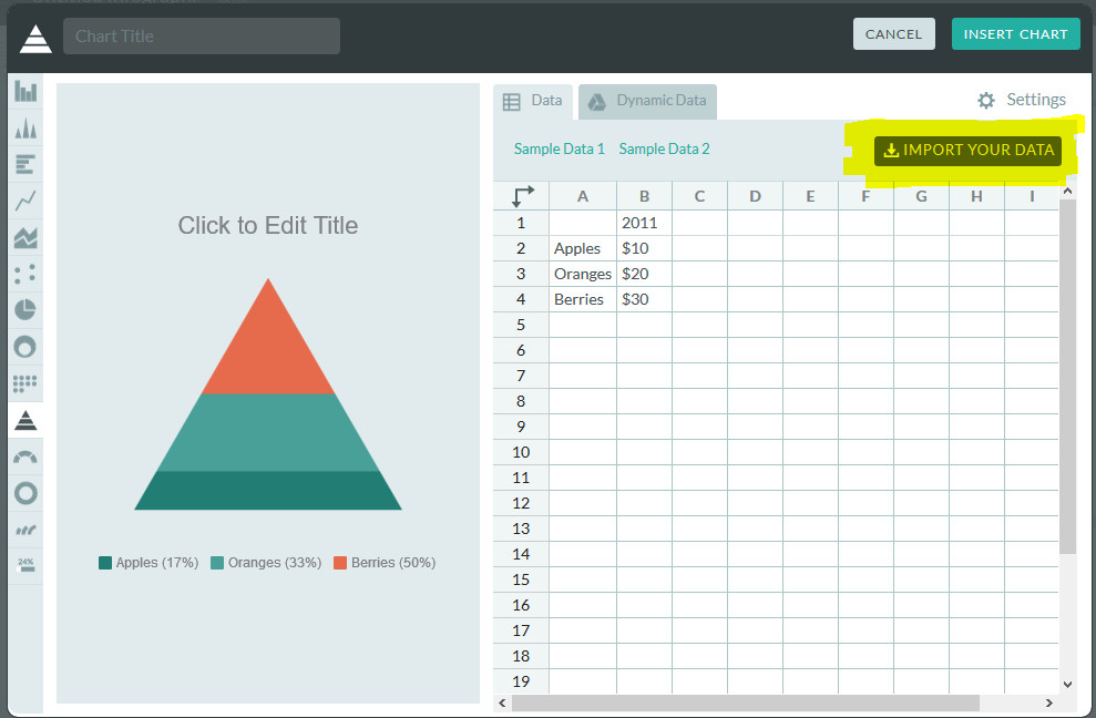
You can import your own data
Although Piktochart does infographics, reports, and some really nice data visualisation with maps, I've mostly used it to create individual charts which I've then exported for use in other things, like Action Plan documents, or presentations. In the example below, all the graphs etc and visualisations are from Piktochart, and I'm by no means an expert user so this is just scratching the surface of what it can do.
Piktochart is free, but also has reasonably priced educational packages, one of which we have at York, that allow you a few more options and some more features.
2) Good for flexibility: Canva
Canva does a lot more besides infographics. It's really good for creating images perfectly sized for social media, and they put genuinely useful tips on their design school blog.
At York we've used Canva for creating one page guides to things like Google Scholar, or JSTOR, in order to embed them in the VLE, blogs, etc. Canva is simple to use and there are a lot of nice built in fonts and images which can make otherwise not-overly-exciting subjects a bit more engaging for users.
You can use Canva for free, which is what we do. It tries to tempt you in with paid for images and templates, but you can also import your own images so there's no requirement to pay for theirs if you don't want to.
Here's the interface and an example of a free to use template you can build on:

The Canva interface
I'd recommend playing around with Canva if you've not used it, because it has so many potential applications. The trick, really, is being able to sort through the paid stuff to find the free stuff, and being able to sort through the superficial 'this is probably great if you're the web designer for an artisan baker in Portland' templates to find the 'I can actually see this working in my world' examples...
3) Good for interactivity: Infogram
Infogram is particularly good for creating graphics you want to embed online, because they can be responsive and interactive depending on what you do with them. It's basically about hovering over different bits of the graphics, but it does allow you to focus on certain parts of the data more easily than a static chart allows. See the example below:
Other pluses with Infogram include its ability to import data from a really impressive variety of sources. Downsides include the free version being fairly stripped back of features, and even the cheaper paid for version being out of financial reach for most non-profits.
4) Good for surprising you with its potential for making infographics: PowerPoint!
The much maligned PowerPoint is actually a very good tool which is often deployed spectacularly badly by its users. It's more flexible people than people realise (especially the two most recent iterations, 2013 + 2016), and that makes it surprisingly good for infographics. The main reason it's good is because you can take something - a chart or graph from excel, words written in interesting fonts, icons, images - and put it on a slide, and it just stays where you put it. Then you can layer more and more stuff on, and easily move it around - unlike Word which is a nightmare for that sort of thing, and a bit like Photoshop, but without the need for a 2 year learning curve...
The keys to making an infographic are firstly to edit your slide to the right dimensions: go into the Design tab, choose Page setup and then choose, for example, A3, Portrait. Your single slide is your infographic. Secondly, use images from somewhere like freeimages.com, or icons from iconfinder.com, to make your content interesting (along side graphs and charts you can copy and paste in from Excel). Thirdly, use a non-standard font - download one from fontsquirrel.com - as typography makes a huge difference.
Bonus option: Visual.ly for Google Analytics Infographics
If you have a website which uses Google Analytics to track statistics, but don't want to be logging in to check your stats all the time, visual.ly provide a useful free service. You log in with your Google ID, give them your analytics code, and they send you a weekly infographic which tells you how you've done in all the key areas. When you have a good week it's a nice friendly blue, if you have a not-so-good week it's red for danger...

Sign up for yours at visual.ly, here. Everything else visual.ly does is a paid for service, but the Analytics infographics are free.
Do you have any recommendations I should add to this list? Leave me a comment below.