library induction

Import your floorplans into Prezi to create an interactive map

A couple of years ago I wrote about some interactive maps we'd made of the Library, which we used for induction and teaching - they went down very well. The students are much more engaged by a slick Prezi than a tired PowerPoint, and it's also very practical to have information about the library geographically located in a map, rather than in linear slides. So the maps worked really well as stand-alone web objects to be viewed independently by students and staff, as well as actual materials for live presentations and workshops. You can read the post - Student Induction, Libraries, Prezi, and Interactive Maps - here; it also contains an embedded Prezi map, with which to compare the new version I've created below.

In 2012 we tried to improve the maps a little, including embedded a lot of videos in them - things like the virtual tour, but also information at the point of need, for example '1 minute on... how to photocopy and scan' next to where the printer/scanners are on the map.

This year, we did something I've wanted to do from the start, which is import floor plans to Prezi and create the maps based on those. Previously we simply didn't have good enough floor-plans in a format I could use - hence having an outline of the Library buildings (drawn by someone in the Digital Library team), somewhat awkwardly divided up by me using lines and boxes. Now though, we have a MUCH better interactive map, the basis of which is an imported PDF of our floor plans.

Here is the generic map we display on our Info for New Students page (as always I'd recommend going into Full-Screen mode to view this - press the Start Prezi button then once it loads, click the box icon in the bottom-right corner):

We experimented with various ways of representing the different floors: separate maps for each floor, or one map but with box-outs containing the other floors, for example. In the end we opted for making the ground floor plan of the overall building take up most of each ground floor, but with the other floors contained within the same space. (That doesn't make much sense; you'll see what I mean if you look at the map.)

Unexpected benefits

Once again the response from the students was really good. Quite a lot of our induction talks happen as part of wider introductions to the course, from academics, the Student Union, Careers office etc - just the fact that we aren't using PPT and they all are makes the students sit up and take notice. They've often not seen Prezi before so are impressed by the ability to zoom in on different parts of the Library and talk about them. It really does have more impact, and make people more aware of what you're saying about the Library, than a PowerPoint presentation. (And I say that as someone who still likes and uses PPT a lot, including for a lot of teaching.)

That is the expected benefit of using Prezi, but each year another benefit that occurs is the map instigates conversations with the academics. People from the Departments we're presenting in come up to us and want to talk about the Prezi - they're often impressed by it, and they appreciate the fact that the students took notice of it. I really do think I've found it easier to work with departments after they've seen me using Prezi; it serves as a jumping off point / builds bridges. (Bit of a mix of metaphors there but you get what I mean!)

If you want to try making your own interactive map, here's how

The process we followed at York was this:

  1. Open a new Prezi and edit the template so it reflected our branding
  2. Import the floorplans as a PDF. When you import as a PDF each page of becomes a seperate object on the canvas, to be manipulated: picked up, shrunk, stretched, etc
  3. Stretched the overall top-down view of the Library so it was absolutely massive - after all, everything else has to fit inside it
  4. Placed the individual building plans within the stretched top-down view
  5. Annotated the maps with further information by simply double clicking anywhere on the canvas to type
  6. Put in photographs to give the audience a better idea of where they were in the building
  7. Embedded YouTube vids at all appropriate places (this is very easy with Prezi - you just need the video's URL)
  8. Saved a copy - individual Academic Liaison Librarians then took the generic map and made bespoke versions for each department
  9. Made different versions, by copying the maps, to suit specific needs - so edited the 'path' (the order in which the Prezi moves through all the text and pictures on the canvas) to make e.g. 5 or 6 key points only for a 10 minute presentation, or every single thing on the map for the stand-alone web version ..

An example of a different version of the map (as in point 9) is this iteration I made for my History of Art PG students, with subject-specific information added and non-essential path-points taken out:

We also use Prezi for some teaching but not all. So for my History of Art 1st years, with whom I have an hour on Texts and an hour on images, I use PowerPoint for the Finding Texts session, and Prezi for the Finding Images. The latter was created using a Prezi template - these are really good if you need something nice looking in a hurry. It took me around 2 hours to turn my predecessors PPT into the Prezi you see there.

Non-York examples

Here are other takes on the interactive map:

If you have examples I can add me list, or any comments or questions, let me know below!

Student Induction, Libraries, Prezi, and Interactive Maps

This'll probably be my last blog post for a while - I just wanted to share the results from a bit of an experiment to try and increase student engagement with library induction (and market the library at the same time). All new students go through quite a lengthy induction process in the first three weeks at the University. The library is slotted into that - how much time we get with the students varies between departments - and so it's a good opportunity for us to make contact, promote our services, and try and embed ourselves in the academic culture, but also tricky because the students are overloaded with information as it is.

I wanted to give each of my departments an interactive map with all the library info relevant to them specifically - the idea being that it's easier to navigate an actual map of the library than it is to just search for stuff on the library website. Because each department would have a bespoke map it would mean the students had all the info they needed in one place, and because I created the maps in Prezi they could also be used as a presentation tool (as well as a stand-alone web object, later; I give students the URL of the Prezi itself and tell them not to worry about writing down any of the other URLs it contains).

I created a generic map of the library with all the information which wasn't department specific, then copied that for each of my two departments and doctored it accordingly. I also made it available to my colleagues in Academic Liaison here at York, and a few of them created their own subject-specific versions too.

The upshot of all this is, it really seems to have worked! Both me and my colleagues have reported that students noticeably perk up when the Prezi starts zooming about (I even had some gasps from one of my groups...) and seem more engaged than they had in previous years when PowerPoint was used. I don't have anything to compare it to as it's my first Induction as a subject librarian, but my colleagues seem to think the student response is definitely better. What's also really good is that it's been great PR for the library - the academics all seem really impressed by it. One of my departments have asked me to run a session to teach them, the staff, on how to use Prezi, and it's made the library look innovative and more of an intellectual partner to the academic departments. I'm collecting a quote-book of all the comments we're getting (for example, a lecturer emailed one of my colleagues and said "[the Prezi] went down very well, and generated a much greater response from the students than in previous years – it’s a great presentation format, so do pass on that feedback"), and I might submit a proposal for LILAC all about this whole thing as I'd really recommend other libraries using Prezi in this way.

Anyhow, here is the presentation, based on a top-down outline of the library buildings created for my by my colleague Matthew Herring:

It is designed to either be navigated through in the normal way, or to be a proper 'interactive map' with clickable hotspots. Anything that flashes green when you hover over it can be clicked on and zoomed-in on for more info - this also gives you the option of a student-led session where you ask them where they want to go, rather than leading them around. I'm planning on doing this with the Postgrads (many of whom will already know the library fairly well) but I must admit I chickened out of doing it with the Undergrads... I wanted it to be interactive but I didn't think fresh-out-of-school students would know enough about academic libraries to want to lead the session.

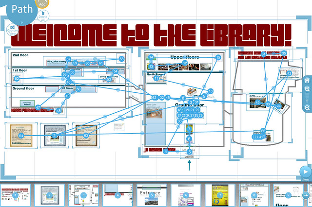
To achieve the hotspots I used a lot of hidden frames, one of the most useful features Prezi has. Here's what the canvas looks like in edit view - check out a new feature of Prezi, along the bottom: a preview screen showing you each stage of your navigation path:

Prezi screengrab

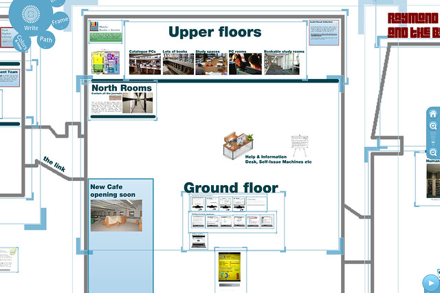
And here's a closer view without the path showing, so you can better see how the hidden frames sit within the canvas:

prezi screengrab number 2

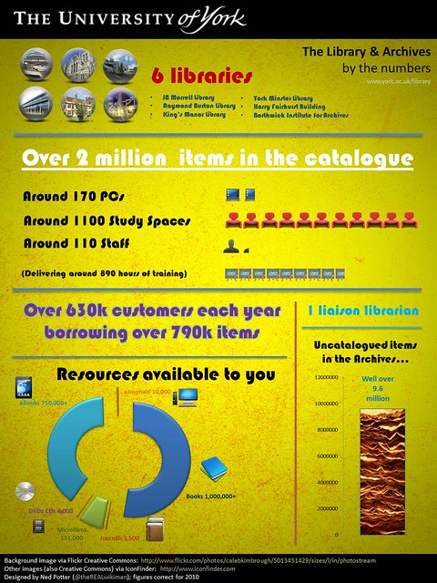
Finally, here's an infographic I created about the library, which you get to when you walk in through the 'door' of the library map. The idea is to get across the scale of the library operation in one screen, without having to bore them with lots of stats throughout the presentation.

Big library infographic

So overall, this approach worked well for everyone. For my other subject (Theatre, Film and Television) I'm planning to use an expanded Prezi for teaching purposes too. I don't think the scope of this is limited to Academic Libraries, either; you could easily embed a virtual Prezi map on a public library website, to help people use it better, too. If you're wondering about creating your own, here's a link to the Prezi guide.

Incidentally, one other  thing I did was let the students leave early from my 45 minute sessions. At this stage of the student lifecycle they are getting too much thrown at them for the full 45 minutes to be valuable - I wanted to get the key info across and leave it at that, rather than get them so bogged down in detail that they forget all of it or just switch off. When I see them again later in the term they'll hopefully be in a better position to go in-depth into the services and resources the library offers.

- thewikiman