Don't think I've been to a conference before where all speakers not only have really great things to say but know how to say it #UXLibs
— JamesA-E (@JamesAE) March 19, 2015My second and third posts about the User Experience in Libraries conference are about the Keynote speeches. (Email subscribers, there's a load of embedded content in this one - here's the link if you want to read it online.)
There were three, and they were all brilliant. I found them not only very informative (as someone new to UX) but also fascinating and educational in their delivery (as someone who teaches presentation skills workshops). I want to cover both aspects here.
A keynote is very different to a regular conference talk. It has a different role. You can't just report back on a project you've done, in a keynote - it has to address wider or more fundamental issues, and be transcendent somehow. But for me the best keynotes still give people something to DO with the information they've been given. It's a real challenge. It's an art.
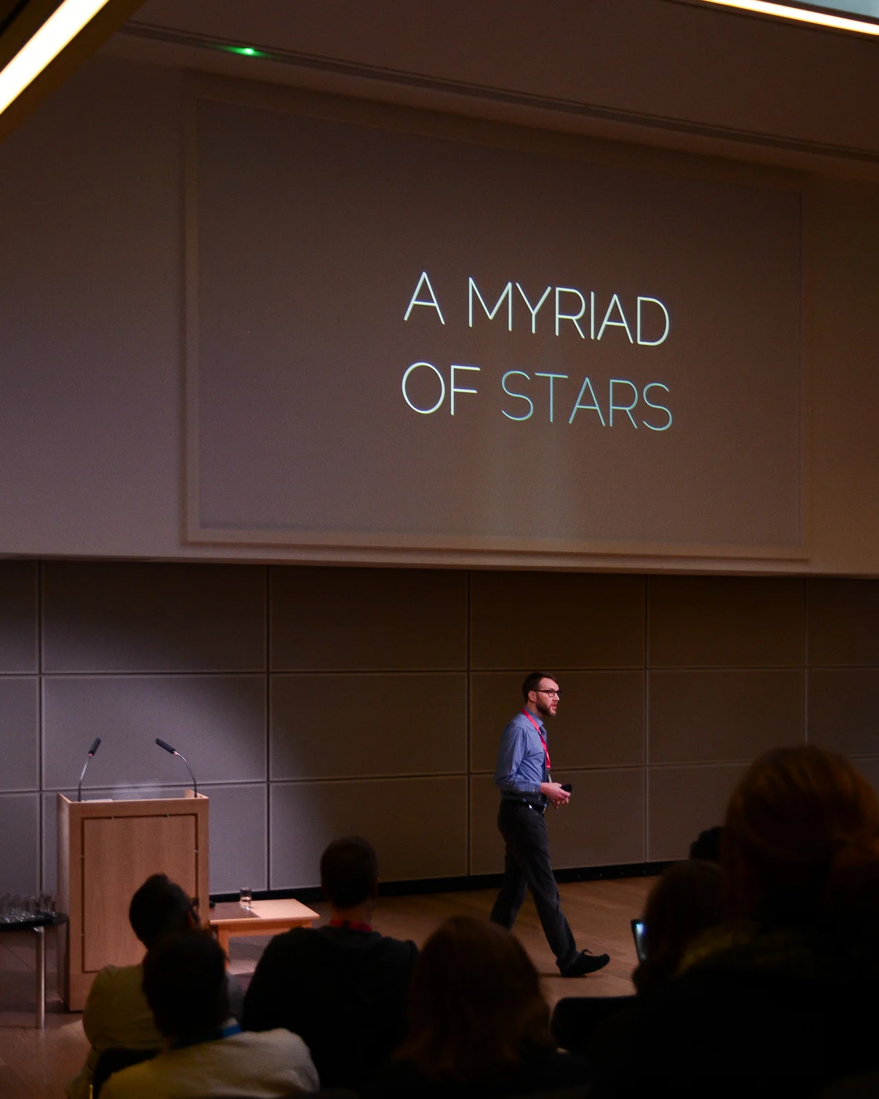
Matthew Riedsma | More than usable: library services for humans
All of the keynotes were fantastic. Matt's in particular, I thought, taught me a lot about the art of the keynote. He had so much TIME. He left long pauses.
He let things sink in.
He allowed us to digest what he was saying.
And of course, allowing pauses is all about having confidence in your material. When I'm doing an infolit talk a Department has asked me to do, with them selecting the content, I tend to keep the momentum up and move quickly through it, because I'm not always convinced the audience is enjoying it. It needs urgency to work. But if I'm doing a talk at a conference, a talk of my own choosing, I believe in it a lot more so I try and leave more gaps. But not as longer gaps as Matt did. This was a masterclass of pause-leaving. It was awesome. No one was shuffling their feet or wondering what was going on. We were all captivated by the talk.
Matt's slides were the perfect example of how to create a visual theme without using a template. They did what a template is supposed to do: keep the audience aware they were part of a certain landscape, that all the information they were seeing is connected and of a piece. But without all the bad stuff templates also do: because all the slides didn't actually look the SAME, they were able to express their contents uniquely, and be formatted for the best method of communicating that particular set of information.
Matt used blue, black and white as the colour scheme. This meant blue and white text, black backgrounds, pictures with a lot of black in (the night sky, for example), and, a really nice idea this, black and white pictures of the people he was quoting, behind their quotes.

A selection of Matt's slides to illustrate his visual theme. All of a piece but no template in sight.
The visual theme was cemented by the use of fonts:
@thomaskistell @ned_potter Fonts: Bemio for quotes, Montserrat and RaleWay for titles.
— Matthew Reidsma (@mreidsma) March 19, 2015Three fonts, which is the maximum you should use in one presentation, generally. Two of which worked together and complemented each other nicely: in effect, Raleway is for the set up and Montserrat for the punchlines, so we as the audience are being guided to what is most important about each slide. The other font, Berio, contrasted to denote that something different was happening (quoting others' words rather than creating his own).
The slides were pretty. But that was a by-product of them being EFFECTIVE. Big fonts that everyone could read, and which guided us as to the key messages. Pictures which helped us learn and told a story. One point per slide so we never had to decide if we should continue reading or continue listening. The presentation supported and enriched, and possibly prompted (although Matt seemed to know exactly what he was going to say without using the slides) - but not duplicated. Slides and presenter working together, not competing.
Here's Matt's full presentation:
If you have three-quarters of an hour to spare, there's a recording (slides and audio) on Vimeo - it's well worth watching!
Matt's talk was ostensibly about usability. It covered a lot more - philosophy, immigration videos, chair awareness, urine in space.
I've created a Storify of the tweets people wrote during the Matthew Reidsma keynote, which goes some way to capturing what is was all about, and which I won't embed here as this post is already taking up a lot of space, but I'd recommend you follow the link and have a look.
To try and boil it down, the phrase that summed up the essence of the talk for me is 'Libraries are PEOPLE, all the way down'. Usability is all about putting people and their experiences first. Experience is messy and complicated. How someone experiences something can be affected by the kind of day they're having (the kind of LIFE they're having), rather than just, as we might assume, the tools they're using in our libraries. Our users are not coming from an emotionally neutral place. A task based approach to usability assumes they are; an experience based approach better allows for an emotional experience. The Andromeda Yelton quote in the slides above is key: often people talk about libraries as being about information, and access to information, and more frequently these days we talk about people in that equation too. But not just librarians. Other users. Libraries let people transform themselves through access not just to information but to each other.
And, absolutely crucially, we need to rethink usability from being an attempt to produce a perfect experience, to instead an attempt to design for breakdown. Accept things will do wrong. The key is the user's ability to self-right them.
Design our services (online and in person) so when they breakdown, it is intuitive to rescue them and carry on working. Matt used the analogy of using a mouse on a small table: at some point you may move the mouse too far and it falls off the table. At that point, no one goes 'oh it's broken' and seeks help - they just put the mouse back on the table and go back to work, very quickly forgetting the 'task' of using the mouse and getting back to the 'experience' of the technology being an extension to themselves. This is what we need to aim for.
This is far more revelatory to me than it probably should be. I feel I should have been more aware of this before. But I wasn't. I frequently try to get everything to just WORK - but when I think about what works for me outside the library, it's the procedures or technology which I can correct, on my own, when they break down. I've been designing everything as task based, forever. Now I can focus on transitioning to designing for experience and usability.
It was a brilliant talk. It had stories (that were relevant), humour (but no jokes), philosophy (which underpinned the practical stuff), and calls to action. Ace.
(As an aside, we also challenged Matt to get the words 'sac magique' into his presentation - a reference to 90s classic Tots TV - which he managed to do so brilliantly as to satisfy our juvenile need to get him to do something silly, but in such a way that no one else saw them so it didn't detract from the professionalism of his presentation... They were in the search box of an American Citizenship website he showed us a print-screen of. I mention this because although I was trying to spot the reference, I kept forgetting about doing so and getting engrossed in Matt's talk - which is actually a neat metaphor for a lot of what he was talking about. I had a task - spot the sac magique - but actually the experience was so good I forgot all about it...)
Header Photo by Jamie Tilley - the original, on jtilleyphotographic's Flickr account, is here.