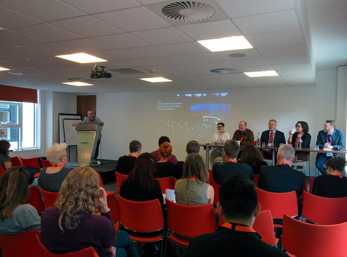
At the 2023 User Experience in Libraries conference I ran a workshop all about comms and UX - basically my two favourite aspects of librarianship, mashed together, at my favourite event in librarianship. It was also in Brighton were my wife and I got married, and she came down to hang out with old friends while I was there and attended the conference dinner, and the weather was great - the whole thing was A+++, would do again.
Anyway, the workshop went really well and I later wrote it up for the 2024 UXLibs yearbook, which I’d highly recommend getting your library to buy a copy of. My chapter is now available Open Access via York’s repository so please do go and have a read if this is an area that interests you. I’ve put the intro below so you can see what it’s about.
(You can also find OA chapters from previous UXLibs Yearbooks on my Publications Page.)
The introduction TO my UXLibs YEARBOOK chapter
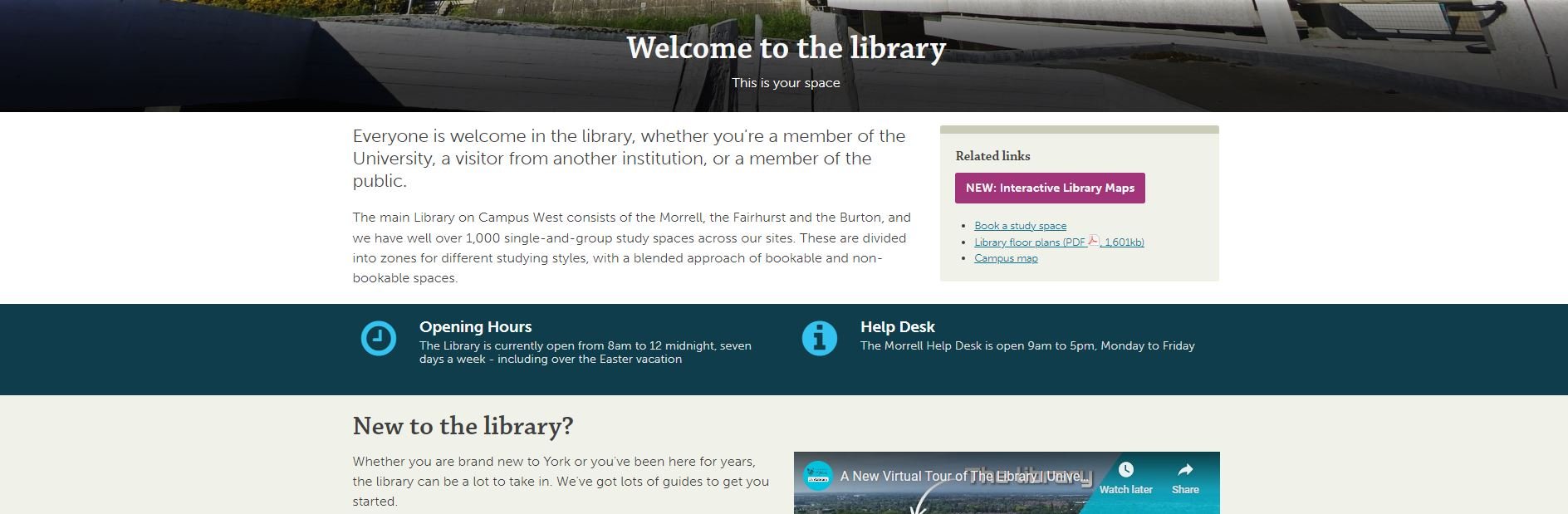
At the end of what was known at the University of York as the ‘UX Study Space Project’, we presented our final recommendations to management. Ten months of work had gone into it and we were proposing (or in some cases had already implemented) far-reaching and wide-spread changes: new study space booking rules; new zoning for food and noise; new signage throughout the library; increasing the number of accessible spaces; creating a new ‘Zoom Room’; purchasing some interactive mapping software… We got some really useful input from the leadership team and they signed off on all the things we wanted to do – at which point it occurred to me: this was the single most impactful piece of work I’d ever done in librarianship.
Nothing else really came close – the fingerprints of our UX project were all over the actual, day-to-day user experience of our students and staff, simplifying and improving things in so many ways: it felt euphoric! But the 10 months of hard work that had made these changes possible could have been undone if we hadn’t been able to effectively and meaningfully show the value of our proposals to the audience who could give them the green light.
UX is such a complex and messy business, and it can be easy to get lost in the processes of ethnography and design. We mustn’t undervalue the comms; successful communication plays a huge part in helping our work achieve its goals, and it’s worth breaking down the communications life cycle of a UX project to ensure we’re making the most of each stage.
Part 1 is The Pitch. This is where you communicate the value of your proposed project, to get the time and resources you require to do the work. The audience here is the managers who can release funds for incentives and release staff time for fieldwork and design, and your colleagues whose input you’d like on the project.
Part 2 is The Recruitment. Now the audience are library users (and, ideally, non-users too) that you need to persuade to participate in the fieldwork, lending you their insight.
Part 3 is The Findings. This is where you need to communicate the results in such a way that you’re empowered to really act on them – it’s not UX if all you do is diagnose problems… The audience here is not just the managers who need to approve your design proposals, but wider library staff too. Keep them in the loop and get them on board.
Part 4 is The Legacy. Here the audience is everyone. Everyone needs to know what you’ve done, how brilliant it was, and what the ongoing impact is. Tell the participants. Then tell the world.
All in all, UX is a comms-heavy business, so let’s explore each stage in more detail and look at some tips to enrich your UX and help make those user-centred changes your library needs.