Ethnography at York

Elevating voices: UX as a tool for equity

Today I am honoured to give a keynote at UXLibs 10, the User Experience in Libraries Conference. Below is a version of my slides, and then I’ve linked to several relevant articles and reports covering things I discussed in the talk, finishing with highlights from my report on the Inclusivity and Belonging UX project at the University of York.

The presentation

My slides are embedded below and available on Slideshare here.

The abstract

Higher Education is facing financial crisis. When budgets tighten, services often shrink to fit the needs of the majority, and ‘maintaining core services’ can easily become a proxy for exclusion. By designing for the ‘typical’ user – those with the fewest barriers and the most flexibility – we inadvertently sideline marginalised groups with complex needs.

This keynote positions UX work as an essential tool for equity, with a five point manifesto. We will explore how libraries can represent the under-recognised, elevate diverse perspectives and ensure our institutions remain inclusive, authentic spaces for everyone.

Recruiting for diversity

An absolutely essential part of my UX manifesto is to recruit as diverse a group of fieldwork participants as possible, rather than taking a first-come, first-served approach, or trying to achieve a representative sample. Your service will be more inclusive if you design it to meet the most needs, rather than for the most people. I cover this and several other aspects of communication around UX in ‘Communicating the benefits of UX to everyone who needs to hear it’ in the User Experience in Libraries: Yearbook 2024 edited by Andy Priestner and Marisa Martin (2024) - the Open access version available via White Rose Research Online here.

Three rounds of five, and getting UX done

A really effective structure for UX projects is to interview 15 participants, split over three rounds of five people each. The first round is generative, the second round is for prototyping, and the third round is evaluative. This process is covered in more detail, along with some advice on how to advocate for UX and get it done at your institution, in ‘Ask not what your organisation can do for UX; ask what UX can do for your organisation,’ in User Experience in Libraries: Yearbook 2023, edited by Andy Priestner (2023). The Open access version of that is available via White Rose Research Online.


The Inclusivity and Belonging Report

Throughout my talk I referred to a recent UX project at the University of York, entitled Inclusivity and Belonging. The report was written for use within the University and it wouldn’t be appropriate to share all of it - however, below are some highlights, with the quotes from participants removed.

Executive Summary

Our spaces help shape the daily experiences of our users, and should reflect the communities that use them as far as possible. This project originated from the need for better data on the library experiences of students from smaller, under-recognised demographics. We have consistently prioritised diversity in participant recruitment for previous User Experience (UX) projects, but rarely have we made that diversity the focus of the project itself; while we have made good strides in specific areas relating to inclusivity, there are many groups outside the ‘typical’ York student, who face barriers to service use which we could potentially remove. In particular we wanted to focus on the experiences of first-in-family students and ethnically minoritised students, and to make the library a more trauma-informed service, as part of this project. There was intersectionality here among our participants, both in terms of class and race, and in terms of neurodiversity.

Key findings and observations

The Library is widely regarded as an inclusive environment, but this perception is carried by the interpersonal skills of our staff, our communication online, and specific initiatives (such as the Sensory Rooms or Family Study Room) - rather than the building itself.

  • Staff are a key part of inclusion. Students frequently praised the approachable and welcoming nature of library staff, especially in the Customer Services Team. In general, the library's approach to inclusion and belonging is actively noticed, and appreciated.

  • Elements of the physical environment - often beyond the library's control - actively work against inclusion. Several safety features required by the University - such as the turnstiles, high-intensity lighting, and glass-fronted study rooms - act as signals of exclusion for marginalised groups. In contrast, spaces like the Spring Lane Building are perceived as more inclusive despite being unstaffed: this is attributed to the absence of turnstiles, more thoughtful lighting, and flexible furniture configurations. However, those spaces do not foster a sense of belonging in the same way the library does.

  • Louder study spaces are important. Students from marginalised groups often feel exposed or scrutinised as they move through University spaces. Silent or very quiet study areas heighten this feeling of hyper-vigilance, whilst louder, Studious Buzz areas help to reduce the exposure, helping students feel more at ease. (This is a key reason one of the outcomes of this project, the Ethnically Minoritised Author Showcase Space, is located in the Fairhurst rather than the Morrell.)

  • Students from marginalised groups experience information gaps. We know from the 'York Risks' work from the No Gaps Project that 'Without a sense of belonging, students may feel isolated, excluded and marginalised, leading to lower engagement in learning, support and university life.' Students from working-class or ethnically minoritised backgrounds often operate under a constant state of "decoding" the university environment. This cognitive overload leads to missed opportunities within the library - such as students unnecessarily purchasing books, failing to seek help, or overlooking available services.

Outcomes and recommendations

This report details findings across 8 key themes and offers 19 recommendations. Rather than waiting for the publication of this report to take action, we adopted an iterative approach. As a result, over half of the recommendations are already complete or well under way.

Methodology: a UX-led approach

User Experience

As with all major projects, we based our approach around User-Experience (UX) methodologies. The best way to hear from students is not through focus-groups or surveys but through one-to-one conversations. The data we get from a semi-structured interview is so rich that only a small sample size can yield incredibly useful - and actionable - insights.

Project Overview

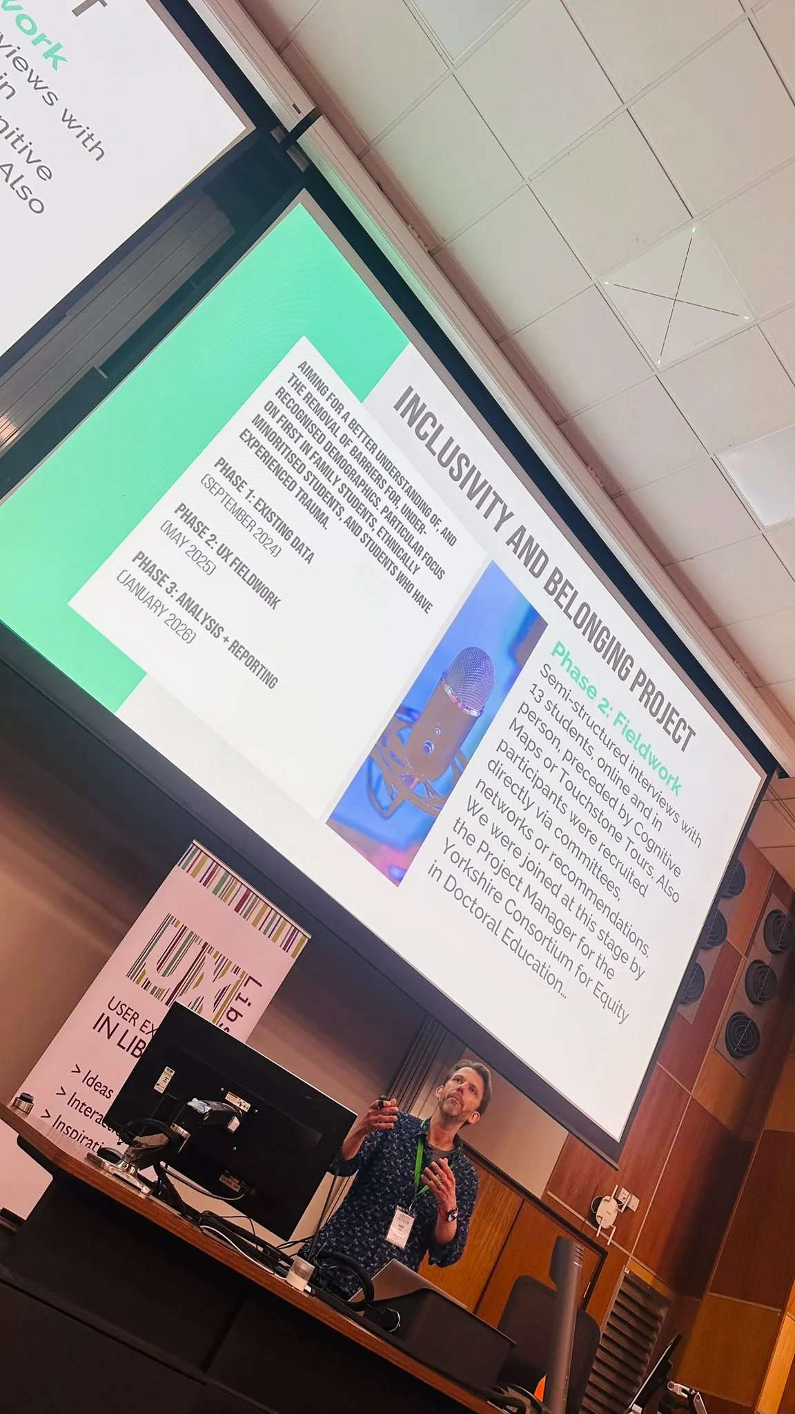
The project began in September 2024. Phase 1 focused on existing data: we met with around 10 staff from around the University to assemble perspectives and documentation from related studies. Phase 2 was the UX fieldwork, beginning in May 2025 and running until January 2026; we spoke to 13 students recruited directly, via channels such as Step Ahead or recommendations from relevant staff. Phase 3 - thematic analysis and reporting - began in January and ended in April 2026.

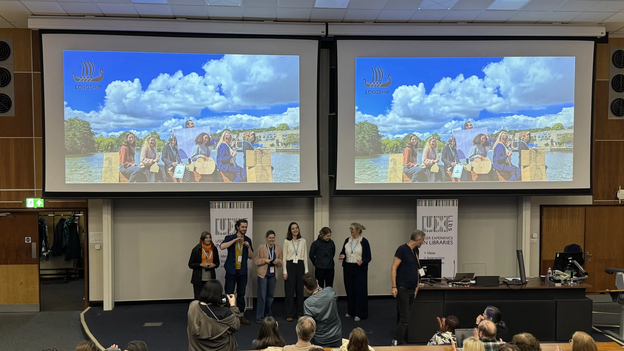
The project group consisted primarily of Ned Potter, Clare Ackerley, Martin Philip and Olivia Else, all from the Faculty Librarian Team, and we benefited from three later additions to the group. Raj Mann (who was at the time Project Manager for the Yorkshire Consortium for Equity in Doctoral Education) joined us for two months of the project, bringing invaluable expertise on many pertinent areas including providing a safe environment for interviewing students on potentially traumatic subjects, and introducing us to the term Trespasser Syndrome (more on which below).

Sarah Lapacz and Emanuela Buizza from the Customer Services Team joined up after most of the fieldwork was conducted, to help with thematic analysis and recommendations. Having their perspective and fresh eyes on the data was really valuable, and I'd recommend this approach of involving new people at the analysis stage for future UX projects going forwards.

A note on terminology

We use the term under-recognised groups rather than under-represented groups, which is the phrase we typically see used in the University. Even though it is almost always not intended this way, there is an implication with the latter term that the onus is on the marginalised person to represent themselves better, whereas of course the reasons for under-representation are systemic and institutional.

We use the term ethnically minoritised students rather than BAME or Black, Asian and Minority Ethnic students, based on advice from specialists in Diversity, Inclusion, Equity and Belonging. This framing highlights the fact that Black and Asian students' minority status at the University is an active, systemic process, rather than a static identity. Talking about 'BAME students' also risks implying a homogonisation of very diverse experiences.

We use the term Trespasser Syndrome where the University often used the term Imposter Syndrome. Imposter Syndrome individualises suffering: it’s not something being done to you; it’s something you ‘have’, a personal flaw that comes from within. But students from marginalised groups are made to feel like outsiders by the University - that comes from without. To quote Dr Arin N Reeves: "People from under-represented groups are not afraid that they are imposters; they are afraid that the majority groups won’t see them for who they are and won’t welcome them if they do see them. These fears are not the fears of imposters; they are the fears of trespassers."

Findings

1) Standard library environments can be exclusionary to marginalised students.

Large, bright, open study areas (such as Morrell Floor 1 or the Burton) are perceived as overwhelming and high-pressure spaces.

It was notable that this was the one area in which ethnically minoritised students, first in family students, students who have experienced trauma, and neurodivergent students all reported similar experiences and issues: the discomfort that comes from feeling observed ("it's just eyes and heads"), or 'taking up someone else's space' in an environment in which they already feel like a trespasser.

2) Bright fluorescent lighting is a source of overstimulation, especially for neurodivergent students. We know from previous UX projects that students want controllable lighting (such as desk lamps) or dimmer zones within the library - this was further confirmed in the fieldwork here. The natural light from windows is appreciated, but strong internal lighting is not.

3) There is a demand for semi-enclosed "micro-spaces". Students want the comfort and privacy of a "little house" while remaining in a public study environment rather than in an isolated area where they feel vulnerable.

Student needs are not as straightforward as wanting to study in busy areas, or quiet areas, or secluded areas. They require different combinations of good sight-lines, whilst not being overlooked; being private whilst not being isolated; feeling not just more scholarly but more inspired than they would at home.

4) The Hidden Curriculum causes financial stress in the library context. The hidden curriculum a wider issue across the University, but in the library it manifests in students not knowing that textbooks are available for free or that online copies exist, leading to unnecessary financial worries. There is also a lack of understanding around borrowing, returning and requesting books which is exacerbated for any students who feel othered or like they don't belong, as they're less likely to seek out help for their problems.

5) The lack of a quiet, segregated prayer space within the library is a functional barrier to long-term study for Muslim students. We know there are many reasons why a prayer room is not currently possible in the Library - however it continues to be raised in the research, every time we speak to students, even if we don't ask about it. Any student needing to pray during their study faces a stark choice - the discomfort of public, overlooked prayer in the library, or losing time (and potentially their study space within the building) by needing to travel to a prayer room elsewhere on campus.

6) Inclusion and belonging can come from exhibitions and events in the library. When we asked what could make the library more inclusive, several students talked about events or exhibitions as being key to seeing themselves (and those of other cultures) in the space.

7) The library is considered a diverse space. The majority (though not all) of ethnically minoritised students we spoke to considered the student body who use the library to be relatively ethnically diverse.

However it was notable that working class students are keenly aware of how many private school educated people are in the wider University. Several mentioned feeling othered by this.

8) Library staff are considered open, helpful and approachable. Many students report positive interactions with library staff, including ethnically minoritised students who have not had positive experiences elsewhere on campus. This is a real strength in the library which we should continue to build on.

For many of our participants, asking for help at all is significant. We need to continue to encourage and reward help-seeking behaviour at all times, and to foster non-direct forms of communication - students told us they'd prefer to DM on Instagram than speak to a member of staff face-to-face when seeking help, for example.

As mentioned in the executive summary, it is my belief that the staff of the library go a long way towards mitigating the more exclusionary aspects of our buildings and services, and are a key part of why we are widely considered to be a very inclusive space within the University.

Recommendations

There were 19 recommendations, many of which are complete. A selection are mentioned below.

  1. Ethnically Minoritised Author Showcase Space (completed): This collection was suggested by Raj Mann as a way to celebrate ethnically minoritised authors and make the library a more inclusive environment. It began with the purchase of around 500 books, and rather than selection being driven by the library each item was a recommendation from students or staff at the University. To ensure these books remain accessible throughout the library, we purchased dedicated copies specifically for this room rather than moving existing stock. There is a QR code in the room where students and staff can suggest additional purchases for the collection: these are reviewed twice a year in Collections Community.

  2. Add tags to study spaces in LibCal to aid students affected by trauma in choosing where to work (completed): The LibCal booking system now has additional checkable boxes when searching for study spaces. These allow you to filter the spaces and, for example, show only spaces with good sightlines, or spaces where you're seated with your back to the wall.

  3. Add blinds to study rooms to allow privacy for prayer (completed): we have had bespoke blinds fitted to two Morrell bookable study rooms (on Floors 1 and 2) to allow students privacy to pray

  4. Offer bespoke Library Tours for relevant Student Communities particularly First in Family groups

  5. Introduce more cultural event programming within the Library buildings. We will also explore offering LFA/144 as a safe, warm, well-lit event space for EDI+B related events at evenings and weekends, for student groups and societies.

  6. Better promotion of money-saving and no-cost services in the Library ideally in collaboration with Central Comms channels where possible

  7. Expand the glossary of library terms (in progress): our current glossary is focused on library terminology: we want to expand this to cover more colloquial and idiomatic territory, to help those adapting from other countries. Will include English and Yorkshire based expressions, as well as the usual definitions of library jargon such as 'quartos'.

Conclusions and future work

This project has taken a year and half to explore the experiences of several communities, and this has been extremely successful. However, in the future we aim to undertake smaller UX projects with specific communities to understand their needs better. This more agile approach would see us undertake three projects (interviewing 5 participants each rather than 15) each year, focusing on one group at a time.

The Library must continue to be an exemplar across campus in investing in, and genuinely believing in, inclusivity. The user voice is key to this, and this project has shown how valuable it is to continually undertake research directly with the student (and staff) population to inform our decisions.

We need to work to mitigate some of the systemic issues beyond our control. We can't solve all the problems we identified, but our experience from previous UX projects has shown people really appreciate any efforts to reduce the impact of the issues - see for example providing blankets because we don't have the ability to make our buildings warmer. What are the blanket equivalents for the issues identified in this project?

We need to ensure that designing for the typical York user doesn't become a proxy for exclusion. When budgets tighten, services often shrink to fit the needs of the majority: when we design for those with the fewest barriers and the most flexibility we can inadvertently sideline marginalised groups with complex needs. UX projects like this one are an essential tool for equity, elevating diverse perspectives and ensure our library remains an inclusive, authentic spaces for everyone.

Ned Potter, April 2026

UXLibs 10

You are about to read a blog-post devoid of nonchalance or professional cool… Because this summer I am delivering a keynote speech at my favourite conference of all time, User Experience in Libraries, on its 10th anniversary, in my home City of York.

I am completely thrilled about this!

UX as a tool for equity

My talk is entitled Elevating Voices. Here’s the summary:

Higher Education is facing financial crisis. When budgets tighten, services often shrink to fit the needs of the majority, and ‘maintaining core services’ can easily become a proxy for exclusion. By designing for the ‘typical’ user – those with the fewest barriers and the most flexibility – we inadvertently sideline marginalised groups with complex needs.

This keynote positions UX work as an essential tool for equity. We will explore how libraries can represent the underrepresented, elevate diverse perspectives and ensure our institutions remain inclusive, authentic spaces for everyone.

I feel really passionately about this subject, and I can’t wait to explore it and share some of the work we’ve done at York.

About the conference

The list of speakers is fantastic, and I’m delighted Raj Mann will also be delivering a keynote: I’ve been working with her on our Inclusivity + Belonging UX Project she has been inspirational. I’ve mentioned Raj on this blog before, with regards to Trespasser Syndrome, which she’ll be talking about in her own keynote.

I have bored onto anyone who will listen about how much I love UXLibs. I attended the first one ten years ago in Cambridge, and it was revolutionary for me - learning about User Experience techniques beyond the app / web usability realm I’d previously understood was game-changing, and the conference format was incredibly innovative. A decade on and I have UX in my job title (Faculty Engagement Manager: Community + UX) and it’s a key part of my role.

I have also previously been on the organising committee of the conference for two years, so I know first hand how inclusive and forward-thinking the event is. The community that attends is usually drawn from 25 or more countries, and there’s no group of people who are more interested in the sharing of ideas. To want to do UX work you need empathy above all else, and 100 empathetic people in a room makes for a fantastic event..

If you have even have an inkling that UXLibs might be for you, I cannot recommend coming highly enough. You will learn so much you can USE, and have so much fun, and meet so many great people.

You can find full details of the conference, including booking, on the UXLibs website.

About York

The River Ouse at sunset

The River Ouse is pretty but very floody - hopefully in June though you should still be able to walk along the path shown here.

The River and the Guildhall in York

In the top right of this pic you’ll see the hotel at which the conference dinner takes place. Lovely hotel, but the exterior is unloved by the locals. The good thing about the Gala dinner being there is it’s one of the few places in York you can’t see the building from, because you’re inside it.

Former factories converted into flats above a canal-like river

The Ouse gets all the headlines but York’s other river, the Foss, is pretty great

York is tiny as Cities go - you probably won’t need to use a bus or a taxi while you’re here as pretty much everything is walkable. It’s very beautiful. has a famously large number of pubs, and some great places to eat. For anyone who wants recommendations:

  • If you want variety and you like shipping containers, Spark York has both of these in abundance. Loads of different foods in what is, by York’s standards, a very cool and happening place.

  • If you want six million inventive varieties of beer in and industrial-chic setting with some banging Korean street food, Brew York is the place to go. It’s very near Spark York so why not go directly from one to the other?

  • If you like cake, drop what you’re doing and head to Brew and Brownie immediately. Their pancake breakfast is famous but the trouble with it is you don’t want to eat any cake afterwards, and you need to eat their cakes.

  • For fabulous sandwiches head to Mannions

  • If you like cafes head to Bishy Road where there’s a lot to choose from - the Pig & Pastry and Robinsons in particular are a delight

If you’d like any more specific local tips just send me an email. It goes without saying I hope to see you there!

Communicating the benefits of UX to everyone who needs to hear it

At the 2023 User Experience in Libraries conference I ran a workshop all about comms and UX - basically my two favourite aspects of librarianship, mashed together, at my favourite event in librarianship. It was also in Brighton were my wife and I got married, and she came down to hang out with old friends while I was there and attended the conference dinner, and the weather was great - the whole thing was A+++, would do again.

Anyway, the workshop went really well and I later wrote it up for the 2024 UXLibs yearbook, which I’d highly recommend getting your library to buy a copy of. My chapter is now available Open Access via York’s repository so please do go and have a read if this is an area that interests you. I’ve put the intro below so you can see what it’s about.

(You can also find OA chapters from previous UXLibs Yearbooks on my Publications Page.)


The introduction TO my UXLibs YEARBOOK chapter

At the end of what was known at the University of York as the ‘UX Study Space Project’, we presented our final recommendations to management. Ten months of work had gone into it and we were proposing (or in some cases had already implemented) far-reaching and wide-spread changes: new study space booking rules; new zoning for food and noise; new signage throughout the library; increasing the number of accessible spaces; creating a new ‘Zoom Room’; purchasing some interactive mapping software… We got some really useful input from the leadership team and they signed off on all the things we wanted to do – at which point it occurred to me: this was the single most impactful piece of work I’d ever done in librarianship.

Nothing else really came close – the fingerprints of our UX project were all over the actual, day-to-day user experience of our students and staff, simplifying and improving things in so many ways: it felt euphoric! But the 10 months of hard work that had made these changes possible could have been undone if we hadn’t been able to effectively and meaningfully show the value of our proposals to the audience who could give them the green light.

UX is such a complex and messy business, and it can be easy to get lost in the processes of ethnography and design. We mustn’t undervalue the comms; successful communication plays a huge part in helping our work achieve its goals, and it’s worth breaking down the communications life cycle of a UX project to ensure we’re making the most of each stage.

Part 1 is The Pitch. This is where you communicate the value of your proposed project, to get the time and resources you require to do the work. The audience here is the managers who can release funds for incentives and release staff time for fieldwork and design, and your colleagues whose input you’d like on the project. 

 Part 2 is The Recruitment. Now the audience are library users (and, ideally, non-users too) that you need to persuade to participate in the fieldwork, lending you their insight. 

 Part 3 is The Findings. This is where you need to communicate the results in such a way that you’re empowered to really act on them – it’s not UX if all you do is diagnose problems… The audience here is not just the managers who need to approve your design proposals, but wider library staff too. Keep them in the loop and get them on board. 

 Part 4 is The Legacy. Here the audience is everyone. Everyone needs to know what you’ve done, how brilliant it was, and what the ongoing impact is. Tell the participants. Then tell the world. 

All in all, UX is a comms-heavy business, so let’s explore each stage in more detail and look at some tips to enrich your UX and help make those user-centred changes your library needs. 

[Read on here]

Getting UX Done

It’s here! bit.ly/GettingUXDone.

I’m currently at UXLibs 7, so this is good timing. My colleague Paul Harding and I presented at the last User Experience in Libraries conference, in 2022, and then wrote the paper up as a chapter in the 2023 UXLibs Yearbook, which I’d highly recommend you buy for your library… The link at the top of the page is to an Open Access copy of our chapter in the White Rose repository, and you can see lots of other OA stuff (including previous UXLibs year book pieces) on my Publications page.

Ask not what your organisation can do for UX; ask what UX can do for your organisation.

The title of the chapter refers to our central thesis, that we need to spend less time talking about the concept of UX in our organisations, and more time focusing on the results. Sell by doing. Save the library money and give UX the credit afterwards…

We have lots of tips in there about how to truly embed UX, and a case study about the YorSearch Improvement Project, a UX-led piece of work to usher in the new UI for our catalogue. That particular piece of work had a fairly profound ongoing effect on the way we approach User Experience at York, and the ‘three rounds of five’ approach to the fieldwork (detailed in the article) is one we use all the time, including in the recent Website Improvement Project.

Anyway, have a read of the article and let me know if you have questions or would like to discuss any of it in more detail.


A structured introduction to UX in libraries is a whole page of this website, recently revamped, and it displays posts about UX work we’ve done at York. It also features a new quote from Andy Priestner (UXLibs founder and chair) about what UX really is:

At their core, UX methods are all about making sure that the user is at the centre of what you do. They are about accepting that library services should not be built around staff agendas, convenience, assumptions or gut feelings, but instead around what your users really need and really do. This naturally requires that you regularly connect with, empathise with, involve, and understand your users.

A myriad of UX research techniques are available to explore user activities and needs: attitudinal techniques such as semi-structured interviews, cognitive mapping and photo studies; and behavioural techniques such as observation, behavioural mapping and usability testing. These approaches should always be conducted in balance so you are researching both what people say they do and think they need (attitudinal), and what they actually do and really need (behavioural).

The UX Process begins with user research, continues with data analysis and concludes with the ideation and testing of prototypes. The end result should be investment in more valuable and relevant user-centred services and initiatives, which have been generated from, and tested with, your users.
— Andy Priestner, May 2023

5 more UX insights for library website content

This is the second post of three covering the process of completely rewriting my library’s website from scratch. Here’s part one: 5 UX insights, and here is the new site itself: york.ac.uk/library.

Don’t try and sell the library.

In the prototype version of the site the homepage started with a section called ‘Plan your visit’, with opening times and other details. One student told us ‘It feels like I’m a visitor not a member, or like an Open Day rather than something for current researchers and students. You’re selling the library, rather than making it usable [for the people already here].’ I loved this. Because I was finding the line between ‘information dump’ and ‘promoting the library’ a really hard one to judge, and she told me where I wasn’t getting it right.

In the University context specifically, a lot of the website is external facing rather than inward facing. It’s aimed at potential users rather than existing ones. This means that the way the website is set up and designed to be used, and the language we’re encouraged to employ, is often better suited to external comms too - and we have to be aware of this and resist it, to ensure we’re speaking to OUR audience as they wish to be spoken to. Of course, the audience I’m aiming this website at is external too - but it is primarily internal. So: no more ‘plan your visit’ (but the opening times are still really easy to find!).

anticipate needs, and make it clear you’ve done so.

On the subject of opening times, the banner at the time we did the UX work said ‘the library is open 8am to midnight’. A problem with the previous site is it mentioned opening hours on multiple occasions all over the place, and rarely would we get them all up to date at once when the times changed. In the new version, there’s one banner and it’s mirrored onto the Visit & Study page - so we only edit in one place for the whole site. Much better.

The UX took place just before Easter, and I was planning to change the banner during Easter itself to say ‘the library is open as usual over Easter’ but students wanted this info to be present already. They said we can see the opening times now but what about the bank holiday? So now, our opening times banner tries to anticipate and answer follow-up questions - so for example right now it says ‘The Library is currently open 24/7 until midnight 3 June.’

No one knows what ‘Collections’ means.

We have changed our Collections pages to Featured Collections pages because people didn’t know the difference between the significant books or groups of books that we wanted to make a song and dance about, and just All Our Stuff. We used the word ‘collections’ to mean quite a few different but closely related things, and it confused everyone. So now we’ve tried to remedy this and use the word with intention, or not at all.

Students want bridges.

A perennial problem for all library marketing is we’re too close to what we’re promoting, so we assume other people get why it’s important. We list features not benefits. Our student intern who worked with us on this project said they wanted bridges so that our resources were more explicitly connected with their academic work. “For example the large collection of exam papers - it would be a big help to students if there were some guides on how to make the most of these, how to use and learn from them. Don’t assume that that departments are providing this information or help.” So now we’ve got guidance on how to use exam papers, rather than just a list of them - and we’re trying to incorporate more bridges going forward, so our site is not just ‘here’s what we have’ but ‘here’s what we have and how you can use it’.

Don’t link to the catalogue, embed it.

A simple one, this. We had a mixture of links to the catalogue and embedded search boxes. The students assumed there must be a good reason for this, and that one method would offer one function while the other method would offer something else - so we asked them which we should keep to make things simple, and the embed was the preferred option (see the Where to start in the library’ section of this page for an example).

Part 3 will be about the way we organised the project. As always, any comments and questions are welcome below!