york library website

5 more UX insights for library website content

This is the second post of three covering the process of completely rewriting my library’s website from scratch. Here’s part one: 5 UX insights, and here is the new site itself: york.ac.uk/library.

Don’t try and sell the library.

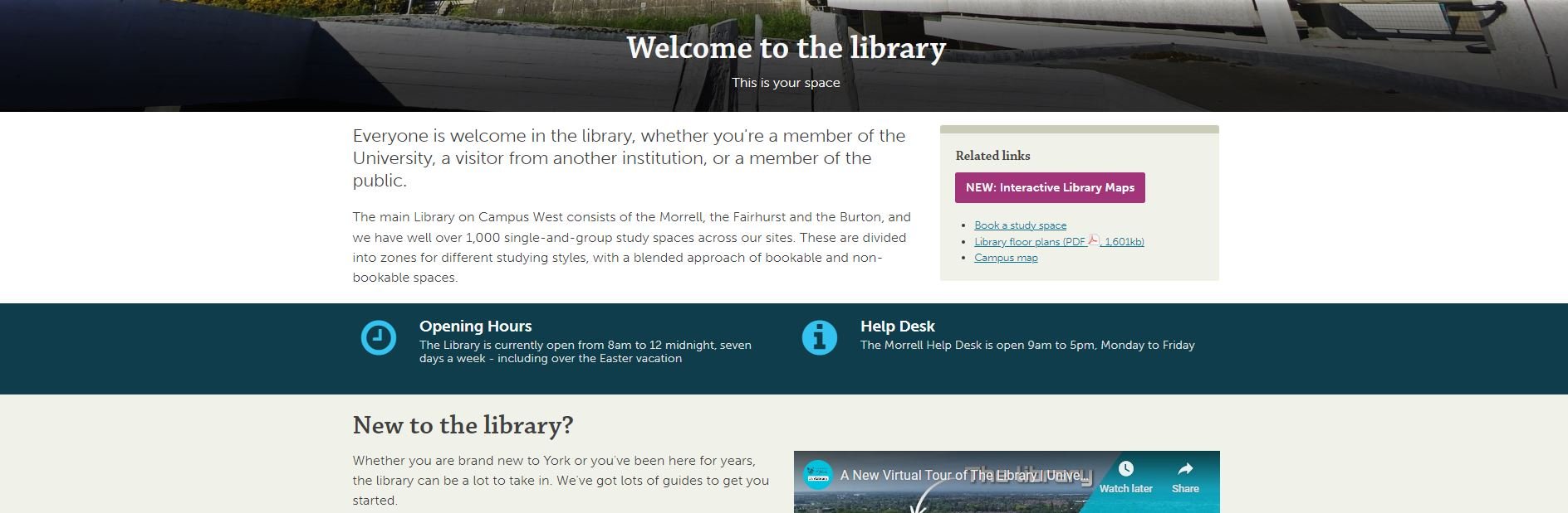
In the prototype version of the site the homepage started with a section called ‘Plan your visit’, with opening times and other details. One student told us ‘It feels like I’m a visitor not a member, or like an Open Day rather than something for current researchers and students. You’re selling the library, rather than making it usable [for the people already here].’ I loved this. Because I was finding the line between ‘information dump’ and ‘promoting the library’ a really hard one to judge, and she told me where I wasn’t getting it right.

In the University context specifically, a lot of the website is external facing rather than inward facing. It’s aimed at potential users rather than existing ones. This means that the way the website is set up and designed to be used, and the language we’re encouraged to employ, is often better suited to external comms too - and we have to be aware of this and resist it, to ensure we’re speaking to OUR audience as they wish to be spoken to. Of course, the audience I’m aiming this website at is external too - but it is primarily internal. So: no more ‘plan your visit’ (but the opening times are still really easy to find!).

anticipate needs, and make it clear you’ve done so.

On the subject of opening times, the banner at the time we did the UX work said ‘the library is open 8am to midnight’. A problem with the previous site is it mentioned opening hours on multiple occasions all over the place, and rarely would we get them all up to date at once when the times changed. In the new version, there’s one banner and it’s mirrored onto the Visit & Study page - so we only edit in one place for the whole site. Much better.

The UX took place just before Easter, and I was planning to change the banner during Easter itself to say ‘the library is open as usual over Easter’ but students wanted this info to be present already. They said we can see the opening times now but what about the bank holiday? So now, our opening times banner tries to anticipate and answer follow-up questions - so for example right now it says ‘The Library is currently open 24/7 until midnight 3 June.’

No one knows what ‘Collections’ means.

We have changed our Collections pages to Featured Collections pages because people didn’t know the difference between the significant books or groups of books that we wanted to make a song and dance about, and just All Our Stuff. We used the word ‘collections’ to mean quite a few different but closely related things, and it confused everyone. So now we’ve tried to remedy this and use the word with intention, or not at all.

Students want bridges.

A perennial problem for all library marketing is we’re too close to what we’re promoting, so we assume other people get why it’s important. We list features not benefits. Our student intern who worked with us on this project said they wanted bridges so that our resources were more explicitly connected with their academic work. “For example the large collection of exam papers - it would be a big help to students if there were some guides on how to make the most of these, how to use and learn from them. Don’t assume that that departments are providing this information or help.” So now we’ve got guidance on how to use exam papers, rather than just a list of them - and we’re trying to incorporate more bridges going forward, so our site is not just ‘here’s what we have’ but ‘here’s what we have and how you can use it’.

Don’t link to the catalogue, embed it.

A simple one, this. We had a mixture of links to the catalogue and embedded search boxes. The students assumed there must be a good reason for this, and that one method would offer one function while the other method would offer something else - so we asked them which we should keep to make things simple, and the embed was the preferred option (see the Where to start in the library’ section of this page for an example).

Part 3 will be about the way we organised the project. As always, any comments and questions are welcome below!

5 UX insights for library web-design

For the last few months I’ve been leading a project to completely redo my library’s website from scratch. It has been full-on, and rewarding, and most importantly the new site is live as of midday today.

I’ll post about the project process later, but for now I want to focus on what the UX fieldwork with our users told us, as these insights will hopefully be useful for anyone redesigning their org’s website.

I’d love you to go to york.ac.uk/library (opens in a new window) and take a look, then come back here and tell me what you think!

This post focuses on the organisation of the site; part 2 will be on the content.

Use colour with intention

As you can imagine, we’re working within the limits of the University CMS (Content Management System) and don’t have a lot of control over colours - most of the content types are white, but several can be set to cream, teal or dark blue. I must admit when I first started designing the pages, I just used colour to mix things up a bit and add some visual interest - a strip of colour here, a nice accent there. But the users told us in the UX sessions that they wanted the colours to mean something - they expected consistency across the pages (for example opening times always one colour, as shown below; quotes from students always another colour) and in particular they wanted the darker colours to signify something especially significant - a call to action, or really essential information.

The teal strip showing opening hours. The fact the Help Desk opening hours are on there too, and the fact that the Easter vacation is explicitly mentioned even though the hours aren’t changed, are both as a direct result of student suggestions during the UX.

Topic based organisation beats audience based navigation

A perennial debate for designing anything for users, websites included, is: do we organise things by theme, or by who is accessing information? Do we say ‘PGs go here, UGs go here’ or do we talk about space on one page, resources on another?

In a literature review carried out at the start of the project, my colleague Alice Bennett wrote, on the topic of a particular study finding topic-based organisation to be significantly preferable: “This is potentially a more inclusive approach, as it better allows for intersectional user identities and better accommodates search behaviour, with users typically searching for specific information, rather than looking to find themselves in the menu.”

This was really borne out by the UX. I asked one distance-learner where all the distance-learning information should sit in the new structure. They said “I wouldn't separate it. Because you don't like to treat yourself as a second class [citizen] and just look for, okay, where is the info for the distant learner people?” And to Alice’s point about intersectionality, we also had an International Students guide - many of our distance learners are also international students, so where do they look? And of course the contents were extremely similar. In the end we have a nice ‘basic introduction to the library essentials’ page which is for everyone: universal design wins again.

Your users will tell you which compromises are worth making

Compromise is inevitable in this sort of process - library websites have too much complex information and too many responsibilities to our users to just make a super slick, neat website. The top-level navigation is one of the biggest changes between the old site and the new - the old site had about 15 overlapping ways in to the info down the left of the screen; the new one has just six top-level landing pages.

The top-level navigation of the new site

We thought loooong and hard about how to group the information - we spent weeks planning this before we even had access to the CMS. But still we changed it during the UX process, because our users told us the compromise we’d made wasn’t the right one.

Our info for Researchers was split across the Skills & Training page you see listed above, and a Facilities page. The Facilities page has loads of useful info, but no flow and no cohesion - and more importantly when we spoke to Researchers in the fieldwork we set them tasks to find Open Access info, and they couldn’t do it. The split of info which had internal logic for us simply didn’t make sense for the user, and they couldn’t get to what they needed.

So we now have Research and Digital Creativity. This too is a compromise because that pairing isn’t as natural as the others (skills & training, for example) but those are two important aspects of the library offer that are really easy to find, so it’s a better way to go.

KnowING it’s important to invert the pyramid isn’t enough!

We all know about inverting the pyramid, right? I talk about it all the time. But knowing how important it is and ruthlessly acting on it turned out to be two different things… Even when I actively tried to do it with the website, I wasn’t doing it enough. One participant in the UX literally said ‘this page is upside down’… It’s so tempting to try and set the scene and lead people through the information, but they just want the important stuff at the top and that’s what we should be doing.

So: invert the pyramid, and invert it hard. (And then come back later and check it’s still fully inverted.)

Pictures have more than cosmetic valuE

“I’m never going to read that.” This a common refrain from students when faced with dense, lengthy text. We tried to simplify and reduce where possible, but sometimes in libraries there just IS detail - so breaking that up with images really helps. It’s not just that the images can help illustrate what you’re talking about, it’s that they make the user more likely to read even long passages of text because it’s broken up into chunks. It makes it manageable.

We also made sure to use the same image for thumbnail links to pages, as you find at the top of the pages themselves when you click the links. This reassures the user that they’ve clicked the right thing, and creates a sense of familiarity which helps make the info less intimidating.


A part 2 post detailing what the users told us about the Content of the site will be coming soon!