Information Professional

Ask yourselves, libraries: are surveys a bit bobbins?

We all agree we need data on the needs and wants of our users.

We all agree that asking our users what they want and need has traditionally been a good way of finding that out.

But do we all agree surveys really work? Are they really getting the job done - providing us with the info we need to make changes to our services?

Personally I wouldn't do away with surveys entirely, but I would like to see their level of importance downgraded and the way they're often administered changed. Because I know what it's like to fill in a survey, especially the larger ones. Sometimes you just tick boxes without really thinking too much about it. Sometimes you tell people what they want to hear.  Sometimes you can't get all the way through it. Sometimes by the end you're just clicking answers so you can leave the survey.

I made this. CC-BY.

I made this. CC-BY.

How can we de-bobbins* our surveys? Let me know below. Here are some ideas for starters:

  1. Have a very clear goal of what the survey is helping to achieve before it is launched. What's the objective here? ('It's the time of year we do the survey' does not count as an objective)
     
  2. Spend as much time interpretting and analysing and ACTING ON the results as we do formatting, preparing and promoting the survey (ideally, more time)
     
  3. Acknowledge that surveys don't tell the whole story, and then do something about it. Use surveys for the big picture, and use UX techniques to zoom in on the details. It doesn't have to be pointless data. We can collect meaningful, insightful data.
     
  4. Run them less frequently. LibQual every 2 years max, anyone?
     
  5. Only ever ask questions that give answers you can act on
     
  6. Run smaller surveys more frequently rather than large surveys annually: 3 questions a month, with FOCUS on one theme per month, that allows you to tweak the user experience based on what you learn
     
  7. Speak the language of the user. Avoid confusion by referring to our stuff in the terms our users refer to our stuff
     
  8. [**MANAGEMENT-SPEAK KLAXON**] Complete the feedback loop. When you make changes based on what you learn, tell people you've done it. People need to know their investment of time in the survey is worth it.

Any more?


*International readers! Bobbins is a UK term for 'not very good'.

The problem with peer review (by @LibGoddess)


I am ridiculously excited to introduce a new guest post.

I've been wrestling for a while with the validity or otherwise of the peer review process, and where that leaves us as librarians teaching information literacy. I can't say 'if you use databases you'll find good quality information' because that isn't neccessarily true - but nor is it true to say that what one finds on Google is always just as good as what one finds in a journal.

There was only one person I thought of turning to in order to make sense of this: Emma Coonan. She writes brilliantly about teaching and information on her blog and elsewhere - have a look at her fantastic post on post-Brexit infolit, here.


The Problem With Peer Review | Emma Coonan

Well, peer review is broken. Again. Or, if you prefer, still.

The problems are well known and often repeated: self-serving reviewers demanding citations to their own work, however irrelevant, or dismissing competing research outright; bad data not being picked up; completely fake articles sailing through review. A recent discussion on the ALA Infolit mailing list centred on a peer-reviewed article in a reputable journal (indexed, indeed, in an expensive academic database) whose references consisted solely of Wikipedia entries. This wonderfully wry PNIS article - one of the most approachable and most entertaining overviews of the issues with scholarly publishing - claims that peer reviewers are “terrible at spotting weaknesses and errors in papers”.

As for how peer review makes authors feel, well, there’s a Tumblr for that. This cartoon by Jason McDermott sums it up:

Click the pic to open the original on jasonya.com in a new window

Click the pic to open the original on jasonya.com in a new window

- and that’s from a self-proclaimed fan of peer review.

For teaching librarians, the problems with peer review have a particularly troubling dimension because we spend so much of our time telling students of the vital need to evaluate information for quality, reliability, validity and authority. We stress the importance of using scholarly sources over open web ones. What’s more our discovery services even have a little tickbox that limits searches to peer reviewed articles, because they’re the ones you can rely on. Right? …

So what do we do if peer review fails to act as the guarantee of scholarly quality that we expect and need it to be? Where does it leave us if “peer review is a joke”?

The purpose of peer review

From my point of view as a journal editor, peer review is far from being a joke. On the contrary, it has a number of very useful functions:

·        It lets me see how the article will be received by the community

The reviewers act as trial readers who have certain expectations about the kind of material they’re going to find in any given journal. This means I can get an idea of how relevant the work is to the journal’s audience, and whether this particular journal is the best place for it to appear and be appreciated.

·        It tests the flow of the argument

Because peer reviewers read actively and critically, they are alert to any breaks in the logical construction of the work. They’ll spot any discontinuities in the argument, any assumptions left unquestioned, and any disconnection between the method, the results and the conclusions, and will suggest ways to fix them.

·        It suggests new literature or different viewpoints that add to the research context

One of the hardest aspects of academic writing is reconciling variant views on a topic, but a partial – in any sense – approach does no service to research. Every argument will have its counter-position, just as every research method has its limitations. Ignoring these doesn’t make them go away; it just makes for an unbalanced article. Reviewers can bring a complementary perspective on the literature that will make for a more considered background to the research.

·        It helps refine and clarify a writing style which is governed by rigid conventions and in which complex ideas are discussed

If you’ve ever written an essay, you’ll know that the scholarly register can work a terrible transformation on our ability to articulate things clearly. The desire to sound objective, knowledgeable, or just plain ‘academic’ can completely obscure what we’re trying to say. When this happens (and it does to us all) the best service anyone can do is to ask (gently) “What the heck does this mean?”

In my journal’s guidelines for authors and reviewers we put all this a bit more succinctly:

The role of the peer reviewer is twofold: Firstly, to advise the editor as to whether the paper is suitable for publication and, if so, what stage of development it has reached. [ ….] Secondly, the peer reviewer will act as a constructively critical friend to the author, providing detailed and practical feedback on all the aspects of the article.

But you’ll notice that these functions aren’t to do with the research as such, but with the presentation of the research. Scholarly communication always, necessarily, happens after the fact. It’s worth remembering that the reviewers weren’t there when the research was designed, or when the participants were selected, or when the audio recorder didn’t work properly, or the coding frame got covered in coffee stains. The reviewers aren’t responsible for the design of the research, or its outputs: all they can do is help authors make the best possible communication of the work after the research process itself is concluded.

Objective incredulity

Despite this undeniable fact, many of the “it’s a joke” articles seem to suggest that reviewers should take personal responsibility for the bad datasets, the faulty research design, or the inflated results. However, you can’t necessarily locate and expose those problems on reading alone. The only way to truly test the quality and validity of a research study is to replicate it.

Replication - the principle of reproducibility - is the whole point of the scientific method, which is basically a highly refined and very polite form of disbelief. Scholarly thinking never accepts assertions at face value, but always tests the evidence and asks uncomfortable, probing questions: is that really the case? Is it always the case? Supposing we changed the population, the dosage, one of the experimental conditions: what would the findings, and the implications we draw from them, look like then?

And here’s the nub of the whole problem: it’s not the peer reviewer’s job to replicate the research and tell us whether it’s valid or not. It’s our job - the job of the academic community as a whole, the researcher, the reader. In fact, you and me. Peer reviewers can’t certify an article as ‘true’ so that we know it meets all those criteria of authority, validity, reliability and the rest of them. All a reviewer can do is warrant that the report of a study has been composed in the appropriate register and carries the signifiers of academic authority, and that the study itself - seen only through this linguistic lens - appears to have been designed and executed in accordance with the methodological and analytical standards of the discipline. Publication in a peer-reviewed journal isn’t a simple binary qualifier that will tell you whether an article is good or bad, true or false; it’s only one of many nuanced and contextual evaluative factors we must weigh up for ourselves.

So when we talk to our students about sources and databases, we should also talk about peer review; and when we talk about peer review, we need to talk about where the authority for deciding whether something is true really rests.
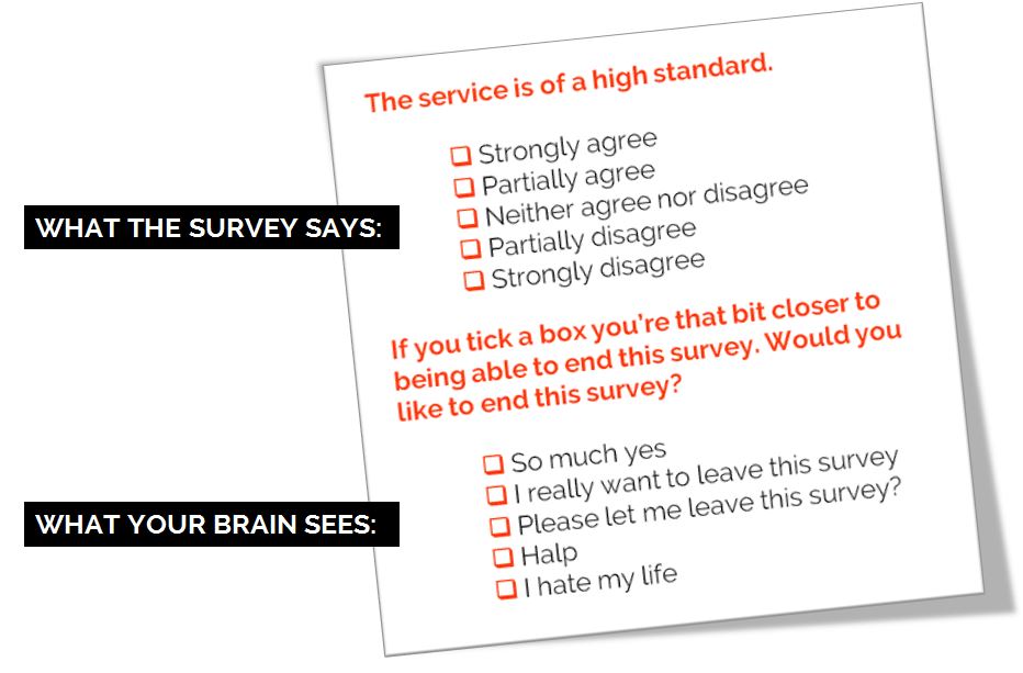
Tickboxing truth

This brings us to one of the biggest challenges about learning in higher education: the need to rethink how we conceive of truth.

We generally start out by imagining that the goal of research is to discover the truth or find the answer - as though ‘Truth’ is a simple, singular entity that’s lying concealed out there, waiting to be for us to unearth it. And many of us experience frustration and dismay at university as a direct result of this way of thinking. We learn, slowly, that the goal of a research study is not to ‘find out the truth’, nor even to find out ‘a’ truth. It’s to test the validity of a hypothesis under certain conditions. Research will never let us say “This is what we know”, but only “This is what we believe - for now”.

Research doesn’t solve problems and say we can close the book on them. Rather it frames problems in new ways, which give rise to further questions, debate, discussion and further research. Occasionally these new ways of framing problems can painfully disrupt our entire understanding of the world. Yet once we understand that knowledge is a fluid construct created by communities, not a buried secret waiting for us to discover, then we also come to understand that there can be no last word in research: it is, rather, an ongoing conversation.

The real problem with peer review is that we’ve elevated it to a status it can’t legitimately occupy. We’ve tried to turn it into a truth guarantee, a kind of kitemark of veracity, but in doing so we’ve shut our eyes to the reality that truth in research is a shifting and slippery beast.

Ultimately, we don’t get to outsource evaluation: it’s up to each one of us to make the judgement on how far a study is valid, authoritative, and relevant. As teaching librarians, it’s our job to help our learners develop a critical mindset - that same objective incredulity that underlies scientific method, that challenges assertions and questions authority. And that being so, it’s imperative that we not only foster certain attitudes to information in our students, but model them ourselves in our own behaviour. In particular, our own approach to information should never be a blind acceptance of any rubber-stamp, any external warrant, any authority - no matter how eminent.

This means that the little tickbox that says ‘peer reviewed’ may be the greatest disservice we do to the thoughtful scepticism we seek to help develop in our students, and in our society at large. Encouraging people to think that the job of assessing quality happens somewhere else, by someone else, leads to a populace which is alternatively complacent and outraged, and in both states unwilling to undertake the critical engagement with information that leads us to be able to speak truth to power.

The only joke is to think that peer review can stand in for that.

UXLibs II: This Time It's Political

At 9am on Day 2 of the UXLibs II conference, 154 information professionals sat in a large room feeling collectively desolate. I don’t want to be glib or melodramatic but the feeling of communal sadness at what had happened in the EU Referendum overnight felt to me akin to grief, like someone close to the conference had actually died the night before.

Was there anyone present who voted Leave? Possibly. But it seemed everyone was devastated. There were tears. UXLibs is, as Library Conferences go, relatively diverse (although it's still something we need to work on), not least because well over a third of the delegates - 60 this time around - are from outside England. Our North American and Singaporean friends felt our pain, our European friends were sad our country had chosen to leave them, and for the Brits it was already clear what an omnishambles the vote had caused.

The committee had met for an early breakfast to process how we should proceed. We agreed on two things: first that however we all felt, organisers and delegates had to deliver the best possible conference experience in the circumstances; and second that this was not time for neutrality. (In fact I was talking to Lawrie Phipps from JISC a little later that morning and we agreed that perhaps if so many libraries and educational institutions generally weren’t so neutral by habit, people might have a better idea of when they were being systematically lied to by politicians.) Conference Chair Andy Priestner was due to open the conference: say what you want to say, don’t hold back, we agreed. There had been a lot of jokes the day before - humour is an important part of the UXLibs conference as it leads to informality, which in turn most often leads to better and deeper communication, proper relationships – but there would be no attempt at making light of this. Don’t gloss over it. Don’t be glib. Don’t be neutral. But do be political.

So he was. You can read Andy’s reflections on his opening address here, and this is what he said:

Today is not a good day.

I’ve worried for several months about this moment in case unthinkably it might go the way it has gone. I am devastated. Everyone I speak to is devastated. This is a victory for fear, hate and stupidity.

But as Donna said yesterday when describing her experiences in Northern Ireland – ethnographers have to get on with it. WE have to get on with it. Perhaps it’s a good thing that we will all have less time to dwell on what has just happened. Perhaps it’s good that we’ll be busy.

What I do know for a fact is that we have to be kind to each other today however we might feel. Let there be hugs. Let there be understanding.

For me one of the most precious things about UXLibs is the networking and sharing we enjoy from beyond the UK. The collaboration across countries, the realisation that despite the different languages, cultures and traditions that we are all the same and can learn so much from each other.

But it’s too soon to be cheerful. It’s too soon for silver linings.

Today is not a good day.’

I was proud of him.

And then Day 2 happened, and I was proud of EVERYONE. What an amazing group of people. Shelley Gullikson put it like this:

“Last year I said that UXLibs was the best conference I’d ever been to. UXLibs II feels like it might be the best community I’ve ever belonged to.”

Everyone found a way to help each other, support each other, make each other laugh, and work together – after Lawrie’s keynote the first thing on the agenda was the Team Challenge so no one could spend any time sitting in dejected silence, there was too much to do… Collectively everyone not just got through the day but made it brilliant. It wasn’t a good day overall – a good conference doesn’t transcend political and socio-economic catastrophe. But it was the best day it could possibly be.


I attended the first UXLibs conference in 2015 and I was blown away by it. It felt like the organising committee had started from scratch, as if there were no legacy of how a conference should be, and designed it from the ground up. They kept some elements, the ones that work most, and replaced others with new and more engaging things, especially the Team Challenge. It was the best conference I’ve ever attended.

The follow up, UXLibs II, had something of an advocacy theme – as I put it in the conference, if UXLibs I was ‘how do we do UX?’ then UXLibs II was ‘how do we actually make it happen?’. As communication and marketing is something I do a lot of work around and, as Andy so kindly put it, he wanted to see if we’d actually get on and not hate each other if we worked together, I was invited to join he and Matt Borg as the main organising committee (although we had a huge amount of input from several other people in planning the event). This was in September last year; Andy and Matt had already been planning for a while and by October we had our first provisional programme in place.

Andy and Matt...

Andy and Matt...

Matt and me...

Matt and me...

I find organising events approximately three trillion times more stressful than speaking at them, and hadn’t got fully involved in putting on a conference since 2011 when I swore ‘never again’. But I couldn’t resist the chance to work with Andy and Matt because we are pretty much on the same page about a lot of things, but disagree on a lot of the details, which makes for an interesting and productive working arrangement. So, around 400 emails later, a couple of face-to-face meetings later, many online meetings using Google Hangouts later, we were in thestudio, Manchester for the event itself. At the end of the two days, despite the dark cloud of Brexit hanging over us, everyone seemed exhausted but fulfilled. We’d built the event around the community and what that community said it needed, and I think it worked. It’s a great community and I felt excited to be part of it – challenged, stimulated, and I’d echo the delegate who came up to me at the end and said she’d never laughed so much at a conference: it was FUN.

Several things made this conference different, for me, apart from just the content. There's the fact that all the delegates have to be active participants (they were 'doing doing' as I put it, somewhat to my own surprise and certainly to my own mortification, when introducing the team challenge), there's the mixture of keynotes, workshops, delegate talks and team challenge, there's the informality and fun but with the Code of Conduct to ensure people can work together appropriately, there's the fact we individually emailed 100 delegates from UXLibs I to find out what their challenges were so we could help shape the conference, there's the fact that 150 people got to choose which workshops and papers they attended, there's the blind reviewing process for accepting papers, there's the scoring system for the best paper prize that was far more complicated than 'highest number of votes' because different papers were seen by different sizes of audience... There's the fact there's less fracture and division than in most conferences: I truly feel we're moving forward together as a UX in Libraries community. There's the fact that the venue was not only excellent but had a trainset running around near its ceiling that you could stop and start by tweeting at it!

Turns out it's quite easy to avoid All Male Panel. What you do, conference organisers, is you don't put all males on the panel. (Pic by @GeekEmilia)

Turns out it's quite easy to avoid All Male Panel. What you do, conference organisers, is you don't put all males on the panel. (Pic by @GeekEmilia)

There's the fact that Matt made completely bespoke badges with individual timetables for all 154 attendees! I can't tell you what mine said (let's say Matt was experiencing some remorse at saying he'd do the badges by the time he got to 'P') but so many people commented on the good-luck messages he put in to all presenters for their slots...

So it was pretty great, overall, despite everything. Thank you everyone invovled.

UXLibs III planning has already begun.

Life, Librarianship and Everything at #NLPNOpen

I gave at talk at the #NLPNOPEN event on Saturday, organised by the wonderful Manchester New Library Professionals Network. I actually invited myself to talk at this event, something I've not done before, because I think NLPN are ace, and because my favourite events have always been New Professionals events, and I miss the enthusiasm and hope, and what to learn from the new ideas. They were kind enough to let me talk at them for an hour at the start, basically about things that I've found to be important and that I'd wish I'd known earlier, about life, librarianship and everything (although mainly, it has to be said, librarianship).

Here are the slides.

Really the key messages are firstly that the tools exist now for you to make things happen if you want to - start a network, start a JOURNAL even, write blog, join a wider dialogue, whatever it may be - and that if you take one action it can lead to all sorts of other actions, that are rewarding in themselves and can benefit your career.

BUT, that said, the second message is no one cares if you're a rockstar, and interview panels don't actually ask about the stuff you do outside your job very often. It may be that you talk about it - it may be that when they say how would you cope with marshalling an annual resources budget, you can reply 'I'm the treasurer for this committee so I have experience' - but no one seems to say 'tell us about what groups you've joined / what conferences you've presented at / what articles you've written'. Not normally. In HE particularly we literally have to ask the same questions to every candidate so there's no room for those kinds of digressions. So this slide is, I think, important to reassure people who feel like they should be Doing All The Things but cannot Do All The Things because life gets in the way:

Everyone present did a brilliant job of tweeting the talk and indeed the whole day, which you can see in the Storify NLPN have pulled together - it's embedded below this next bit.

I saw some really good talks at this event, and I really enjoyed the open nature of the discussion - sometimes at traditional library conferences everything feels quite narrow because so many conversations have been had before, or are on sort of perpetual loop. The standard was very high too, in terms of presentation skills and the slides themselves - hardly any bullet points, lots of images, lots of creativity, lots of good communication.

Suzanne Coleman gave a great mini paper about Instagram, which is absolutely the most important platform for academic libraries using social media at the moment. Laura Green and Louise Beddow (who joined Twitter off the back of my talk - please go and make her feel welcome!) then talked about what they did for National Libraries Day at MMU - generally the academic sector engages with NLD in a fairly minimal way but they went all in and it really seemed to work. They had huge success with their comment board, allowing students to write things which other students (and staff) could reply to on the wall - this is an ethnographic technique which seems to work well so much of the time. We have walls at my own institution which you can write on, but they're specifically designed for students to just workshop ideas or get things out of their brains, rather than for feedback. But we're doing the feedback wall thing properly soon and I'm interested to see how it goes.

Carly Rowley talked about music librarianship, which was interesting to me as I've been a Music Liaison Librarian here. The discussion was a lot more Content / Collections based than my experiences - I tended to focus on the services we could offer rather than the stuff we had, but that probably just reflects my biases and interests. It was interesting that a few people in the room could play instruments or read music but didn't consider themselves musicians! I think if you can play or sing, you're a musician. Surely? I love being a musician and in how I define myself it's a lot more important to me than being a librarian is, although outwardly it takes up far less of my life. On that note, there's actually a secret (as in, unlisted in the navigation) part of this website that acts as an outlet - along with my Instagram - for drum-related things. You can find it here, friends of drums and drumming...

The final two presentations were Open Access themed. They complimented each other well actually - Jen Bayjoo representing the librarian and Penny Andrews representing the Researcher. The common theme was really around what it is actually like to be an academic, which is to say a human being with pressures and insecurities and lives to lead, and interact with library systems. A healthy dose of realism ran through Penny's talk - it's so important to be realistic about which parts of what we do work, which parts really matter, which parts may or may not endure... Jen had a nice practical element too, discussing real life problems and issues of working in an OA advocacy / support role. Her slides are online here.

It's also important that we as info pros are Open Access all the way - don't submit your article to a non-open-access journal, folks! I wrote most of my 'proper' publications before I really understood Open Access, but I've retrospectively got as many permissions as possible to make things OA. See my Publications page for the links, including a thing for Bethan Ruddock's New Professionals Tookit book - although my take on a lot of that stuff has evolved since I wrote that, so if NLPNOpen-me disagrees with Bethan's-book-me, go with NLPNOpen-me...

Organising events is hugely stressful - it's THE WORST, worse than dating a Tory, even - so massive thanks so NLPNOpen for doing this, for free, on their weekend (and of course many more days in the run-up to the event, working everything out). I got a lot out of the day. I learned stuff and I felt good afterwards. It was ace.


Here is @ManchesterNLPN's excellent Storify of the day - check out the tweets to get more of a feel for all of the presentations. Thank you SO MUCH to NLPN for having me. Loved it.

So you want to make in infographic? 4 useful options


We're putting together a guide to various infographic software for our students, so I've had cause to play around with a few. I find a lot of tools recomended on the web just don't quite work for educational stuff (or, indeed, library stuff); they're just too much style and not enough substance.

Also, all the articles about infographic tools are entitled things like '61 GREAT INFOGRAPHIC PACKAGES!' which always baffles me somewhat. Maybe it's the information professional in me, but I think if you're going to write something recommending a set of tools, you should at least narrow the number down to a recommended few...

So what are the most effective tools for creating meaningful infographics?

1) Great for stats and figures: Piktochart

I really like Piktochart. It's the tool we use most often at work. My colleagues have used the templates to create infographics, for example this one has been used to explain library processes to users in a way that is engaging and easy to understand:

An example of a Piktochart template

An example of a Piktochart template

It's simple to take something like the template above and change the images (there's a huge built in library of icons, or you can use your own) and the colours etc to suit whatever you wish to express. Piktochart also has seperate templates for Reports, which are nice.

For me, though, the way it integrates very easily with your own data from Excel or Google Sheets, which you can import from a .CSV file, is the best thing about this tool. So it takes what you already have and makes it visually appealing, which helps prevent the all-style-no-substance issue that afflicts a lot of infographics.

You can import your own data

You can import your own data

Although Piktochart does infographics, reports, and some really nice data visualisation with maps, I've mostly used it to create individual charts which I've then exported for use in other things, like Action Plan documents, or presentations. In the example below, all the graphs etc and visualisations are from Piktochart, and I'm by no means an expert user so this is just scratching the surface of what it can do.

Piktochart is free, but also has reasonably priced educational packages, one of which we have at York, that allow you a few more options and some more features. 

2) Good for flexibility: Canva

Canva does a lot more besides infographics. It's really good for creating images perfectly sized for social media, and they put genuinely useful tips on their design school blog.

At York we've used Canva for creating one page guides to things like Google Scholar, or JSTOR, in order to embed them in the VLE, blogs, etc. Canva is simple to use and there are a lot of nice built in fonts and images which can make otherwise not-overly-exciting subjects a bit more engaging for users.

You can use Canva for free, which is what we do. It tries to tempt you in with paid for images and templates, but you can also import your own images so there's no requirement to pay for theirs if you don't want to.

Here's the interface and an example of a free to use template you can build on:

The Canva interface

The Canva interface

I'd recommend playing around with Canva if you've not used it, because it has so many potential applications. The trick, really, is being able to sort through the paid stuff to find the free stuff, and being able to sort through the superficial 'this is probably great if you're the web designer for an artisan baker in Portland' templates to find the 'I can actually see this working in my world' examples...

3) Good for interactivity: Infogram

Infogram is particularly good for creating graphics you want to embed online, because they can be responsive and interactive depending on what you do with them. It's basically about hovering over different bits of the graphics, but it does allow you to focus on certain parts of the data more easily than a static chart allows. See the example below:

Other pluses with Infogram include its ability to import data from a really impressive variety of sources. Downsides include the free version being fairly stripped back of features, and even the cheaper paid for version being out of financial reach for most non-profits.

4) Good for surprising you with its potential for making infographics: PowerPoint!

The much maligned PowerPoint is actually a very good tool which is often deployed spectacularly badly by its users. It's more flexible people than people realise (especially the two most recent iterations, 2013 + 2016), and that makes it surprisingly good for infographics. The main reason it's good is because you can take something - a chart or graph from excel, words written in interesting fonts, icons, images - and put it on a slide, and it just stays where you put it. Then you can layer more and more stuff on, and easily move it around - unlike Word which is a nightmare for that sort of thing, and a bit like Photoshop, but without the need for a 2 year learning curve...

The keys to making an infographic are firstly to edit your slide to the right dimensions: go into the Design tab, choose Page setup and then choose, for example, A3, Portrait. Your single slide is your infographic. Secondly, use images from somewhere like freeimages.com, or icons from iconfinder.com, to make your content interesting (along side graphs and charts you can copy and paste in from Excel). Thirdly, use a non-standard font - download one from fontsquirrel.com - as typography makes a huge difference.

Bonus option: Visual.ly for Google Analytics Infographics

If you have a website which uses Google Analytics to track statistics, but don't want to be logging in to check your stats all the time, visual.ly provide a useful free service. You log in with your Google ID, give them your analytics code, and they send you a weekly infographic which tells you how you've done in all the key areas. When you have a good week it's a nice friendly blue, if you have a not-so-good week it's red for danger...

Sign up for yours at visual.ly, here. Everything else visual.ly does is a paid for service, but the Analytics infographics are free.


Do you have any recommendations I should add to this list? Leave me a comment below.