Training

Upcoming Power Hours on UX and Marketing

Two of my favourite people in Libraryland, Phil Bradley and Val Skelton, are running Power Hours on a Friday lunchtime. The idea is a packed hour of useful CPD, with space for discussion afterwards, for £35 a session. I’ve done one of these already and it was great, with loads Chat back-and-forth; they have sessions coming up on Canva, AI and more - plus three in the diary between now and the new year, hosted by me!

I hope to see you at one or more of them. Here’s what we’ve got coming up.

Introduction to UX in Libraries: November 17th

Libraries using UX are discovering rich and often fascinating data on their patrons, which is proving a nuanced feedback method to complement traditional surveys and focus groups. We'll explore what ethnography really is and why you might want to use it, then look at specific examples of techniques to try out. We'll also look at examples of changes libraries have made to their services based on UX projects.

More details of the UX In Libraries session on Eventbrite


Jargon free introduction to Library Marketing

This session will focus on how to approach marketing libraries in all sectors. How do we frame messages so they have the most impact? What actually matters to our audiences? How do we keep things simple without dumbing down?

This works as a stand-alone session, but can also work as an introduction to the Strategic Marketing session below.

More details on the Intro To Library Marketing on Eventbrite.


Strategic Marketing in Library Campaigns

Library marketing becomes hugely effective when it is coordinated and joined up. In this Power Hour we'll explore marketing strategically and in campaigns. We'll work on segmenting audiences and tailoring messages for each group, before tying everything together in a strategic marketing plan.

This session works as a stand-alone session, but also picks up where the Intro To Marketing, above, leaves off, if people want to take them as a pair.

More info on the Strategic Marketing Power Hour on Eventbrite.

So you want to be a library freelancer?

10 years ago today I did my first ever freelance work. It was for the Latvian Ministry of Culture (of all people!) and within 12 months I’d run workshops for the Bodleian, then UKeIG, then the British Library, all of whom I still run workshops for a decade later, and I was off. I went down to 90% in my day-job and started doing a day of freelancing a fortnight, and I’ve now done over 270 workshops in 16 countries for 78 different organisations.

I absolutely love it. A decade of doing it is as good an excuse as any to write about it so for anyone who’s interested here’s what I’ve learned along the way.

The freelance work benefits the day-job, and having a day job benefits the freelance work

I am constantly bringing to my day job things I’ve learned doing freelance work. The analytics apps my library uses for social media, the PowerPoint techniques used to create our Induction slide decks, the campaign structure we use for our marketing - all of these were researched / developed for training and then adapted for my work place. There’s no better way to keep on top of new developments in your field than to have to know enough about them to be able to train others! So for example, when it comes time to make a video for the library there’s several apps or programmes I know how to use - because in order to include something in a workshop I always have to have used properly it myself.

It works both ways though; the day job feeds into the workshops. It grounds me in the reality of working in libraries with all the constraints that involves. Feedback I get a lot after workshops is ‘it’s so nice to have someone talk about marketing who actually works in our industry so knows what we can and can’t do’. Working in a library 4.5 days a week is extremely useful for the training that happens in the other half day.

The creation-to-delivery ratio is bonkers and not in a good way

I have a selection of workshop outlines which I adapt for each session. There’s three broad categories - strategic marketing, social media, and presentation skills - with variations. Each of those took hours and hours and HOURS to create, and then I usually spend an hour or two tweaking content and making improvements for each workshop.

Sometimes people will ask me to run training on a topic I’ve not done before, and I almost always say no - because to make 3 hours’ of content for a half-day workshop takes at least 12 hours. Planning structure, outcomes, creating slides, planning tasks and activities, writing the booklet - there’s at least a 4:1 ratio of creation to delivery. So if you take on a workshop or training gig, make sure you book in a LOT of prep time if it’s something you’ve not done a version of before.

That said, I always tweak the sessions. I’ve almost never delivered the same set of slides twice - there are always new ideas or improvements to incorporate. Sometimes I get people coming - deliberately! - to versions of sessions they’ve attended with me before, and in those cases I’m always relieved that there’ll be new content for them…

It’s lovely to build relationships over many years. One of the things I’m most proud of is that 39 of the organisations I’ve worked with have invited me back!

The orgs I've delivered most sessions for

My relationships with the Bodleian, LIEM, the British Library, NEFLIN, PiCS and UKeIG go back years and years now, I really value that. And speaking of relationships…

The best thing about librarianship is librarians

Libraries are great, but the people who work in them are better… The community is certainly not without its issues, but in general I find it to be supportive and great at sharing. Especially in the age of zoom workshops, one of the things I love is how much knowledge the participants share with each other - everyone, including me, learns from everyone else.

One of the very best things about freelance work has been the opportunity to travel. Four of the countries below I have only worked in virtually, but the rest I’ve been fortunate enough to visit for work, and librarians are fantastic the world over.

Workshops by audience location (excluding England)

(Includes online)

Flexibility and interaction are everything

Interaction is what makes workshops feel alive and exciting. An audience full of questions and comments is just the greatest thing, and as a trainer I thrive off the energy that comes with it - and it’s lovely to know the workshop is really covering everyone’s specific needs because we’re discussing them. Sometimes groups really have to be convinced that you want interactivity, so re-emphasise it a few times both out loud and on the screen with specific prompts. I’ve done 144 in-person sessions and 128 online - the Chat is absolutely brilliant in online sessions, and I really enjoy getting to hear even more from delegates - tips, advice, examples, questions - than I do face-to-face.

Flexibility is absolutely essential for long training sessions. A session running from 10am - 4:30pm has so much potential to be elastic in terms of timings, so it’s worth being ready to change things on the fly. I usually put in more slides than I think I’ll need, then go into the slide-deck and hide material as I go along depending on how much discussion there is and what people want to focus on - then share the fuller version of the slides with delegates afterwards so they can still see the extra content if they’re interested.

You do not have to do things the way you’ve seen them done before

I can’t stress enough how it’s worth starting with a completely clean slate when building a training session. You don’t need to use post-its, or break-out rooms, or group discussion and a nominated person feeding back, just because they all get used a lot. You can, of course! But choose each activity because it best suits the work you’re doing and the delegates in that moment, rather than because it’s the sort of thing that normally happens...

I’m genuinely honoured to have worked with all these organisations below. If you’ve ever come along to a workshop thank you so much for attending, and if you asked questions or made comments thank you for that (and if you didn’t that’s fine too!), and I really hope you found it useful. I’m looking forward to seeing what the next decade brings.


If you’ve made it this far, thanks for reading! And by the way, the Instagram series that was previously running on this blog in 2022 WILL return next time I post - we’ll be talking about Stories: what they are, why they’re important, and ideas for how to use them well…

Tweeting for libraries: a handful of useful tools and examples

I ran a webinar on building engagement on Twitter during this strange lockdown times we live in, for the Living Knowledge Network run by the BL.

I ended up finding some useful tools and examples I’d not seen before as part of the research for it, so I thought I’d share those (and some classics) here, if you’re interested…

Image Resizing

Tweeting images is good: 80% of social media use happens on mobile devices, people scroll at speed - images help slow them down and engage with your stuff. (That said, I see some libraries including an image with literally every tweet. Conversely I actually wouldn’t advise this as it reduces the impact of all of them. Think of images as punctuation to your timeline, rather than the words.) If you make images the right size, people can see all of the image in your tweet, without needing to click on it to expand - which many people won’t do, so it’s good to make the most impact from the image without the need for a click.

The short version of resizing is, make your images 16:9. These are the right proportions to display correctly in a tweet. You can achieve this by using a PowerPoint slide as a template - these are 16:9 in default (since Office 2013 anyway) and you can Save As and choose .png rather than .pptx to save a slide as an image. Or, take an existing image and use photoresizer.com to get it exactly right for Twitter.

Going a step further with this, check out @nanobop’s really handy guide to posting multiple images in the same tweet. The first one in the thread below we’ve already covered, but click on it and read the follow-ups for guides to posting, 2, 3, and 4 pics at once, and the ‘open for a surprise!’ technique.

Twitter Moments

Sometimes you do something on Twitter and it goes well and you want to capture that success. Storify and a number of other tools have been great for that in the past, but are no longer available.

Step forward Twitter’s own Moments feature. It allows you to pull together the tweets of your choice into a little narrative, with an explanatory note at the top - then share it with whoever you like. Here’s a Moment I put together for my own place of work about a new space we’d launched: I used it to share all the positive feedback with non-twitter-using colleagues (and to make the success story easy to come back to later when I do an annual social media report) - you can view this Moment here.

Another example of using Moments is below - this time just to collate our own tweets and easily share them, rather than documenting feedback. We asked our users to draw our buildings, a challenge they took on so well I ended up using the fabulous Photofunia to put their images into gallery settings… This went down really well, I’d recommend trying it with your own library.

View this moment here or by clicking the image below.

A @UoYLibrary Twitter moment

A @UoYLibrary Twitter moment

Battles and other threads

There are millions upon millions of tweets every day (there’s more than 350,000 every minute…) so it’s easy for your own attempts at engagement to get lost amid the noise. One way to help them stand out is to build something more tangible and substantial than separate tweets.

Sometimes friendly institutions ‘war’ with each other on twitter - this epic #AskACurator battle between the Science Museum and the Natural History Museum drew so many eyes to it that it ended up in the papers, as did this more recent ‘creepiest object’ thread. (There are merpeople in both which are just off-the-charts horrend.) In the Library world, the ongoing good-matured spat between the Orkney and Shetland libraries twitter accounts is excellent and benefits both parties.

Threads are just a series of related tweets. If you reply to your own tweet they are connected; if someone finds one they can find the rest. You can build a thread in three main ways - all in one go BEFORE you tweet any of it (by clicking the little + symbol to add another tweet as many times as you need before you click ‘Tweet all’), in real-time where you just add your tweets as you go along - this is good for incorporating feedback and questions from your followers - and over a series of days, weeks, or even years. This example from the Glasgow Women’s Library is a thread tweeted over a month - every day more and more people found out about it and got involved, and because it was threaded rather than discrete tweets, they could find all the previous tweets very easily, whatever point they came in at…

Happy tweeting everyone.


By the way the header image of the balanced stones (from Pexels) was in reference to a bit about balance which I took out of the post above, but I really liked the picture so I left it in, if you’re wondering what that was all about.

How important is library branding? And other marketing questions...

Ahead of Internet Librarian International, where I'm running a workshop next week, I had an interesting chat about marketing with Caroline Milner. The Q&A is reproduced below because I thought there were some good questions!

What are the biggest challenges libraries face when marketing their services?
There are so many! A big one is that we have so much to offer - we're complex organisations, but complex marketing messages rarely work. So how do you boil down what we do into messages people can easily understand, without dumbing down? And not just understand our messages, but see how we fit into their lives? Another problem is constantly battling against the wider narrative that libraries are irrelevant or dying. Library use is astronomically huge when you compare it to other cultural activities, but I bet 99% of the public wouldn't guess that.

And of course, a major disadvantage libraries face is that most of us have little or zero budget for marketing. Everything we cover in my workshop costs time, but almost none of it involves shelling out actual cash, because for most libraries it's just not an option readily available to them.

How important is library branding?
It depends how you interpret branding... I don't think branding as in visual identity as important as other people say it is.

It's not that it isn't good to have great branding, it's that there are so many other things we need to get right before the branding becomes key from the user's point of view. If your message is simple, clear, focuses on the benefits, and has a good call to action, but looks average, that will be 20x more effective than most library marketing even if the branding is perfect on all those other examples. It's the message, and its relevance, that matters to the users.

The library branding should reflect the library brand. It should communicate who you are. It should help users identify us and remember us. Beyond that, the exact logo or colour scheme is really not that big a deal. The people who say it is are often (not always, but often) the people who make money as branding consultants.

What about the interaction between marketing in the physical space, and marketing online?
Library marketing works best when the two go hand-in-hand. You want people to see the same key message more than once. The online marketing should hook them in, but the messages in the building should reinforce those messages and deliver on the promise. People need to be reminded of the same things in different contexts.

How much emphasis should library marketers place on social media?
Loads and loads. It's hard to talk in general terms - for example, social media for a Law Library that almost exclusively markets to the Law firm it is attached to is less vital than social media for a public library trying to reach thousands of people in a geographical area. But for most libraries, social media was the last great marketing silver bullet. It was the last big thing we could do that completely revolutionises and improves our communication with users. From now on it's really all about making several small changes to affect greater results.

Don't get me wrong, social media can't exist in isolation. It's not as simple as just being on all the latest platforms and posting about the library. But used strategically in conjunction with other channels, it can be hugely productive. It suits libraries really well.

What about involving stakeholders – getting their buy in, and their active support? 
We mustn't forget to market upwards - an absolutely key stakeholder for libraries is the person or group who holds the purse-strings, or who decides on the future of the institution. We need to talk their language, and communicate how what we're doing with the library aligns with their aims. 

More generally, the stakeholders are our key user groups, and those groups are everything. Not just in helping you spread the messages - word of mouth marketing is the most effective marketing of all - but also understanding what those messages should be in the first place. Understanding the different segments of your audience, and tailoring the communications to each group accordingly, is a huge part of what we cover in the workshop. A small amount of marketing segmentation goes a long way.

6 Alternatives to Bullet Points


First things first: bullet points are not inherently bad. They can be very useful in written documents. When used in presentations, however, they stop your presentation being as effective. (They often turn presentations into written documents) In fact, your audience engages less, remembers less, agrees less and likes you less when you use bullet points in your PowerPoint presentations. (International Journal of Business Communication, 2015)

So why take that risk?

Usually the answer to that question is one of: 1) It's what I've always done, 2) It's the easiest way thing to do, or 3) Because what else would I do?

For me, 'we've always done it this way' is not a reason to do something. 'This is the best way to do it' is a reason to do something, and sometimes that overlaps with that we've always done, but not always. 

Presentations are often huge opportunities. You have a room full of people giving you your attention (with potentially thousands more online afterwards) and you're there to talk to them about something significant. So although bullets may be easy, why not make the most of the opportunity? Why not do everything you can to not only get your message across but to get it to stick in people's minds? And finally, the 'what else is there?' issue - well, here are five alternatives to using bullets.

(Subscribers, there's LOTS of images in here, some of them stacked up as slides. It's probably going to be a lot easier to view this on the website itself rather than in an email / feedreader - here's the link.)

1) Just put fewer words on the slide

An example of using fewer words without reducing the impact

An example of using fewer words without reducing the impact

An obvious and straightforward place to start. Take away everything you don't need - if it's surplus to requirements, if you can remember to say it out-loud, or if it doesn't really matter whether you say it or not, just get rid of it!

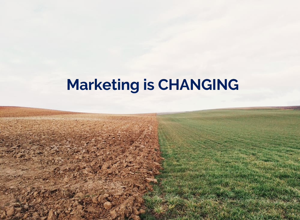
The example here is a slide I used in a recent workshop. I could of course have listed all the ways in which marketing is changing, using bullet points to separate them. But I felt the slide would have more impact with just a single sentence written on the screen, me listing examples out loud, and a visual metaphor as the background image.

2) Cascade the key messages across multiple slides

Rather than making four or five points on one slide (and risk your audience reading ahead and getting out of sync with you the presenter), make one point per slide over four or five slides. This gives each point room to breathe, and helps with signalling to ensure your audience understands and remembers you.

If you're making several points on a theme you don't have to make new slides from scratch for each one - just do the first slide, right-click and Duplicate it, then edit the text on the duplicated version. I've used this technique in the examples below (use the arrows to switch between slides):

If you've got the most recent PowerPoint you can use the Morph transition between the slides, which works really nicely.

People worry that this method will mean a longer presentation but this isn't the case - you take the same amount of time overall, but cycle more quickly through the slides.

3) Use colour to make lists readable, rather than use bullet points

An example of using colour to differentiate chunks of text

An example of using colour to differentiate chunks of text

There are times when you need several points on a slide - for example when you're showing an audience what you'll talk about, or are summarising something, or making comparisons. In these instances neither of the first two techniques are appropriate; you need all the text on one screen. So just write it out like you normally would, but get rid of the baggage and negative associations of bullet-points by not using them - and recreate the POINT of them (making text easier to read) by using alternating colours.

In the particular example shown here, I've actually built up to what you see over three slides. The first just says has the alternating colours text list much larger and in the centre of the screen, then the second is as you see above but with the Bodleian's reply hidden, and then lastly the slide you see here.

4) Highlight key sections of your slide, one by one

I do this a lot - sometimes by building the content of the slides one animation at a time, or by changing the colour to highlight each section, one at a time. Again it means you can have all the points on screen, but you're not using bullets and you're in sync with your audience.

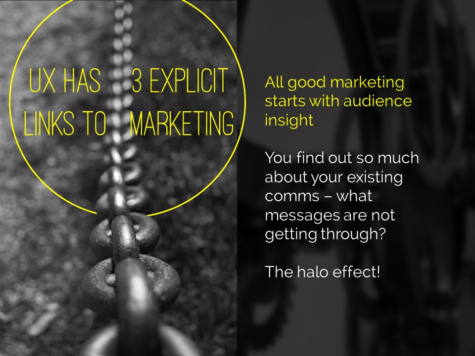
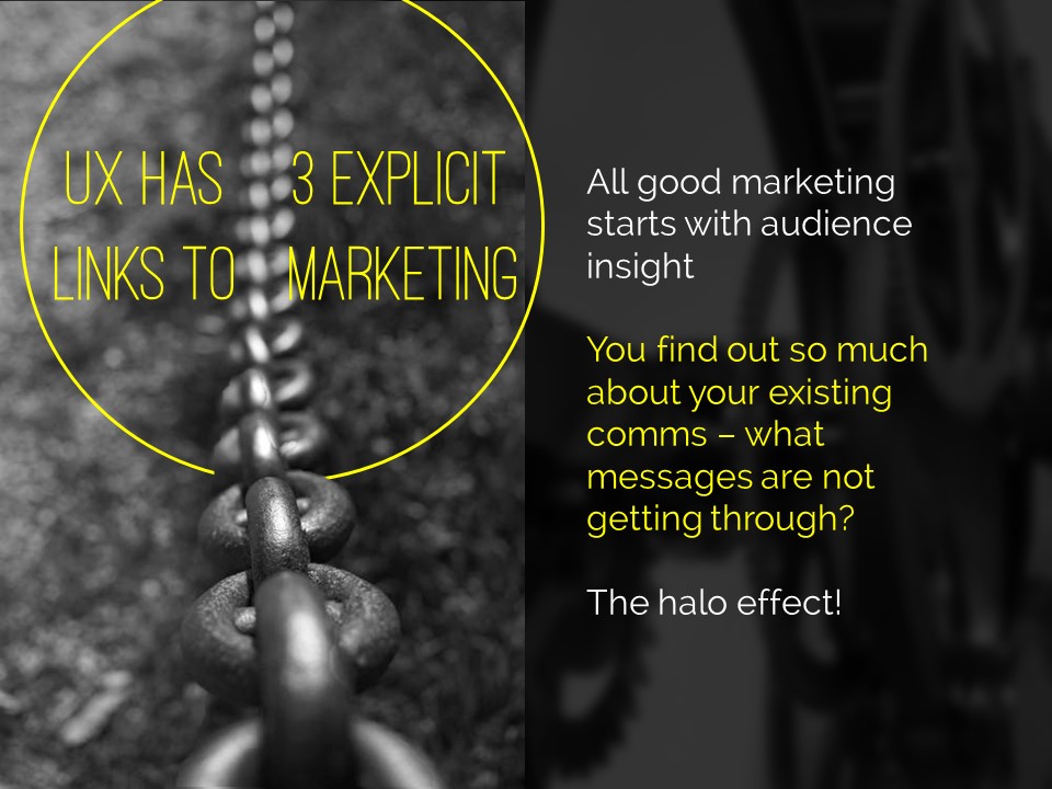
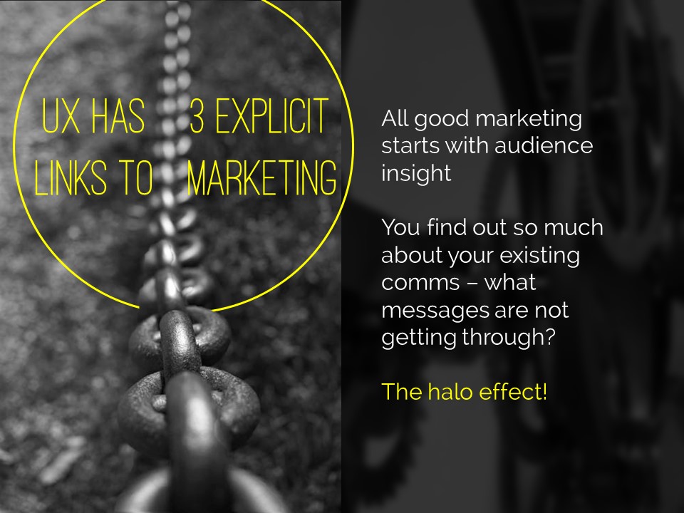
In the example below I've got all three points on screen but each one is highlighted yellow (picking out the yellow from elsewhere on the slide) while I talk about it - again use the arrows to move between them:

5) Turn your bullet points into something visual

An example of using icons instead of bullets

An example of using icons instead of bullets

A fifth option is to basically use bullets without people thinking 'Aargh, bullet points, death by PowerPoint here I come' etc. Use icons (for example from iconfinder.com) as bullet points - the images will help your audience learn. A basic example is shown here.

6) Combine several of the techniques above

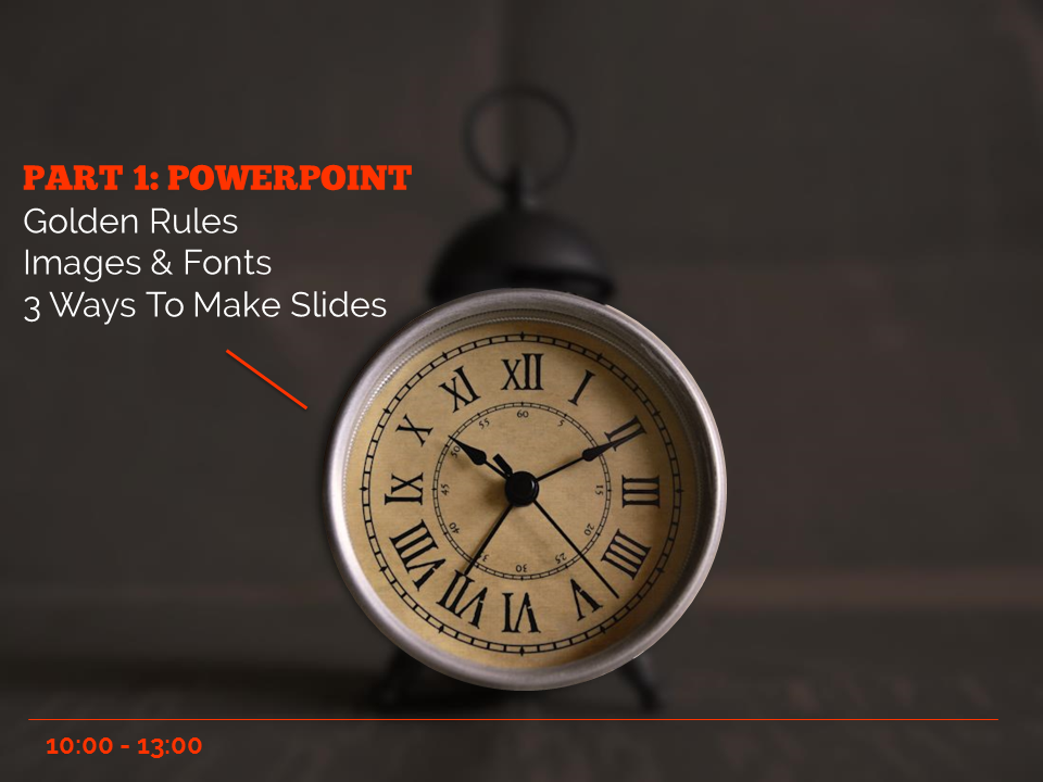
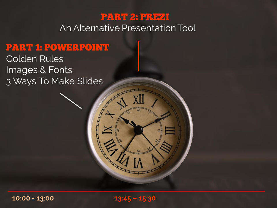
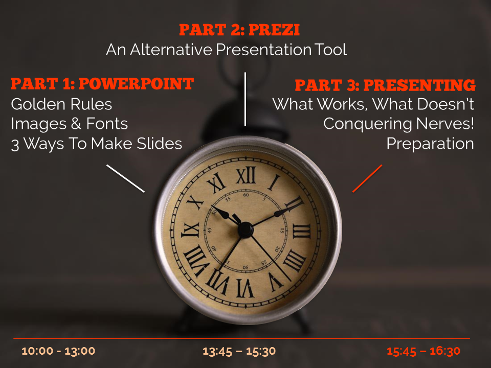
The final example below is how I introduce the timings for my Presentation Skills training days. It does what a single slide with bullet points would do, but uses colour and visual elements over three slides to introduce the information in a more engaging way. Part of the reason I bothered doing this is the slides allow me to talk about each part of the day in turn, whilst staying in sync with my audience, AND it allows the audience to see the full day's timings in one go on the final slide of the sequence.

So there you go! Several ways to avoid bullet points. It's really worth taking a small amount of time to rewrite presentations to avoid bullets: your audience will thank you for it...


You’ll find details of my Presentation Skills or PowerPoint workshops here: you can book an all-day or half-day session for your organisation, online or in person.