prevent prezi motion sickness

Using Prezi in the Academic Library


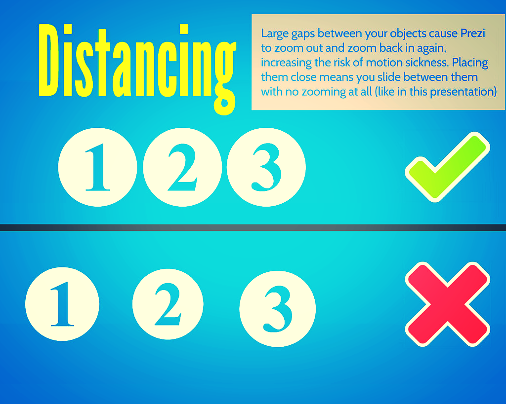
The zooming presentation tool Prezi is a very divisive alternative to PowerPoint. Prezi's 40 million users have created MANY bad presentations since it launched in 2009, and for that reason it has a bad rep in some circles - poorly made Prezis make the audience feel motion-sick, and even really well made Prezis are sometimes more about the tool and the presenter than they are about the content and the audience. Conversely some people LOVE it: "I just use Prezi for everything" is a phrase you hear sometimes, which personally I view as a mistake.

My own feelings on Prezi are somewhere in the middle - I don't use it for about 75% of the presentations I create, but I don't hate it either. It can be a really effective tool in the academic environment, and at my institution we've had students and staff love what we've done with it. The key is, use Prezi with a good reason. Otherwise, don't.

So here are some good uses for Prezi in the academic library:

1. Interactive Maps of the Library

My favourite use for Prezi is take something static, and make it dynamic. You can stretch any image as large as you want (as long as it's not a low-res image) and make it the background to your entire presentation, then add points of interaction with that image.

This is the main example from York - our interactive map of the library:

This serves two purposes. Firstly it sits online (and embedded in various places on our website and Libguides) for the students to interact with in their own time. The students appreciate this because the information about the library, of which there is a LOT, is arranged geographically. This level of context makes it easier to get to grips with. The non-linear qualities of Prezi mean that if, for example, the student wants to know what's on the second floor of the Fairhurst building, they just click on the second floor of the Fairhurst building. (Try it in the map above!) It goes straight there - rather than having to skip a bunch of slides or scroll through a bunch of text or sit through a video. Talking of video, I've embedded about 10 videos in this Prezi at appropriate points - anyone who's ever tried to embed videos in PowerPoint know what a thankless task that is... In Prezi you just copy and paste in the YouTube URL and it does the rest.

The second purpose is to use it in Induction talks. We create department-specific versions of it - these tend to be far less detailed than the full version above, covering less ground, but adding in more subject detail: the specific whereabouts of a department's books and journals, for example, or details of the Special Collections we have which are most relevant to them. Here's a History of Art example that I used this year with my Postgraduates.

As Prezi users will know, the order in which your presentation visits the various elements on the canvas is known as the 'Path'. It's easy to take things out of your path WITHOUT taking them out of your presentation - meaning you can deliver a talk for whatever time-slot you have, but when you give people the link the presentation afterwards they can see the full version with much more detail left in.

So for me, the ability to take a floor-plan PDF and make it interactive, the ability to contextualise our YouTube videos, and the ability to make copies of the map which we customise for each department and presentation length, are all good reasons to justify using Prezi.

If you want to take your own floor-plans and turn them into interactive maps, it's really not that complicated - I've written a guide to that here. Student feedback is great so it's worth doing - also, we often get academics giving us very good feedback and starting conversations about it, so it's a chance to boost our credibility in departments more generally.

2. Presentations with a focus on visual content

Another History of Art example here - the presentation I use for a session on Finding Images with my HoA 1st years. Because it's all about imagery, a very visual presentation makes sense. It also helps to make some of the tedious step-by-step instructions I have to cover slightly more engaging. I don't know why but I quite like the 70s wallpaper aesthetic of this Prezi template, too.

3. Presentations on several disparate subjects

The final reason I use Prezi is when covering lots of different topics or tools under one umbrella. When doing a presentation or teaching session on one topic or idea, the linear nature of PowerPoint suits this well. But when covering lots of things, it can be helpful to show the audience all of them at first, then visit each of them one by one. For a session for academics on online tools and technologies, there's not much linking the content except everything is online - for that the Prezi helps make sense of the broader context.

For most teaching and most presentations I find PowerPoint is fine - it's also much maligned of course, but when used well it can be very effective. For me it's never a case of tossing a coin as to which one to choose - unless there's a compelling reason to use Prezi, why risk the audience feeling sea-sick?

That said, when there IS a compelling reason to choose it, it make a huge difference to the level of engagement. People literally sit up in their seats and take notice. And if you always keep the audience in mind, and use Prezi to deliver your message effectively rather than show off, it will work.

In terms of accessibility, Prezi does provide a transcript of each presentation but I'm not sure that would be much of a recreation of actually watching the presentation, so we don't provide any information only in Prezi. In the Finding Images presentation above, for example, there's nothing in it which isn't also in the hand-out I give the students.

Here's a specific post on how NOT to make your audience feel sick, if you want more detail on that. If you've had successes or failures in using Prezi in academic libraries that you'd be willing to share, leave me a comment below.

Presentation Tools 4: Using Prezi to make NORMAL slides


Yesterday in the post about Canva, I promised Prezi but not as you know it... This is because we're not going to be using Prezi to make a Prezi, we're going to use it make regular slides.

Using Prezi to make normal slides (prezi.com)

If you want to take advantage of some of Prezi's features (particularly the symbols, shapes, graphics, and templates) but don't want an actual Prezi with all the zooming and swooping which can make people feel ill, you can just create a Prezi to work as a PDF. The slides below are both an example of this and an explanation as to how:

Of course, you may want to use Prezi as Prezi themselves intend, in which case have a read of this guide to preventing motion sickness in the viewer. If you want to use Prezi in the academic environment, start here. And, although it's a little out of date now, my 2013 mega guide to using Prezi is here.

The final post of Presentation Tools Week is tomorrow, and focuses on 3 different tools that help you with colour.

Prezi Guide: The 5 Essentials To Stop Your Audience Feeling Sick


Prezi is nothing if not divisive. Some people love it, some people hate it - I'm in neither of those camps. I find it very useful in some situations, but still use good old fashioned PowerPoint Slides for more than half the presentations I give. Prezi should be used for a reason.

Prezi is relatively new (it's been around since 2009), it's getting more popular (there are around 40 million users now) and it's improving its interface all the time. Some people accuse it of being style over substance, but for certain ideas (interactive maps, for example) it provides substance that slides simply can't bring to the table. For me, Prezi can be fantastic as long as you adhere to one maxim above all: don't let the medium get in the way of the message. Any presentation materials should be there to support the presenter and work FOR the audience in adding to their experience. Do that, and Prezi can really raise the level of an audience's engagement.

Potentially, a great Prezi has the wow factor. So why would you want to completely undermine that by creating something which makes sections of your audience feel motion-sickness? It's up to you, the presenter, to minimize the possibility of this as far as humanly possible. Here's how. (For the short version, view the Prezi about it.)

1. Positioning

The single most important thing about creating a Prezi is the positioning of the objects on the canvas (and directly related to this, the order in which they're visited on the path). Position your materials sympathetically, people! By which I mean, rather than moving haphazardly around the canvas and disorientating the viewer, move from left to right, or from top to bottom - move in a way the human brain is used to.

2. Distancing

But positioning is about more than putting your objects in a coherent pattern - it's about having a uniform (and short) distance between them. The closer you place your objects together, the less zoom and swoop there is in your prezi. Place them right next to each other and it won't zoom out at all, it will just slide right over from one object to the next.

3. Sizing

As with distancing, uniformity is the key to sizing too. Put similarly sized objects together - ideally make them the exact same size. This means there's no need to zoom in or out. Contrast this to having a small object followed by a much larger object and then a small object again: the zoom is flying all over the place.

4. Rotation

99.9% of rotations and barrel-rolls in Prezis add absolutely zero value to the presentation.

I just made that stat up but I'm sure it's true. In fact most of the time rotating actively detracts from a Prezi. It is the Number One cause of queasyness in the viewer. It can be used with a good reason (a visual metaphor of some kind to better express your ideas) but otherwise, why would you? It just gets in the way of your message.

5. Pacing

The ability to zoom in and out is both Prezi's strength and its weakness. It's what allows you to show the relationship between objects on your presentation, it's what allows the element of surprise for the big reveal, it's what lets you put your own hierachy onto your information rather than having it dictated to you. But it's also at the heart of what can induce nausea in your audience.

So, pace your Prezi like you would regular slides. Don't move it on every few seconds - arrive at point on your path, talk about it for two minutes, or five minutes, or more, and then move on. This means there are fewer zooms per presentation, and less quickly following one-another. But you can still take advantage of the zoom's ability to enhance your presentation.


One last note on zooming

If you double-click the right arrow to move your presentation on (or left arrow to move it back) it zooms twice as fast. This can be effective in reducing the sea-sick effect - after all it's the transitions which cause the problems, so if you only transition for 50% of the time you did before, that helps. The only downside is it feels risky; if you triple click by mistake, you'll miss your path point entirely and have to go back...

Here's my Prezi on this whole topic - it explains what I've just said in a visually illustrative way (which is sort of the point of Prezi after all):


Finally

All that said, if members of your audience are particularly susceptible to motion-sickness, even doing ALL of the above may not be enough. So only use Prezi for a specific reason. Use it to do something PowerPoint can't, rather than as a direct replacement for the sake of it. Use it to cover several dispirate topics, or to make something interactive, or to visually explain relationships between ideas. But if you don't need to do any of those things, and it's a regular presentation, just use regular slides. Just be sure to use them well.

Which leads us to a bonus option:

(6. The nuclear option)

Prezi can be a very useful way to make a nice looking presentation: the fonts, icons, ease of importing images, and themes, make smart presentation materials without the need for a huge amount of effort or design knowledge. Once you get over the initial learning curve, it's quicker to make a nice Prezi than nice slides. So if you want to take advantage of all that, but want to 100% eliminate the possibility of motion-sickness, simply save your Prezi as a PDF, and use it as you would slides. Every path point on your Prezi is a full-page of the PDF so it ends up looking like a (nice) PowerPoint.

To save a Prezi as a PDF, click the share icon and choose the relevant option from there.

To save a Prezi as a PDF, click the share icon and choose the relevant option from there.


Disclaimer: Prezi will always make some people sick - they dislike Prezis intensely, and it's very important to them that they bring this up a lot. I offer no judgement here; I do the same with LinkedIn. But this guide is about stopping an audience feeling motion-sickness when watching a Prezi - if you aren't prepared to take steps to do this, you shouldn't be making Prezis!