Presentation Tools Week

Presentation Tools 5: Colour


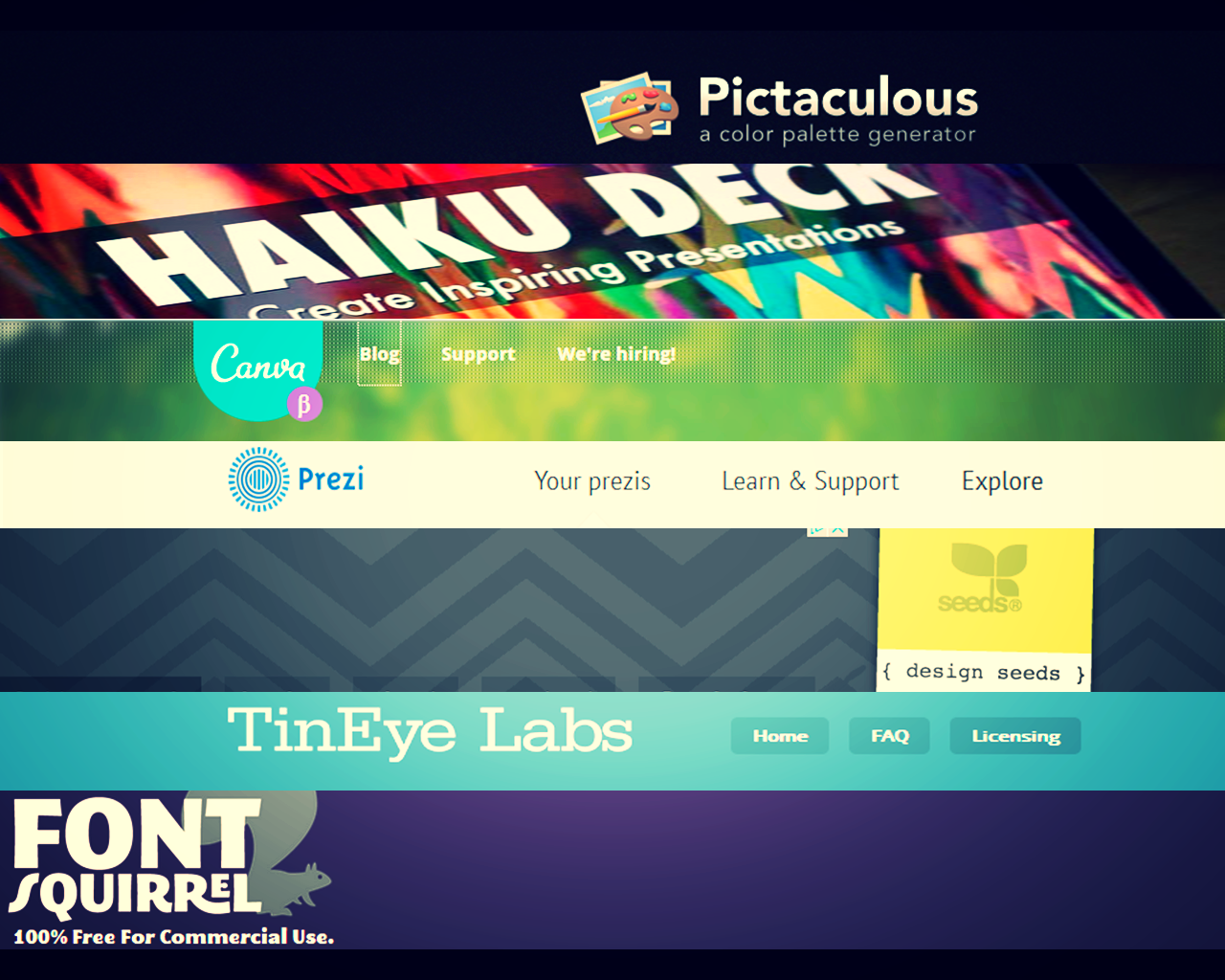
So we come to the final day of Presentation Tools Week on the blog! Day 1 was about fonts, and then we had three alternatives to PowerPoint for making slides: Haiku, Canva, and Prezi. (Also don't forget Adobe Voice as another slide-alternative.) The final post is about colour, and tools which relate to colour.

Design Seeds (design-seeds.com)

Design Seeds is a colour palette search. It allows you to see groups of colours which work together for design - obviously I'm thinking of colour in presentations here, but of course it can apply to posters, an organisation's branding, or indeed any other aspect of design.

I like this site because how colours work together is something I'm interested in but have no real knowledge about. I like seeing things happen successfully, but it's all trial and error for me. With Design Seeds there's some real expertise to draw upon.

There are countless existing palettes of six colours, but you can also choose a colour as a jumping off point and it finds a palette to match, which I think is the most useful aspect to Design Seeds. If you want to use your organisation's main branding colour to underpin your presentation, but want some nice colours to go with it (for the font, shapes, icons, blocks etc) this is a great way to find the colours. Here's a screengrab - I've put in the approximate colour of the hyperlinks on this website (my favourite colour, sort of green but with a bit of blue in it) and it's given me two palettes to choose from:

Click to go to the Design Seeds website

Click to go to the Design Seeds website

I'm going to use this tool in the next set of slides I make from scratch.

Pictaculous (pictaculous.com)

Pictaculous isn't entirely dissimilar to Design Seeds in that it's a colour palette generator - but it works in a different way. The idea here is that you upload an image (it could be your organisation's logo, or a key picture in your presentation, or you could use it for every image on a slide by slide basis) and it gives you the component colours and suggests a palette to go with it.

Here's a screengrab:

Click to go to pictaculous

Click to go to pictaculous

I uploaded the picture which appears in my blog header (a photograph taken by Matt Fairview, which I found on flickr. It is a picture of the M5 Wicker Man, in Somerset; the original can be seen here. Matt has kindly given me permission to use the image on my site) and you can see it's broken the image down into colours, then provides suggested palettes from Kuler and Colourlovers (all of which are clickable so you can view them in larger sizes). If you work with InDesign you can also download the Adobe Swatch.

Multicolr Search Lab (labs.tineye.com/multicolr)

TinEye Labs provide a couple of useful tools - the first is a reverse image search engine. Upload the image you've got saved on your PC, and it will find examples of the image online - handy if you've saved something and forgotten where you found it, but also handy if you want to know if anyone is using your own images without proper attribution!

The second is the more fun tool - the colour search engine. It searches 20 million Creative Commons Flickr images, not by keyword, but by colour. People LOVE this tool when we try it out in Presentation Skills workshops, and they find it addictive for reasons which are hard to explain but you'll know when you try it...

You can select the colours of your organisational branding and it will bring back a staggering amount of pictures featuring just those colours (allowing you to make a presentation which stays 'on brand' without using the dreaded PPT template). You can also select a dizzying selection of 5 different colours just for the sake of it, then move the sliders around so some colours are more prominent than others, and be amazed at how many images match your absurd criteria...

Click to go the colour search engine

Click to go the colour search engine

So that's the end of Presentation Tools Week - click the pic below for a link to all 5 posts in one go. Any useful tools I've missed? Let me know in a comment.

Presentation Tools 4: Using Prezi to make NORMAL slides


Yesterday in the post about Canva, I promised Prezi but not as you know it... This is because we're not going to be using Prezi to make a Prezi, we're going to use it make regular slides.

Using Prezi to make normal slides (prezi.com)

If you want to take advantage of some of Prezi's features (particularly the symbols, shapes, graphics, and templates) but don't want an actual Prezi with all the zooming and swooping which can make people feel ill, you can just create a Prezi to work as a PDF. The slides below are both an example of this and an explanation as to how:

Of course, you may want to use Prezi as Prezi themselves intend, in which case have a read of this guide to preventing motion sickness in the viewer. If you want to use Prezi in the academic environment, start here. And, although it's a little out of date now, my 2013 mega guide to using Prezi is here.

The final post of Presentation Tools Week is tomorrow, and focuses on 3 different tools that help you with colour.

Presentation Tools 3: Canva


Day 3 of Presentation Tools Week. (See the previous posts on Fonts, and on Haiku Deck.) Today, a more complex tool.

Canva (canva.com)

Canva, like Haiku Deck, is an entirely self-contained alternative to PowerPoint. It's more complicated than Haiku, but with the added complication comes more flexibility and more style too.

I haven't found it quite as intuitive to use as Haiku, and it's based on a freemium model which encourages you to purchase images for $1 a time, but it can be used with the decent supply of free built-in images and the results are excellent. There's also a wealth of insight into what makes design work, available as part of their tutorials. I love learning that sort of thing; sometimes it turns out there's a reason to back up something I already do, and sometimes I end up completely changing what I do to something more effective...

Canva does a whole load of stuff besides slides, and I like the distinctive design feel that runs throughout their products. We'll focus on presentation-making today, though - here's what the slide design view looks like:

On the left are various extremely stylish and useful layouts. I don't know how well you can see in the pic but the very first layout at the top-left, and the one below it, have a sort of criss-cross fence effect over them - that denotes that the picture needs to be purchased (for $1). Images without the criss-cross effect, like the one in my example slide, are free to use. Like Haiku Deck, Canva uses filters to allow a uniform feel to your presentations and make it easier to write directly onto slides - you can see I've got the filter options open above, and there's plenty of filters to choose from.

I think Canva versus Haiku is the classic effort versus reward conundrum - with Canva you need to put a lot more effort in, but you get a lot more out if you do. My only reservations with it are that the templates are literally for one slide at a time (whereas Haiku templates are for the whole deck) and it's a bit fiddly to build your own content until you get used to it. As with Haiku I think this tool would be more useful for conference presentations than for internal infolit materials, although [this an update from the original post] you can use your own images  (e.g. screengrabs) in Canva, which I previously hadn't thought possible - thanks to Danielle for pointing this out in the comments!

I feel like I don't want to spend too much time learning a new system if there's a chance I'll end up needing to pay for just the right image (which I'm unwilling to do, as there are so many great sites out there for freely available images). I actually think it's a great business model though, and I think Canva gives a lot of itself away for free so you don't HAVE to pay, which is great considering how contemporary and chic the templates are.

If you LIKE good slide design but don't feel like you know where to start in achieving it, Canva does a lot of the hard work for you and gets you a lot of the way there. Here's an example of a Canva slidedeck uploaded to Slideshare:

If you sign up for Canva and like using it, check out the aforementioned plentiful (and genuinely useful) design tutorials. If you've used Canva and like it, please leave me a link in a comment so I can see your presentation! I'd love to see what Information Professionals are doing with it.

Tomorrow on the blog it's Prezi, but not as you know it!

Presentation Tools 2: Making Slides with Haiku Deck


It's Presentation Tools Week on the blog; yesterday was all about using non-standard fonts in PowerPoint, and the next few days are all about not using PowerPoint at all. Here's the first of three useful alternatives to PPT.

Haiku Deck (haikudeck.com)

This a very easy to use, very useful tool for making slides. It almost forces you to make attractive and effective presentations, by limiting you to only desirable options (whereas PowerPoint is full of features which actively harm your presentations!).

Haiku Deck is free to use on the web, or you can download the iPad app, also free. It gives you templates - not ugly PowerPoint templates, but attractive ways of doing slides using semi-transparent text boxes and large fonts, a method I recommend on my training courses. The software encourages you to use images effectively, not pack too much text in, and make one point per slide - all absolute essentials for good presentations. (Unfortunately there is actually a 'bullet point list' option for slides, but luckily most users seem to ignore this.)

Here's a nice Haiku Deck example I found, from Tricia LaRue:


It's Banned Books Week! - Created with Haiku Deck, presentation software that inspires

Haiku Deck is entirely self-contained - you choose a style (which includes fonts), slide templates, and even find your Flickr CC images, all within the package online. This screengrab shows you pretty much all the important things at once:

You can see I've chosen CINEMATIC from the themes along the top - this dictates the fonts, and also put a filter on all the images, which is a nice touch. There are different filters for each theme, and they're there to make the text easier to read and to help get a consistent feel to the deck. Down the left-hand side are the various layout options for this particular slide. To find the image in my example I just typed it into Haiku's own search box - it hunts for appropriately licensed Flickr images to match your search terms, and automatically credits the author and provides a link! Which is an excellent thing. (Here's an example of that, with the image credit for the pic in my screengrab, which is by ectaticist.) Along the bottom is the Add Slide button, and the preview slides (of which there is only one in my example) for you to cycle through and edit. 

Overall I think Haiku Deck is an excellent way to put together effective and attractive slides quickly. The only disadvantage is it is relatively inflexible - but of course this is also what makes it so good. It's quick, and you're locked down to only the most useful options.

When you want to present data or graphs (or your own screengrabs), or have a very varied slide-deck, Haiku perhaps isn't the right option. Otherwise, give it a shot: haikudeck.com.

Next up on the blog tomorrow, Canva.

Presentation Tools 1: Fontsquirrel


I love a good presentation. I think they're often the best way to communicate information, and I create them as stand-alone online objects as well as for actual talks to an audience. So it's Presentation Tools Week on the blog - seven different useful tools from the list below, explored over the next five days.

These fall into two broad categories: tools for creating presentations from scratch, and tools for making PowerPoint presentations better in some way

These fall into two broad categories: tools for creating presentations from scratch, and tools for making PowerPoint presentations better in some way

When I began giving presentations 5 years ago, I remember looking at Bobbi Newman's, Buffy Hamilton's and Helene Blowers' Slideshare accounts and being amazed that slides could look so beautiful. My horizons were truly expanded; previously every PPT I'd seen had been functional, boring, and (as I later learned) ineffective as a communication method. I learned by trying to expose my brain to as many great ways of putting together a PowerPoint presentation as possible, and trying things out to see what worked for me.

These days things are a lot easier, as there are several helpful tools which assist you in creating effective and pretty slides. Some of them do a lot of the work for you, and some of you provide a helping hand for specific elements of a presentation. I've summarised the 7 tools I think Past Me would have found most useful. Hopefully if you're reading this you can take something from one or more of these platforms too.

Tomorrow we'll look at an alternative to PowerPoint, but for now we'll look at working with it, using non-standard fonts. It took me a long time to realise just how important fonts were to a good presentation.

FONTSQUIRREL (fontsquirrel.com)

FontSquirrel is a website full of downloadable fonts, and I use it ALL the time - it's the first port of call for non-standard fonts. I think using new fonts which we're not all over-saturated with from the Office suite can make a HUGE difference to how good a presentation or poster looks, and everything on FontSquirrel is free even for commercial use.

Examples from FontSquirrel

Examples from FontSquirrel

I use Megalopolis Extra in loads of presentations, along with Aller, Caviar Dreams, ChunkFive Roman, Quicksand Book, and Pacifico. You need admin permissions to install fonts on your PC, so if you can't have that permanently at work, try and get it for a couple of hours, go onto FontSquirrel, and go mad downloading interesting fonts. Once you install them they install across the Office Suite, so you can use them in Word as well. Try it!

(NB: An alternative to FontSquirrel is DaFont, which I've heard people recommend, but I can't vouch for it as I've never used it myself.)

Remember to save your PPT as a PDF when using non-standard fonts! Otherwise when you come to present on a different PC without the fonts installed, it will almost certainly go horribly wrong.

Some guidance around fonts - generally it is thought that you should use a maximum of 3 fonts per presentation (although as with all 'rules' around presenting, feel free to break this one if you have a good reason), and my personal minimum font size is 36 for slides.

Font-pairing is an art I feel like I've not mastered at all, but would like to - I found the following (albeit very brief) presentation helpful: