How to

Can you use Twitter for Academic teaching? Yes, here are some examples

I have read, and contributed to, an awful lot of writing online about Twitter in HE. Social networks in general and Twitter in particular are increasingly accepted as a valuable part of the academic world. If you want to know about how to use Twitter for communication, for building reputation, for research, then Google will provide you with endless hours of reading. However, using Twitter in teaching seems to be far more tricky and ambiguous. There are a lot more people asking 'Can we use Twitter in academic teaching, and if so, how?' then answering that question. Interestingly, there's a lot more info out there in using it in the school classroom than on using it in the University seminar room, lab, or lecture theatre.

With that in mind, and to make the most of a real edtech zietgeist happening at the University of York at the moment, I put together a 1.5 hour workshop for academics, as part of a series I'm doing for the Learning & Teaching Forum. I really enjoyed putting this together because I learnt a lot, and spoke to a lot of academics doing really interesting things with tweets.

The biggest issue in this area seems to be that you can't make students sign up for the platform, so how do you make sure no one is excluded if you're providing key info via Twitter (without you having to duplicate everything)? The first answer is embedding a Twitter stream in the VLE - there is a full guide on how to do that (with BlackBoard) in the handout which accompanied the session (embedded below). The second answer is projecting a hashtag onto the walls during teaching. Chemistry at York is, for some reason, always at the front of the curve with social media, and one of the things Simon Lancaster does is have a back-channel running on big screens during lab-sessions, using Tweetbeam, so that students who don't wish to sign up for Twitter can still get the benefit of seeing other students' tweets (and also pictures shared by Simon). I really liked this idea - I liked the ceding of control, the high risk of it, and I like the fact that the students don't abuse the trust, and take the opportunity instead to contribute enthusiastically and productively.

Anyhow, here are the slides from the workshop - I hope if you're reading this you find them useful. If you're an academic and want to chip in via the comments with how you utilise Twitter, that would be great; if you're an information professional and you also run these sorts of workshops, I'd love to hear from you too.


Using Twitter in Academic Teaching by University of York Information

10 things to make a conference great

What makes a conference great? Andy Priestner posed the following question on Twitter today:

I found my answer wouldn't fit even across loads of tweets. So with that in mind, and following on from the previous post on inspiring conferences, here's my personal opinions based on conferences I've attended.

  1. The other delegates. This is very tricky. Much like what makes a good school experience isn't really the Ofsted report and the facilities so much as the other kids and whether they're nice, and a good job experience has (probably) more to do with your colleagues and line-manager than your salary and objectives, a good conference experience has a lot to do with the kind of crowd the conference attracts. If you get open, enthusiastic and practical people to hang out with, the presentations themselves are really just a springboard rather than the focus of the conference. What I remember most about SLA was the other delegates.
  2. A good keynote from outside the industry. LILAC gives fanstastic keynote - and part of the reason is they bring in someone from outside of libraries, who knows enough about them to make their talk relevant without just pandering to librarians. Spare me people saying 'A library without a librarian is just a room' - guess how much that helps me? Correct: not at all.
  3. A variety of formats. There's no excuse just to have a bunch of people doing long presentations, these days. I want to see Pecha Kucha 20/20s, I want to see Teachmeet style sharing, I want to see panel discussions, I want some unconference style rewriting of the hierarchy. Ideally, I'd like to see something not listed here because I've never seen it before. Surprise me.
  4. Speakers who understand speaking rather than just the subject they've been asked to speak about. Don't tell me all about your methodology at the start - if you have to tell me about your methodology at all, do it after you've told me WHY I should care about it (i.e. give me the results first). On the subject of results, if you've not yet finished your project and can't tell us your conclusions, why are you here? And of course, don't get me started on presenters who can't be bothered to make decent presentations, or go over their time slots.
  5. A mixture of the cerebral and the immediate. I want to be inspired, uplifted, and invigorated. I ALSO want to be able to go back to my desk when the conference is finished and change the way I work, for the better, right away.
  6. New blood. I want there to be new professionals at any event I go to, because apart from being, obviously, The Future, they're often the most enthusiastic and passionate. So make sure your event offers hard-up new profs the chance to attend and ideally to present too. (On a related note, I'd recommend going to New Profs events even if you aren't so 'new' anymore; it restores your faith...)
  7. A lead organiser who really has their shit together. I've been to conferences where the person effectively chairing the event seems completely at sea, or not to be invested in the success of  the day at all. Organising conferences is REALLY hard (I've done it, enjoyed it, but resolved to stick to speaking from then on because that is MUCH easier) so you've got to be completely committed and quite sharp, and creative, and good at logistics, to make a success of it.
  8. An appropriate level of resource. It is possible to organise conferences and unconferences very cheaply, but that needs to be built into the DNA of the conference. A hugely ambitious conference shouldn't be attempted without a hugely ambitious budget. I'm quite happy to sleep through 15-minutes of sponsor-talk at the start of each day if it means the event is well financed and everything works.
  9. Technology. If the wifi is no good, find another venue. If the screens are small, find another venue. If the presenter PCs are positioned so the presenter has to look away from the audience to present, find another venue. If someone is doing a presentation via Skype or a webinar software then by God they'd better give a transcendent and truly transformative talk if we're to suffer through the 100% inevitable bad sound quality, visual glitches, and delays where the screen goes blank.
  10. Downtime. I'm an introvert. Most people going to library conferences are introverts. Introverts need time to recharge, away from the crowds, or we go a bit loopy. So the best conference schedules, for me, are the ones brimming with activity - but with some downtime built in too.

achievement via says-it.com

Anything you'd add?

The key to good marketing is to promote one thing at a time

If you've got a great idea, don't dilute it. Simplicity results in better traction for your idea. You need to give people one idea at a time, so they can grab onto it, digest it, and see how it relates to them. Not only that, but the simpler the idea, the more likely it is for people to share and pass it on. Think about the really successful online writers, like Seth Godin. He's made a career out of taking single concepts, focusing on them one at a time, and getting a bajillion hits to his blog as a result. Once people buy into his one-key-thing-at-a-time approach to ideas, they're then more likely to buy into him as a concept, and push his (more complex) books up the best-seller charts.

So, keeping things simple isn't dumbing down. It's providing people with an easy way-in. That's just good marketing. Much of marketing is to simply get people in the door - THEN you can give them a whole variety of reasons to say inside.

Most of the readers of this blog work in the information profession, like I do. This means we have a complex sell. Library services are myriad, but your promotion must be in bite-sized chunks. Libraries are complicated, but your marketing must not be. The secret to good communication is to market one thing at a time.

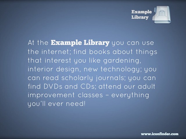
Here's an example of a poster promoting a library. In theory, it ought to be good. It looks okay, uses a nice font. But more importantly, it tells you about all sorts of amazing library services! What's not to like? How you can resist this?

But actually, this poster doesn't work. There's too much going on, it does not provide an easy way in. You're relying on people grabbing on to the part that relates to them, and then taking an action (coming to the Library) because of it - in most cases, that's too big a leap of faith. You're much better off dividing that list up into individual posters, and putting them in the most relevant areas for their specific target groups. So for example this message, even though it's only one useful thing instead of many useful things, is a much more powerful piece of marketing:

Then you make ANOTHER poster to cover another aspect of the original:

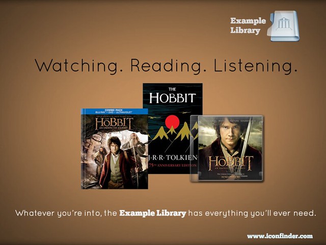
Or you can take multiple concepts but tie them together into one easily-digestible, relate-able, shareable package:

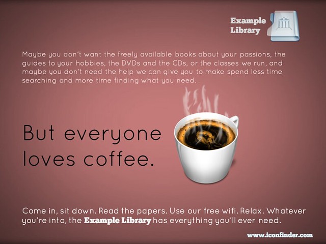
Finally, if you really want to put several library services into the same piece of promotion, you can do this and STILL have the one simple message for people to take away. In the example below, you're saying to people that the library is a welcoming place, that they can come in and use the wifi and enjoy the cafe, without being judged for not using the books and journals. But you're also listing all the other things they MIGHT do if they so desire. As I said above, much of marketing is to simply get people in the door - then you can give them a whole variety of reasons to say inside.

So remember, keep it simple. Market one thing at a time. It WILL yield tangible results.

(All of these posters are available on my Flickr account via an Attribution Creative Commons licence. Note that it's NOT a 'no-derivs' or 'non-commercial' license - in other words if you can find a use for these ideas, but want to change and adapt them to your own purposes, feel free to do so.)


Steal this: Student Guide to Social Media

If you click the image below, you'll be taken to the Student Guide to Social Media. This is an interactive online resource, giving information on various social media platforms, and on tasks you can accomplish using social media - it is aimed primarily at undergraduates but has applications across the board. It is made available under a BY-NC-ND Creative Commons licence: in other words if you think this resource might be of use to YOUR students, feel free to use this, link to this, make it part of your own institution's website, just as long as you credit the creators (the BY part), aren't using it for commercial purposes (the NC part) and use it entirely as it is, in its current state, rather than creating your own version or derivatives (the ND part).

A screenshot of the resource's homepage


Alternatively, book mark libassets.manchester.ac.uk/social-media-guide/ or click the link to open the resource in a new window.

A Northern collaboration

The resource is the result of a joint project between the Libraries of the Universities of Leeds, Manchester and York, developed over the Summer. Michelle Schneider from Leeds' very successful Skills@Library team approached me about working together on a social media resource for undergraduates - I was extremely pleased she did, because it was something on my list to do anyway.

There's a lot of support out there for postgrads, academics, researchers generally in using social media, but I don't think there's as much for undergraduates. It's an area we're looking to expand at my own institution, and as well as face-to-face workshops I really wanted something that worked as an interactive learning object online, probably made using Articulate / Storyline. Imagine how pleased I was, therefore, when Michelle told me the other collaborators would be Manchester, including Jade Kelsall, who is absolutely brilliant with Articulate! I'd worked with Jade before at Leeds; she provided all the technical expertise to create the Digitisation Toolkit (using the Articulate), one of the parts of the LIFE-Share project I actually enjoyed. Also on the team were Carla Harwood at Leeds, and Sam Aston at Manchester.

So we got together, brainstormed on lots of massive pieces of paper, photographed the paper with our ipads, emailed each other a lot, and came up with a resource which we think will be really useful. I feel quite bad because I was off on paternity leave for a month of this and it took me ages to get back up to speed, so I don't feel like I contributed enough compared to Jade and Michelle who worked tirelessly on this (sorry guys!) but I'm really pleased with the result. It's gone down very well on Twitter, and I was excited to see we've found our way onto a curriculum already:


How it works

Increasingly as I do more and more teaching, training, and planning, I'm aware that when introducing people to new tools (or trying to help people use existing tools better) you have to give them two different versions of the same core information. The first and obvious thing is how to use a tool - e.g. here's Twitter, here's how you create an account, here's some tips on using it. But this assumes some prior knowledge - what if you don't know why you'd need Twitter? So you also have to present the information in terms of tasks people want to achieve: "I want to boost my professional reputation" is one such task, and Twitter would be among the tools you might recommend to achieve this. The great thing about using Storyline is we can do exactly that - students can explore this resource by tool, or by task, or both.

We've also included case studies (some video, some not) and I'm indebted to my colleague in the Career's Service at York, Chris Millson, for providing a lot of really useful information about both tools and tasks and sourcing case studies...

The resource is, deliberately, very straightforward. We stripped out everything non-essential to give students easily digestible, bite-sized introductions to the various things they might want to use these tools for (Twitter, Facebook, LinkedIn, Slideshare, Google+, Academia.edu, blogs etc). It's also relatively informal without attempting to be in any way cool or streetwise. I've showed it to some of my students in info skills classes already and it's gone down very positively; I think even students who are very au fait with web 2.0 tools still appreciate some guidance on how to meld the social with the academic and the professional.

So, check out the Students Guide to Social Media, tell us what you think, and if you'd like to steal it, feel free.


Import your floorplans into Prezi to create an interactive map

A couple of years ago I wrote about some interactive maps we'd made of the Library, which we used for induction and teaching - they went down very well. The students are much more engaged by a slick Prezi than a tired PowerPoint, and it's also very practical to have information about the library geographically located in a map, rather than in linear slides. So the maps worked really well as stand-alone web objects to be viewed independently by students and staff, as well as actual materials for live presentations and workshops. You can read the post - Student Induction, Libraries, Prezi, and Interactive Maps - here; it also contains an embedded Prezi map, with which to compare the new version I've created below.

In 2012 we tried to improve the maps a little, including embedded a lot of videos in them - things like the virtual tour, but also information at the point of need, for example '1 minute on... how to photocopy and scan' next to where the printer/scanners are on the map.

This year, we did something I've wanted to do from the start, which is import floor plans to Prezi and create the maps based on those. Previously we simply didn't have good enough floor-plans in a format I could use - hence having an outline of the Library buildings (drawn by someone in the Digital Library team), somewhat awkwardly divided up by me using lines and boxes. Now though, we have a MUCH better interactive map, the basis of which is an imported PDF of our floor plans.

Here is the generic map we display on our Info for New Students page (as always I'd recommend going into Full-Screen mode to view this - press the Start Prezi button then once it loads, click the box icon in the bottom-right corner):

We experimented with various ways of representing the different floors: separate maps for each floor, or one map but with box-outs containing the other floors, for example. In the end we opted for making the ground floor plan of the overall building take up most of each ground floor, but with the other floors contained within the same space. (That doesn't make much sense; you'll see what I mean if you look at the map.)

Unexpected benefits

Once again the response from the students was really good. Quite a lot of our induction talks happen as part of wider introductions to the course, from academics, the Student Union, Careers office etc - just the fact that we aren't using PPT and they all are makes the students sit up and take notice. They've often not seen Prezi before so are impressed by the ability to zoom in on different parts of the Library and talk about them. It really does have more impact, and make people more aware of what you're saying about the Library, than a PowerPoint presentation. (And I say that as someone who still likes and uses PPT a lot, including for a lot of teaching.)

That is the expected benefit of using Prezi, but each year another benefit that occurs is the map instigates conversations with the academics. People from the Departments we're presenting in come up to us and want to talk about the Prezi - they're often impressed by it, and they appreciate the fact that the students took notice of it. I really do think I've found it easier to work with departments after they've seen me using Prezi; it serves as a jumping off point / builds bridges. (Bit of a mix of metaphors there but you get what I mean!)

If you want to try making your own interactive map, here's how

The process we followed at York was this:

  1. Open a new Prezi and edit the template so it reflected our branding
  2. Import the floorplans as a PDF. When you import as a PDF each page of becomes a seperate object on the canvas, to be manipulated: picked up, shrunk, stretched, etc
  3. Stretched the overall top-down view of the Library so it was absolutely massive - after all, everything else has to fit inside it
  4. Placed the individual building plans within the stretched top-down view
  5. Annotated the maps with further information by simply double clicking anywhere on the canvas to type
  6. Put in photographs to give the audience a better idea of where they were in the building
  7. Embedded YouTube vids at all appropriate places (this is very easy with Prezi - you just need the video's URL)
  8. Saved a copy - individual Academic Liaison Librarians then took the generic map and made bespoke versions for each department
  9. Made different versions, by copying the maps, to suit specific needs - so edited the 'path' (the order in which the Prezi moves through all the text and pictures on the canvas) to make e.g. 5 or 6 key points only for a 10 minute presentation, or every single thing on the map for the stand-alone web version ..

An example of a different version of the map (as in point 9) is this iteration I made for my History of Art PG students, with subject-specific information added and non-essential path-points taken out:

We also use Prezi for some teaching but not all. So for my History of Art 1st years, with whom I have an hour on Texts and an hour on images, I use PowerPoint for the Finding Texts session, and Prezi for the Finding Images. The latter was created using a Prezi template - these are really good if you need something nice looking in a hurry. It took me around 2 hours to turn my predecessors PPT into the Prezi you see there.

Non-York examples

Here are other takes on the interactive map:

If you have examples I can add me list, or any comments or questions, let me know below!