University of York library

Risks and Rough Edges: Building Genuine Relationships Through Library Social Media

Here we are with another regular blog-post, following on from the last one a mere [checks notes] 418 days ago!

I was recently invited by Royal Holloway to present at an event they were organising on academic library social media. RH themselves were also presenting, as were representatives from MMU and Liverpool Uni Libraries. The other presentations were all great (see below) and I learned a lot.

My presentation was about the work we do at University of York Library, and in particular how we’ve seen a monumental spike in social media engagement over the last 18 months or so. The slides are here.

The whole thing was recorded on Zoom so if you’d rather you can see and hear the slides here:

The video above starts from my talk, but I’d really recommend checking out the Nathalie Rees’s talk on MMU, Patrick Walker and our host Greg Leurs’s talk on Royal Holloway, and Amy Lewin’s talk on Liverpool University too.

It was great to hear talks from four different libraries with four varying approaches (I felt we at York had the most in common with Liverpool but everyone came at it slightly differently. There were so many conferences and events centering on social media a few years ago but you don’t get so many now - it’s still a really key issue though!

Thanks again to Greg for inviting me to present.

Starting small and scaling up, and what have we learned about Design? UX at York

In March I presented at the excellent Northern Collaboration event on UX, held in Huddersfield. Here are the slides from my talk, which was basically a timeline of our ethnographic and design adventures at York since we went to the first UXLibs conference in 2015:

I've blogged about the event and the other talks over on Lib-Innovation.

This week, as part of our approach to disseminating our UX work and talking (and listening) to as many different types of audience as possible, I presented to the Good Things Foundation in Sheffield. Good Things is a charity working around social inclusion and digital divide, and it was really interesting to hear about what they did, especially their work with public libraries. 

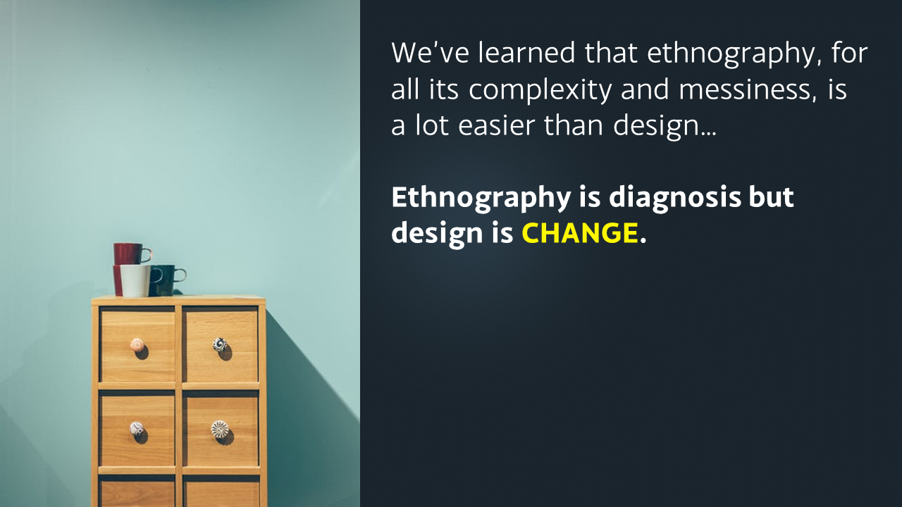
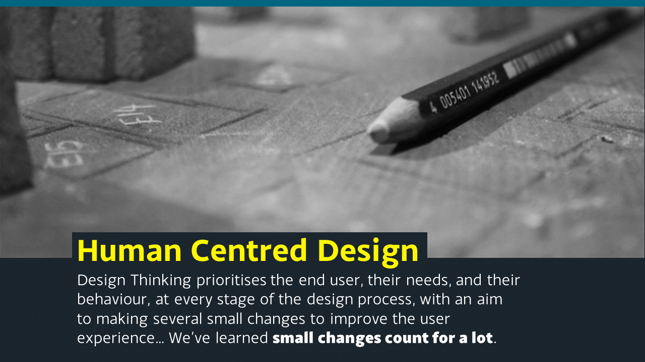
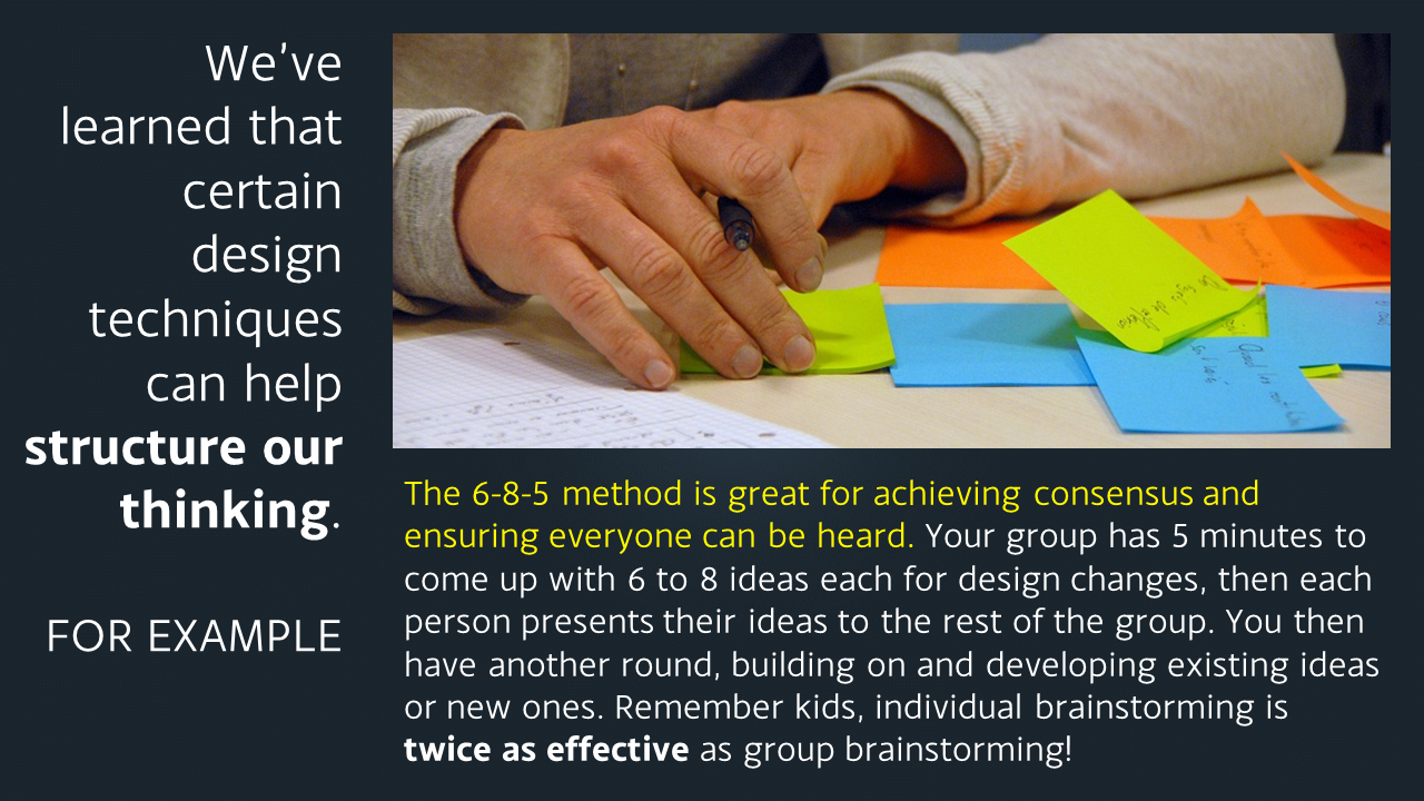
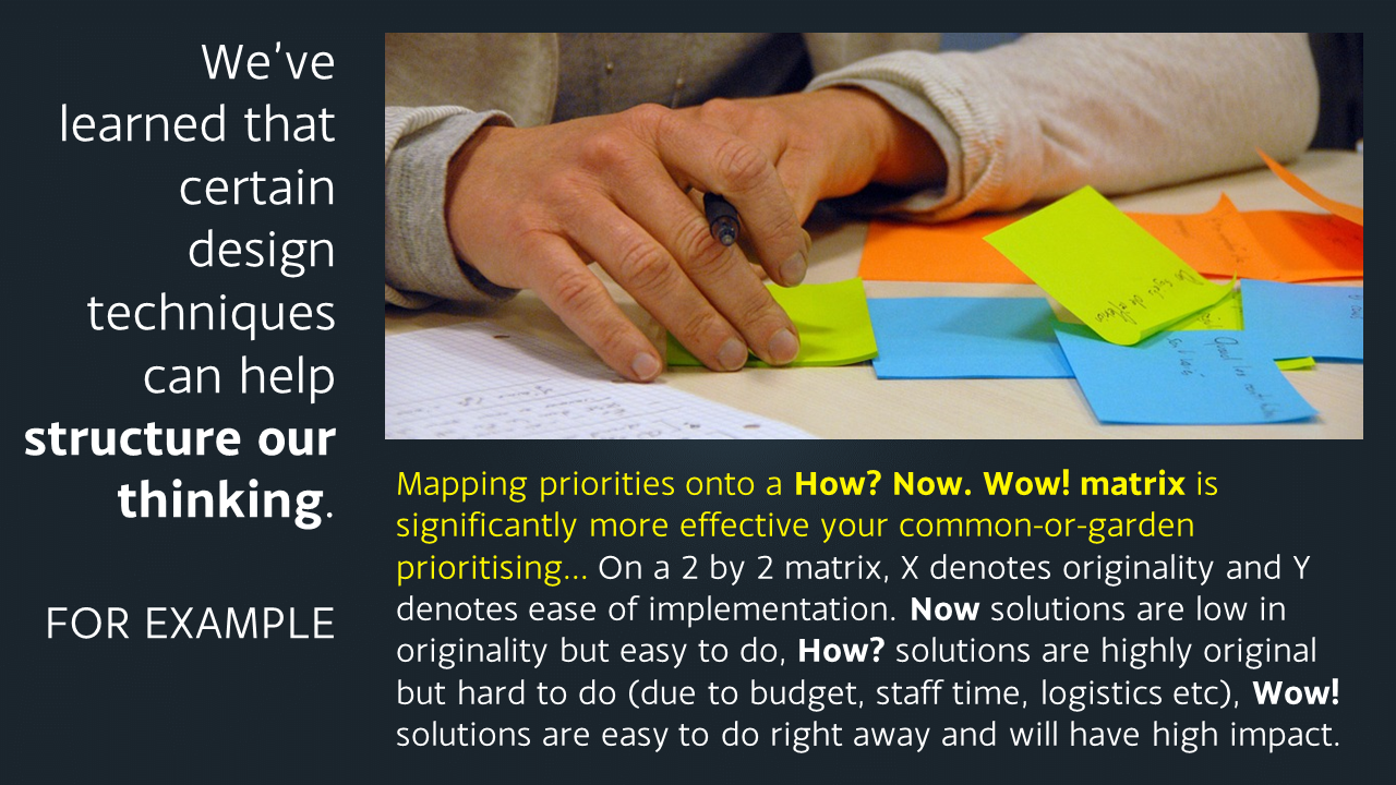
They were particularly interested in design, so the presentation consisted of an extended and adapted version of the one embedded above, with a more specific section on design added in. At the moment Slideshare is not playing ball so I thought I'd upload the design related slides as images here in the meantime, because I do think the design aspect of UX is the part we libraries struggle with most, and it's good to share what we've learned.

Just click the arrows on the image below to cycle through the slides (email subscribers, this'll work better live on the site - click here to view this post on ned-potter.com)

If you have any more tips on getting human centred design embedded as part of the organisational culture in libraries, do let me hear them! 

Creating images with copy-space for text

This post originally appeared on the Lib-Innovation blog.

As always things have changed in my library over the summer, and we needed some new images to reflect our reconfigured rooms, new signage and new services. We're very fortunate to have easy access to the University photographer Paul Sheilds, who is based in our Morrell Library building, so we booked a morning with him.

We had very specific needs in mind, based on a list we'd drawn up to suit what I wanted for our Induction Project, what my Academic Liaison colleague David Brown wanted for the new LibGuides and what the Comms Team needed. In particular I was really keen to get photos with copy-space.

Copy-space literally means a space to write 'copy' in the newspaper meaning of the word - in other words an area of the image which is less busy and which could be written upon without obscuring a key part of the picture.

In essence I wanted to be able to write directly onto the images (for use in slides, posters, digital screens and social media) without having either a separate area for text, or a back-filled text box - because I think it looks smarter that way and because it allows the images to be full screen at all times. It's a lot easier to do this when the images are captured with that in mind from the outset.

Here are some examples - these are works-in-progress that I'm playing around with for the forthcoming #UoYTips Induction campaign for 2016/17 at my institution. They won't look exactly like this in the final versions but the copy-text principle will remain.

We have borrowable laptops which I wanted to showcase. I've added a piece of text to the copy-space:

Here's an example of an image of the same lockers which is a great pic but which doesn't have copy-space built in (making it a little less flexible to work with in marketing):

It would be possible to write on this of course, but you'd need to manipulate the image to ensure the text was legible, or used a back-filled text box.

Next up is a picture of the copy-print-scan machines - the copy-space in this case being the underside of the lid. I did experiment with having the text at an angle to match it but it looked a little clunky so I went with good old fashioned horizontal text for this one...

Here's a picture of a student - by not putting her centre of the frame (and by conforming to the rule of thirds) we've made space for the text.

Finally here's an example where despite leaving copy-space the background is too busy to write directly onto - the text wouldn't be clear enough. There's a neat divide where the wall ends, so I've inserted a shape over everything to the left of the wall, to make the copy-space more clearly defined. I did this in PowerPoint - inserting the rectangle, filling it black, then making the fill 19% transparent. The white text is clearly visible against it, and the focus of the image (the walls you can write on) is still clear and uncluttered.

Steal this: Student Guide to Social Media

If you click the image below, you'll be taken to the Student Guide to Social Media. This is an interactive online resource, giving information on various social media platforms, and on tasks you can accomplish using social media - it is aimed primarily at undergraduates but has applications across the board. It is made available under a BY-NC-ND Creative Commons licence: in other words if you think this resource might be of use to YOUR students, feel free to use this, link to this, make it part of your own institution's website, just as long as you credit the creators (the BY part), aren't using it for commercial purposes (the NC part) and use it entirely as it is, in its current state, rather than creating your own version or derivatives (the ND part).

A screenshot of the resource's homepage


Alternatively, book mark libassets.manchester.ac.uk/social-media-guide/ or click the link to open the resource in a new window.

A Northern collaboration

The resource is the result of a joint project between the Libraries of the Universities of Leeds, Manchester and York, developed over the Summer. Michelle Schneider from Leeds' very successful Skills@Library team approached me about working together on a social media resource for undergraduates - I was extremely pleased she did, because it was something on my list to do anyway.

There's a lot of support out there for postgrads, academics, researchers generally in using social media, but I don't think there's as much for undergraduates. It's an area we're looking to expand at my own institution, and as well as face-to-face workshops I really wanted something that worked as an interactive learning object online, probably made using Articulate / Storyline. Imagine how pleased I was, therefore, when Michelle told me the other collaborators would be Manchester, including Jade Kelsall, who is absolutely brilliant with Articulate! I'd worked with Jade before at Leeds; she provided all the technical expertise to create the Digitisation Toolkit (using the Articulate), one of the parts of the LIFE-Share project I actually enjoyed. Also on the team were Carla Harwood at Leeds, and Sam Aston at Manchester.

So we got together, brainstormed on lots of massive pieces of paper, photographed the paper with our ipads, emailed each other a lot, and came up with a resource which we think will be really useful. I feel quite bad because I was off on paternity leave for a month of this and it took me ages to get back up to speed, so I don't feel like I contributed enough compared to Jade and Michelle who worked tirelessly on this (sorry guys!) but I'm really pleased with the result. It's gone down very well on Twitter, and I was excited to see we've found our way onto a curriculum already:


How it works

Increasingly as I do more and more teaching, training, and planning, I'm aware that when introducing people to new tools (or trying to help people use existing tools better) you have to give them two different versions of the same core information. The first and obvious thing is how to use a tool - e.g. here's Twitter, here's how you create an account, here's some tips on using it. But this assumes some prior knowledge - what if you don't know why you'd need Twitter? So you also have to present the information in terms of tasks people want to achieve: "I want to boost my professional reputation" is one such task, and Twitter would be among the tools you might recommend to achieve this. The great thing about using Storyline is we can do exactly that - students can explore this resource by tool, or by task, or both.

We've also included case studies (some video, some not) and I'm indebted to my colleague in the Career's Service at York, Chris Millson, for providing a lot of really useful information about both tools and tasks and sourcing case studies...

The resource is, deliberately, very straightforward. We stripped out everything non-essential to give students easily digestible, bite-sized introductions to the various things they might want to use these tools for (Twitter, Facebook, LinkedIn, Slideshare, Google+, Academia.edu, blogs etc). It's also relatively informal without attempting to be in any way cool or streetwise. I've showed it to some of my students in info skills classes already and it's gone down very positively; I think even students who are very au fait with web 2.0 tools still appreciate some guidance on how to meld the social with the academic and the professional.

So, check out the Students Guide to Social Media, tell us what you think, and if you'd like to steal it, feel free.