feedback

What makes you act on a piece of marketing?

The title of this post is something I often ask delegates in marketing workshops. It's rhetorical, usually - I'm trying to get people to think about how seldom marketing makes them change their behaviour. Think about how hard it is for marketing to get YOU to do something you weren't already going to do, and you see the scale of the challenge we face when marketing libraries.

That's why putting up a poster and sending a tweet doesn't constitute having 'marketed' something. If seeing a nice poster and a tweet about how good something is would not be enough to get you to take a (new) action, then chances are you users won't act either.

For this post though I'm keen on exploring this issue non-rhetorically. I want to hear your answers. I've set up a google form because I figure people may be more comfortable doing this anonymously. I'm interested in what makes you act on a piece of marketing. If you did something you weren't going to do because of an ad or a campaign or anything else, what did you do and why did you do it? From the results I hope to learn things we can apply to library marketing.

Here's the form. I'm aware it's really inelegantly phrased, there's probably a much more succint way of putting all this... (If you'd like to share the question with anyone, the link is https://goo.gl/forms/IxalsAl2swfME5v52)

Thanks in advance to those who fill this in, I appreciate it. I'll come back and anaylse the results in a future post.

What is UX and how can it help your organisation?

User Experience - UX - is still relatively new to libraries. I've been writing about it a lot on here of late: there's now been 4 posts in the Embedding Ethnography series about what we're doing at York.

I thought it would be useful take a step back and create a slide-deck to introduce UX - ethngraphy and design - in this context. Here it is:

One of the most popular pages on this site is the Structured Introduction to UX and Ethnography and I wanted something to go on there, and also for a new blog from the University of York.

Introducing Lib-Innovation

The Lib-Innovation blog is an attempt to capture some of the more creative stuff we do at York, and especially as a channel to disseminate ideas and results around our UX activities.  I'm reposting my own articles from Lib-Innovation on here, but not those written by my colleagues: if you're interested in the results of the UX studies I've written about on here so far, the Head of Relationship Management at York, Michelle Blake, has written about the projects on Lib-Innovation. What we learned what absolutely fascinating and we've already started to make the changes to help both students and staff.

More on UX

Here is a (continually updated) list of the latest posts on this blog that feature User Experience in some way.

A second UX Intern writes... Oliver Ramirez on User Experience

This post originally appeared on the Lib-Innovation blog.

This is another guest post in the Embedding Ethnography series - click to see all four so far - this time written by Oliver Ramirez. He completed some hugely detailed work for us at the start of 2016, and these are his reflections on the whole process.

Oliver is now based in London and enjoyed UX work so much he wants to pursue it further, perhaps with another internship - if you're reading this and you are potentially interested in having him come and work with you, send me an email and I'll put you in touch!


My UX research internship: More than ticking boxes

I was interested in seeing how my user experience knowledge from my Computer Science degree could apply to physical services. So, when I was offered the chance to conduct a UX research project for the library team at the University of York, I took my chance to see how library UX works.

The motivations behind the project were straightforward; among postgraduate research students (PGRs), there was a large disparity in satisfaction scores when it came to certain areas of research life. In conducting the project, I was to identify the reasons for this.

For this, the UX research approach made sense. I was to report on how PGRs conducted research, in particular their habits and reasons behind study space choices and resource choices, their interactions with others during research, and their use of study services. Through this, I would identify the pain points for less happy demographics, try to understand what worked for happier demographics, and suggest ways to try and bridge the gaps between those experiences.

As part of this research, I ran 1 on 1 sessions with PGRs across different departments. The team also gave me a couple of UX techniques to test out, so as well as a “non-directed interview”, I ran Cognitive Mapping and Love & Break Up Letter exercises with each participant.

Cognitive Mapping

The first exercise that I ran with participants was cognitive mapping. Participants were asked to draw a “map” of the things that they interacted with while conducting research (limited to the areas I outlined earlier), mostly adopting the methodology outlined by Donna Lanclos. I say “map” because, in reality, few participants drew anything resembling a conventional map – participants mostly favoured writing down concepts (for example, ‘their office’) and linking those to other related concepts (‘their office’ may be near their ‘supervisor’).

A Cognitive Map from the PGRUX Project

A Cognitive Map from the PGRUX Project

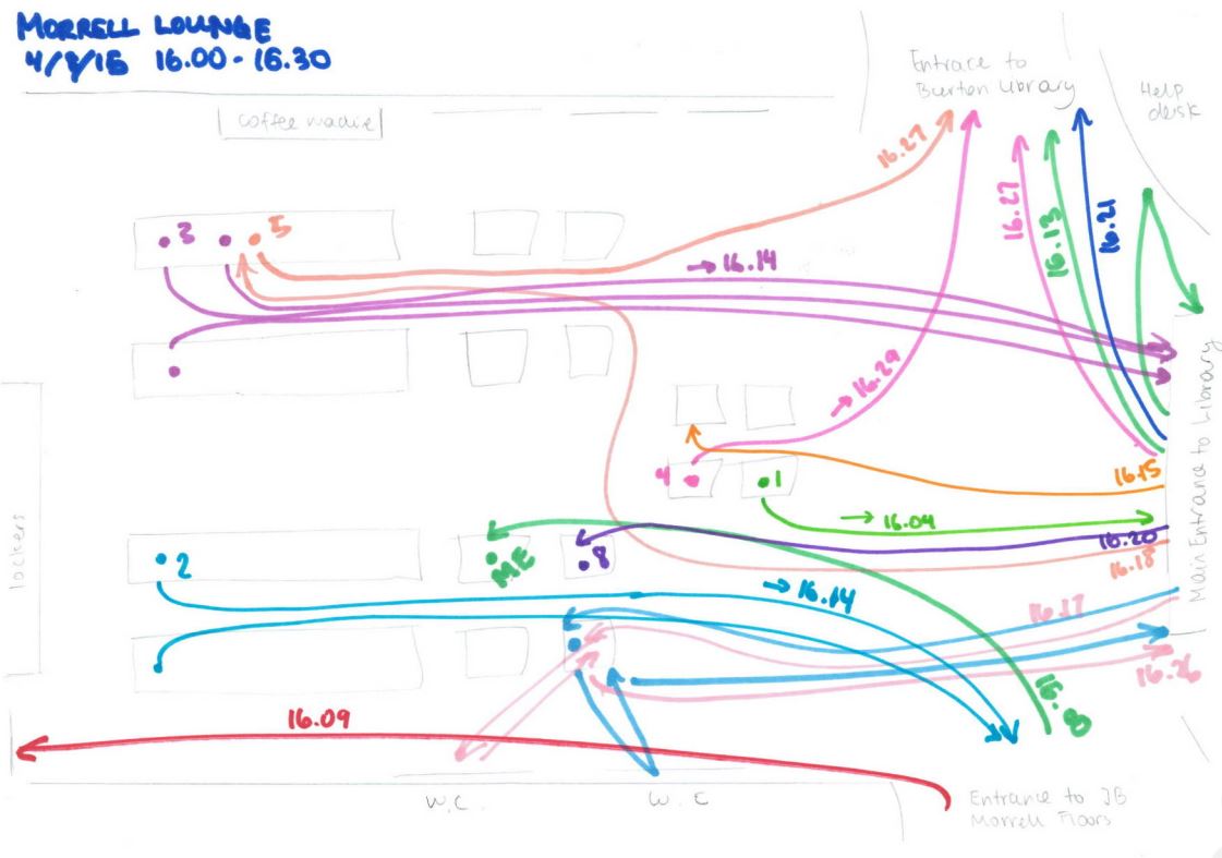
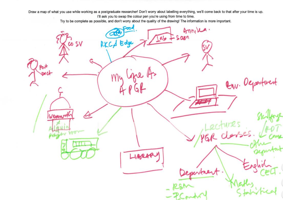
It was a great way of getting the participants to think about the areas I would end up interviewing them on, and the temporal and relational information captured in the map made it easier to pick up on each participant’s thoughts. One good example of this is how a participant placed importance on their desk: they drew it as their map’s central element early on, and branched everything off of that central element. This was reflected in their interview, where they emphasised the importance of that desk to them.

“Non-directed interviews”

Using the participant’s cognitive map as a ‘guide’, I would then conduct a non-directed interview. This involved taking an almost passive, neutral stance in everything I asked about, primarily allowing the concepts brought up on the participant’s map to direct the conversation – then, after those points had been exhausted, I would consult my own discussion guide to cover the rest of the areas of interest.

Conducting the interview in this way was initially difficult for me – it was sometimes hard to probe without being ‘aggressive’ (asking weighted questions or changing the topic), and I sometimes struggled to facilitate the conversation without suggesting topics to talk about.

There was immense value from conducting the session in this way, however. By focusing the interview on the topics participants brought up, gathered information more closely reflected the participant’s “perspective” – their habits, their opinions and their choices, mostly on what they were aware of in the discussed areas. Gathering the information in this way allowed for me to more effectively deliver insight on issues of awareness.

Love/Break Up Letters

Finally, participants were asked to write a ‘love’ or ‘break up’ letter. By asking participants to address this letter to a personified IT or library service, we hoped to draw out the emotions of participants towards those services, and easily establish positive/pain points.

My participants seemed to be very polarised by the exercise; people either really got into it, or they really didn’t. Upon reflection, the abstract nature of the exercise may have made some participants uncomfortable, especially knowing that their letters would be scrutinised. However, while I feel that while this technique didn’t work in a 1 on 1 session, there is merit to trying it out in a pop-up-desk context, or a ‘prize raffle’ format – this would allow for many responses, and for the easy identification of pain points across services.

All in all, I felt that the techniques allowed me to attain some real insight into PGRs, and despite the initial nerves, I really enjoyed conducting these sessions with participants. But while I’m singing the praises of these techniques now, back before I started my internship, my mentality for designing around users (or stakeholders in general) was one of appeasement – design a website that does what stakeholders need it to do, and fix any issues preventing its smooth use. A real ‘checklist’ oriented approach. Historically, I had followed this approach in my degree through a type of observation called ‘usability testing’, where I noted any issues users had when doing tasks that I had set.

So, heading into this internship, I had expected to do just that: more observation, make a list of issues to fix, and suggest some solutions - tick those boxes off, one by one, on the way to a “good UX”. But, throughout my internship, I realised this approach just yields a ‘passable’ user experience – you end up with something that works, but not necessarily something that’s good.

Example of Findings: Lonely Researchers

For example, one of my participants told me something that really struck me: they said that when they were based at a general desk, that they felt disconnected from their department. It was always possible to contact or visit their supervisors, or use the department testing rooms, or go out of their way to interact with their peers, but not being based alongside all of that meant that they felt ‘distant’ with their department. This changed when they were offered a desk inside their department. Besides improvements on all of those fronts, they reported feeling ‘valued’ as a member of the university because of it.

The importance of ‘department community’ - being alongside your researcher peers and supervisor so that interaction is readily possible – was prominent in my discussion with some participants. During my research, I found that while non-department PGR study spaces covered various noise levels (something participants valued), those spaces did not facilitate this kind of ‘natural interaction’ that only happens when PGRs and supervisors are all based together – and so PGRs based outside their department missed out on this.

My approach of “observation to find issues, fix issues” would not have yielded this type of insight – I would have thought along the lines of “they don’t really like the silence in this building”, suggested to change the noise level policy and called it a day. It wouldn’t have made much headway in creating a better UX for the people based outside their departments.

But, it finally dawned on me during my time with the library team at York: good UX necessitates understanding what your user values, what is important to them, and actively working with that in mind. Which worked out for me, in the end: UX is a more satisfying when it isn’t just making something that works and ticking boxes.


Header pic of the University by Paul Shields, used by permission.

Planning and delivering an Intern-led UX Library Project (Embedding ethnography Part 3)

This post originally appeared on the Lib-Innovation blog.

Last time out, as part of the Embedding Ethnography series, Emma Gray wrote about what it was like to be a UX Intern here at York, and the techniques she employed while she worked with us. Next time I'll write about what the study discovered.

If it's in any way possible to get an intern to help out with your ethnographic project I'd highly recommend it, so this post is about our process for setting the project up and working with Emma.

Here's a summary of the project:

Recruiting an intern

This was the part of the whole project we struggled most with, and were fortunate in how it worked out.

Five of our staff went to the first UXLibs Conference in 2015, and came back wanting to immediately implement some of the things we'd learned. But we all had not nearly enough day-to-day time in our roles to do any serious amount of ethnographic observation and interaction. So I submitted a proposal to a University-wide Intern scheme - but despite making it attractive as a I could, all the applicants chose to go for other Internships on offer from the University. If anyone has any tips on writing a great UX Intern job spec and advert, I'd love to hear them in a comment below...

We then got an email from the Head of HR in the Library saying a student at Durham University who lived locally wanted to work for the library over the summer, and did anyone have any suitable work? Naturally I jumped at this and sent Emma the existing job spec, she agreed it looked interesting, and she came in for an interview.

Emma Gray talks to a colleague

Emma Gray talks to a colleague

It was a very informal interview, just me and my manager and Emma without a huge list of pre-prepared questions. Emma didn't have any UX knowledge prior to coming in, but that didn't matter. As it happened she did have experience of working in a public library but that wasn't essential either. For us, the essential qualities were to show some initiative (Emma ticked this box, having found my website and read my reviews of the UXLibs conference...) and above all to be a good communicator. UX work involves a LOT of dialogue with users, so if that isn't something you enjoy it's going to be a slog... Emma was naturally communicatory so we had no doubts about offering her the role. As it turned out she was much more brilliant than we could have anticipated.

Pre-arrival set up

As Emma's manager I set about doing several things before she started at the Library:

1) Putting together a resource list on UX in Libraries to get her up to speed with an area she was unfamiliar with - I made that publicly available here

2) Putting together a document that outlined the aims of the internship so Emma would know exactly what she was working towards - I've put this on Google Drive here for anyone interested. I've not edited this from the original so there's some York-centric language - also I said 'emoji' when I meant 'emoticons' so you'll have to forgive me. Here's a preview:

Part of the Aims of the Internship document I put together for Emma

Part of the Aims of the Internship document I put together for Emma

(It's worth noting that we didn't achieve some of the aims - for example visiting Cambridge and Sheffield Hallam, or trying out group interviews.) 

Essentially the thing that made this project different to future UX projects we'd undertake is this one was at least partly about understanding UX processes as well as our actual users - so Emma was tasked with setting up a UX Toolkit for our future use 

3) Sort out all the admin stuff associated with a new member of staff - entry card, username and password, where Emma would sit, PC she'd use, access to Google Drive folders etc etc 

4) Put together a timetable for the first week or so of her employment, after which she would become more self-directed. This included inviting Emma to a number of meetings and a couple of teaching sessions, so she could go away with a more rounded impression of what life in an academic library, and particular in the Academic Liaison Team, was like. We wanted it to be as rewarding and CV-enhancing as possible for her, as well as focusing on our project.

All of this took AGES. Any work you can put in beforehand is worth it though, otherwise it quickly takes up most of your job generating work and things to do for the intern. (This is something I've heard echoed across other sectors too.) 

[Feel free to re-purpose the reading list or the aims document if they help at your own organisation.]

Planning the project

As mentioned part of the aim was to build a UX toolkit - a suite of information and resources to call upon for future projects. As such as we decided Emma would use, as far as possible, all four of the interactive ethnographic techniques we'd learned (cognitive mapping, unstructured interviews, touchtone tours, love/break-up letters) with each participant, as well as doing behavioural mapping. My explanations of how to do these are in the 'Aims of the Internship' document, or see Emma's own post her description of each of these

This meant that a) Emma could start on the behavioural mapping and general observation while we recruited participants, and b) we'd need at least an hour of each participant's time. This would in turn mean a large amount of time spend interpreting and analysing the results; as a rule of thumb UX work takes 4 hours of analysis and reporting for every 1 hour of ethnographic fieldwork - a 4:1 ratio. 

The UX Team (the five conference attendees) met to discuss what sort of thing we should focus on in the project - I found this tricky because you want to provide a framework and guidance for an intern, but also part of the spirit of UX is to let the data tell you the story and not to go in with preconceptions to, or even seeking specific answers to questions. In the end we settled on using the project to better understand Postgraduate students simply because, during the summer holidays as this was, there were many more of them around. There were various things we hoped to learn - or various aspects we hoped to learn about - but we didn't put these into the project documentation or ask Emma to focus on them (or even tell her about them); we wanted the process to be as neutral as possible. 

We agreed that the five of us would meet during Emma's 6 weeks with us to discuss progress, look at the results, steer the further direction and so on.

During the project

Once Emma arrived and worked her way through the reading list, we started with observation and behavioural mapping. Observation is a great way for an intern to settle in because it's a relatively low pressure environment - it's a break from ingesting huge chunks of written information and a chance to be in your own head-space, and actually DOING ethnography where the stakes are much lower if you're not familiar with it yet. Not being sure about how to label a map of someone's path through the lobby is less intimidating than not being sure how to ask someone to write love-letter to a library service! 

The biggest problem we had was recruitment. We put requests for participants on social media, e.g.

.. and we put similar info on a giant whiteboard in the Postgraduate Lounge area. We also approached people face to face and left them with info about the project and Emma's contact details. All in all these approaches yielded just three participants.

So all the Academic Liaison Librarians emailed their PostGrad cohorts via Departmental administrators: this was much more successful and yielded lots of emails to Emma, most of whom went on to book appointments with her. 23 people in total were recruited this way. The students were a mixture of PGTs and PGRs, from a variety of Departments and a variety of nationalities.

As it happened this project would conform to the 4:1 analysis to field work ratio almost EXACTLY: Emma was with us for 125 hours in total, and engaged with 26 participants in that time for around an hour each, spending the other 99 hours doing everything else: analysing, interpreting, transcribing, and writing up (and getting to grips with UX in the first place). It must be said that Emma was an incredibly proficient transcriber, having done this kind of work before: for mere mortals (me, for instance) the 4:1 ratio would not be remotely possible with transcription included, and in fact transcription itself often comes with a 4:1 ratio of its own, before you even get as far as analysis.

In general we consider ourselves incredibly lucky to have got Emma as our first ever UX intern: she was extremely bright and showed a great deal of initiative and confidence, as well as working extremely hard. She produced a brilliant report detailing her experiences across the 26 participants, with the findings clustered around the areas of: study space, noise levels, the catalogue, the library building, and facilities. We learned more about those 26 students than we'd ever learned about any students before.

Working with an intern is a brilliant way to free up enough time to actually start the process of UX and ethnography, although it still takes existing staff time to manage the project.

Michelle Blake is going to blog about the results of this and the next UX project we did; I'll add a link here when this is online.

The next post on here in this series will be another guest slot from an Intern, Oliver Ramirez, so undertook our second UX project at York.

Ask yourselves, libraries: are surveys a bit bobbins?

We all agree we need data on the needs and wants of our users.

We all agree that asking our users what they want and need has traditionally been a good way of finding that out.

But do we all agree surveys really work? Are they really getting the job done - providing us with the info we need to make changes to our services?

Personally I wouldn't do away with surveys entirely, but I would like to see their level of importance downgraded and the way they're often administered changed. Because I know what it's like to fill in a survey, especially the larger ones. Sometimes you just tick boxes without really thinking too much about it. Sometimes you tell people what they want to hear.  Sometimes you can't get all the way through it. Sometimes by the end you're just clicking answers so you can leave the survey.

I made this. CC-BY.

I made this. CC-BY.

How can we de-bobbins* our surveys? Let me know below. Here are some ideas for starters:

  1. Have a very clear goal of what the survey is helping to achieve before it is launched. What's the objective here? ('It's the time of year we do the survey' does not count as an objective)
     
  2. Spend as much time interpretting and analysing and ACTING ON the results as we do formatting, preparing and promoting the survey (ideally, more time)
     
  3. Acknowledge that surveys don't tell the whole story, and then do something about it. Use surveys for the big picture, and use UX techniques to zoom in on the details. It doesn't have to be pointless data. We can collect meaningful, insightful data.
     
  4. Run them less frequently. LibQual every 2 years max, anyone?
     
  5. Only ever ask questions that give answers you can act on
     
  6. Run smaller surveys more frequently rather than large surveys annually: 3 questions a month, with FOCUS on one theme per month, that allows you to tweak the user experience based on what you learn
     
  7. Speak the language of the user. Avoid confusion by referring to our stuff in the terms our users refer to our stuff
     
  8. [**MANAGEMENT-SPEAK KLAXON**] Complete the feedback loop. When you make changes based on what you learn, tell people you've done it. People need to know their investment of time in the survey is worth it.

Any more?


*International readers! Bobbins is a UK term for 'not very good'.