I'm a little bit obsessed with nice fonts - I love how they can impact on design and help tell your story. An aspect of design which is often undervalued is the combinations of fonts: pairing up fonts (or sometimes mixing groups of three fonts, ideally not more than three in one design) for posters, or social media campaigns, or PowerPoint presentations.
I've just found a great site called Type Genius that helps out with choosing fonts, more on which below.
Here are four font combinations I like, three of which I've used, and all the fonts for which can be downloaded individually from Fontsquirrel:

BEBAS NUEUE AND MONTSERRAT
The first combination is what is used for the blog and much of the rest of site. The blog title is Bebas Nueue and the body text is Monstserrat. (Whenever I use Heading 2 in the formatting that's also Montserrat, but in all-caps - the Heading 3 used in this post os back to Bebas Nueue again). I chose them mainly because when I rejigged the design of the site recently I wanted a thicker body text font, so chose Montserrat which I've been using since I saw Matthew Reidsma use it for his UXLibs I keynote. Bebas compliments it for titles because it a tall and narrow font in contrast with Montserrat being thick and more rounded.
LATO AND ROBOTO SLAB
The second combination I've not used at the time of writing, but got from Type Genius - which you can find at typegenius.com. You tell it what font you want to use, and it gives you a number of potential companions to pair with it (as it happens when you put in Montserrat it suggests Bebas Nueue, as used on this site).
In the case of Lato and Roboto Slab, I've actually not used the Regular Lato in the example above at all - I used Lato Thin for the first part and Lato Heavy for 'titles'. I do like the contrast of light and heavy.
RALEWAY AND... RALEWAY
Which brings us to the third combination, which isn't technically a pair as it's just Raleway used in three different ways. I love Raleway beyond all other fonts. As long as you have both Raleway Regular and Raleway Bold installed (although PowerPoint will try and Bold non-standard fonts when you highlight them and click the Bold button, it's not the same as actually installing the Bold version that the typographers intended) they work so beautifully together, especially in all caps. The intro to UX presentation I blogged about recently used Raleway in all possible combinations (Regular and Bold in both lower and upper case) with no other fonts involved:
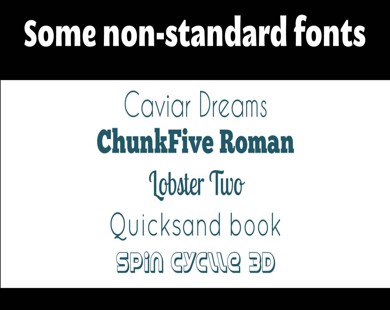
The other joy of Raleway is it renders perfectly on Slideshare. Some other fonts, even when you save and upload your presentations as a PDF, go a bit blocky on Slideshare, for example my LIANZA Marketing Manifesto slides, which use Raleway along with ChunkFive Roman - the latter looked great at the conference but not so good on Slideshare, but Raleway was perfect in both situations.
MATHLETE BULKY AND CAVIAR DREAMS
I used this combination for my Tuning Out The White Noise presentation which became the most popular thing I've ever put on Slideshare (despite Mathlete Bulky not rendering properely on the site) and I use it in some of my training materials, so I've become slightly bored with it due to over-exposure! I also over-used Mathlete and have since changed it round so it gets much less use in my slides, because it's a little too quirky for any kind of long-term reading. I like the way it looks but usability has to come first.
Further reading
For more info and guidance on font-pairing, check out this article from CreativeBloq, and Canva's Ultimate Guide to font-pairing.
If you have a particular pairing you'd recommend I'd love to hear it in a comment below.