slides

An Alternative to Seth Godin's 5 Rules to create amazing PowerPoint Presentations


Seth Godin is a very influential man, and his views on PowerPoint carry a lot of weight. He wrote a famous post a while back (1.5k Facebook shares, a gazillion tweets about it etc) on creating amazing presentations - you can read it here. I agree with lots of it completely, but I'm not totally on board with the five rules at the end.

My take on Seth's rules

My take on Seth's rules

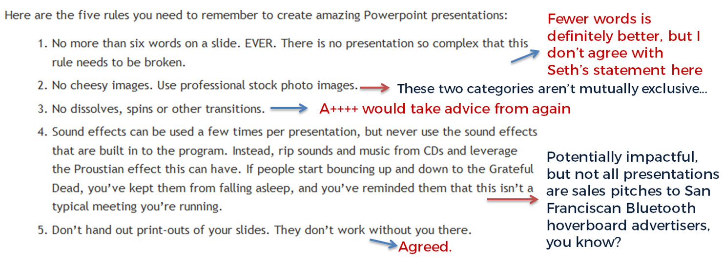
No more than six words on a slide. EVER. There is no presentation so complex that this rule needs to be broken. To me this seems too arbitrary. Fewer words is without doubt better than more words when it comes to slides - they're presentation tools not written documents. But six? As the maximum ever? Unless that's based on research that shows seven or more words reduces the effectiveness of your PowerPoint, why limit yourself in such an extreme way? I'd say one or two sentences to ensure brevity but allow yourself a little flexibility in conveying meaning and nuance.

No cheesy images. Use professional stock photo images. First of all there are plenty of cheesy professional stock photos! Authenticity is key. The trick is to find images which look like the camera has happened upon a real scene - lots of pro stock images show impossibly perfect people laughing flirtatiously over a blank iPad, I mean come on. I find Pixabay and Unsplash have enough for most presentations I make, plus someone introduced me to Pexels the other day which looks good, and they're all free - both of copyright and financial cost. The professional stock photo sites cost a fortune to use - why use them when so many great (legal) images can be found for free?

No dissolves, spins or other transitions. Yup. No argument here. If it's extraneous to your story, all you're doing is reducing the impact of your message.

Sound effects can be used a few times per presentation, but never use the sound effects that are built in to the program. Instead, rip sounds and music from CDs and leverage the Proustian effect this can have. If people start bouncing up and down to the Grateful Dead, you’ve kept them from falling asleep, and you’ve reminded them that this isn’t a typical meeting you’re running. I like the idea about using music etc but it really needs a certain type of high energy presentation performance to pull this off. It's not for everybody (I couldn't do it). It's hard to think of a rule around sound that is absolute; it all depends on your audience, and some of them way think the use of music is a little distracting, whatever your music taste... From what I understand about the Proustian effect it's a very personal thing; I'm not sure a presenter could expect to cause or induce it for a room full of people. 

Don’t hand out print-outs of your slides. They don’t work without you there. I agree with this. But I wouldn't put it in my top 5...

Header pic is a CC-BY image by Betsyweber - clcik to view original on Flickr.

Header pic is a CC-BY image by Betsyweber - clcik to view original on Flickr.


My own top 5 rules for creating effective PowerPoint slides

So what would I put in my top 5 rules for creating amazing PowerPoint presentations? I can answer that question because the intro to my full-day Presentation Skills training is built around five golden rules, based on existing research into what makes for an effective presentations - and that's the aim here, to build something which works. 'Amazing' is no good on its own; you need people to remember your key messages, not just how great a presenter you were.

Here we go:

  1. Keep it simple. Slides don't need to be flash - get rid of anything that doesn't tell your specific story, and leave behind something which supports and reinforces what you're saying out loud, and prompts you as to what to say next.
  2. No more bullets. Bullet points ruin slides. They're fine for documents, but you're not making a document in PowerPoint. As well as being symptomatic of a general Death By PowerPoint malaise, they make people less likely to agree with, understand and remember your presentation. Oh and they like you less when you use them. That's enough of a reason to never use them, surely?
  3. Make one point per slide. Make your point, allow your audience to digest it, then move on together in sync with them. Several points on a slide inevitably result in your audience moving at a different pace to you, because they can only listen and read for a few short seconds. Why be in conflict with your presentation materials when you don't have to? Give each key message room to breathe.
  4. Big fresh fonts. Font size 24 is the absolute minimum you should ever use in slides. If you need more you're trying to fit too much on one slide. Either ditch some text or cascade it across two slides. Non-standard fonts (which is to say, fonts which don't appear in the Office Suite) can, if chosen carefully, increase the impact of your presentation. Typography is underrated.
  5. More images, less text. Too much text stops slides working. Relevant images help people learn. Make the most of your opportunity with each new PowerPoint you make!

6 useful things Prezi can do (which even experienced users miss)

I keep discovering new things about the presentation software Prezi. Asking around, it seems lots of other users didn't know about some or all of these either, so with that in mind I thought I'd draw your attention to 6 useful things. Got any more? Leave them in a comment...

1. Upgrade to the educational licence for free if you are a student or work for a University

All you need to do is go to Upgrade on the Prezi site, and stick in your university email address (.edu or .ac.uk etc). As a result of the upgrade you get more storage space (quite useful), the ability to substitute the Prezi logo for one of your own (could be useful for institutional branding of Prezis) and the ability to keep Prezis private (very useful, particularly from a teaching point of view - you don't want students to see the presentation until it's ready!). Well worth doing, I think.

The upgrade box is at the bottom of the screen

2. Hold down shift when drawing frames and hidden frames to maintain a perfect 4:3 aspect ratio (trust me, this one is REALLY useful!)

This is completely brilliant. I use LOADS of hidden frames in my Prezis, to ensure the viewer is shown exactly what I want them to see in the order I want them to see it. However, when you draw a frame or hidden frame which isn't the (usually 4:3) aspect ratio you're using to present - in other words, when the frame isn't the same shape & proportions as a monitor or projector screen - then other stuff can creep into the frame and slightly ruin all the careful planning.

By pressing shift before drawing a frame, it keeps a perfect 4:3 aspect ratio as you draw it - moving the mouse simply increases or decreases the size, but the shape stays the same. You can in effect create several screens, and populate the screens with content knowing that everything will fit perfectly when you're presenting or when people are viewing the presentation online. I used this technique loads in the new technologies Prezi and the branding Prezi I recently created. The result is: better looking, more cohesive prezis.

An example of hidden frames using 4:3 aspect ratio

3. Save your Prezi to a USB stick

I realise most of you will know this one, but I wrongly assumed it was an 'upgraded licence only' option for ages, so thought I'd flag it up here. It's very much worth doing because a: you aren't relying on an internet connection, b: if you've got embedded YouTube videos (and there is an internet connection) they'll still play and c: it enables you to use a clicker to move the presentation along without having to stand by the PC and use a mouse or the keyboard - you can't use a clicker with a web-based Prezi, for some reason.

When you click 'download' you get a ZIP file - you can extract the ZIP to a USB stick but make sure you take all the files and folders with you, as you need all of them to play the Prezi back. You can't edit it on the stick, so make sure it's your final version before you download it.

Screengrab showing the download button

4. Print your Prezi in an actually quite useful way

Pressing 'print' in edit mode saves the Prezi to a PDF - each page of the PDF is a 'screen' on Prezi (i.e each number on your path becomes a printed screenshot). Again, I'd not previously realised this worked so neatly. It means that, for example, for teaching, you could set a simplified path on your presentation, press print to produce a handout of a reasonable length, then put the path back to the full route again. Also, it's the ultimate back-up - if you can't present your Prezi for some disastrous reason, you can present with the PDF instead.

Screengrab showing the print-preview

5. Import a PowerPoint presentation directly into Prezi

The easiest way to get started with Prezi is probably to import a PPT and mess around with that. If you have slides you wish to convert, just click Insert > PowerPoint and import them onto the canvas - you can choose all or some of the slides, and have Prezi automatically add a path between them if you like. You can edit the text within Prezi - it's not like importing a PDF where you're stuck with what you have.

I'm not sure there's much point in just pulling in some slides and leaving it at that, but it's a nice jumping-off point to creating something more interesting - and it's a lot quicker than typing all the info from your slides in by hand. Quick tip: the more straightforward the slide, the better this works - it struggles with more complicated stuff.

Screengrab showing import slides

6. Choose from more than just 3 colours for your fonts

It used to be the case that you chose your theme, then stuck with the three colours you were given. Now you can change any passage of text to one of a huge number of colour choices - type it first, then the options appear above it on the right.

Picture showing colour highlighting

I hope some or all of these are useful.

A newly updated Ultimate Prezi Guide is here (refreshed in May 2013), and all sorts of related materials are available here.

- thewikiman

Buy India a Library illustrates the power of social media once again

Last month I wrote a blog post outlining the Buy India a Library project, and calling for donations. We wanted to raise, in an ideal world, £1,350 - enough, remarkably, to build a library in a book-free zone in India, AND to build a donkey-drawn mobile library that would travel around Africa. This month we will hand over the unbelievable £2,420 we raised in just two weeks, to the charity that administers the donations.  If you're time poor, you can just have a look at the slides below to learn a bit more about it - and thank you if you got involved!

I seem to be genetically programmed to try and break-down things I've used / done / been involved with / learned about, and repackage them for consumption by the wider community - so if you're less time-poor, read on below the slides for some of the stuff I learned from the experience, about using social media for a campaign like this.

The power of social media, writ large

A lot of people talk about the power of social media, and it can tend to polarise people - either you get really put off by all the fuss, or you become a social media evangalist yourself. For me, this was conclusive proof of the power of social media, as it was the mechanism by which we could communicate with people, and draw together a community of librarians (and non-librarians) who wanted to get involved. Crowd-sourcing was made easy by Twitter, and our conversation reached people none of us had previously connected with.

Aaron Tay has written in detail about four recent campaigns for libraries (including Buyalib) that use Social Media.

Working together

It was great working with Justin, Andromeda and Jan (and huge thanks to Andromeda for suggesting we do this at all). All of us brought something to the table that made the foursome a really strong unit. Not 'more than the sum of our parts' as such, it's just that the sum of our parts was a lot more than any of us on our own (obviously). I'm not sure it would be possible to have done this invidually, and why would you want to? Collaboration is ace.

We didn't use any particuarly advanced communication methods, by the way - just emails (lots of 'em!), Twitter DMs, and a Google Docs spreadsheet. Plus of course a Wordpress.com blog which we all had access to.

If you're planning something similar...

I wish I had some peircing insights into what we did, or top tips about what unique things we employed to get it done - but I don't! We just tried it, made it as we went along, and it worked. But a couple of things that I noticed along the way:

  • There is huge momentum for this kind of thing initially - you need to capatalise on this before people get bored! Lots of people got excited about the idea, and RT'd, and donated - but after a few days that momentum had ebbed away and I was worrying we were starting to annoy people by constantly tweeting links and demanding their money. So I'd say, for a campaign like this, don't launch until you're completely ready - you need to be around to really push it when you do launch and make the most of the initial good-will.
  • Mix up the information you provide. We had a lot of info and things to say about the project from the get-go, but we aggregated it in several blog posts over time. You need new things to say, new angles to come from when you blog about it - otherwise it's just 'we've made X, please give us more!' every time, and people won't keep reading.
  • It was a Twitter campaign, but moving it off Twitter got results too. We pitched buyalib as a 'let's crowd-source the money to build a library, to build a library' type campaign, but obviously Twitter is a bit of a bubble. After a while, everyone who is going to donate has seen your tweets. Looking at the timings and frequency of donations, it's clear that when people blogged about the campaign this provoked a surge in donations. This is probably for a number of reasons - first and foremost you're bound to be reaching people who aren't on twitter but who do read blogs. Secondly when the blog posts weren't written by members of the Buyalib team on their own blogs (ie other Info Pros felt moved to blog about the campaign) the argument was more powerful. These bloggers were, in effect,  champions of the cause, disseminating information about it - rather than people directly associated with the cause, promoting it. That gets round the 'well of course they think it's a good idea!' issue that comes with blogging about your own projects. The power of word-of-mouth is not to be under-estimated. Thirdly, a blog post can explain something in a lot more detail than a tweet. The maximum most tweets about buyalib could be was an invatation to click a link and read more - that only works on people who are willing (and have the time) to click the links and engage. With a blog post, the reader has already made the commitment to read it, and all the information is right there with no further action required on their part. It's only a little thing, but we do live in a world of information overload - people don't have time to click all the links they see.
  • People really want regular updates! They really, really do. Even if you have nothing much new to add, you need to blog or otherwise provide updates on the total raised, because people have an emotional investment (as well as a financial investment) in the whole process - they don't want to just donate and feel like that's the end of it, they want to follow the whole thing through.
  • Thanking people takes a long time... Make sure you leave a good chunk of time to assemble and collate all the donors so you can get in touch to thank them. It takes a while (we had 100 people donate), but it's a vital step. I only just finished thanking all the people I personally knew (or knew via social media) - sorry it took me so long!
  • A good hashtag goes a long way. No evidence for this one - I just get the feeling that the ease of writing, saying and understanding #buyalib as a hashtag helped the campaign. As everyone knows you only have 140 characters to play with on Twitter - using too many of those up on a hashtag is a cardinal sin, as it inhibits peoples' ability to discuss it. But then also a cardinal sin is having a hashtag which means nothing to anyone. I think #buyalib worked well - better than #buildanIndianlibrary, or whatever, might have done. .

Thanks again to all who got involved! And if you're just reading about this now and wish you could have donated, I'm afraid we've closed the campaign now but you could always go direct to GoodGifts.org and buy a library of your own.

In the meantime, stay tuned to the Buy India a Library blog because when we get updates on building progress etc, we'll stick 'em up on there!

- thewikiman