Twitter Analytics

Two More Twitter Changes: Group DMs and In-Tweet Analytics

Following on from my post on the excellent new Twitter video, there's a couple of other things Twitter have introduced in the last couple of weeks.

The first is group Direct Messaging, where you can set up a group of people (up to 20) and privately message them collectively. The conversations can include pictures and be about specific tweets. This is potentially very useful for taking a problematic conversation or dispute out of the public eye but staying within the platform. From the point of view of libraries, that's great. From the point of view of librarianship, I'm not so sure.

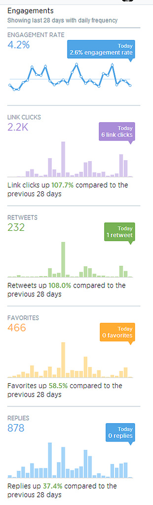
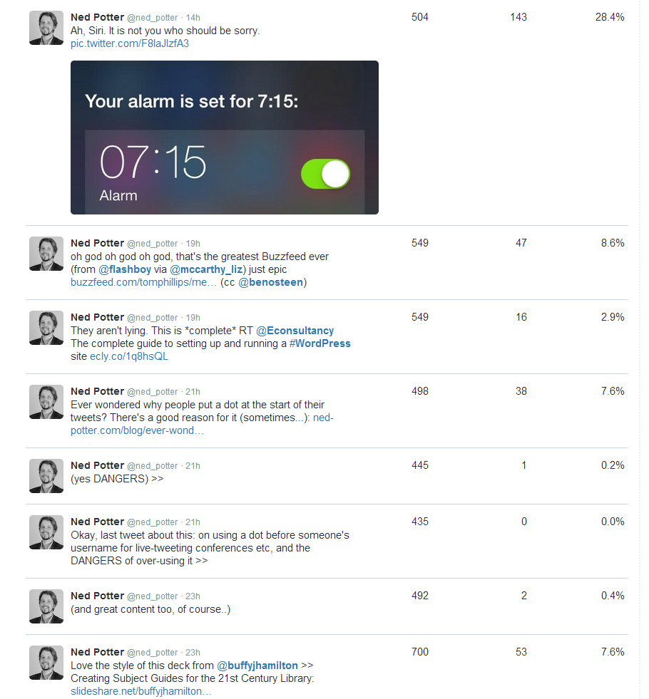
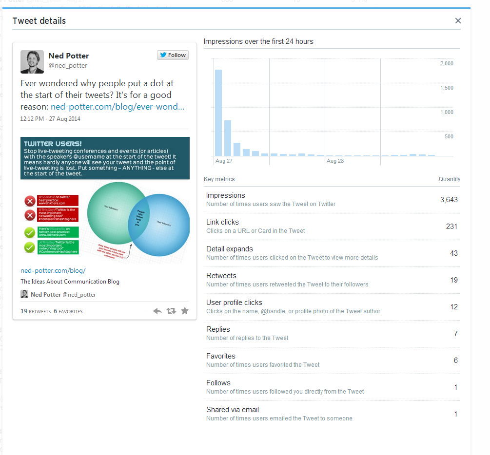
The second feature is and tweet-by-tweet analytics within the mobile app. I mentioned in my previous post about Twitter's new Analytics how what the stats really show you is how few of your followers see each tweet (it's around 11%, and that's assuming it's not part of a conversation or at a weird time of day in which case it's much less, or if it's RT'd in which case it's a bit more). The ability to click on each tweet in the mobile and app and see the stats right away just reinforces this - here's a tweet linking to my last post, which got ReTweeted 21 times, and was still only seen by a number of people which amounts to just over half the total number of followers I have.

Twitter11.PNG

I'm not totally convinced the link clicks figure is accurate though - not just because it seems really low! But because it doesn't correspond with my website's own statistics or Google Analytics, which attributes a lot more click-throughs to this particular tweet.

But the total number of impressions I do trust. So what do we take from this as libraries? If something's important, you have to tweet it more than once! And it's also worth tweeting at the peak times for when your followers are online - this is usually around 11am and 3pm, but you can find out more specifically using Tweriod, which I'd recommend you do.

[Edit: Since I wrote that I checked Tweriod and it seems to have gone to a paid-only service, which is a real shame - FollowerWonk should tell you when your followers are most active though, so use that instead.)

Twitter Analytics is now free for all: so what can libraries get out of it?


Twitter stats packages are sort of fascinating but also not. I look at a fair few because I need to be able to talk about them in social media workshops: what tends to happen is I put my username in, go 'ooooh that's interesting!' a few times, but then never actually go back and check the analysis on a second occasion.

As individuals we don't really need Twitter stats apps (unless you take Twitter very seriously) but as organisations they can be genuinely useful. They can help us understand our network, show us what works (so we can build on it) and what doesn't (so we can phase it out).

For an analysis package to be useful to an organisation it really needs three qualities:

  1. It must give you information you can ACT on. There are a million stats apps out there, but if they don't tell you anything which you can use to inform better practice for your twitter account, then they don't really have any value.
  2. It must NOT tweet things about that information on your behalf. Some apps tell you useful things - but they tell the rest of the world those useful things too. I'm dubious about this at the best of times (for me an auto-tweet saying "This week on Twitter: X follows / unfollows, Y ReTweets and Z total reach!" either looks a bit awkward if X, Y and Z are small numbers, and a bit show-boaty if they're large) but I really don't think organisational accounts should have anything tweeted on their behalf.
  3. It ideally needs to be free. Some things are worth paying for but realistically it's hard to get the people who control the purse-strings in libraries to shell-out for a Twitter stats annual subscription...

Thankfully the official Twitter Analytics, newly available for all, meets all three of those criteria. If you just tweet as yourself, sign in to analytics.twitter.com and have a look a round at the things worth noting; it's interesting to see how few of your followers actually see your tweets, for example.

If you tweet as an organisation or group, Analytics is definitely worth your time. But it's quite overwhelming at first as there's a LOT of information there - so here's a guide to what to look out for.

Twitter Analytics: What You Can Learn, and What You Might Do

We'll look at the two main tabs in turn.

The Tweets Tab is potentially the most useful thing the tool offers, because it deals with follower engagement, which is the most important metric (much more so than number of followers). It shows you how many people see your tweets - not that many; only just over 10% of my followers see each of mine, on average - and how much engagement you're getting over time in terms of people replying, RT'ing, and so on.

So, dissecting the screen (I'm using my own account as an example as I don't run my Library's account anymore, but as I say the notes and advice are aimed at organisations using Twitter) one area at a time:

Tweet Impressions

'Impressions' basically means views. So in other words, the figures aren't the total number of people who've seen your tweets, they're the total number of times the tweets have been seen.

Things to note here are the spike on August 14th, and the big drops at weekends.

Things to note here are the spike on August 14th, and the big drops at weekends.

What can you learn? Most days your tweets will have a similar number of impressions – some days that’ll be much higher. Why was it higher that day? Was it simply that someone with a huge amount of followers RT’d you? Or was it that you posted a particular type of content which struck a chord with people?

Clearly there are far fewer impressions at the weekend – is it worth scheduling some tweets to maintain a more consistent level of service?

The overall number of impressions is only really meaningful if you know how many times you tweeted - if you tweet 15% more and get 15% more impressions, then clearly you're maintaining the status quo rather than having a particularly successful month. Twitter Analytics doesn't (currently) give you your tweets totals, so use an app like SumAll to find that out, and cross-reference the two.

What might you do? Go back and look at your tweets from your most successful day, find out what you did differently, and aim to repeat and build on it. Also if the overall impressions for the month are up significantly on the month before, identify why and try and do more of the same. If you feel it's worth scheduling tweets to cover the weekend, a social media dashboard like Hootsuite can do this for you.


Engagements

This shows you the main actions people have taken based on your tweets over the last month, and compares it with the previous month.

This is useful for measuring campaigns

This is useful for measuring campaigns

Ultimately if you're using social media for communication and marketing, you want people to take actions, it's vital.

1000 Facebook friends who act and feel the same regarding the Library as they did before they joined your Facebook network, are of far less value than just 50 Facebook friends who actually modify their behaviour as a result of becoming part of your network. They might use the Library more, for example, or tell their friends about how great it is, because they're connected with you on social media. So, this part of the screen is really worth your attention.

What you can learn: Although looking at these graphs and seeing if you're doing better or worse than the month before is interesting in itself, I think the real value of this metric is to measure a campaign. It can tell you whether your specific audience responds well, or indifferently, to certain types of content and output.

For example, if you're spending a month promoting a new electronic resource at a business library, or inducting freshers at an academic library, or crowd-sourcing tips and advice at a public library, you can see how much engagement this results in compared with your normal patterns of tweeting.

What you might do: If the campaign is successful, run similar things again. Over time you should build up a picture of what your network likes and what it doesn't, which you can use as a platform to develop a more engaging social media presence. If I was an organisation I'd look at the graph on the left and think, okay, replies and favourites were up significantly, which is good, but RTs and link-clicks more than doubled - so what did I do to cause that? Whatever it was it's worth trying to repeat in future - if people are clicking links, preferably through to other content of yours such as your Library website, then social media is doing its job fantastically well for your organsiation.

The other thing this section, and indeed the Followers graph described below and the whole analytics package generally, is *reporting*. It's so great to be able to have figures to hand when reporting on your library's social media programmes, or justifying putting time into it, or looking to expand. Instead of telling your boss 'We've got some great engagement, people really seem to like our twitter account' you're able to say things like 'In the last 6 months our network has grown by 40%, and on average we get over 1,000 interactions on the platform per month - equivalent to a fairly busy Enquiries Desk in the physical Library'. Or whatever you want to say.

You can use the statistics to tell meaningful stories.


Tweet by Tweet impressions and engagements

I wish the columns of this one were sortable, because then you'd be able to instantly identify specific tweets which resulted in the most actions being taken. As it is you can glance down the list and see your most recent tweets and how they've been received - Impressions is how many people saw the tweet, Engagements is how many people interacted with it (not just RTs, replies and favourites, but clicking on hashtags, images, your username etc), and the Engagement Rate is the latter divided by the former.

The first number is Impressions, the second is Engagements, the third is Engagement Rate

The first number is Impressions, the second is Engagements, the third is Engagement Rate

What you can learn: Well the screengrab above appears to show that my network is a lot more interested in clicking on a link to Buzzfeed list of 'Medieval Beasts That Cannot Even Handle It Right Now' then they are in clicking on a link to a Wordpress guide! Which is entirely fair enough. Essentially this metric gives you an insight into what people react to. The engament rate is absolutely key to understanding what your network values - it could be that a tweet has 50,000 impressions if it gets ReTweeted by Stephen Fry, for example, which would distort the number of engagements to a massive figure. But it's the engagement divided by the impressions that gives you a true picture of what people care about, rather than just how many people happened to see it. Does that make sense?

What you might do: It's the same as above - identify what your audience responds to and do it more, basically. It works the other way too - it's not in the screenshot above but a little further down in my stats I saw a tweet that only got 93 impressions. This is because I tweeted at 5:10pm, and the largest percentage of my followers are from the UK, and everyone is either winding down or on the way home by then. So don't tweet anything important during commuting time. But you knew all that already.


Individual Tweet Analysis

An extension of the tweet-by-tweet covered above, this allows you to really drill down and see EXACTLY how people responded to each tweet.

People would have needed to click 'Detail expands' to see the picture properly.

People would have needed to click 'Detail expands' to see the picture properly.

What you can learn: This shows you exactly what people DO when your tweet appears in their timeline, either because they follow you or because they follow someone who ReTweeted you. The 'Follows' stat is interesting - it's not been possible before to see so explicitly when a specific tweet causes someone to take the plunge and hit the follow button, nor how many people are emailing your tweets to non-twitter users.

What you might do: Honestly I think you'd need to be in a full-time Comms role to get any real use out of this level of detail - there's simply too many tweets to spend time analysing each one. One thing I do find interesting is the number of people clicking links, even in quite popular tweets that get a lot of RTs - it's relatively low as a percentage.

Something I've been trying to do since restarting this blog after a hiatus for much of 2014 is to include an image in the tweet linking to my post, which tells as much of the story of that post as possible. This means people don't HAVE to click the link to get the (hopefully!) useful piece of information. So my tweet about the BuzzFeed Libraries had the actual BuzzFeed mock-up added as an image to the tweet (not a good example of useful information, admittedly!), and my tweet about revoking access to twitter apps you don't need had the little poster that I'd made used in the same way. (I also then put these in the blogposts themselves, as not everyone finds my blog via Twitter.)

If you use Twitter Cards (more on this another time) they seem to automatically take the image from the blogpost and use it in the tweet, which I've only discovered recently - so in the example above, I've just added a link to my post in the tweet, and the Twitter Card has put in the main image from the post - again, meaning people can get the info there and then without having to leave Twitter and read it on here.


The Followers Tab

This is slightly less important but still useful. It shows you how your followership changes over time, and gives you a bit of info about demographics. Everything on this tab can fit into one screenshot:

I can highly recommend NOT using Internet Explorer to view this page, as it bafflingly uses as sort of 'Ancient Manuscript' font which makes the figures completely unreadable...

I can highly recommend NOT using Internet Explorer to view this page, as it bafflingly uses as sort of 'Ancient Manuscript' font which makes the figures completely unreadable...

What you can you learn: Perhaps the most useful aspect of this would be to see weeks or months where your number of followers changes dramatically. I can't stress enough how I don't think number of followers is a metric you should worry too much about (level of engagement is worth so much more) - but generally when I've run campaigns on our Library Twitter account, concerted efforts to engage the network, word has spread and the number of followers has gone up more than it would normally, and that is a good thing. (My own graph above is pretty regular so doesn't really tell you anything, except I obviously annoyed some people in July 2013 because it went down!) So if there's a drop, a leveling out, or a spike, you can look back at your tweets from the period and try and identity the cause.

If anyone can think of a use for the Interests part of the screen then please let me know in the comments - I'm stuck for how we could meaningfully use this. Gender is potentially interesting - if your Library is attracting an unusually large amount of one gender versus another, you could seek to address that. Your followers also follow is interesting in passing - keep in mind that a larger proportion of your network will view conversations between you and the people who feature highly in this list, for reasons discussed in last week's post. See also the UPDATE section at the bottom of the post for a great idea (from Imperial) on how to use this section.

Location is definitely worth noting, for reasons of time-zone. I have around 1500 followers from North America, so realistically anything I tweet before lunchtime is not going to reach them.

What you might do: The most obvious thing is to identify what went right (or wrong) when your number of followers changed dramatically, and either seek to emulate it or stop doing it accordingly. The other thing you can do is adapt when you tweet to suit a global audience - either by saving key information until, for example, 3pm UK time if you're a UK tweeter, so you get the most audience for it (Tweriod can help with this, it tells you when your followers are online), or by scheduling tweets for late night if that suits your overseas followers.


The Twitter Cards Tab I'm struggling to make much sense of at first glance. I do use Twitter Cards and I'm going to write a post about them at some point, so will revisit it then.

One final piece of advice - most of the info in Analytics is displayed on a month by month basis - so take print screens! To build up a picture over time you need to be able to compare the data. So put a reminder in your calendar for the first of each month: Screengrab My Twitter Stats.

That's a lot of information, has anyone made it to the end..? If so what do you think, is (are) Twitter Analytics potentially useful to you?


UPDATE FOR ACADEMIC LIBRARIES: I really like this idea from Imperial Library:

So basically by looking at how many of your followers ALSO follow your Student's Union, or your overall University's Twitter account, you can see approximately how much of your network is actually your target audience. Of course there's lots of good reasons for including, for example, other libraries and librarians as part of your target audience - but your PRIMARY group are people who use your Library, and that will not be everyone who follows you on Twitter. A proviso is that there will of course be students and staff who follow you and not the overall University account, but still it's a useful exercise.