My final post about the UXLibs Conference (see all five posts in one place, here) is about the pitch. It's also about the concept we came up with for the pitch, which I think is a genuinely useful idea...
At UXLibs we were all split into teams. Across the three days we had a specific aim:
Create a product, concept, or service that you could implement which increases awareness and use of library resources and services. Your proposal could solve a specific problem, offer an alternative approach, meet an unmet need, or completely re-imagine an existing service.
On the final day, we had to pitch our idea, Apprentice / Dragon's Den style, to Lord Priestner and his assistants
I was in Team Space Grey. Everyone was lovely. We initially found things hard going, ethnography-wise, because the library we'd been assigned simply didn't have any problems which needed solving. Our field work was showing happy students in a well used building. But when we did the 6-8-5 process of ideation, it all came together really well and there was a clear idea of what we should focus on, which was arrived at with everyone able to contribute and have their voice heard.
In short, if I've understood it right, the 6-8-5 method involves a bunch of people (in our case there were 9 of us) having 5 minutes to each write 6 to 8 post-it notes with an idea on each one. So between us we had around 60 post-its after 5 minutes, which we talked through and then sorted into themes. Then you have another 5 minutes to do the same again, either honing existing ideas other people have mentioned, or your own, or creating something new based on the discussion. Eventually patterns emerge and a common-ground idea rises to the top.
Here are a bunch of our post-its, which we then arranged into themes:
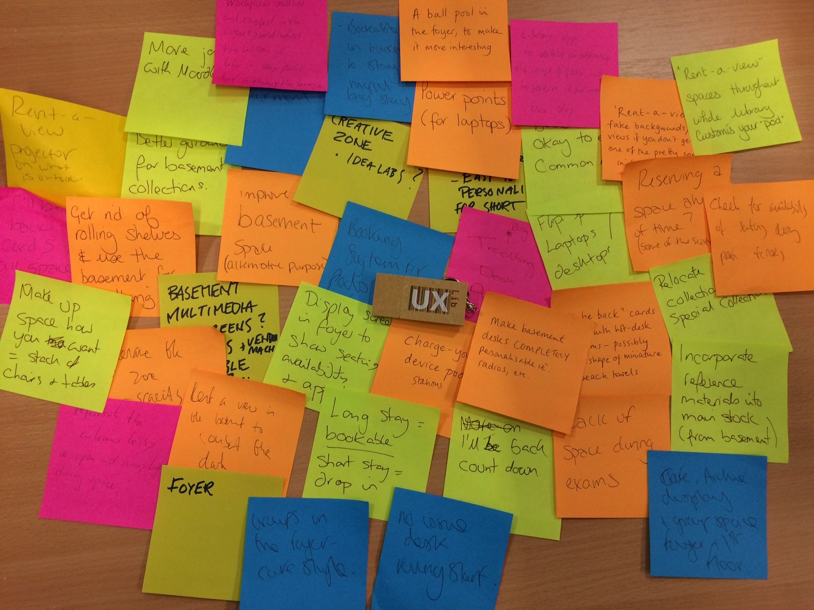
After this process it was clear we were all thinking about transforming the basement of the college we'd been assigned, and from there we were able to come up with a really good concept.
Team Space Grey didn't make the final of the pitch-off, and it was basically my fault that we didn't do better because I made a fundamental error. An error which, a bit frustratingly, anyone who has been on one of my presentation skills workshops will have heard me banging on about not doing, at length.
(NB: I'm not saying we'd've got to the final if I hadn't made the mistake I'm about to describe, by the way; Blue Steel were ace and deserved to be there. Just that I prevented us from doing as good a job as we might have been able to...)
On Day 1 when we did the ethnographic field work but before we'd done any ideation, we really didn't have anything to pitch. The students simply didn't complain about problems for us to find solutions to. So when I woke up really early on Day 2 my mind was churning about the WAY to pitch, because I didn't know WHAT to pitch. I had this idea in my mind that we could use the iPad app Paper to draw our presentation in real time, because that somehow reflected the organic nature of ethnographic work whereas PowerPoint reflected the sterile nature of traditional data collection methods (like surveys). But no one could draw, so that ruled that out. Then I remembered VideoScribe, which I had on my iPad (although it no longer appears to be available as an app, sadly) - you give it pictures and it 'draws' them for you. It's great, and can hugely increase both engagement and data retention in audiences when used well. I got really excited about this and started to play around, putting in a heat map I'd made of where users were walking, and having the app draw them. It looked really good.
So I presented this to my team the next day. I very much hope I didn't steamroll anyone into it, and no one said 'I don't think we should use this', but I was probably so enthusiastic about it that no one wanted to protest! It was pretty cool. On Day 3 we used VideoScribe to make our presentation - never have I made so much in so little time, when it comes to presentation materials. We worked HARD. Below is an edited version of our presentation, adjusted to make more sense without us speaking over the top of it.
It looks nice, I think. It's certainly good as a video. But there was a fundamental problem with what we were then doing for the pitch at the conference.
After our pitch in the heats, on the way back to the main hall for the pitch Final, lots of people said nice things. Some people said we'd've got there vote, if they'd've had one. All of them asked about the tool, and how we made the presentation. It was generally agreed that VideoScribe was pretty brilliant.
Not one of them mentioned our concept.
(Ugh, I thought the above was important enough to need its own line. But I can't write single sentence paragraphs without feeling like Dan Brown. Still. At least I'm not writing whole sections in italics.)
I had committed an absolue cardinal sin of presenting: I'd let the tool become the content! I'd let the medium obscure - well, if not obscure the message exactly, certainly not allowed the message the room it needed to breathe. This became brutally clear to me when I watched the 3 finalists doing their pitches. Our pitch had drama and a twist, and a really engaging piece of software at its heart. But their pitches, all presented with nice slides, were all about the concepts and they had the time to explore them properly. I really wanted our presentation to stand-out, and it did, but not for the reasons which really counted in the context of the conference pitching competition...
So, apologies, Space Grey teammates. I'm convinced we could have done a lot more justice to our pretty brilliant concept if we'd just gone with a good old fashioned PowerPoint presentation. It was a good learning experience for me. Although, I have to say, when they announced Blue Steel as the winners of the heat, LeMurph and I did breath a sigh of relief that, after the most exhausting of conferences, we could finally stop, and just sit there and relax for the remainder of our time. But in future I'll be more careful to heed my own advice.
The winning pitch, from Purple Haze, was brilliant. It was great to hear David Jenkins speak - I'd heard he was fantastic at it, and he was. (As was Angus.) David's a natural - his enthusiasm and dynamicism energised me even though I was completely knackered! I'm very glad they won.
If you've watched the video above, I'd be interested to hear what you think of the Responsive Study Space idea. I reckon the basic principles - use ethnographic techniques to identify the dead space in your library, then convert that space into a study area which changes its nature according to where abouts you are in the academic year, based on student need - are pretty sound. The idea is that just as a Responsive Design website takes all the same elements and re-arranges them to be the best fit for the size of screen, Responsive Study Space takes the same elements of the room but maximises number of study spaces at Exam time, collaborative study spaces in term time, provides induction information in October and November, and so on depending on what your ethnography reveals. I really do think it's a good idea!
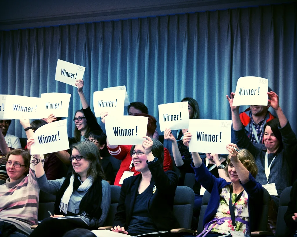
(Header image copyright of the UXLibs photographer, jtilleyphotographic, used by permission. View the original on Flickr, here. It features me and various others voting for Purple Haze as the pitch-off champions!)