Email feels very old-school sometimes, and it's tempting to think it's no longer relevant. But actually for a lot of Libraries and other non-profits email remains an essential tool for good communication, and if you think about it it's easy to see why.
You have mass coverage (not EVERYONE uses email but a huge percentage do, and it's not a tribal medium like social media where people pick and choose to be on some platforms and not others); you have a captive audience (once they've given you permission to email them); the message goes directly to your audience; it waits for your audience until they're ready to see it (unlike asychronous media such as Twitter for example); and it's very easy for people to ACT on an email, by clicking a link within it.
Where Email falls down is in sharability (it's much less intuitive to share useful information contained within an email with one click, than it is to share information contained on a specific URL) and, like so many other forms of communication, over-saturation. We all get too many emails. They can easily become part of the White Noise.
Over the years I've read a ton of advice and guidance about emailing, and a lot of it is either over-complicated or related directly to chasing leads and converting sales and all sorts of other things we don't need to do in the non-profit sector. In fact, for me, it comes down to just three things, and, as it happens, they call begin with T: emails must be Targeted, Timely and Titled.
I wanted to experiment with Piktochart for work purposes, and I always feel you have to actually make something to completion with a tool to get a feel for it, so here's the Keys to Good Email Communication as a mini infographic:
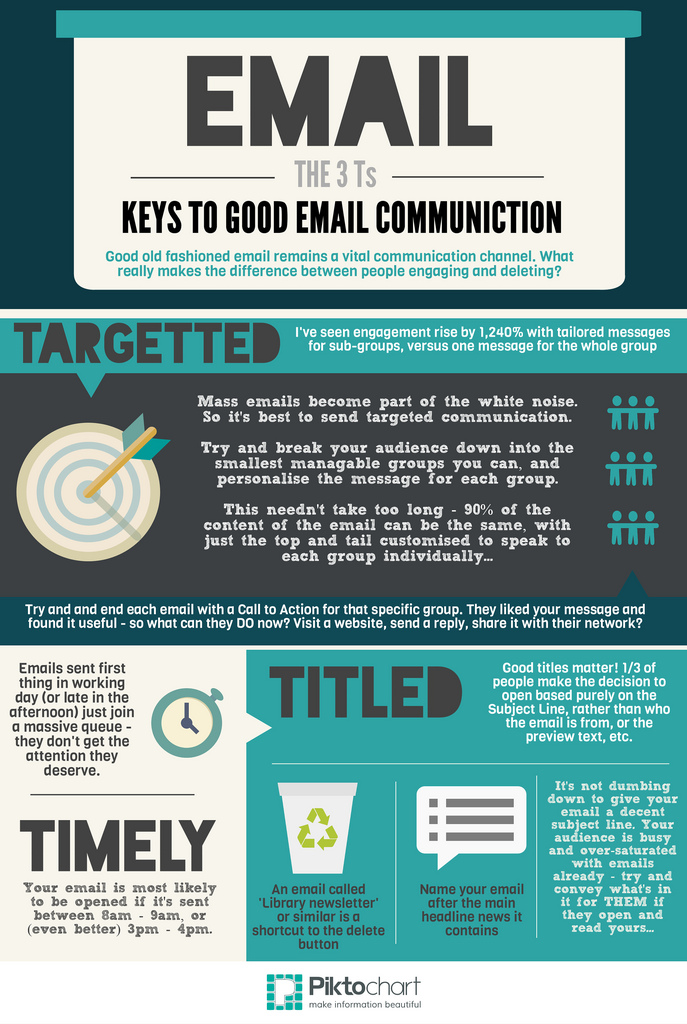
Click to view the much larger Creative Commons version on Flickr
These three things really do matter - TO ME. Every audience is different, so while I'd advise you try to work by the Three Ts, you may find your users respond differently to mine.
Certainly targeting is something which I find works very well for me - the response rate (people doing the things I'm asking them to in the email) increases massively if I subdivide my audience into smaller groups and customise the content somewhat. The stat above relates to the MoreBooks campaign at York, mentioned int the White Noise presentation (slides 47 - 52, as displayed here).
The title is so important - it makes the difference Open and Delete Unread on so many occasions (think about your own policy of reading emails from organisations). The stat there comes from convinceandconvert.
In the past I didn't think being Timely mattered - the idea of sending an email at 3pm because that's the 'best' time to send it seemed mildly absurd to me. But I've changed my views on this - what is beyond doubt is that people are more likely to engage with an email if it comes with some distance either side of it, than they are if it comes with 10 other emails at the same time. You don't want to be part of a virtual pile, you want undivided attention. 3pm being the best time to send is a stat you hear everywhere, but in this particular case I got it from the sherpablog.
There's another dimension to being Timely, around when to send emails in general (rather than the specific time of day), which will be covered in part 2 of this post later in the week.
When I was promoting LISNPN, the New Professionals Network (check out their ace new site, by the way) I kept stats on which promotional avenues resulted in the most people signing up for the site. Email won every time. Articles in the professional press, newsletters, face to face presentations - these all helped, but ultimately people need to CLICK on something right away after they hear about it, or most of them will soon forget it entirely.
Email allows you to put in a call to action which people can heed there and then.