Presentations

Prezi Guide: The 5 Essentials To Stop Your Audience Feeling Sick


Prezi is nothing if not divisive. Some people love it, some people hate it - I'm in neither of those camps. I find it very useful in some situations, but still use good old fashioned PowerPoint Slides for more than half the presentations I give. Prezi should be used for a reason.

Prezi is relatively new (it's been around since 2009), it's getting more popular (there are around 40 million users now) and it's improving its interface all the time. Some people accuse it of being style over substance, but for certain ideas (interactive maps, for example) it provides substance that slides simply can't bring to the table. For me, Prezi can be fantastic as long as you adhere to one maxim above all: don't let the medium get in the way of the message. Any presentation materials should be there to support the presenter and work FOR the audience in adding to their experience. Do that, and Prezi can really raise the level of an audience's engagement.

Potentially, a great Prezi has the wow factor. So why would you want to completely undermine that by creating something which makes sections of your audience feel motion-sickness? It's up to you, the presenter, to minimize the possibility of this as far as humanly possible. Here's how. (For the short version, view the Prezi about it.)

1. Positioning

The single most important thing about creating a Prezi is the positioning of the objects on the canvas (and directly related to this, the order in which they're visited on the path). Position your materials sympathetically, people! By which I mean, rather than moving haphazardly around the canvas and disorientating the viewer, move from left to right, or from top to bottom - move in a way the human brain is used to.
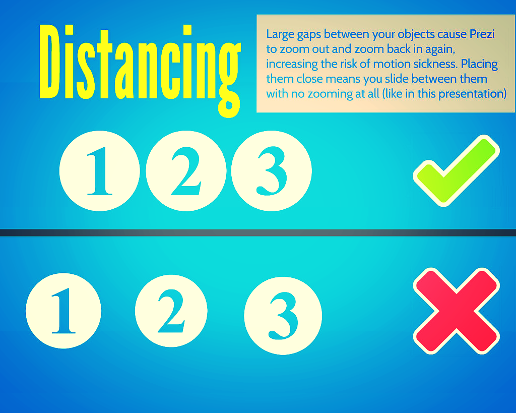
2. Distancing

But positioning is about more than putting your objects in a coherent pattern - it's about having a uniform (and short) distance between them. The closer you place your objects together, the less zoom and swoop there is in your prezi. Place them right next to each other and it won't zoom out at all, it will just slide right over from one object to the next.

3. Sizing

As with distancing, uniformity is the key to sizing too. Put similarly sized objects together - ideally make them the exact same size. This means there's no need to zoom in or out. Contrast this to having a small object followed by a much larger object and then a small object again: the zoom is flying all over the place.

4. Rotation

99.9% of rotations and barrel-rolls in Prezis add absolutely zero value to the presentation.

I just made that stat up but I'm sure it's true. In fact most of the time rotating actively detracts from a Prezi. It is the Number One cause of queasyness in the viewer. It can be used with a good reason (a visual metaphor of some kind to better express your ideas) but otherwise, why would you? It just gets in the way of your message.

5. Pacing

The ability to zoom in and out is both Prezi's strength and its weakness. It's what allows you to show the relationship between objects on your presentation, it's what allows the element of surprise for the big reveal, it's what lets you put your own hierachy onto your information rather than having it dictated to you. But it's also at the heart of what can induce nausea in your audience.

So, pace your Prezi like you would regular slides. Don't move it on every few seconds - arrive at point on your path, talk about it for two minutes, or five minutes, or more, and then move on. This means there are fewer zooms per presentation, and less quickly following one-another. But you can still take advantage of the zoom's ability to enhance your presentation.


One last note on zooming

If you double-click the right arrow to move your presentation on (or left arrow to move it back) it zooms twice as fast. This can be effective in reducing the sea-sick effect - after all it's the transitions which cause the problems, so if you only transition for 50% of the time you did before, that helps. The only downside is it feels risky; if you triple click by mistake, you'll miss your path point entirely and have to go back...

Here's my Prezi on this whole topic - it explains what I've just said in a visually illustrative way (which is sort of the point of Prezi after all):


Finally

All that said, if members of your audience are particularly susceptible to motion-sickness, even doing ALL of the above may not be enough. So only use Prezi for a specific reason. Use it to do something PowerPoint can't, rather than as a direct replacement for the sake of it. Use it to cover several dispirate topics, or to make something interactive, or to visually explain relationships between ideas. But if you don't need to do any of those things, and it's a regular presentation, just use regular slides. Just be sure to use them well.

Which leads us to a bonus option:

(6. The nuclear option)

Prezi can be a very useful way to make a nice looking presentation: the fonts, icons, ease of importing images, and themes, make smart presentation materials without the need for a huge amount of effort or design knowledge. Once you get over the initial learning curve, it's quicker to make a nice Prezi than nice slides. So if you want to take advantage of all that, but want to 100% eliminate the possibility of motion-sickness, simply save your Prezi as a PDF, and use it as you would slides. Every path point on your Prezi is a full-page of the PDF so it ends up looking like a (nice) PowerPoint.

To save a Prezi as a PDF, click the share icon and choose the relevant option from there.

To save a Prezi as a PDF, click the share icon and choose the relevant option from there.


Disclaimer: Prezi will always make some people sick - they dislike Prezis intensely, and it's very important to them that they bring this up a lot. I offer no judgement here; I do the same with LinkedIn. But this guide is about stopping an audience feeling motion-sickness when watching a Prezi - if you aren't prepared to take steps to do this, you shouldn't be making Prezis!

7 Super Slide Styles to download, copy, and adapt


I love slides, as I've said before. One of the biggest problems people have when trying to make something effective and visually arresting is simply knowing where to start. Or having not much time at all, so they can get together the content but don't have chance to put it into a new style.

So with that in mind, I've created the presentation below. It features the same information presented seven different ways; if you like any or all of them, you can download the original PowerPoint from here, and do whatever you want with it. Delete the bits you don't want, modify and build on the styles you like.

I've not done this before, provided a sort of OER version of a presentation, so I'll be interested to see if people find it useful. I hope the templates can work in some situation or other for you, particularly if you're stuck for inspiration. It may be that you take a slide style and use it throughout a presentation, or it may be that you take one or two styles and just use them as a blueprint to give you a head-start, and then change them completely.  It's entirely up to you, you can do whatever you like with them - and although it would be great if you could credit me somewhere, don't worry if you can't fit it in. I'm not releasing them under a Creative Commons Attribution license, I'm just putting the whole thing into the public domain.

Something I need to make clear though (and thank you to Andrew Preater for flagging this up to me) is that the images are Creative Commons images (rather than public domain), and so if you want to use those images specifically you need to respect their original licenses! Each of them is linked to, both in the presentation itself and with its creator's name at the end of the presentation, so you can see the kind of Creative Commons licence they have. In all cases, they need at a minimum for the creator to be attributed. Obviously the images I've used here are just in there as examples, I'm expecting people to take the slide designs and redo them with their own content - but if you do decide to keep them, keep their Creative Commons status in mind...

For 6 of the styles I've included a little arrow in the breakdown section with a link to a full set of slides created somewhat in that style (most by me, a couple by other people) so you can see what an expanded version might look like.

To adapt and build on these styles if you like them, the right-click menu in PowerPoint is your friend. Firstly if you right-click on the little slide preview pane, you'll find the 'Duplicate' option. Duplicate the slide you like, then edit the contents. Right-clicking on the main slide edit view is vital here too: the menu it produces allows you to recolour text boxes or backgrounds, change the picture (but retaining size and positioning), copy elements you like and paste them elsewhere, blur or darken images so you can write directly onto them, etc etc. This allows you to take a single slide and build a presentation with a cohesive visual theme around it, rather than just having literally the same slide several times with different words on it.

Good luck making your slides, and let me know what you do with the templates! (You don't have to. I'm just curious to see whether people make things using these as a building block, and what they're like...)

Digital Scholarship Training at @UniofYork: Facts and Figures


Andy Priestner has written about the importance of writing reports, even if no one asks you to, to showcase the value of what the Library is doing.

...it is not enough just to collate this data and wait to be asked for it. It is far better to ensure that the people who need to know this stuff are informed, at least once a year, of these top level statistics, before they ask for them: a pre-emptive strike if you like…
— Andy Priestner in Business School Libraries in the 21st Century, edited by Tim Wales

(You can read a larger excerpt from his chapter here.)

With that in mind, a while ago I produced an internal report on the Digital Scholarship Training I've run at York (and various exciting things happened as a result of doing this) - which I've now expanded into an external version, which includes the Google Apps for Education training run by my colleagues.

My message to you is that if you have any expertise in the area of digital scholarship, scholarly comms, Web 2.0 in HE etc, find a way to offer it to your academic community! As I've mentioned before, we've found they're ready for it, and excited about the opportunities.

Below is a tweaked version of the report to include the message in the paragraph above - the original version (which can be found on our Library slideshare page) is aimed at York staff and asks them to get in touch for information about upcoming events. Putting it on our Slideshare page will hopefully increase the profile of something very positive for the Library and IT - we've both found that there's been some reputational gain from helping people out with things they really value right now, rather than solely focusing on what we've always done. We've also both found that word is starting to spread and we're becoming go-to people within the University when help or advice is required in these areas, which is excellent.

There's more about the nature of the training itself in this blog post on the Networked Researcher suite of workshops, and this later post about how the training is shifting slightly.

Creating quick and easy videos with Adobe Voice


I saw this tweet earlier in the week, and had a look at the list. It's a good list, and the thing which really caught my eye was Adobe Voice. It allows you to create an animated video which sits somewhere between a normal video or screen-capture, and a slidedeck on autoplay. I decided to sign up and have a go, and it took only about half an hour to create this video with it.

It's a very new product, coming out in May of this year. Hopefully the video above shows you how it works and what it can do - the reason I feel like it could be so useful for libraries is that it allows you to explain fairly dry and complex information in a visual and engaging way. Some types of video, particularly stuff about databases and online things, really don't lend themselves to the 'person talking either to or off camera' school of video-creation - and screen capture can sometimes be a little dull too. I feel like this is a nice hybrid - the 'animation' element keeps things moving, and you can use screengrabs if you like too. You need neither a micrphone nor a video camera to create an effective video. You don't have to master complicated software (and even Camtasia, which I think is ace and very easy to use, feels complex compared to Voice).

Like a lot of new tools coming out these days, it makes things look very smart without the user having to know about anything except providing useful content. There are lots of different templates - here's the same video as above, using a different theme. Notice how it recolours the icons to fit the new theme.

You can also choose different layouts - I chose a side-by-side theme but there are four other options.

So have a look and see if it could be useful to your library. In summary:

(The Cons list looks really big when they're side-by-side but that's only because the cons take more explanation!)

Pros

  1. Solves an existing problem! I love tools which do this
  2. Free
  3. It's an all-in-one solution. When I create slides I have to go to iconfinder for icons, flickr for images and PPT to actually make it - Voice does all these things from one place
  4. Looks great
  5. Extremely quick to create something useful
  6. Conveys information well - it's not just pretty, it's effective in what we need it for

Cons

  1. iOS only
  2. You can't, at the time of writing, have more than one layout (or theme) per video, which would be nice
  3. In fact there's very little flexibility in how you layout each slide, once your theme and layout are selected - but this is also its strength. It's idiot proof. You'd have to go out of your way to make something bad with this tool
  4. At the moment there's no option to upload to YouTube - they have to be hosted on Adobe's own site and embedded elsewhere. That's fine, but having a video which isn't on YouTube always seems like a massive waste of an opportunity...

10 Tiny Tips for Trainers & Teachers


I do a whole load of training these days, both as part of my day-job and my freelance work, so have picked up a few small tricks along the way. There's nothing earth-shattering here - but if you run training or teach infolit classes, you may find some of these useful.  

Here's the short, visual version - then I go into each one in a bit more detail below.

Session structure

1. Start with something practical. Sometimes there is, unavoidably, a bunch of theory or conceptual stuff you have to get through. But if that's the case, if at all possible make this second on your itinerary for the day / hour - and start off with something practical. Diving in with something for people to DO wakes everyone up, and grounds the whole workshop in something tangible rather than abstract. It also makes everyone into active participants early on.

2. Allow time to recharge. A full-day workshop should have coffee-breaks etc built-in, but even a 1hr workshop can be quite overwhelming. Just building in a 3 minute gap for participants to switch-off, chat to each other, relax, will help them focus for the second half of the session and raise the energy level all round. A break 10 minutes in to a 1hr session works brilliantly - surprisingly better then, than half-way through the session or later.

3. Sum up via a Random Slide Challenge (also known as Battle Decks). I love a random slide challenge. Here's how it works:

  1. You create a short simple slide-deck which summarises the session you've just run (I normally create two decks of 5 slides each)
  2. You get participants to deliver the presentation (so in my case, two volunteers)
  3. The volunteers have never seen the slides before, which is part of the fun - so they see each slide for the first time at the same moment the audience does, and have to improvise their presentation based on that
  4. You move the slides along after 15 seconds per slide, so the whole thing takes only just over a minute per presentation

You have to give them the best possible chance of knowing which part of the session each slide is getting at! If you look at slide 41 onwards of the deck embedded here, you'll see an example of a random-slide challenge set of slides.

This works well for two reasons - firstly it is often hilarious. People in the audience shout-out if they pick up on what the slide is about before the presenters, and basically it leaves everyone on a high at the end of the session. Feedback forms at both the British Library, where I've done this on training courses, and for my infolit classes at York, often point towards this as being one of the delegates' favourite parts. The other reason it works is it's often a surpisingly great summary of the session. People say the exact kinds of things I would have said if I was summarising myself, but it has more impact because it's another voice (and, with students, it's one of their peers). Try it! The only thing is, you need a plan B for if you get no volunteers, which once happened to me. Prizes help ensure this doesn't happen...

4. Close after the questions. It's good to end any training or teaching session with a call to action - a clear message as to where participants can go from here. This can be somewhat muddied by a Q&A session (which can of course throw up anything), so build in time for questions just before the end, and leave yourself the last 5 minutes to close the session with something direct and meaningful.


Tablet as teaching assistant

5. Use Padlet on your tablet to remember who's who. Padlet is a great tool that can be used in all sorts of ways. You create an online wall, onto which you and anyone else who has the URL can post notes. Anyone can double-click anywhere to add a sort of virtual post-it. Then they can put in their name as the title, and a note, or a URL - links to pics or videos become embedded objects on the wall. I use it to crowd-source people's ideas in training sessions - like you'd use a flipchart, except everyone can go back and look at the URL after the session, and it becomes a sort of archive for everyone to learn from oneanother.

Anyway, depending on the session I'll go round at the start and ask people to introduce themselves, and say what they want to get out of the day / hour. This is very useful in and of itself, as you can tailor things accordingly. I'll type it into Padlet on the big presenting screen as I go, so we can all refer back to it later in the day and see if we did what we said we'd do! But the really useful thing is, you can choose exactly where your notes go on the screen - so I put the notes in a way which corresponds to the physical layout in the room and where people are sitting, like in the example below. Then when I take it off the big-screen to put my slides up, I put the Padlet wall on my ipad screen - this means I've got everyone's names in the right place for easy reference so I can remember who's who!

(I feel like I didn't explain that very well. Does that make sense? The example below should clear it up.)

A Padlet wall example

A Padlet wall example


6. Skip ahead in the presentation, on your tablet. I like to have my slides or prezi open on my ipad so I can see what's coming. This is particularly handy if you're joint-teaching with somone - while they're speaking, you can recap what you're supposed to be saying next. A massive part of successful teaching and presenting, for me, is feeling in control - and this helps.


Handouts

7. Hand out the handouts. It's tempting to feel more organised by distributing the handouts, if you use them, before people arrive. Placing one by each PC or on every table. But if the group is of 20 or less, hand them round yourself; it's a great opportunity to meet each person individually and make eye-contact which, however brief, makes the communication easier and fuller for the session proper.

8. Use screengrabs to make exercises easy to find. It's amazing how often people lose their place in a handout. When you get to an excercise in the handout, put a screengrab of the slide that's on the big-screen at the time you're introducing the excercise - it makes it quick and easy for people to know exactly where they should be.


Materials

9. Use a free PBworks wiki to store materials for delegates. For all sorts of reasons, it's good to have materials online. Particularly if your session is link-heavy, store a digital copy of the hand-out on a free wiki (PBworks for example) so delegates can access them that way and just click on URLs rather than typing them in. Put the PowerPoint on there too - this means you’ll have a copy of your presentation and hand-outs even if your USB stick falls out of your pocket and your printer breaks…

10. Send the presentation round afterwards with an email. A follow-up email is useful for reinforcing key messages, and making sure people have access to the presentation materials. Don’t rely on people (students especially) tracking it down for themselves; follow up directly, ensuring they have a copy of the presentation AND your contact details. If there are issues around attachment filesizes, upload your slides to Slideshare and your hand-out to Scribd, and include links instead.


As always, I'd welcome comments - add your own tips below and help make this post more useful!