presentation skills

6 Alternatives to Bullet Points


First things first: bullet points are not inherently bad. They can be very useful in written documents. When used in presentations, however, they stop your presentation being as effective. (They often turn presentations into written documents) In fact, your audience engages less, remembers less, agrees less and likes you less when you use bullet points in your PowerPoint presentations. (International Journal of Business Communication, 2015)

So why take that risk?

Usually the answer to that question is one of: 1) It's what I've always done, 2) It's the easiest way thing to do, or 3) Because what else would I do?

For me, 'we've always done it this way' is not a reason to do something. 'This is the best way to do it' is a reason to do something, and sometimes that overlaps with that we've always done, but not always. 

Presentations are often huge opportunities. You have a room full of people giving you your attention (with potentially thousands more online afterwards) and you're there to talk to them about something significant. So although bullets may be easy, why not make the most of the opportunity? Why not do everything you can to not only get your message across but to get it to stick in people's minds? And finally, the 'what else is there?' issue - well, here are five alternatives to using bullets.

(Subscribers, there's LOTS of images in here, some of them stacked up as slides. It's probably going to be a lot easier to view this on the website itself rather than in an email / feedreader - here's the link.)

1) Just put fewer words on the slide

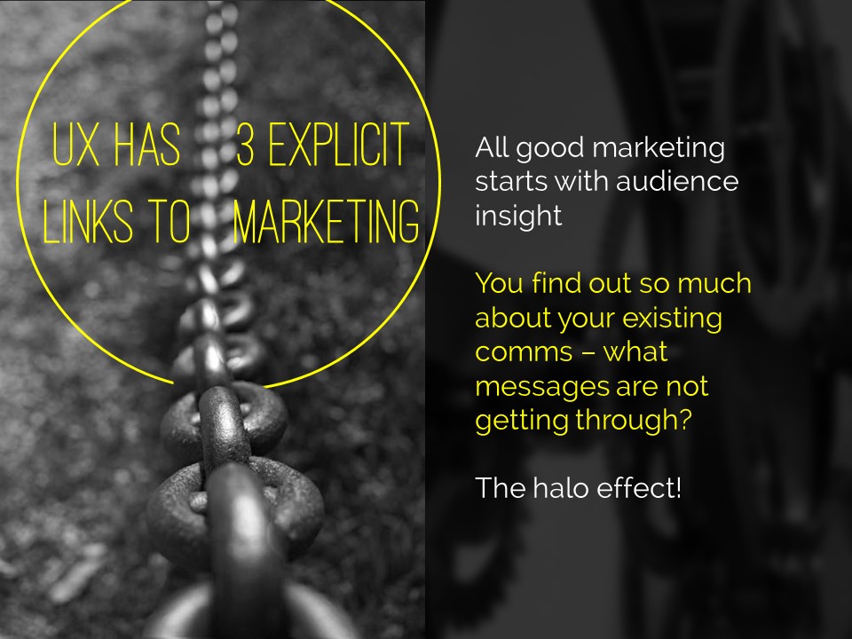
An example of using fewer words without reducing the impact

An example of using fewer words without reducing the impact

An obvious and straightforward place to start. Take away everything you don't need - if it's surplus to requirements, if you can remember to say it out-loud, or if it doesn't really matter whether you say it or not, just get rid of it!

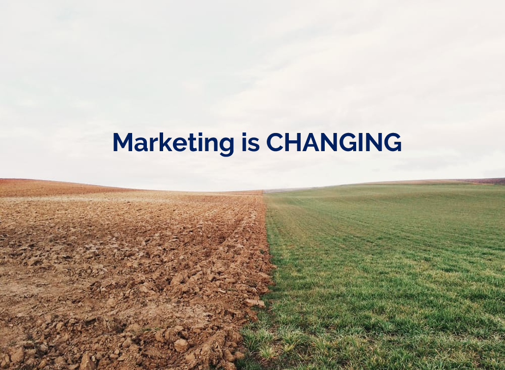
The example here is a slide I used in a recent workshop. I could of course have listed all the ways in which marketing is changing, using bullet points to separate them. But I felt the slide would have more impact with just a single sentence written on the screen, me listing examples out loud, and a visual metaphor as the background image.

2) Cascade the key messages across multiple slides

Rather than making four or five points on one slide (and risk your audience reading ahead and getting out of sync with you the presenter), make one point per slide over four or five slides. This gives each point room to breathe, and helps with signalling to ensure your audience understands and remembers you.

If you're making several points on a theme you don't have to make new slides from scratch for each one - just do the first slide, right-click and Duplicate it, then edit the text on the duplicated version. I've used this technique in the examples below (use the arrows to switch between slides):

If you've got the most recent PowerPoint you can use the Morph transition between the slides, which works really nicely.

People worry that this method will mean a longer presentation but this isn't the case - you take the same amount of time overall, but cycle more quickly through the slides.

3) Use colour to make lists readable, rather than use bullet points

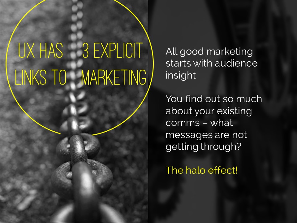
An example of using colour to differentiate chunks of text

An example of using colour to differentiate chunks of text

There are times when you need several points on a slide - for example when you're showing an audience what you'll talk about, or are summarising something, or making comparisons. In these instances neither of the first two techniques are appropriate; you need all the text on one screen. So just write it out like you normally would, but get rid of the baggage and negative associations of bullet-points by not using them - and recreate the POINT of them (making text easier to read) by using alternating colours.

In the particular example shown here, I've actually built up to what you see over three slides. The first just says has the alternating colours text list much larger and in the centre of the screen, then the second is as you see above but with the Bodleian's reply hidden, and then lastly the slide you see here.

4) Highlight key sections of your slide, one by one

I do this a lot - sometimes by building the content of the slides one animation at a time, or by changing the colour to highlight each section, one at a time. Again it means you can have all the points on screen, but you're not using bullets and you're in sync with your audience.

In the example below I've got all three points on screen but each one is highlighted yellow (picking out the yellow from elsewhere on the slide) while I talk about it - again use the arrows to move between them:

5) Turn your bullet points into something visual

An example of using icons instead of bullets

An example of using icons instead of bullets

A fifth option is to basically use bullets without people thinking 'Aargh, bullet points, death by PowerPoint here I come' etc. Use icons (for example from iconfinder.com) as bullet points - the images will help your audience learn. A basic example is shown here.

6) Combine several of the techniques above

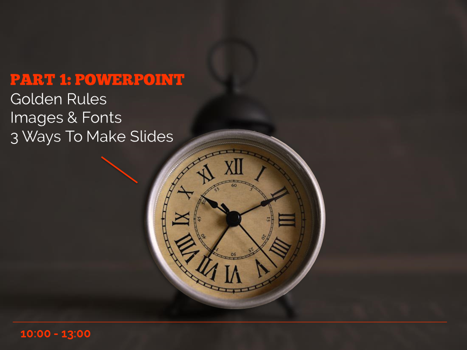
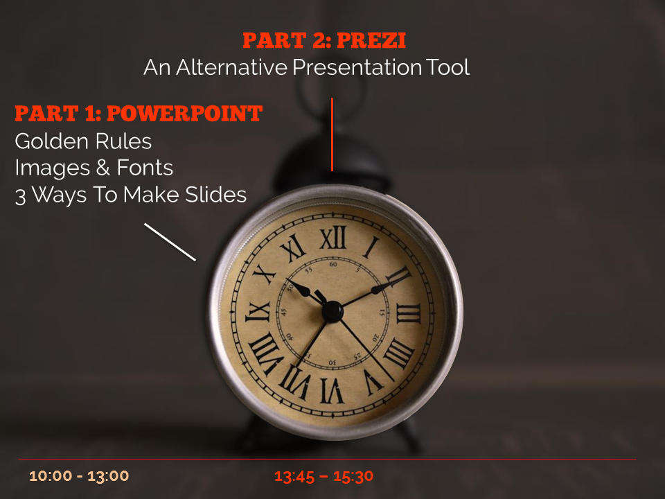
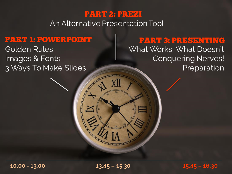
The final example below is how I introduce the timings for my Presentation Skills training days. It does what a single slide with bullet points would do, but uses colour and visual elements over three slides to introduce the information in a more engaging way. Part of the reason I bothered doing this is the slides allow me to talk about each part of the day in turn, whilst staying in sync with my audience, AND it allows the audience to see the full day's timings in one go on the final slide of the sequence.

So there you go! Several ways to avoid bullet points. It's really worth taking a small amount of time to rewrite presentations to avoid bullets: your audience will thank you for it...


You’ll find details of my Presentation Skills or PowerPoint workshops here: you can book an all-day or half-day session for your organisation, online or in person.

(updated) Training up North! Presentation Skills workshop coming up

UPDATED 1st OCTOBER:

I now have confirmation of the location and details on the October 16th workshop. I've deleted all the stuff about the York workshops in the post below, as those dates are now past.


Oct 16: Presentation skills workshop, Liverpool

This is the full-day Making Your Message Stick workshop, which I've just revamped, for CILIPNW. It'll take place at the Library at the University of Liverpool. All the details, including how to book, are on the CILIP website - in essence we'll be covering how to make a very effective presentation indeed (which, as it happens, will also look really nice!).

There are also two free student places available, with a deadline of October 5th for application - if you're currently enrolled on a LIS course, click here to see how to apply.

Some feedback from the two most recent Presentation Skills workshops I've run, for CILIP NE and the Bodleian:

“Tips and tricks about perfect presentations - it was fantastic! Very informative, very attractive content of the course. I’d recommend it to anyone.”

”The trainer’s knowledge and approach to the presentation were outstanding. We received numerous references for further learning and finding resources, which is greatly appreciated.”

”It was excellent. It is a particularly difficult topic to present on, as the audience is looking to see excellent presentation skills in action. The trainer succeeded in demonstrating presentation skills as well as talking about them.”

”It was just perfect.”

”Ned is very engaging and was able to get across his enthusiasm and expereince of presenting at a high standard.”

”The trainer gave lots of useful tips and could draw on own experience in libraries to illustrate points; there as a good balence between written and spoken input and time to practice new ideas.”

”The course was really fantastic, I came away with lots of practical ideas and feeling enthusiastic about sharing them with my team.”

”The best training I have ever been on.”

“I found the day very useful - a very practical session with time for hands-on practice and a lot of good advice given. I have heard a lot of about Ned’s presentation expertise. He was great!”

”Really useful and informative. Good to have practical sessions as well as demos.”

”Ned was fantastic, and there was a great balance of practical exercises, and presentation of examples and tips.”
— Bodleian Libraries 2015, and CILIP NE 2015

You can see all of the upcoming workshops on my Upcoming Events page. Hope to see you at one of them!


#UXLibs 2 | The Art of the Keynote: Matthew Reidsma


My second and third posts about the User Experience in Libraries conference are about the Keynote speeches. (Email subscribers, there's a load of embedded content in this one - here's the link if you want to read it online.)

There were three, and they were all brilliant. I found them not only very informative (as someone new to UX) but also fascinating and educational in their delivery (as someone who teaches presentation skills workshops). I want to cover both aspects here.

A keynote is very different to a regular conference talk. It has a different role. You can't just report back on a project you've done, in a keynote - it has to address wider or more fundamental issues, and be transcendent somehow. But for me the best keynotes still give people something to DO with the information they've been given. It's a real challenge. It's an art.

Matthew Riedsma | More than usable: library services for humans

All of the keynotes were fantastic. Matt's in particular, I thought, taught me a lot about the art of the keynote. He had so much TIME. He left long pauses.

He let things sink in.

He allowed us to digest what he was saying.

And of course, allowing pauses is all about having confidence in your material. When I'm doing an infolit talk a Department has asked me to do, with them selecting the content, I tend to keep the momentum up and move quickly through it, because I'm not always convinced the audience is enjoying it. It needs urgency to work. But if I'm doing a talk at a conference, a talk of my own choosing, I believe in it a lot more so I try and leave more gaps. But not as longer gaps as Matt did. This was a masterclass of pause-leaving. It was awesome. No one was shuffling their feet or wondering what was going on. We were all captivated by the talk.

Matt's slides were the perfect example of how to create a visual theme without using a template. They did what a template is supposed to do: keep the audience aware they were part of a certain landscape, that all the information they were seeing is connected and of a piece. But without all the bad stuff templates also do: because all the slides didn't actually look the SAME, they were able to express their contents uniquely, and be formatted for the best method of communicating that particular set of information.

Matt used blue, black and white as the colour scheme. This meant blue and white text, black backgrounds, pictures with a lot of black in (the night sky, for example), and, a really nice idea this, black and white pictures of the people he was quoting, behind their quotes.

A selection of Matt's slides to illustrate his visual theme. All of a piece but no template in sight.

A selection of Matt's slides to illustrate his visual theme. All of a piece but no template in sight.

The visual theme was cemented by the use of fonts:

Three fonts, which is the maximum you should use in one presentation, generally. Two of which worked together and complemented each other nicely: in effect, Raleway is for the set up and Montserrat for the punchlines, so we as the audience are being guided to what is most important about each slide. The other font, Berio, contrasted to denote that something different was happening (quoting others' words rather than creating his own).

The slides were pretty. But that was a by-product of them being EFFECTIVE. Big fonts that everyone could read, and which guided us as to the key messages. Pictures which helped us learn and told a story. One point per slide so we never had to decide if we should continue reading or continue listening. The presentation supported and enriched, and possibly prompted (although Matt seemed to know exactly what he was going to say without using the slides) - but not duplicated. Slides and presenter working together, not competing.

Here's Matt's full presentation:

If you have three-quarters of an hour to spare, there's a recording (slides and audio) on Vimeo - it's well worth watching!

Matt's talk was ostensibly about usability. It covered a lot more - philosophy, immigration videos, chair awareness, urine in space.

I've created a Storify of the tweets people wrote during the Matthew Reidsma keynote, which goes some way to capturing what is was all about, and which I won't embed here as this post is already taking up a lot of space, but I'd recommend you follow the link and have a look.

To try and boil it down, the phrase that summed up the essence of the talk for me is 'Libraries are PEOPLE, all the way down'. Usability is all about putting people and their experiences first. Experience is messy and complicated. How someone experiences something can be affected by the kind of day they're having (the kind of LIFE they're having), rather than just, as we might assume, the tools they're using in our libraries. Our users are not coming from an emotionally neutral place. A task based approach to usability assumes they are; an experience based approach better allows for an emotional experience. The Andromeda Yelton quote in the slides above is key: often people talk about libraries as being about information, and access to information, and more frequently these days we talk about people in that equation too. But not just librarians. Other users. Libraries let people transform themselves through access not just to information but to each other.  

And, absolutely crucially, we need to rethink usability from being an attempt to produce a perfect experience, to instead an attempt to design for breakdown. Accept things will do wrong. The key is the user's ability to self-right them.

Design our services (online and in person) so when they breakdown, it is intuitive to rescue them and carry on working. Matt used the analogy of using a mouse on a small table: at some point you may move the mouse too far and it falls off the table. At that point, no one goes 'oh it's broken' and seeks help - they just put the mouse back on the table and go back to work, very quickly forgetting the 'task' of using the mouse and getting back to the 'experience' of the technology being an extension to themselves. This is what we need to aim for.

This is far more revelatory to me than it probably should be. I feel I should have been more aware of this before. But I wasn't. I frequently try to get everything to just WORK - but when I think about what works for me outside the library, it's the procedures or technology which I can correct, on my own, when they break down. I've been designing everything as task based, forever. Now I can focus on transitioning to designing for experience and usability.

It was a brilliant talk. It had stories (that were relevant), humour (but no jokes), philosophy (which underpinned the practical stuff), and calls to action. Ace.

(As an aside, we also challenged Matt to get the words 'sac magique' into his presentation - a reference to 90s classic Tots TV - which he managed to do so brilliantly as to satisfy our juvenile need to get him to do something silly, but in such a way that no one else saw them so it didn't detract from the professionalism of his presentation... They were in the search box of an American Citizenship website he showed us a print-screen of. I mention this because although I was trying to spot the reference, I kept forgetting about doing so and getting engrossed in Matt's talk - which is actually a neat metaphor for a lot of what he was talking about. I had a task - spot the sac magique - but actually the experience was so good I forgot all about it...)


Top Tip: Create your PPT for the web, THEN strip it down for live presenting


In my Presentation Skills training I spend a lot of time offering different ways of presenting information and ideas visually, so you can lose a lot of the words from your PowerPoint slides. After all, it is a presentation, not a document. It's not designed to be read - or at least it shouldn't be, else you'll leave your audience wondering if your presence as a presenter is even really neccessary...

Then later we discuss the importance of uploading your presentations to Slideshare to amplify their impact and reach a wider audience. So inevitably the most common question which gets asked after that is: "But how will this make sense to people who weren't in the room to hear me talk?"

It's a tricky question because in most cases, a presentation simply can't be fit for both purposes. Good live slides won't make sense without the presenter, and good web slides won't have been an effective communication tool in a face-to-face presentation.

There are basically three answers to this (that I give, anyhow):

  1. You make a different version that goes online
  2. You upload the accompanying notes or audio
  3. You accept that the online audience will have a different experience, and that's not the end of the world

There are times when I do all three of these, sometimes all for the same presentation (bear with me...). Let's look at each of them in turn.

Making different slides for live versus web

My main advice here is twofold: first of all make two versions of the presentation - one for the face to face presentation, and one to sit on the web afterwards - and second of all, do the web version first!

It is a lot easier to start off by putting in all the detail on the slides so that the presentation makes sense on its own without you talking over the top. It helps you shape your ideas, work out exactly what story you're telling with the presentation, and can be a useful aid to learning your talk (learning your talk is actually something I wouldn't recommend, but there isn't time to get into that here).

Once that's done, save a copy to upload to Slideshare or whatever, and then save a new version which you edit to strip out all the detail. The function of slides in a conference or training situation is to enrich and reinforce what you have to say out loud, help the audience understand and engage with your message, and last - but NOT least - to prompt you as to what you need to say. Not to duplicate it. The ideal slide (in my opinion) has perhaps one sentence on it, which crystalises the key message of that part of the presentation AND acts as a jumping off point to remind you of everything you have to say on the topic. So you take your detailed web PPT, and you strip them back to one or two sentences per slide (or go entirely word-free).

The key thing here is it's a lot easier to make detailed web slides and strip them down for live presenting, than the other way around. Making your live slides and then adding all the detail in afterwards takes ages. It really adds to your prep time and so isn't practical in most situations. Doing the detail first doesn't really add that much time on at all because it's part of the process that helps you create the narrative in the first place.

Incidentally, I don't use this option all the time - because it does take some more time. If the presentation is important however, it's worth it.

Providing further content to help explain slides

If you want to leave your slides beautifully simple but consequently ambiguous, you can provide some supplementary materials to help them make sense. For example:

  • If you've made notes you could upload them to Scribd, and then link to them from your presentation (and embed the Scribd document and the Slideshare presentation on the same web-page)
  • If your PowerPoint presentation has speaker notes (in that little box below the main slide in edit view) they will be added to Slideshare below your slides. The trouble with this is you need to upload specifically a PPT file to Slideshare, it doesn't work with PDFs - and if you're using non-standard fonts, which can be really beneficial, you need to use PDFs. So potentially useful, but not ideal
  • If you literally have a script of the whole talk, just provide that alongside the slides. If you don't use a script, and again I wouldn't recommend doing so, the only way to achieve this is to record the talk and then play it into some kind of dictation software to provide you with a transcript after the event...
  • You could add audio. Slideshare discontinued their webcast functionality (being able to add audio to PPTs once uploaded) last year, so really your best option for this is YouTube. In the past I've recorded my own talks using my iPhone in my jacket pocket, then used Camtasia to add that audio to slides - as in this example from South Africa - but that's a laborious process, takes ages, and honestly I'm rarely happy enough with any of my talks to want people to be able to hear and analyse them outside the in-the-moment conference environment... I would recommend recording your talks though, just for your own use - it's amazing how much you learn about what worked and what didn't
  • (If you do go down the YouTube route, don't forget to add the YouTube video to your slides on Slideshare too. Slideshare has so much reach, you don't want to just put stuff on YouTube.)
  • You could use Storify to collect the tweets from people in the room during your presentation and link to / embed that with your presentation - this is my preferred method as I don't use notes and don't like the audio options listed above. Even if you're not on Twitter I'd recommend at least considering this option
  • And finally, my super-advanced-mega-slideshare-hack: Slideshare displays whatever text you have on each slide, in the transcript below. (That's completely seperate from the notes field thing discussedearlier - every slideshare presentation has an accompanying transcript.) So you could add a full explanation of each slide, to each slide, but then make it invisible on the slide itself! (Either by writing in white on a white background, or covering it with an image, or using font-size 0.5.) So the transcript has all the info, but the slides do not. Good eh? [High-fives the internet]

Or, of course, just not worrying about it at all. Which brings us to the other way forward.

Just having the same version for both

Sometimes a presentation is too low stakes to worry about all this stuff. Sure it's not ideal that the slides don't make so much sense online, but what's most important is that they worked for the audience in the room.

Another way of looking at it is to view it as simply a different experience for the two audiences, rather than neccessarily a compromise or a problem. Your slides aren't as easily understandable for the online audience, but the fact they get the kernel of an idea rather than the fully-formed notion can be really interesting in itself. Just as the one-sentence prompt was your jumping off point during the talk itself, it's the online audience's jumping off point for their own ideas and further learning. That's no bad thing. Barthes would approve, anyhow.

An example of combining all three

The slides I put the most effort into ever were those I created for a keynote at the BLA Conference last year. And I kind of did all three things listed above.

First of all I did a different version for the web. Not a massively different version - but I included more detail in quite a few places, skipped to the end of some pseudo-animated parts, and changed the way I displayed certain images to comply with the copyright licences. I also removed a section which contained at its climax with a category C swearword (or is A the strongest category? I never know how that works) because although I trusted the audience in the room to understand it and not be offended, I coudn't be sure The Internet would do the same...

So what you end up with is slides which first and foremost aided my communication to 60 people in a room in Leicester (the face to face audience must ALWAYS be the priority!), but which at least made sense and provided some sort of jumping off point for over a hundred thousand people online subsequently. The only upsetting thing for me is one of the two fonts I used doesn't seem to render properly on Slideshare no matter what I do, but never mind...

I also provided a Storify of the tweets from the talk in the associated blog-post. And I didn't fill in ALL the gaps, as I really do think slides are great for providing a taster of a topic, hopefully in a way which encourages people into looking into it more themselves, and forming their own conclusions.

Other peoples' perspectives

I don't want this post to just be my views and opinions, so I canvassed Twitter. Here's what they had to say - if you have anything to add, I've love to hear from you in a comment.


3 Training courses coming up this Winter in London

 
Click the pic to go to the upcoming events page

Click the pic to go to the upcoming events page

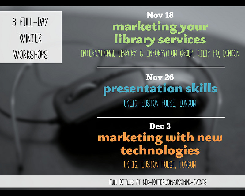
Just a brief post to draw your attention to three workshops I'm running in London in November and December. All of these are open for anyone to book onto (unlike some of the things I do for the British Library, for example), and full details of each can be found on the Upcoming Events page.

People have fun on these courses and find them genuinely useful - the idea is to give practical advice which can be applied the minute you get back to your desk. You can see feedback from previous workshops via the links on the Training page. Any questions about content etc, let me know!