powerpoint techniques

Using screencapture software to make next-level PowerPoint presentations

I normally record talks I give at conferences, using my phone in my jacket pocket. I have a strict 'no critiquing myself during the talk itself' rule, so the recording allows me to listen back afterwards and pick up on things that I'd want to do differently next time, or things that worked well etc.

In the past I've also put a video up on YouTube, using Camtasia to record me moving the slides along with the audio of my talk at the LIASA conference in Cape Town. I don't think this worked that well because there was simply too many long periods where nothing changed on the screen - in real life that was fine because the audience looks at the speaker, but in a video - a visual medium after all - it just feels a little inert and uninteresting.

So for a recent talk I decided to try and make a version of the slides that would work as a proper video. I spoke at the CILIP PPRG Conference in January (more on that in a previous post) about our UoYTips marketing campaign - York won a Bronze Marketing Award which I was picking up at the event. I delivered the slides and recorded the talk in the usual way, but then set about creating a new version of the slides that had much more going on visually. The actual slides are here, if you're interested, and here is how they evolved for the video I came up with:

Now I've done this, I'm wondering why I can't just do more visually exciting slides anyway? This doesn't have to be just for YouTube. I've always wanted to use video in presentations more, and it's surprisingly easy to do as it turns out.

The tools

To make the video above I used three bits of software. PowerPoint, obviously, for the slides. Audacity to edit and play the audio (this is free). And Screencastomatic for both the screen-capture videos within the slides, and the overall screen-capture of slides plus audio you can view above. Screencastomatic is a great tool, which I found much easier to use than Camtasia. It's quick and intuitive. It can be used for free, but in order to record videos of more than 15 minutes, and record PC audio, you need the pro subscription - this costs 12 quid year which is pretty great value, I reckon.

Here's what the Screencast-o-matic interface looks like:

too.PNG

It's very easy to redraw the box around the exact part of the screen (or all the screen) that you want to record. You can pause and restart. You can also record PC audio as you go, or narrate into a mic. As you can see it gives you the option of recording from webcam at the same time if you wish, which happens in a smallish box at the top right of the screen.

It's really easy to use.

The techniques

In the video above there are a number of techniques (perhaps that's too grand a word!) employed to suit different types of information.

  • Actual video recorded on my phone. (This happens about 25 seconds in.) I recorded a video in the usual way, emailed it to myself, and went to Insert Video in PPT. You can make it full screen, or you can overlay the branding / visual identity from your PPT over the top. I think this is crucial to how easy this is to do - the video can effectively be the background of the slide, just like an image can. You then overlay it with text, shapes, images etc as normal.

  • Screencasting Google Earth. I really like this one, which happens here. How to have something dynamic on screen while I talk about the University of York? Type it into Google Earth then press record on the screencasting software, and return on Google Earth. It zooms all the way in and then, delightfully, spins round the building you've chosen for a bit. I'm going to use this in library induction sessions in the future, for sure.

  • Using gifs. There's a couple of examples of this, but here's the most interesting one. It starts off as a regular full-screen image, and then I used animation to first of all drop the text on top of the image at the appropriate time, and secondly to trigger the gif video beginning (having downloaded the gif from a gif site, and saved it as a video).

  • Regular PowerPoint animations and transitions. There's a few moments where things are added onto the screen one-by-one as I mention them, and there's this very long fade transition between two slides

  • Videos of websites instead of screengrabs of websites. There's an example here, and another example here. In the talk I just showed a screenshot of the thing I was talking about, but here it's a 15 second video of the site being used, which is much more interesting. I'm definitely going to reuse this technique.

The drawbacks

Really the only two drawbacks are that it takes time, and it takes space.

Of course, recording a clip on a website in use takes more time than just a screenshot, but it becomes surprisingly quick. Perhaps a minute to set-up, record and save / export 20 seconds' worth of screen-capture, so not too bad at all.

In terms of space - the videos are MP4 files and pleasingly small. Most brief captures were under 1 meg. The 22 second-long Google Earth zoom right at the start of the video was 12 meg. The overall final file - a 20 minute video capturing the whole thing, was 99MB. Video files are so huge, I think this is pretty reasonable.

So, I'd recommend giving this a try. And if you create a presentation with video and upload it anywhere (or you've already done this in the past) leave me a link in the comments...

6 Alternatives to Bullet Points


First things first: bullet points are not inherently bad. They can be very useful in written documents. When used in presentations, however, they stop your presentation being as effective. (They often turn presentations into written documents) In fact, your audience engages less, remembers less, agrees less and likes you less when you use bullet points in your PowerPoint presentations. (International Journal of Business Communication, 2015)

So why take that risk?

Usually the answer to that question is one of: 1) It's what I've always done, 2) It's the easiest way thing to do, or 3) Because what else would I do?

For me, 'we've always done it this way' is not a reason to do something. 'This is the best way to do it' is a reason to do something, and sometimes that overlaps with that we've always done, but not always. 

Presentations are often huge opportunities. You have a room full of people giving you your attention (with potentially thousands more online afterwards) and you're there to talk to them about something significant. So although bullets may be easy, why not make the most of the opportunity? Why not do everything you can to not only get your message across but to get it to stick in people's minds? And finally, the 'what else is there?' issue - well, here are five alternatives to using bullets.

(Subscribers, there's LOTS of images in here, some of them stacked up as slides. It's probably going to be a lot easier to view this on the website itself rather than in an email / feedreader - here's the link.)

1) Just put fewer words on the slide

An example of using fewer words without reducing the impact

An example of using fewer words without reducing the impact

An obvious and straightforward place to start. Take away everything you don't need - if it's surplus to requirements, if you can remember to say it out-loud, or if it doesn't really matter whether you say it or not, just get rid of it!

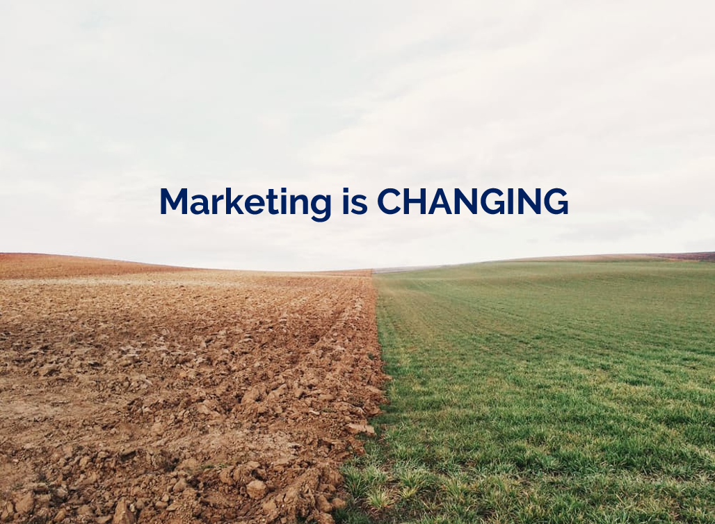
The example here is a slide I used in a recent workshop. I could of course have listed all the ways in which marketing is changing, using bullet points to separate them. But I felt the slide would have more impact with just a single sentence written on the screen, me listing examples out loud, and a visual metaphor as the background image.

2) Cascade the key messages across multiple slides

Rather than making four or five points on one slide (and risk your audience reading ahead and getting out of sync with you the presenter), make one point per slide over four or five slides. This gives each point room to breathe, and helps with signalling to ensure your audience understands and remembers you.

If you're making several points on a theme you don't have to make new slides from scratch for each one - just do the first slide, right-click and Duplicate it, then edit the text on the duplicated version. I've used this technique in the examples below (use the arrows to switch between slides):

If you've got the most recent PowerPoint you can use the Morph transition between the slides, which works really nicely.

People worry that this method will mean a longer presentation but this isn't the case - you take the same amount of time overall, but cycle more quickly through the slides.

3) Use colour to make lists readable, rather than use bullet points

An example of using colour to differentiate chunks of text

An example of using colour to differentiate chunks of text

There are times when you need several points on a slide - for example when you're showing an audience what you'll talk about, or are summarising something, or making comparisons. In these instances neither of the first two techniques are appropriate; you need all the text on one screen. So just write it out like you normally would, but get rid of the baggage and negative associations of bullet-points by not using them - and recreate the POINT of them (making text easier to read) by using alternating colours.

In the particular example shown here, I've actually built up to what you see over three slides. The first just says has the alternating colours text list much larger and in the centre of the screen, then the second is as you see above but with the Bodleian's reply hidden, and then lastly the slide you see here.

4) Highlight key sections of your slide, one by one

I do this a lot - sometimes by building the content of the slides one animation at a time, or by changing the colour to highlight each section, one at a time. Again it means you can have all the points on screen, but you're not using bullets and you're in sync with your audience.

In the example below I've got all three points on screen but each one is highlighted yellow (picking out the yellow from elsewhere on the slide) while I talk about it - again use the arrows to move between them:

5) Turn your bullet points into something visual

An example of using icons instead of bullets

An example of using icons instead of bullets

A fifth option is to basically use bullets without people thinking 'Aargh, bullet points, death by PowerPoint here I come' etc. Use icons (for example from iconfinder.com) as bullet points - the images will help your audience learn. A basic example is shown here.

6) Combine several of the techniques above

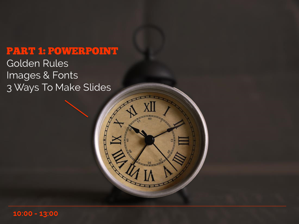
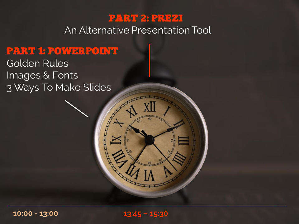
The final example below is how I introduce the timings for my Presentation Skills training days. It does what a single slide with bullet points would do, but uses colour and visual elements over three slides to introduce the information in a more engaging way. Part of the reason I bothered doing this is the slides allow me to talk about each part of the day in turn, whilst staying in sync with my audience, AND it allows the audience to see the full day's timings in one go on the final slide of the sequence.

So there you go! Several ways to avoid bullet points. It's really worth taking a small amount of time to rewrite presentations to avoid bullets: your audience will thank you for it...


You’ll find details of my Presentation Skills or PowerPoint workshops here: you can book an all-day or half-day session for your organisation, online or in person.

Making your message stick - presentation skills for information professionals

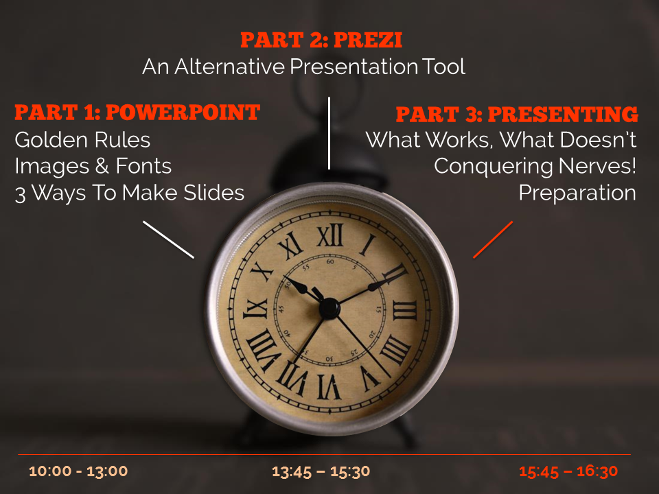
On Tuesday the 12th of November I'm running a workshop on presentation skills in London. So many of us have to do presentations now, and it makes a big difference if you feel confident about it, and know some tips and tricks to make presenting easier and more effective. I'm really looking forward to it - it's the first time of doing this outside the British Library, where it's gone down really well. We'll be covering how to make lovely PowerPoints (even if you have to use a dreaded template), how to make your audience remember the things YOU want them to, tips for presenting itself, an introduction to Prezi and a bunch of other stuff too. You can read some of the kinds of things we'll be talking about in this 10 non-standard tips for public speaking post  and this presentation on making presentations...

It's hands-on, at PCs. The details, including a booking form, are here.

UKeIG website picture

One of my favourite ever pieces of feedback came for this course (it was unsolicited, too):

What I enjoyed so much about the presentation workshop:

 1.      Expertise in the subject matter

2.      Relevant and highly useful information: presented and practiced

3.      Clear and engaging presentation style

4.      Professionalism with a great sense of humour, no hidden agenda

5.      Dedication to collaborative professional development, to high standards, to excellence

... so I promise it'll be good! :) Hope to see you there.

Ned