University of York Library

Library ratio of online versus on site visits and visitors

Interesting tweet from #uxlibucc, above. Can you answer that question? I'd wager most of us can't, but we should be able to. Someone in our orgs should be able to, right? We need to make strategic decisions, about to where to prioritise resources, based on evidence wherever we can.

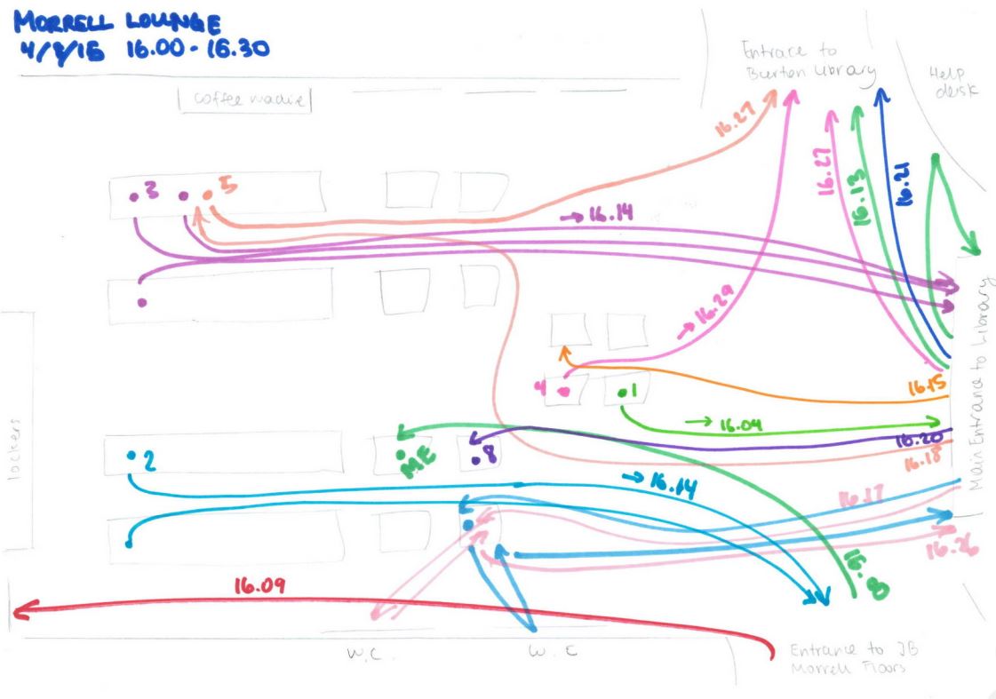
As it happens, I can check this figure at my own institution, because it's something I've been thinking about a lot. I realised that a) I had no idea which were the most popular online parts of the library presence and b) I had no idea how this compared with actual footfall. So I got access to Google analytics, and I repeatedly ask my colleague Steph for turnstile statistics...

So below is a chart to compare physical and online use of the Library, for Monday of this week (all 24 hours of it). A couple of caveats:

1) This is not presented as a pie chart because we're not dealing in percentages. Many of the users of the building will also be using the catalogue at the same time.

2) I've taken the actual numbers off it in case I shouldn't be giving that info out publicly, but to give you a rough idea the total number of visits to the building is well over 10,000

3) This is just one day. I have not gone into the data to try and find an average day or a representative day, I just chose the first day of this week. (Although we compared it with the previous Monday and none of the data was atypical.)

Chart comparing visits to the library building, subject guide, website and catalogue on one day. The building gets the most visits, the catalogue the most visitors.

Chart comparing visits to the library building, subject guide, website and catalogue on one day. The building gets the most visits, the catalogue the most visitors.

So while building visits outstrip online visits (because each student is coming in almost exactly 3 times on average) it appears more people use the catalogue overall, though that figure could be skewed by people using the catalogue multiple times on different devices. Clearly the catalogue is MUCH more popular than the website, which makes me think: should we work even harder than we already do on the system as it's the way more people interface with us than any other? Should we be trying to get more info on to it as people go there so much more than they go to our other online places, or should we try and strip it down so the usability is as good as possible? 

If you combine the online stats into one figure, the graph looks like this:

Chart showing there are more overall online visitors compared to building visitors, but more uses of the building than the combined online spaces.

Chart showing there are more overall online visitors compared to building visitors, but more uses of the building than the combined online spaces.

Keeping in mind that I'm not including any social media in the online figure - so our YouTube, Facebook, Twitter, Slideshare, Blog(s) and Instagram views aren't represented - you can see the online sphere is a huge factor in people's daily use of the library, as indeed we'd expect.

To go back to the question in the tweet at the start of the post, does our staff allocation reflect this ratio? No it doesn't. The staffing at York is so labyrinthine I can't work the ratio out, but suffice to say we devote much more staff to face-to-face interaction than we do to the website and catalogues.

This is as it should be. I'm not advocating for the staff ratio to exactly reflect the virtual/physical ratio, because the nature of the use is very different. But I do wonder if we were starting from scratch but knew the ratio in the graphs above, would we do things a little differently?


UPDATE: Since I posted this yesterday I had some interesting discussion on Twitter, and a couple of people mentioned if we included the stats for the resources themselves (JSTOR for example) then the online side of things would be even higher.

This is a good point. I didn't include them because I didn't think of doing so (rather than it being a position I'd deliberately taken), but on reflection I think it skews the picture too much to put them in - because a lot of the catalogue views, and probably the majority of the SubjectGuide views, will be people on their way to the licenced e-resources. I'd argue that in the same way one visit to the building results in lots of potential uses of the library, one use of the catalogue may result in several e-resources being consulted.

That said, there will always be lots of people on campus going direct to the resources without following our links, so that would increase the online views somewhat. Ultimately the reason I find this interesting is comparing, for want of a better word, the different interfaces of the library and being able to see explicitly which area engages the most users. So although our databases and journals are hugely important, they aren't 'our' interfaces in quite the same way as the catalogue, website, libguides and building.

Using Kahoot in Library Induction and Teaching Sessions

A colleague at York, Tony Wilson, brought Kahoot! to our attention recently for possible use in teaching and orientation sessions: it's a really nice quiz tool. There is nothing new about using quizzes in library sessions and there's about a million and one tools out there for making them, but Kahoot differs in its execution of the idea. It's so much slicker and just more FUN than anything like this I've looked at before. And interestingly, it already seems to have currency with students:

One of the most useful aspects of a quiz is that people are asked to actively engage with the information rather than passively receive it. I'm absolutely convinced the students are remembering more this way than if we just presented them with the complete information.

4 reasons Kahoot works so well

It's really, really nice, for these reasons in reverse order of importance:

The music. It has cool retro sort of 8-bit music in the background.
The aesthetics. It has bright colours and looks generally nice. Here's what a question looks like:

An example of a question as it looks on the screen during the quiz

An example of a question as it looks on the screen during the quiz

The leaderboard. Oh yes. It has a LEADERBOARD. This is the key thing, really: people put in their nicknames and after each question the top 5 is displayed (based on, obviously, how acurate their answers are but also how quick). Even completely non-competitive people get excited when they see their name in the top 5... I tweeted about using Kahoot and Diana Caulfied chimed in about the tension the leaderboard brings:

The mobile view from the student perspective

The mobile view from the student perspective

It's VERY easy to use. These things have to be SO simple to justify using them. In the case of Kahoot, you load up the quiz, and the students go to kahoot.it and put in the pin number the quiz gives you on the screen. It works perfectly on phones, tablets, or PCs. There's only one thing on the screen - the box to put the pin number in; and only one thing to do - put the pin number in. This simplicity and intuitive interface means everyone can get on board right away. There's no hunting around. 

You can also use it on an epic scale - one colleague just came back from using it with 95 undergraduates today, who responded really well, another used it with over 100 who were absolutely buzzing after each question. You can actually have up to 4,000 players at once.

Here's what the students are presented with when they go to the (very simple) URL:

An example from York

So here's the quiz I made for Induction, click here if you want to have a go. This particular link is (I think) in ghost mode, where you're competing with a previous group of players. So if you do the quiz now, you'll be up against my History of Art PostGraduates and will only show up in the Top 5 leaderboard if you get better scores than at least 25 of them! But normally in a session I'd use a completely blank slate.

Possible uses

In this example the questions I chose are basically just a way to show off our resources and services: it's all stuff I'd be telling them as part of a regular induction talk anyway:

My Kahoot quiz questions

My Kahoot quiz questions

The students I've used it with so far have really enjoyed it (as far as I can tell!). It's much more interesting than listing things, and, intruigingly, I think that asking people to guess between possible options actually seems the answer more impressive than just telling them the fact outright. So for example in the Google Apps question above, there were gasps when I revealed they get unlimited storage and the majority had chosen one of the lower options (the results screen shows how many people have chosen each option) - I'm fairly sure if I'd just told them they get unlimited storage, not one person would have gasped.

But there are plenty of other possibilities for Kahoot that are a bit more pedagogical in nature. Using it to measure how much of the session has sunk in at the end; using it at the start and end to measure a difference in knowledge; and using it to establish the level of student understanding:

There's also a Discussion mode rather than a Quiz mode. You pose a question and students type their answers in (rather than selecting from multiple choice) and their words come up on the screen. Anything rude or offensive can be deleted with one click. It would be a great way to find out what students felt unsure of or wanted to learn about, or to discuss the merits of a particular approach.

In summary

So I'd recommend taking a look at Kahoot and seeing if you can incorporate it into your teaching. As well as using it throughout Induction I'm planning on using different kinds of quizzes as part of infolit sessions and am excited to see how that works. You can easily incorporate your own library's images and videos and the tool is free, very easy to use, nicely made, and FUN. 

Creating images with copy-space for text

This post originally appeared on the Lib-Innovation blog.

As always things have changed in my library over the summer, and we needed some new images to reflect our reconfigured rooms, new signage and new services. We're very fortunate to have easy access to the University photographer Paul Sheilds, who is based in our Morrell Library building, so we booked a morning with him.

We had very specific needs in mind, based on a list we'd drawn up to suit what I wanted for our Induction Project, what my Academic Liaison colleague David Brown wanted for the new LibGuides and what the Comms Team needed. In particular I was really keen to get photos with copy-space.

Copy-space literally means a space to write 'copy' in the newspaper meaning of the word - in other words an area of the image which is less busy and which could be written upon without obscuring a key part of the picture.

In essence I wanted to be able to write directly onto the images (for use in slides, posters, digital screens and social media) without having either a separate area for text, or a back-filled text box - because I think it looks smarter that way and because it allows the images to be full screen at all times. It's a lot easier to do this when the images are captured with that in mind from the outset.

Here are some examples - these are works-in-progress that I'm playing around with for the forthcoming #UoYTips Induction campaign for 2016/17 at my institution. They won't look exactly like this in the final versions but the copy-text principle will remain.

We have borrowable laptops which I wanted to showcase. I've added a piece of text to the copy-space:

Here's an example of an image of the same lockers which is a great pic but which doesn't have copy-space built in (making it a little less flexible to work with in marketing):

It would be possible to write on this of course, but you'd need to manipulate the image to ensure the text was legible, or used a back-filled text box.

Next up is a picture of the copy-print-scan machines - the copy-space in this case being the underside of the lid. I did experiment with having the text at an angle to match it but it looked a little clunky so I went with good old fashioned horizontal text for this one...

Here's a picture of a student - by not putting her centre of the frame (and by conforming to the rule of thirds) we've made space for the text.

Finally here's an example where despite leaving copy-space the background is too busy to write directly onto - the text wouldn't be clear enough. There's a neat divide where the wall ends, so I've inserted a shape over everything to the left of the wall, to make the copy-space more clearly defined. I did this in PowerPoint - inserting the rectangle, filling it black, then making the fill 19% transparent. The white text is clearly visible against it, and the focus of the image (the walls you can write on) is still clear and uncluttered.

What is UX and how can it help your organisation?

User Experience - UX - is still relatively new to libraries. I've been writing about it a lot on here of late: there's now been 4 posts in the Embedding Ethnography series about what we're doing at York.

I thought it would be useful take a step back and create a slide-deck to introduce UX - ethngraphy and design - in this context. Here it is:

One of the most popular pages on this site is the Structured Introduction to UX and Ethnography and I wanted something to go on there, and also for a new blog from the University of York.

Introducing Lib-Innovation

The Lib-Innovation blog is an attempt to capture some of the more creative stuff we do at York, and especially as a channel to disseminate ideas and results around our UX activities.  I'm reposting my own articles from Lib-Innovation on here, but not those written by my colleagues: if you're interested in the results of the UX studies I've written about on here so far, the Head of Relationship Management at York, Michelle Blake, has written about the projects on Lib-Innovation. What we learned what absolutely fascinating and we've already started to make the changes to help both students and staff.

More on UX

Here is a (continually updated) list of the latest posts on this blog that feature User Experience in some way.

A second UX Intern writes... Oliver Ramirez on User Experience

This post originally appeared on the Lib-Innovation blog.

This is another guest post in the Embedding Ethnography series - click to see all four so far - this time written by Oliver Ramirez. He completed some hugely detailed work for us at the start of 2016, and these are his reflections on the whole process.

Oliver is now based in London and enjoyed UX work so much he wants to pursue it further, perhaps with another internship - if you're reading this and you are potentially interested in having him come and work with you, send me an email and I'll put you in touch!


My UX research internship: More than ticking boxes

I was interested in seeing how my user experience knowledge from my Computer Science degree could apply to physical services. So, when I was offered the chance to conduct a UX research project for the library team at the University of York, I took my chance to see how library UX works.

The motivations behind the project were straightforward; among postgraduate research students (PGRs), there was a large disparity in satisfaction scores when it came to certain areas of research life. In conducting the project, I was to identify the reasons for this.

For this, the UX research approach made sense. I was to report on how PGRs conducted research, in particular their habits and reasons behind study space choices and resource choices, their interactions with others during research, and their use of study services. Through this, I would identify the pain points for less happy demographics, try to understand what worked for happier demographics, and suggest ways to try and bridge the gaps between those experiences.

As part of this research, I ran 1 on 1 sessions with PGRs across different departments. The team also gave me a couple of UX techniques to test out, so as well as a “non-directed interview”, I ran Cognitive Mapping and Love & Break Up Letter exercises with each participant.

Cognitive Mapping

The first exercise that I ran with participants was cognitive mapping. Participants were asked to draw a “map” of the things that they interacted with while conducting research (limited to the areas I outlined earlier), mostly adopting the methodology outlined by Donna Lanclos. I say “map” because, in reality, few participants drew anything resembling a conventional map – participants mostly favoured writing down concepts (for example, ‘their office’) and linking those to other related concepts (‘their office’ may be near their ‘supervisor’).

A Cognitive Map from the PGRUX Project

A Cognitive Map from the PGRUX Project

It was a great way of getting the participants to think about the areas I would end up interviewing them on, and the temporal and relational information captured in the map made it easier to pick up on each participant’s thoughts. One good example of this is how a participant placed importance on their desk: they drew it as their map’s central element early on, and branched everything off of that central element. This was reflected in their interview, where they emphasised the importance of that desk to them.

“Non-directed interviews”

Using the participant’s cognitive map as a ‘guide’, I would then conduct a non-directed interview. This involved taking an almost passive, neutral stance in everything I asked about, primarily allowing the concepts brought up on the participant’s map to direct the conversation – then, after those points had been exhausted, I would consult my own discussion guide to cover the rest of the areas of interest.

Conducting the interview in this way was initially difficult for me – it was sometimes hard to probe without being ‘aggressive’ (asking weighted questions or changing the topic), and I sometimes struggled to facilitate the conversation without suggesting topics to talk about.

There was immense value from conducting the session in this way, however. By focusing the interview on the topics participants brought up, gathered information more closely reflected the participant’s “perspective” – their habits, their opinions and their choices, mostly on what they were aware of in the discussed areas. Gathering the information in this way allowed for me to more effectively deliver insight on issues of awareness.

Love/Break Up Letters

Finally, participants were asked to write a ‘love’ or ‘break up’ letter. By asking participants to address this letter to a personified IT or library service, we hoped to draw out the emotions of participants towards those services, and easily establish positive/pain points.

My participants seemed to be very polarised by the exercise; people either really got into it, or they really didn’t. Upon reflection, the abstract nature of the exercise may have made some participants uncomfortable, especially knowing that their letters would be scrutinised. However, while I feel that while this technique didn’t work in a 1 on 1 session, there is merit to trying it out in a pop-up-desk context, or a ‘prize raffle’ format – this would allow for many responses, and for the easy identification of pain points across services.

All in all, I felt that the techniques allowed me to attain some real insight into PGRs, and despite the initial nerves, I really enjoyed conducting these sessions with participants. But while I’m singing the praises of these techniques now, back before I started my internship, my mentality for designing around users (or stakeholders in general) was one of appeasement – design a website that does what stakeholders need it to do, and fix any issues preventing its smooth use. A real ‘checklist’ oriented approach. Historically, I had followed this approach in my degree through a type of observation called ‘usability testing’, where I noted any issues users had when doing tasks that I had set.

So, heading into this internship, I had expected to do just that: more observation, make a list of issues to fix, and suggest some solutions - tick those boxes off, one by one, on the way to a “good UX”. But, throughout my internship, I realised this approach just yields a ‘passable’ user experience – you end up with something that works, but not necessarily something that’s good.

Example of Findings: Lonely Researchers

For example, one of my participants told me something that really struck me: they said that when they were based at a general desk, that they felt disconnected from their department. It was always possible to contact or visit their supervisors, or use the department testing rooms, or go out of their way to interact with their peers, but not being based alongside all of that meant that they felt ‘distant’ with their department. This changed when they were offered a desk inside their department. Besides improvements on all of those fronts, they reported feeling ‘valued’ as a member of the university because of it.

The importance of ‘department community’ - being alongside your researcher peers and supervisor so that interaction is readily possible – was prominent in my discussion with some participants. During my research, I found that while non-department PGR study spaces covered various noise levels (something participants valued), those spaces did not facilitate this kind of ‘natural interaction’ that only happens when PGRs and supervisors are all based together – and so PGRs based outside their department missed out on this.

My approach of “observation to find issues, fix issues” would not have yielded this type of insight – I would have thought along the lines of “they don’t really like the silence in this building”, suggested to change the noise level policy and called it a day. It wouldn’t have made much headway in creating a better UX for the people based outside their departments.

But, it finally dawned on me during my time with the library team at York: good UX necessitates understanding what your user values, what is important to them, and actively working with that in mind. Which worked out for me, in the end: UX is a more satisfying when it isn’t just making something that works and ticking boxes.


Header pic of the University by Paul Shields, used by permission.