How to

Presentation Tools 2: Making Slides with Haiku Deck


It's Presentation Tools Week on the blog; yesterday was all about using non-standard fonts in PowerPoint, and the next few days are all about not using PowerPoint at all. Here's the first of three useful alternatives to PPT.

Haiku Deck (haikudeck.com)

This a very easy to use, very useful tool for making slides. It almost forces you to make attractive and effective presentations, by limiting you to only desirable options (whereas PowerPoint is full of features which actively harm your presentations!).

Haiku Deck is free to use on the web, or you can download the iPad app, also free. It gives you templates - not ugly PowerPoint templates, but attractive ways of doing slides using semi-transparent text boxes and large fonts, a method I recommend on my training courses. The software encourages you to use images effectively, not pack too much text in, and make one point per slide - all absolute essentials for good presentations. (Unfortunately there is actually a 'bullet point list' option for slides, but luckily most users seem to ignore this.)

Here's a nice Haiku Deck example I found, from Tricia LaRue:


It's Banned Books Week! - Created with Haiku Deck, presentation software that inspires

Haiku Deck is entirely self-contained - you choose a style (which includes fonts), slide templates, and even find your Flickr CC images, all within the package online. This screengrab shows you pretty much all the important things at once:

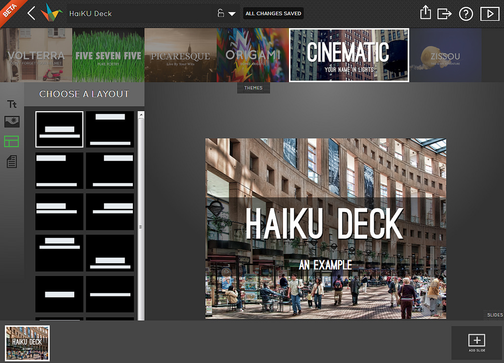
You can see I've chosen CINEMATIC from the themes along the top - this dictates the fonts, and also put a filter on all the images, which is a nice touch. There are different filters for each theme, and they're there to make the text easier to read and to help get a consistent feel to the deck. Down the left-hand side are the various layout options for this particular slide. To find the image in my example I just typed it into Haiku's own search box - it hunts for appropriately licensed Flickr images to match your search terms, and automatically credits the author and provides a link! Which is an excellent thing. (Here's an example of that, with the image credit for the pic in my screengrab, which is by ectaticist.) Along the bottom is the Add Slide button, and the preview slides (of which there is only one in my example) for you to cycle through and edit. 

Overall I think Haiku Deck is an excellent way to put together effective and attractive slides quickly. The only disadvantage is it is relatively inflexible - but of course this is also what makes it so good. It's quick, and you're locked down to only the most useful options.

When you want to present data or graphs (or your own screengrabs), or have a very varied slide-deck, Haiku perhaps isn't the right option. Otherwise, give it a shot: haikudeck.com.

Next up on the blog tomorrow, Canva.

Presentation Tools 1: Fontsquirrel


I love a good presentation. I think they're often the best way to communicate information, and I create them as stand-alone online objects as well as for actual talks to an audience. So it's Presentation Tools Week on the blog - seven different useful tools from the list below, explored over the next five days.

These fall into two broad categories: tools for creating presentations from scratch, and tools for making PowerPoint presentations better in some way

These fall into two broad categories: tools for creating presentations from scratch, and tools for making PowerPoint presentations better in some way

When I began giving presentations 5 years ago, I remember looking at Bobbi Newman's, Buffy Hamilton's and Helene Blowers' Slideshare accounts and being amazed that slides could look so beautiful. My horizons were truly expanded; previously every PPT I'd seen had been functional, boring, and (as I later learned) ineffective as a communication method. I learned by trying to expose my brain to as many great ways of putting together a PowerPoint presentation as possible, and trying things out to see what worked for me.

These days things are a lot easier, as there are several helpful tools which assist you in creating effective and pretty slides. Some of them do a lot of the work for you, and some of you provide a helping hand for specific elements of a presentation. I've summarised the 7 tools I think Past Me would have found most useful. Hopefully if you're reading this you can take something from one or more of these platforms too.

Tomorrow we'll look at an alternative to PowerPoint, but for now we'll look at working with it, using non-standard fonts. It took me a long time to realise just how important fonts were to a good presentation.

FONTSQUIRREL (fontsquirrel.com)

FontSquirrel is a website full of downloadable fonts, and I use it ALL the time - it's the first port of call for non-standard fonts. I think using new fonts which we're not all over-saturated with from the Office suite can make a HUGE difference to how good a presentation or poster looks, and everything on FontSquirrel is free even for commercial use.

Examples from FontSquirrel

Examples from FontSquirrel

I use Megalopolis Extra in loads of presentations, along with Aller, Caviar Dreams, ChunkFive Roman, Quicksand Book, and Pacifico. You need admin permissions to install fonts on your PC, so if you can't have that permanently at work, try and get it for a couple of hours, go onto FontSquirrel, and go mad downloading interesting fonts. Once you install them they install across the Office Suite, so you can use them in Word as well. Try it!

(NB: An alternative to FontSquirrel is DaFont, which I've heard people recommend, but I can't vouch for it as I've never used it myself.)

Remember to save your PPT as a PDF when using non-standard fonts! Otherwise when you come to present on a different PC without the fonts installed, it will almost certainly go horribly wrong.

Some guidance around fonts - generally it is thought that you should use a maximum of 3 fonts per presentation (although as with all 'rules' around presenting, feel free to break this one if you have a good reason), and my personal minimum font size is 36 for slides.

Font-pairing is an art I feel like I've not mastered at all, but would like to - I found the following (albeit very brief) presentation helpful:


Prezi Guide: The 5 Essentials To Stop Your Audience Feeling Sick


Prezi is nothing if not divisive. Some people love it, some people hate it - I'm in neither of those camps. I find it very useful in some situations, but still use good old fashioned PowerPoint Slides for more than half the presentations I give. Prezi should be used for a reason.

Prezi is relatively new (it's been around since 2009), it's getting more popular (there are around 40 million users now) and it's improving its interface all the time. Some people accuse it of being style over substance, but for certain ideas (interactive maps, for example) it provides substance that slides simply can't bring to the table. For me, Prezi can be fantastic as long as you adhere to one maxim above all: don't let the medium get in the way of the message. Any presentation materials should be there to support the presenter and work FOR the audience in adding to their experience. Do that, and Prezi can really raise the level of an audience's engagement.

Potentially, a great Prezi has the wow factor. So why would you want to completely undermine that by creating something which makes sections of your audience feel motion-sickness? It's up to you, the presenter, to minimize the possibility of this as far as humanly possible. Here's how. (For the short version, view the Prezi about it.)

1. Positioning

The single most important thing about creating a Prezi is the positioning of the objects on the canvas (and directly related to this, the order in which they're visited on the path). Position your materials sympathetically, people! By which I mean, rather than moving haphazardly around the canvas and disorientating the viewer, move from left to right, or from top to bottom - move in a way the human brain is used to.

2. Distancing

But positioning is about more than putting your objects in a coherent pattern - it's about having a uniform (and short) distance between them. The closer you place your objects together, the less zoom and swoop there is in your prezi. Place them right next to each other and it won't zoom out at all, it will just slide right over from one object to the next.

3. Sizing

As with distancing, uniformity is the key to sizing too. Put similarly sized objects together - ideally make them the exact same size. This means there's no need to zoom in or out. Contrast this to having a small object followed by a much larger object and then a small object again: the zoom is flying all over the place.

4. Rotation

99.9% of rotations and barrel-rolls in Prezis add absolutely zero value to the presentation.

I just made that stat up but I'm sure it's true. In fact most of the time rotating actively detracts from a Prezi. It is the Number One cause of queasyness in the viewer. It can be used with a good reason (a visual metaphor of some kind to better express your ideas) but otherwise, why would you? It just gets in the way of your message.

5. Pacing

The ability to zoom in and out is both Prezi's strength and its weakness. It's what allows you to show the relationship between objects on your presentation, it's what allows the element of surprise for the big reveal, it's what lets you put your own hierachy onto your information rather than having it dictated to you. But it's also at the heart of what can induce nausea in your audience.

So, pace your Prezi like you would regular slides. Don't move it on every few seconds - arrive at point on your path, talk about it for two minutes, or five minutes, or more, and then move on. This means there are fewer zooms per presentation, and less quickly following one-another. But you can still take advantage of the zoom's ability to enhance your presentation.


One last note on zooming

If you double-click the right arrow to move your presentation on (or left arrow to move it back) it zooms twice as fast. This can be effective in reducing the sea-sick effect - after all it's the transitions which cause the problems, so if you only transition for 50% of the time you did before, that helps. The only downside is it feels risky; if you triple click by mistake, you'll miss your path point entirely and have to go back...

Here's my Prezi on this whole topic - it explains what I've just said in a visually illustrative way (which is sort of the point of Prezi after all):


Finally

All that said, if members of your audience are particularly susceptible to motion-sickness, even doing ALL of the above may not be enough. So only use Prezi for a specific reason. Use it to do something PowerPoint can't, rather than as a direct replacement for the sake of it. Use it to cover several dispirate topics, or to make something interactive, or to visually explain relationships between ideas. But if you don't need to do any of those things, and it's a regular presentation, just use regular slides. Just be sure to use them well.

Which leads us to a bonus option:

(6. The nuclear option)

Prezi can be a very useful way to make a nice looking presentation: the fonts, icons, ease of importing images, and themes, make smart presentation materials without the need for a huge amount of effort or design knowledge. Once you get over the initial learning curve, it's quicker to make a nice Prezi than nice slides. So if you want to take advantage of all that, but want to 100% eliminate the possibility of motion-sickness, simply save your Prezi as a PDF, and use it as you would slides. Every path point on your Prezi is a full-page of the PDF so it ends up looking like a (nice) PowerPoint.

To save a Prezi as a PDF, click the share icon and choose the relevant option from there.

To save a Prezi as a PDF, click the share icon and choose the relevant option from there.


Disclaimer: Prezi will always make some people sick - they dislike Prezis intensely, and it's very important to them that they bring this up a lot. I offer no judgement here; I do the same with LinkedIn. But this guide is about stopping an audience feeling motion-sickness when watching a Prezi - if you aren't prepared to take steps to do this, you shouldn't be making Prezis!

7 Super Slide Styles to download, copy, and adapt


I love slides, as I've said before. One of the biggest problems people have when trying to make something effective and visually arresting is simply knowing where to start. Or having not much time at all, so they can get together the content but don't have chance to put it into a new style.

So with that in mind, I've created the presentation below. It features the same information presented seven different ways; if you like any or all of them, you can download the original PowerPoint from here, and do whatever you want with it. Delete the bits you don't want, modify and build on the styles you like.

I've not done this before, provided a sort of OER version of a presentation, so I'll be interested to see if people find it useful. I hope the templates can work in some situation or other for you, particularly if you're stuck for inspiration. It may be that you take a slide style and use it throughout a presentation, or it may be that you take one or two styles and just use them as a blueprint to give you a head-start, and then change them completely.  It's entirely up to you, you can do whatever you like with them - and although it would be great if you could credit me somewhere, don't worry if you can't fit it in. I'm not releasing them under a Creative Commons Attribution license, I'm just putting the whole thing into the public domain.

Something I need to make clear though (and thank you to Andrew Preater for flagging this up to me) is that the images are Creative Commons images (rather than public domain), and so if you want to use those images specifically you need to respect their original licenses! Each of them is linked to, both in the presentation itself and with its creator's name at the end of the presentation, so you can see the kind of Creative Commons licence they have. In all cases, they need at a minimum for the creator to be attributed. Obviously the images I've used here are just in there as examples, I'm expecting people to take the slide designs and redo them with their own content - but if you do decide to keep them, keep their Creative Commons status in mind...

For 6 of the styles I've included a little arrow in the breakdown section with a link to a full set of slides created somewhat in that style (most by me, a couple by other people) so you can see what an expanded version might look like.

To adapt and build on these styles if you like them, the right-click menu in PowerPoint is your friend. Firstly if you right-click on the little slide preview pane, you'll find the 'Duplicate' option. Duplicate the slide you like, then edit the contents. Right-clicking on the main slide edit view is vital here too: the menu it produces allows you to recolour text boxes or backgrounds, change the picture (but retaining size and positioning), copy elements you like and paste them elsewhere, blur or darken images so you can write directly onto them, etc etc. This allows you to take a single slide and build a presentation with a cohesive visual theme around it, rather than just having literally the same slide several times with different words on it.

Good luck making your slides, and let me know what you do with the templates! (You don't have to. I'm just curious to see whether people make things using these as a building block, and what they're like...)

Email Communication Part 2: Measuring Impact, Subject Line Length, Email Frequency & More


Earlier in the week I wrote about the basics of good email communication, the three Ts. In this follow-up I want to cover a few more complex things which didn't fit in the previous post, particularly around the theme of an email newsletter.


Why do people unsubscribe from mailing lists and newsletters?

Reasons people no longer want to receive a regular email from an organisation include, in ascending order of importance according to Litmus: Found an alternative way to get the same info, Preferred to seek out info on their own, Found the content irrelevant, Received too many emails generally, Found the content to be repetitive or boring over time.

And in First Place? 54% of people said the reason they unsubscribed was this: Emails came too frequently. Don't over-saturate your audience - pick your moments, based on THEIR needs, the lifecycle of their work, and on how much vital information you have to impart. Which leads us to...

So how frequently should I email?

In Part 1 of this post I talked about the importance of being Timely - emailing at the right time of the day so that your email is received both at a time when people actually read emails and when yours isn't buried under a pile of other emails coming in at the same time. 3pm appears to be the sweet spot.

There's another aspect to being timely though. Firstly, Monday appears to be the best day on which to send an email newsletter - for all the reasons you'd imagine (people are still full of vim and vigour early on in the week, and not yet weighed down by all the things they wished they'd got done but ran out of time to do).

Secondly, I believe it's really important NOT to email to a fixed schedule, for example the first Monday of every month. A vital aspect of good communication is not wasting opportunities by communicating when you don't need to - it reduces the value of your communication overall and edges you closer to becoming part of the white noise. So send your newsletter or other 'important updates' email only when there's a weight of useful things to say, rather than just when it's the time you usually send it. Communicate because your audience NEEDS to hear what you have to say, rather than because you need to send a monthly update.

How long should my subject line be?

Click to view this as part of a larger (and very useful) article on EmailAudience

Click to view this as part of a larger (and very useful) article on EmailAudience

Click to view this as part of a larger (and also quite useful) article on MailChimp

Click to view this as part of a larger (and also quite useful) article on MailChimp

I mentioned in Part 1 that I think the Subject Line is hugely important, and that calling your email 'Newsletter' is a recipe for being completely ignored. You need a decent title, one which gives people a specific reason to open the email; a benefit to them.

As to how long this subject line should be, there is conflicting evidence about this. EmailAudience found that very short worked well, medium length worked REALLY badly, and very long (tweet length subject lines, basically) worked fantastically.

However MailChimp analysed 12 billion emails and concluded 'Subject line length means absolutely nothing'! If you compare the graphs showing the two companies' findings, they do actually follow broadly the same pattern - short and long are good, medium length doesn't do much for anyone. It's just that how much of a difference this makes is clearly reflected as being much smaller by MailChimp. 

They conclude with this very sensible statement which makes a good point about Subject Line length and the kinds of devices and platforms your audience are reading on.

Your audience is chock-full of individuals with different reading habits, interests, and demographics. Maybe my audience is full of Apple fanboys and every one of them reads my newsletter on their iPhone. Well, then the subject line they see might need to be shorter for their small screen. Or maybe my newsletter is geared toward businessfolk who mostly run Outlook. In that case, maybe a longer subject is more acceptable.
— MailChimp

Like so many things, it comes down to understanding your audience. Which takes us neatly on to...

How can I measure and track the impact of my email?

There are elaborate things you can do with Gmail to track open-rates of emails, but I think that's much more important in traditional business than it is in non-profit comms. More important is to measure and track the impact - essentially, do people ACT on the email, and can I influence how often this happens by changing when I send the email, the subject line, the tone, the length and so on?

If your email is a just general update, measuring impact is very hard to do. If, however, it includes a Call to Action, and that action has a website involved - e.g. 'Try our new online resource [link to resource]' or 'Come to our workshop [link to booking form]', it becomes possible to see how effective the email is by measuring the Engagement Rate. This is the number of clicks on the link divided by the number people who received the email - so take a really basic example, if you email 100 people and 30 click the link, the Engagement rate is 30%. 

How do you find out how many people click on the link? You use a unique URL created especially for the email via bit.ly. Bit.ly is a URL shortening service (useful in itself) which provides two fantastic functions for Comms purposes - it allows you to customise the URL, and it counts the number of times that specific customised URL is used.

(So for example, at the end of the 10 Tiny Tips for Trainers slidedeck from a couple of weeks back, I put in a customised bit.ly URL for people who found the presentation on Slideshare, and wanted to read the blogpost which accompanied it on here - a lot more people see my slides than see this blog. The reason I used bit.ly was just to make a short, memorable URL - I chose bit.ly/10TinyTips which is a lot easier to fit on a slide in large letters than http://www.ned-potter.com/blog/2014/8/8/10-tiny-tips-for-trainers! - but it also gives me the stats. So I know that 225 people clicked on the link in the slides, because that link didn't appear anywhere else.)

So going back to the email newsletter - if you're launching a resource or promoting an event, and you want to know how effective your email has been, use a customised bit.ly URL to see how many people clicked your link. If half the people you email click on the link you've included, that's a pretty fantastic rate of return as these things go. Build on whatever formula you used and do it again! If only 5% click, then do things differently next time - perhaps change the subject line, or make the call to action more prominent, or email at a different time of the day or week.

Incidentally, another possibility bit.ly allows is to compare effectiveness of promotional activities. So you have one bit.ly URL for your new resource that you use in emails, one that you use on Facebook, and another you use on Twitter. Then you compare the stats for each, with the overall stats for the resource, and see which communication method is the best way to get people to use your stuff...

Should I care about email preview panes?

If your audience are young (University students, for example) then yes, this matters a little bit. According to ConvinceandConvert, 84% of 18-34 year olds use an email preview pane. I am 34 and I do this! I have a preview pane in both Outlook and Gmail for work, where I can - but not in Yahoo for my personal email, where I've never worked out how. I much prefer a preview.

This means these users will see the first few lines of the email (depending on how big they've set their pane) BEFORE they click to open. Worst-case scenario is they dislike what they see so much they never get as far as opening the email. The best-case scenario is they are enticed or inspired by the preview, and when they open the email they are fully engaged with its contents. So, as with so many media in the web 2.0 age, the important thing here is to hit the ground running. No long intros, no scene setting - just useful, headline information right at the top. It's using the journalism model, rather than the academic paper model - put your conclusions at the start.

Are there any useful email tools I should know about?

I think MailChimp looks great for non-profits. You'd probably need to use the paid-for version, but if email is an important part of your marketing strategy, and you can afford it, then MailChimp is worth it because of the level of control, and of impact measurement, it gives you.

I'm a big fan of Scribd (as a creator rather than a consumer - don't be put off by its homepage which is aimed at the latter!) - it takes PDFs and turns them into web documents. So if your email newsletter is a PDF, I cannot stress enough how people don't click on and open PDFs nearly as much as we'd hope they do, so put in a link to a Scribd version (or embed it in the email if that's possible with the tools you use). Not only does this make the newsletter more easily accessible, it allows it to be discovered on the web, and it gives you built-in usage statistics for how it much it's being read too.