
What is a Carousel on Instagram?
First things first: in Instagram terms a carousel is a single post containing multiple images or videos. They appear on the Grid, and you view the different images by swiping right.
Since mid-2023 you can add music to your carousel natively in Instagram, and doing so is absolutely crucial to success - it pushes the post into a different algorithm, ensuring it will be viewed much more widely than a single-image, music-free, regular Grid post.
Why are CaRousels so important?
The short answer is: reach.
Instagram’s algorithm has always prioritised video Reels over static images. For organisations, this often meant spending hours producing video content, or risking really low engagement and poor distribution with an image post. Reels are also less accessible than images, because there’s no built in alt-text feature for video on Instagram.
Over the last couple of years, there’s been a shift in the algorithm - Carousels now provide the reach and visibility of a Reel with the simplicity and accessibility of an image post. They bridge the gap. Your key messages can now reach massive audiences with less time, less production, and frankly fewer complications.
The proof is in the analytics
I run our institutional Instagram account - @UoYLibrary - which is a really significant part of our communication with students. I have a million and one other duties as Faculty Engagement Manager so as I noticed carousels getting more views I started to prioritise them over video content because they took so much less time to produce, not least because they can often be made using existing images I already have available to me, rather than needing to shoot new content.
The impact has been remarkable, The extraordinary thing is, even the less successful posts that don’t get the Likes and engagement I’m hoping for are getting consistently high reach and views. Meanwhile the successful ones are outstripping Reels - always the most popular format, historically - in all metrics.
2025 engagement
Saves: 3 of the top 5 most-saved posts were Carousels (including 1st)
Shares: 4 of the top 5 most-shared posts were Carousels (including 1st)
Likes: all 5 of the top 5 most-liked posts were Carousels
2025 reach and views
In 2024 our top five posts had a combined Reach of 32,095 people: only 1 of these was a Carousel
In 2025 our top five posts had a combined Reach of 40,228 people (a 25% increase) and 3 of them are Carousels
The most dramatic increase year on year is from Views - unsurprisingly, as if someone views three images as part of a Carousel, that counts as 3 views compared with just 1 for someone watching a Reel or viewing a single image post.
2024: Our top 10 posts achieved a combined 70,099 views
2025: Our top 10 posts achieved a combined 211,337 views
This represents a 201% year-on-year increase in total views. That top 10 breaks down as follows - several of these are collabs with other accounts, which is hugely important for Reach and Views too.
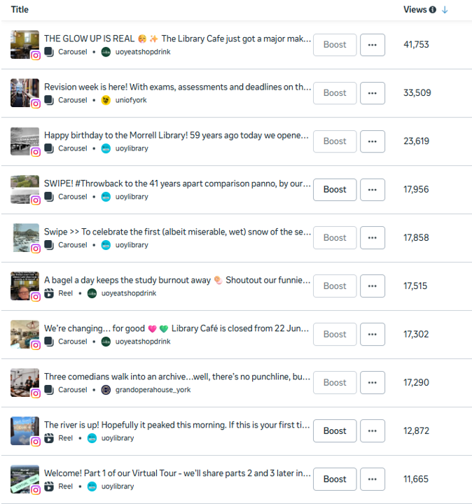
@UoYLibrary’s 10 most viewed posts across 2025: screenshot from Meta Insights
A tale of two posts
Our most successful post (that we originated, rather than were invited onto as a collaborator) in 2025 - by most metrics, albeit not Likes - was this Carousel to celebrate the library’s birthday. It reached over 9,000 people, was viewed over 23,000 times, and had over 750 Likes as well as large numbers of Saves, Shares, and new Follows.
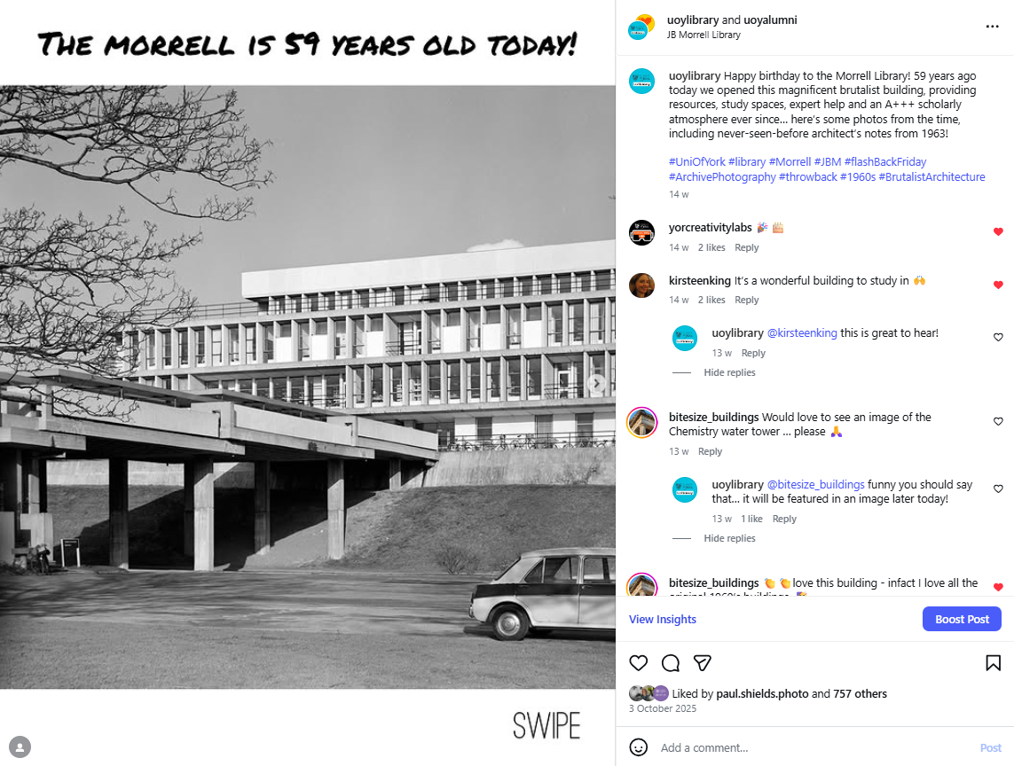
The most viewed post originated by @UoYLibrary in 2025
For me though, a better example of the power of the Carousel is our least successful post of 2025. In fact in terms of engagement, it is, I think, the least successful post I personally have put on the library Instagram account in its entire history (full disclosure I looked back through six years’ worth of posts before giving up)… It got 17 Likes.
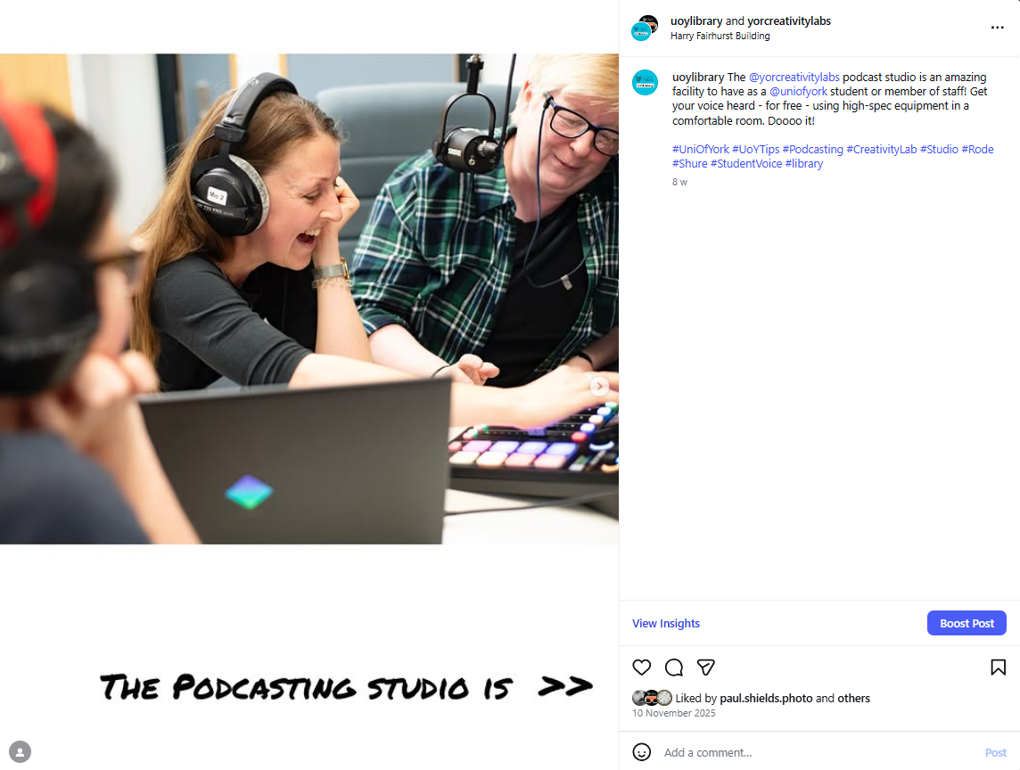
@UoYLibrary’s least Liked post of 2025
Despite this total failure on my part to pitch the Podcasting Studio in such a way as to get Likes (previously when I’ve done a Reel on this it’s had much more Likes, and the TikTok version did really well too - so it’s the framing, rather than the subject matter, that’s the issue with the post above), the Carousel of it all meant it has still reached nearly 900 people and had nearly 4.5k views.
To put that in context, the post reached more people (and got 106% more views) in a week than the podcasting studio webpage did in the whole of 2025 - and that includes a spike in the webpage views caused by the Instagram post… There’s nothing wrong with the webpage - it’s just that our target audience don’t really web-search, but they scroll-search social media all day. So all in all: the habits of undergraduates x the reach of the Carousel = even an unsuccessful Insta post getting key messages out really well compared with other mediums.
Get posting
I’ll write another post soon about what works and doesn’t work with Carousels but for now I hope you’re convinced that, going into 2026 if you’re running an organisational account it’s time to plan some Carousels. In fact I wouldn’t post any individual images this year - why throttle your own reach, when a Carousel would go so much further? Get your message out to the widest audience possible, and take advantage of the cheat code while it lasts!