Presentations

8 tips for teaching library sessions online

We’ll all be teaching infolit online for the foreseeable future (I hope) and it is, as anyone who’s done much of it will tell you, a very different experience to being in a room with people.

I do a lot of training online already for overseas audiences, so I have some familiarity with this. For what it’s worth, here are some tips for retooling your sessions to work in a webinar type environment.

  1. Plan your session so your audience switches frequently between listening and doing

    I don’t know how you currently do your workshops, obviously, but if for example you do a 20 minute intro, then give people 20 minutes to do a task or two, then 10 minutes summing up at the end, you may find it worthwhile to rejig this a bit.

    In the online environment where everyone is learning on screen, too much of anything for too long is a barrier to engagement. Long talky bits are really hard to pull off, and long activities don’t often work either. And indeed, long sessions overall - if you had a 2 hour class booked, make it 1.5 hours max for screen-learning.

    In my experience, relatively short bursts of talking interspersed with relatively short bursts of activity works best. So take a big exercise and split it into two; introduce part one, let them try it, introduce part two, let them try that. And so on. Short, sharp chunks. (Can you have sharp chunks? Shards, maybe.)

  2. Mute participants (apart from specific times for questions)

    I always, always have participants muted as they enter the online space. If everyone’s mic is live, it quickly becomes a cacophony of noise that makes it impossible for anyone to really concentrate. (Honestly just one person having a chat with someone in the same room is enough to derail things.)

    I encourage questions at any time via the Chat (more on which below) rather than audio - however sometimes it can be beneficial for people to ask questions out loud rather than type them. If you want to do that, have a clearly designated time in the session when this will be possible, and signpost it ahead of time. “On 30 minutes we’ll pause, and anyone who wants to unmute and ask a question can do so then.” Then the conversation happens, everyone mutes again and you carry on from there.

    If you do this it’s important to wear headphones, otherwise the audience’s questions come out of your PC speakers, into your mic, and back out of the speakers again - this causes all sorts of problems and is definitely best avoided…

  3. Consider using your webcam for the intro, then turning it off

    Assuming you have a webcam and video is an option, there’s a balance to be struck there too. Webcam-on for the whole session is, in my experience, not conducive to good teaching. You instinctively present to the camera, and this means you’re worrying about that side of things rather than your slides and the Chat. Especially if you’ve not done too much online teaching before, I’d keep things as simple as possible because there are so many more things to juggle than in an online session. You can choose to not use the webcam at all (that’s fine!), or use it for the intro and then say ‘now we’re moving into the session and using the slides, I’m going to turn off the webcam so you can see my screen better’.

    This is because part of each slide is blocked by your own face with the webcam. I have done a workshop where for specific reasons the whole thing was camera-on, and I found it useful to work out exactly how big the camera-window would be and create a Shape in PowerPoint that was the exact dimensions. I then put this on every slide and made sure no content was going in that part, so nothing would be obscured by the window later (which I positioned over the Shape).

  4. The Chat function is absolutely key

    If you’re using webinar software then Chat will be a way your audience can ask you, and each other, questions. Confusingly there is also a Questions function in things like GoTo Meeting - and it’s really important to shepherd people toward Chat rather than Questions. Questions are only seen by you, but Chat is seen by all participants. Obviously if someone had a sensitive query, the DM-style Question is the way to go - but for everything else, you want to encourage active participation as much as possible. Often the difference between good online training and great online training is the Chat - the more people talk to each other and to you, the more than barriers of it being online fade away and the more useful the session becomes.

    Whether you’re using Hangouts style software or webinar software or Google Q&A, it goes without saying you need to keep the Chat where you can see it at all times. You can have particular periods of the session when you dip into it and respond to what has been asked, but seeing the questions as they come in is vital for engaging the audience. Obviously if you have a second screen this helps a lot, but if you don’t have that option it’s still worth making sure the Chat is visible to you always.

    I tell people about it at the start, and I remind them about two minutes later - I tell them about it again and again because sometimes people need encouragement to use it, but once they do everyone tends to join in. Teaching is so much richer when you respond to the audience’s specific needs, so it has to be a priority to make sure these needs are expressed…

  5. Get used to not speaking

    What separates good online teaching from boring webinars is interactivity. The Chat is key to this as discussed, but so is getting people to DO things and - trust me on this - it feels really, really, weird to give people time to do activities and exercises while you sit there in silence. But it’s better to have a couple of 5 or 10 minute activities where your audience are genuinely given time to try things out and then report back in the Chat.

    I find this really tricky because you become hyper-aware of the dead air. You’re not wandering around checking what people are doing, you can’t see them working or hear them chatting to each other. You feel faintly absurd, sitting there in front of your PC and hoping people are using the time you’ve given them to do the thing you’ve asked them to do. But it’s essential - it stops it being a classic ‘boring webinar’, one-way traffic delivered as a lecture on screen which, even if you’re great at public speaking, is not enough to truly engage most audiences.

    I find the not-speaking part so hard that I set a stop-watch for it every time. If I’ve told the group they have 10 minutes, I’ll start a stop watch and not stop them until 10 minutes is up. If I don’t take this measure, I inevitably get angsty 6 minutes in and then move things on prematurely…

    I always mute my mic for these parts - no one wants to hear the click of your keyboard etc - but check in on the mic a couple of times during the period to say ‘don’t forget if you have any questions or something isn’t working as you’d expect, ask me in the chat’. When people ask a good question I’ll come back on the mic and pick it up with the whole group, just as I would with a face-to-face session.

  6. You may wish to stand up…

    Teaching needs energy, and sometimes it’s hard to bring energy when you’re sitting down! If your mic and other equipment allows it and you’re comfortable doing so, standing up to deliver your session just as you would in a seminar room can really help. Without hand gestures and facial expressions it’s already hard to get your point across dynamically, so your delivery counts for a lot.

    Something solo radio DJs apparently do a lot is put something opposite them to stand-in for the audience - a cuddly toy or, in one studio I saw, a Policeman’s helmet - and they talk to THAT. Rather than talking just generally into the ether, addressing something specific (even something faintly ridiculous) will focus your delivery and make it more human. So grab some sort of mascot and stick it above your monitor…

  7. If you can do online teaching in pairs, take that option

    Managing an online session is quite stressful - if anyone has technical problems you really can’t help them and teach at the same time. So pairing up, with one person teaching and another facilitating, is well worth doing if you can. The Facilitator can be on hand to help participants, both with the logistics of the online session and with the exercises themselves - they can also message the presenter to flag up a Chat question if they miss it. Working as a team in this way allows you to teach better because you’re not splitting your focus. 

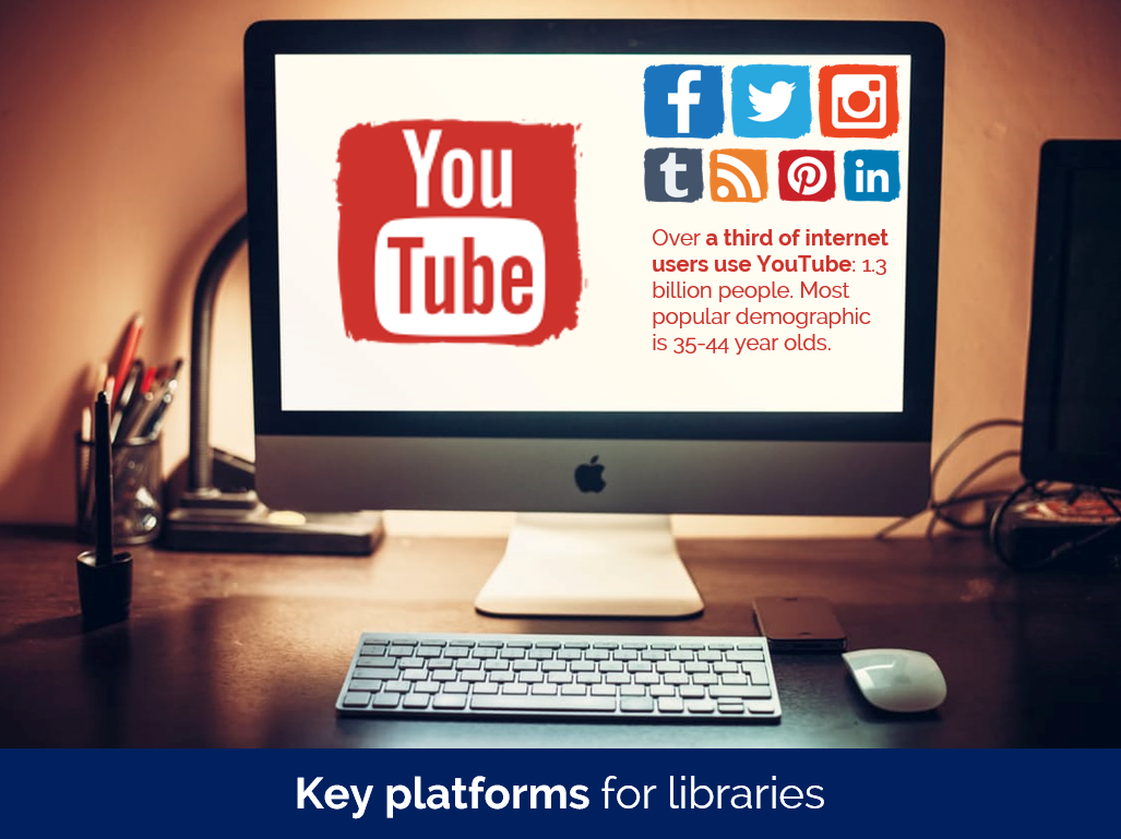
  8. Good slides matter more than ever

    If you’ve read this blog before you’ll know I think good slides are important. In online teaching they’re even more so, because they’re the only thing your audience can see. It’s not just that they can’t see you; they can’t even see each other. So something inspiring on the screen is really essential - especially if your online session is coming as part of many, many other sessions also online. Death by PowerPoint will not do.

    There’s plenty of guidance on this site about making good presentations. A couple of posts to start with would be the Alternatives to Bullet Points and the Sources of CC0 Images articles: but really anything with the presentations tag is potentially relevant.

    Unbelievably this general guide to slide-making is 6 years old now, but although some of the links to image sources are out of date, and, frankly, I’d make very different font choices nowadays, the basic principles are still important for producing effective presentation materials!

Accessibility and online teaching

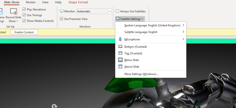
I don’t want to position myself as an expert on this but I do have advice on making your slides more accessible (thanks to Rachel fro the prompt!). The main thing is to use PowerPoint and turn on the subtitles function - if you’ve never used this you’ll be amazed at how well it works. PowerPoint provides subtitles of everything you say, as you say it. You can find the Settings for this in the Slideshow part of the menu:

The Subtitles function, found in ther Slide Show menu in PowerPoint

Otherwise all the normal rules apply.

  • Good contrast between font colour and background. It’s important to have plenty of contrast, for example black text on white background, so the text is easy to read. Purple on black for example doesn’t work. Related to this, don’t put text over a busy background.

  • Minimum font size of 24. Anything less than 24 risks being hard to read on a small screen; if you need the font smaller than 24 there’s probably too much information for one slide.

  • Use sans-serif fonts. Sans-serif fonts such as Calibri and Arial are better than Serif fonts such as Times New Roman or decorative / script fonts.

  • Don’t use colour as the only indicator of key information. You will almost always have at least one colour-blind audience member. It’s important to avoid using colour as the sole way of conveying information. For example, to have something shown in red to say stop doing it and something else in green to say start doing that, is not sufficient. Use the text, or a tick and cross or other non-colour-based-visual indicator, to ensure people understand what you’re telling them.

  • Repeat Chat questions back. This is good practice anyway: if someone asks a question in the chat, say it out loud for everyone to hear before answering it.


There’s lots more aspects of teaching online that others will be able to go into in more depth, but the 8 things above are, to my mind, key as we #PivotToOnline (as they say on twitter…) Good luck everyone!

Any questions, tips, comments, suggestions, advice? I’d love to hear it in the Comments.

Using screencapture software to make next-level PowerPoint presentations

I normally record talks I give at conferences, using my phone in my jacket pocket. I have a strict 'no critiquing myself during the talk itself' rule, so the recording allows me to listen back afterwards and pick up on things that I'd want to do differently next time, or things that worked well etc.

In the past I've also put a video up on YouTube, using Camtasia to record me moving the slides along with the audio of my talk at the LIASA conference in Cape Town. I don't think this worked that well because there was simply too many long periods where nothing changed on the screen - in real life that was fine because the audience looks at the speaker, but in a video - a visual medium after all - it just feels a little inert and uninteresting.

So for a recent talk I decided to try and make a version of the slides that would work as a proper video. I spoke at the CILIP PPRG Conference in January (more on that in a previous post) about our UoYTips marketing campaign - York won a Bronze Marketing Award which I was picking up at the event. I delivered the slides and recorded the talk in the usual way, but then set about creating a new version of the slides that had much more going on visually. The actual slides are here, if you're interested, and here is how they evolved for the video I came up with:

Now I've done this, I'm wondering why I can't just do more visually exciting slides anyway? This doesn't have to be just for YouTube. I've always wanted to use video in presentations more, and it's surprisingly easy to do as it turns out.

The tools

To make the video above I used three bits of software. PowerPoint, obviously, for the slides. Audacity to edit and play the audio (this is free). And Screencastomatic for both the screen-capture videos within the slides, and the overall screen-capture of slides plus audio you can view above. Screencastomatic is a great tool, which I found much easier to use than Camtasia. It's quick and intuitive. It can be used for free, but in order to record videos of more than 15 minutes, and record PC audio, you need the pro subscription - this costs 12 quid year which is pretty great value, I reckon.

Here's what the Screencast-o-matic interface looks like:

too.PNG

It's very easy to redraw the box around the exact part of the screen (or all the screen) that you want to record. You can pause and restart. You can also record PC audio as you go, or narrate into a mic. As you can see it gives you the option of recording from webcam at the same time if you wish, which happens in a smallish box at the top right of the screen.

It's really easy to use.

The techniques

In the video above there are a number of techniques (perhaps that's too grand a word!) employed to suit different types of information.

  • Actual video recorded on my phone. (This happens about 25 seconds in.) I recorded a video in the usual way, emailed it to myself, and went to Insert Video in PPT. You can make it full screen, or you can overlay the branding / visual identity from your PPT over the top. I think this is crucial to how easy this is to do - the video can effectively be the background of the slide, just like an image can. You then overlay it with text, shapes, images etc as normal.

  • Screencasting Google Earth. I really like this one, which happens here. How to have something dynamic on screen while I talk about the University of York? Type it into Google Earth then press record on the screencasting software, and return on Google Earth. It zooms all the way in and then, delightfully, spins round the building you've chosen for a bit. I'm going to use this in library induction sessions in the future, for sure.

  • Using gifs. There's a couple of examples of this, but here's the most interesting one. It starts off as a regular full-screen image, and then I used animation to first of all drop the text on top of the image at the appropriate time, and secondly to trigger the gif video beginning (having downloaded the gif from a gif site, and saved it as a video).

  • Regular PowerPoint animations and transitions. There's a few moments where things are added onto the screen one-by-one as I mention them, and there's this very long fade transition between two slides

  • Videos of websites instead of screengrabs of websites. There's an example here, and another example here. In the talk I just showed a screenshot of the thing I was talking about, but here it's a 15 second video of the site being used, which is much more interesting. I'm definitely going to reuse this technique.

The drawbacks

Really the only two drawbacks are that it takes time, and it takes space.

Of course, recording a clip on a website in use takes more time than just a screenshot, but it becomes surprisingly quick. Perhaps a minute to set-up, record and save / export 20 seconds' worth of screen-capture, so not too bad at all.

In terms of space - the videos are MP4 files and pleasingly small. Most brief captures were under 1 meg. The 22 second-long Google Earth zoom right at the start of the video was 12 meg. The overall final file - a 20 minute video capturing the whole thing, was 99MB. Video files are so huge, I think this is pretty reasonable.

So, I'd recommend giving this a try. And if you create a presentation with video and upload it anywhere (or you've already done this in the past) leave me a link in the comments...

A guide to the best free sites for cc0 art and stock photography

I recently wrote a guide for my library's blog on the best sites for high quality, free, and public domain images. I've recreated part of it below.

These sites are hugely useful for marketing purposes, as you can use them in websites, posters, slides, on social media (but NOT insta! That needs your own photos on...) and so on, completely legally and without shelling out any cash.

The sites listed below contain images which have been made Creative Commons Zero (also known as CCO) by their creators, are available to use by anyone, however they like. The images are in the Public Domain and can be reproduced, incorporated into other works, modified, and reused, without needing permission and in most cases without even needing to credit the author.

Free to use stock photography

Pexels

Pexels is the CC0 site I go to first when creating slides or websites. It's good on technology particularly, but covers loads of areas well, with stock photography that is far above the average stock shots. It has tens of thousands of pictures, including the ability to search by colour, and also has a sister site dedicated to CC0 video.

A selection of images found using pexels.com's colour browsing facility

A selection of images found using pexels.com's colour browsing facility

Stocksnap

Once you start using CC0 image sites you get used to seeing the same stock photography appearing on many of them (it comes with the territory, as the fact that the copyright has no restrictions means any site can pick them up and use them - you could start an image bank right now using CC0 images if you wanted to), but Stocksnap seems to have a few more pictures which are unique to it. Thanks to Hilary and Luke who showed me this at the PPRG conference. Here's the 'recently added images' from today:

The most recent additons to StockSnap.io

The most recent additons to StockSnap.io

nappy.co

Nappy describes itself as “Beautiful, high-res photos of black and brown people. For free” and this is a rare thing: stock photography is often VERY white. Thank you to @AgentK23 for giving me the heads-up about this site.

Photos from the ‘Work’ category of nappy.co

Photos from the ‘Work’ category of nappy.co

finda.photo

finda.photo (that's the actual URL as well as the name) searches through lots of other CC0 sites in one go, including the excellent UnSplash. As well searching by keyword you can browse by colour, collection, or original source.

Images from the 'Glare' category of finda.photo

Images from the 'Glare' category of finda.photo

Interestingly after I tweeted this, Unsplash got in touch with a reply, and pointed out that finda.photo only searches a relatively small percentage of their photos:

I had no idea this was the case! So, worth going direct to Unsplash.com too.

Gratisography

For some pictures that are about as far away from tired stock photography cliches as it is possible to get, head over to Gratisography. Quirky, odd images, of extremely high resolution and quality, free to use in any way you see fit. There's really nothing quite like it.

Gratisography. Not your average stock photography site

Gratisography. Not your average stock photography site

RawPixel

A new site for me is RawPixel. They got in touch after reading an earlier version of this guide and I'm happy to include them - if you work in design this site must be a godsend. There's a real variety here, not just in terms of the images but the way they're grouped and organised - check out the Boards section to see what I mean. Just for this image alone I will be using their site again - images of teaching seem to be almost impossible to find!

Finally a decent image of 'teaching' happening! And they've ever-so-helpfully left a lovely big copyspace on the board for you to write in whatever you like...

Finally a decent image of 'teaching' happening! And they've ever-so-helpfully left a lovely big copyspace on the board for you to write in whatever you like...

UKBlackTech

These aren't cc0 - they're Creative Commons Attribution - but I wanted to include them because they're a set of tech-focussed images focusing on BAME protagonists. It's great that UKBlackTech have made these available for free.

Download these images at ukblacktech.com

Download these images at ukblacktech.com

Free to use art and artwork imagery

An absolute ruddy masterpiece, from 1565, available to you, reader, to do with as you please, thanks to The Met

An absolute ruddy masterpiece, from 1565, available to you, reader, to do with as you please, thanks to The Met

  • New York Met

    375,000 images of artworks from The Met's collection to use, share, and remix without restriction. And it's the New York Met, so they have some of the most famous paintings in the world, like Bruegel's The Harvestors from 1565. 

  • Walters Art Museum

    Because the Walters owns or has jurisdiction over the objects in its collection and owns or customarily obtains the rights to any imaging of its collection objects, it has adopted the Creative Commons Zero: No Rights Reserved or CC0 license to waive copyright and allow for unrestricted use of digital images and metadata by any person, for any purpose.

  • Riks Museum Amsterdam

    The Dutch Rijkmuseum in Amsterdam has opened its collection to the public with the majority of its photographed artwork being released under a CC0+ license that requires attribution. You must create a free account in order to download.

  • Getty Museum

    Thousands of images of artworks are available for download, without charge, under the Getty's Open Content Program. Look for the Download button under the image.

  • Yale Center for British Art

    The Center provides free and open access to images of works in the public domain and certain other materials, and hopes to encourage further the use and reuse of its public domain resources by all who may have access to them.

  • Europeana Collections

    Europeana provides an extraordinary 8 million images which are completely free to re-use, covering the areas of Art, Fashion, Maps & Geography, Migration, Natural History, Music and others.


You’ll find details of my Presentation Skills or PowerPoint workshops here: you can book an all-day or half-day session for your organisation, online or in person. We look at a lot of great CC0 image sites and talk about how to find the right images for your presentations and social media.

A short post on preparing short presentations (for short time-slots)

This is a good question, something I've answered a lot in workshops but never blogged about. So here's what I think is really important about prepping short talks with PowerPoint presentations:

  1. Create the number of slides you think you need, then get rid of a couple! The time just rushes past in short presentations, so when it comes to your PPT (or whatever else you're using) you almost always need less than you think. Five slides for a 15 minute presentation may often be enough.
  2. Simplicity is never more important. Simple slides are better anwyay (image-rich, a little text as possible, no bullets) but are especially vital when you only have a very short window in which to convey your information. The messages need to stick, so make them easy to understand and support them with relevant images.
  3. Signpost to more detailed information. Have a blog-post already published which goes into more detail than your 15 minutes will allow, and use a customised bit.ly URL to share the post in an easy-to-remember link at the end of your talk.
  4. Structure is still important. Audiences find structured presentations easier to remember and understand, even for very short talks. So try to have a beginning, a middle, and an end clearly signalled (both in what you're saying and in your slides)
  5. Consider doing a 20:20. A 20:20 (also known as Pecha Kucha) technique involves having 20 slides, each of which automatically moves on after 20 seconds. These are acually really fun to do (the trick is to keep talking rather than stopping to wait for the slides to catch up) and force a real discipline in terms of the economy of your delivery. A 20:20 takes just under 7 minutes and it's amazing how much you can cover in that time if you practice. (I know point 5 directly contradicts point 1, but the approach is SO different with Pecha Kucha it's a whole different ball-game...) 

6 Alternatives to Bullet Points


First things first: bullet points are not inherently bad. They can be very useful in written documents. When used in presentations, however, they stop your presentation being as effective. (They often turn presentations into written documents) In fact, your audience engages less, remembers less, agrees less and likes you less when you use bullet points in your PowerPoint presentations. (International Journal of Business Communication, 2015)

So why take that risk?

Usually the answer to that question is one of: 1) It's what I've always done, 2) It's the easiest way thing to do, or 3) Because what else would I do?

For me, 'we've always done it this way' is not a reason to do something. 'This is the best way to do it' is a reason to do something, and sometimes that overlaps with that we've always done, but not always. 

Presentations are often huge opportunities. You have a room full of people giving you your attention (with potentially thousands more online afterwards) and you're there to talk to them about something significant. So although bullets may be easy, why not make the most of the opportunity? Why not do everything you can to not only get your message across but to get it to stick in people's minds? And finally, the 'what else is there?' issue - well, here are five alternatives to using bullets.

(Subscribers, there's LOTS of images in here, some of them stacked up as slides. It's probably going to be a lot easier to view this on the website itself rather than in an email / feedreader - here's the link.)

1) Just put fewer words on the slide

An example of using fewer words without reducing the impact

An example of using fewer words without reducing the impact

An obvious and straightforward place to start. Take away everything you don't need - if it's surplus to requirements, if you can remember to say it out-loud, or if it doesn't really matter whether you say it or not, just get rid of it!

The example here is a slide I used in a recent workshop. I could of course have listed all the ways in which marketing is changing, using bullet points to separate them. But I felt the slide would have more impact with just a single sentence written on the screen, me listing examples out loud, and a visual metaphor as the background image.

2) Cascade the key messages across multiple slides

Rather than making four or five points on one slide (and risk your audience reading ahead and getting out of sync with you the presenter), make one point per slide over four or five slides. This gives each point room to breathe, and helps with signalling to ensure your audience understands and remembers you.

If you're making several points on a theme you don't have to make new slides from scratch for each one - just do the first slide, right-click and Duplicate it, then edit the text on the duplicated version. I've used this technique in the examples below (use the arrows to switch between slides):

If you've got the most recent PowerPoint you can use the Morph transition between the slides, which works really nicely.

People worry that this method will mean a longer presentation but this isn't the case - you take the same amount of time overall, but cycle more quickly through the slides.

3) Use colour to make lists readable, rather than use bullet points

An example of using colour to differentiate chunks of text

An example of using colour to differentiate chunks of text

There are times when you need several points on a slide - for example when you're showing an audience what you'll talk about, or are summarising something, or making comparisons. In these instances neither of the first two techniques are appropriate; you need all the text on one screen. So just write it out like you normally would, but get rid of the baggage and negative associations of bullet-points by not using them - and recreate the POINT of them (making text easier to read) by using alternating colours.

In the particular example shown here, I've actually built up to what you see over three slides. The first just says has the alternating colours text list much larger and in the centre of the screen, then the second is as you see above but with the Bodleian's reply hidden, and then lastly the slide you see here.

4) Highlight key sections of your slide, one by one

I do this a lot - sometimes by building the content of the slides one animation at a time, or by changing the colour to highlight each section, one at a time. Again it means you can have all the points on screen, but you're not using bullets and you're in sync with your audience.

In the example below I've got all three points on screen but each one is highlighted yellow (picking out the yellow from elsewhere on the slide) while I talk about it - again use the arrows to move between them:

5) Turn your bullet points into something visual

An example of using icons instead of bullets

An example of using icons instead of bullets

A fifth option is to basically use bullets without people thinking 'Aargh, bullet points, death by PowerPoint here I come' etc. Use icons (for example from iconfinder.com) as bullet points - the images will help your audience learn. A basic example is shown here.

6) Combine several of the techniques above

The final example below is how I introduce the timings for my Presentation Skills training days. It does what a single slide with bullet points would do, but uses colour and visual elements over three slides to introduce the information in a more engaging way. Part of the reason I bothered doing this is the slides allow me to talk about each part of the day in turn, whilst staying in sync with my audience, AND it allows the audience to see the full day's timings in one go on the final slide of the sequence.

So there you go! Several ways to avoid bullet points. It's really worth taking a small amount of time to rewrite presentations to avoid bullets: your audience will thank you for it...


You’ll find details of my Presentation Skills or PowerPoint workshops here: you can book an all-day or half-day session for your organisation, online or in person.