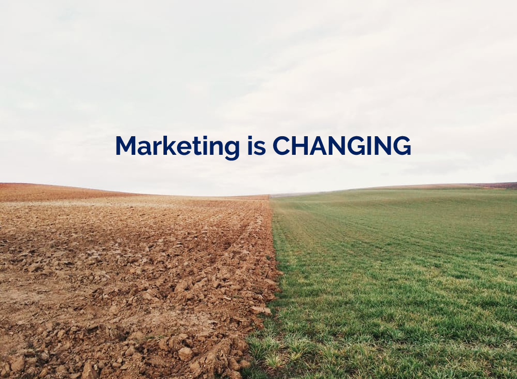
I recently wrote a guide for my library's blog on the best sites for high quality, free, and public domain images. I've recreated part of it below.
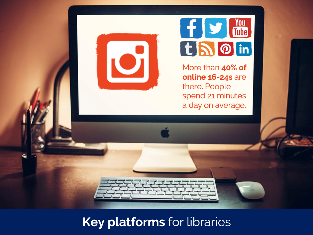
These sites are hugely useful for marketing purposes, as you can use them in websites, posters, slides, on social media (but NOT insta! That needs your own photos on...) and so on, completely legally and without shelling out any cash.
The sites listed below contain images which have been made Creative Commons Zero (also known as CCO) by their creators, are available to use by anyone, however they like. The images are in the Public Domain and can be reproduced, incorporated into other works, modified, and reused, without needing permission and in most cases without even needing to credit the author.
Free to use stock photography
Pexels is the CC0 site I go to first when creating slides or websites. It's good on technology particularly, but covers loads of areas well, with stock photography that is far above the average stock shots. It has tens of thousands of pictures, including the ability to search by colour, and also has a sister site dedicated to CC0 video.
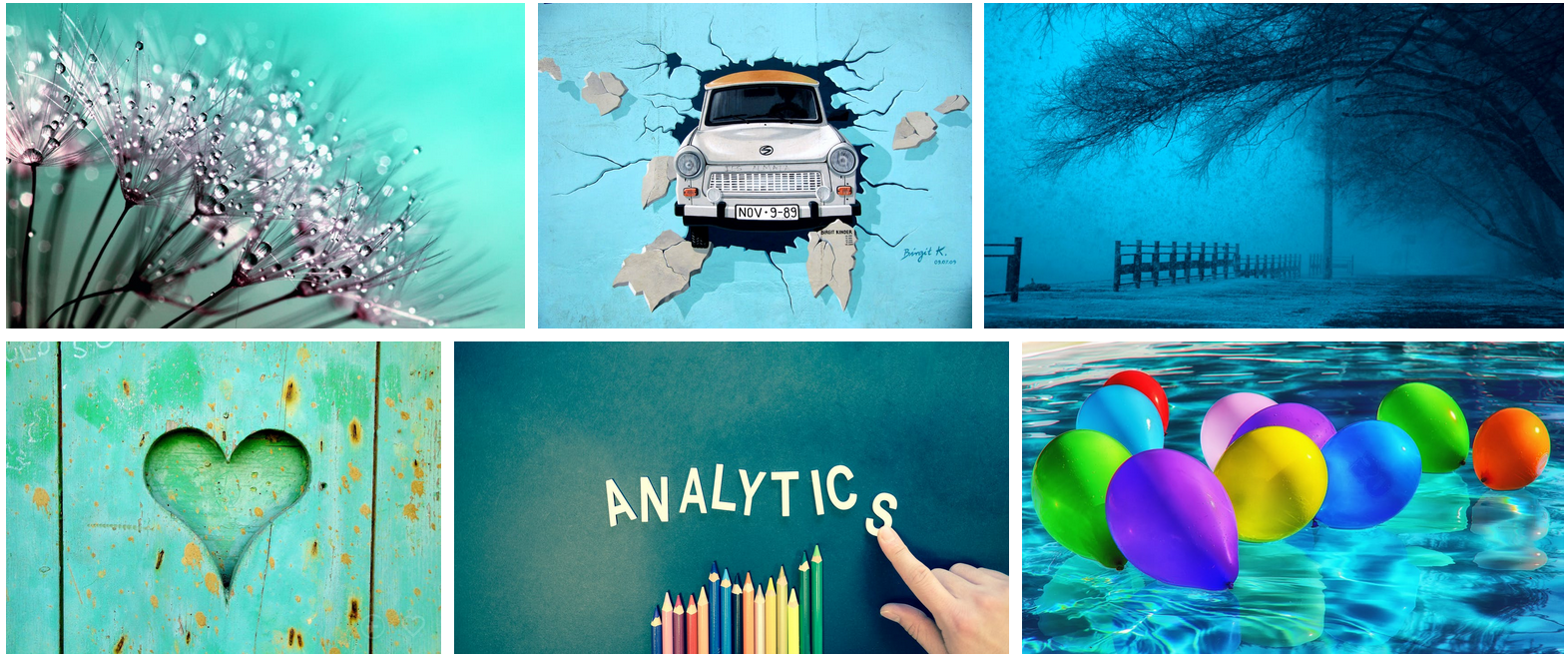
A selection of images found using pexels.com's colour browsing facility
Once you start using CC0 image sites you get used to seeing the same stock photography appearing on many of them (it comes with the territory, as the fact that the copyright has no restrictions means any site can pick them up and use them - you could start an image bank right now using CC0 images if you wanted to), but Stocksnap seems to have a few more pictures which are unique to it. Thanks to Hilary and Luke who showed me this at the PPRG conference. Here's the 'recently added images' from today:
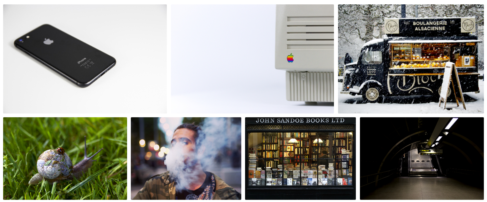
The most recent additons to StockSnap.io
Photos from the ‘Work’ category of nappy.co
finda.photo (that's the actual URL as well as the name) searches through lots of other CC0 sites in one go, including the excellent UnSplash. As well searching by keyword you can browse by colour, collection, or original source.

Images from the 'Glare' category of finda.photo
Interestingly after I tweeted this, Unsplash got in touch with a reply, and pointed out that finda.photo only searches a relatively small percentage of their photos:
Just a heads up, though, that https://t.co/0uq5XGIu1p only offers ~8,000 of our pre-Unsplash License photos and not the other 400,000+ from the Unsplash Library 😉
— Unsplash (@unsplash) January 25, 2018
I had no idea this was the case! So, worth going direct to Unsplash.com too.
For some pictures that are about as far away from tired stock photography cliches as it is possible to get, head over to Gratisography. Quirky, odd images, of extremely high resolution and quality, free to use in any way you see fit. There's really nothing quite like it.
Gratisography. Not your average stock photography site
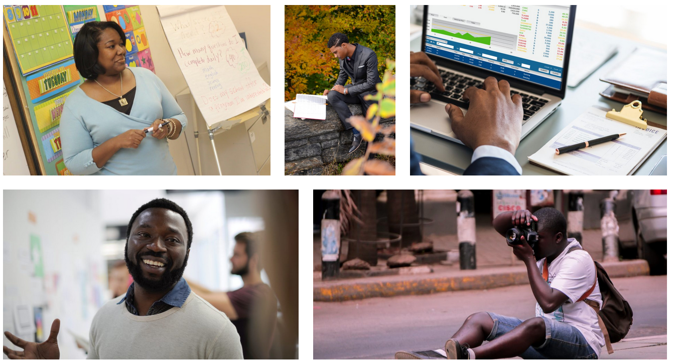
A new site for me is RawPixel. They got in touch after reading an earlier version of this guide and I'm happy to include them - if you work in design this site must be a godsend. There's a real variety here, not just in terms of the images but the way they're grouped and organised - check out the Boards section to see what I mean. Just for this image alone I will be using their site again - images of teaching seem to be almost impossible to find!
Finally a decent image of 'teaching' happening! And they've ever-so-helpfully left a lovely big copyspace on the board for you to write in whatever you like...
These aren't cc0 - they're Creative Commons Attribution - but I wanted to include them because they're a set of tech-focussed images focusing on BAME protagonists. It's great that UKBlackTech have made these available for free.

Download these images at ukblacktech.com
Free to use art and artwork imagery

An absolute ruddy masterpiece, from 1565, available to you, reader, to do with as you please, thanks to The Met
375,000 images of artworks from The Met's collection to use, share, and remix without restriction. And it's the New York Met, so they have some of the most famous paintings in the world, like Bruegel's The Harvestors from 1565.
Because the Walters owns or has jurisdiction over the objects in its collection and owns or customarily obtains the rights to any imaging of its collection objects, it has adopted the Creative Commons Zero: No Rights Reserved or CC0 license to waive copyright and allow for unrestricted use of digital images and metadata by any person, for any purpose.
The Dutch Rijkmuseum in Amsterdam has opened its collection to the public with the majority of its photographed artwork being released under a CC0+ license that requires attribution. You must create a free account in order to download.
Thousands of images of artworks are available for download, without charge, under the Getty's Open Content Program. Look for the Download button under the image.
The Center provides free and open access to images of works in the public domain and certain other materials, and hopes to encourage further the use and reuse of its public domain resources by all who may have access to them.
Europeana provides an extraordinary 8 million images which are completely free to re-use, covering the areas of Art, Fashion, Maps & Geography, Migration, Natural History, Music and others.
You’ll find details of my Presentation Skills or PowerPoint workshops here: you can book an all-day or half-day session for your organisation, online or in person. We look at a lot of great CC0 image sites and talk about how to find the right images for your presentations and social media.