A short post on preparing short presentations (for short time-slots)

This is a good question, something I've answered a lot in workshops but never blogged about. So here's what I think is really important about prepping short talks with PowerPoint presentations:

  1. Create the number of slides you think you need, then get rid of a couple! The time just rushes past in short presentations, so when it comes to your PPT (or whatever else you're using) you almost always need less than you think. Five slides for a 15 minute presentation may often be enough.
  2. Simplicity is never more important. Simple slides are better anwyay (image-rich, a little text as possible, no bullets) but are especially vital when you only have a very short window in which to convey your information. The messages need to stick, so make them easy to understand and support them with relevant images.
  3. Signpost to more detailed information. Have a blog-post already published which goes into more detail than your 15 minutes will allow, and use a customised bit.ly URL to share the post in an easy-to-remember link at the end of your talk.
  4. Structure is still important. Audiences find structured presentations easier to remember and understand, even for very short talks. So try to have a beginning, a middle, and an end clearly signalled (both in what you're saying and in your slides)
  5. Consider doing a 20:20. A 20:20 (also known as Pecha Kucha) technique involves having 20 slides, each of which automatically moves on after 20 seconds. These are acually really fun to do (the trick is to keep talking rather than stopping to wait for the slides to catch up) and force a real discipline in terms of the economy of your delivery. A 20:20 takes just under 7 minutes and it's amazing how much you can cover in that time if you practice. (I know point 5 directly contradicts point 1, but the approach is SO different with Pecha Kucha it's a whole different ball-game...) 

Sharing UX Findings: York's strategic approach

Reblogged from Lib-Innovation, updated with some new statistics and links.

For the 30th post on Lib-Innovation it seemed appropriate to celebrate the milestone by talking about dissemination of our UX work at York. Although the Lib-Innovation blog covers lots of other things too, the topic of UX was the main reason we created it in the first place.

We've tried to take a strategic approach to dissemination, proactively looking to share what we're doing with as many different types of audience as possible rather than just hoping it will happen. We're excited by what we're learning both from and about the ethnography, and the design, that we're undertaking, so we want people to know about it. In the ideal scenario, we'd spark ideas off that others take on and apply in their own contexts. And we want feedback and ideas to improve our own work. So we're telling people about the work across multiple platforms, and in this post we'll explore some of the ways we're doing it, and why.

Internal audiences

Our rule of thumb is that anyone who gives their time to take part in our ethnographic fieldwork should be the first to hear what we've done with the information. So for the last major UX project we did, the 100 or so participants go an interim report (along with library managers), and they will be the first to see the final report, before it is more widely circulated within the University.

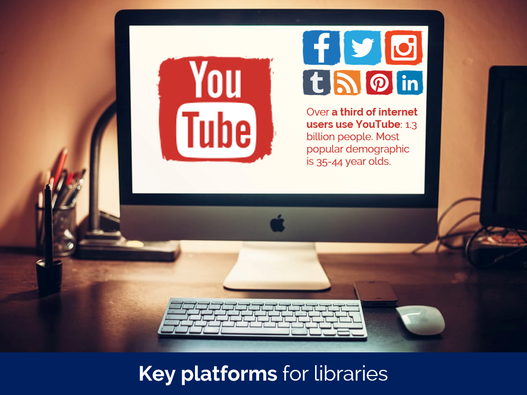
The Library industry in general

The blog is open and anyone can read it, but it is aimed primarily at those in the library industry. (There's a separate blog which we aim at staff and students who use the library.) We hope to reach as many people as possible this way. Not everyone will end up caring too much about UX but hopefully for some it will stick. We put pretty much everything on here - the idea is you don't have to be at a certain event or to speak to any of us in person to learn everything there is to learn about what we're doing.

I tweet about it, we ask the people in the University's Central Marketing who deal with the library to tweet about it, and I sometimes reblog UX articles on my own website.

We've been pleasantly surprised by how much people have read the posts: the most popular article on this site (Vanya Gallimore's overview of our Understanding Academics UX project) has been viewed over 1800 times at the time of writing, which is more than the readership of the majority of subscription journals. What we've not had, however, is comments! I love blog comments. There was a period around 2011 or so when everyone left comments on each other's blogs, and as an author of a post it was so gratifying to be able to interact with people reading. That doesn't seem to happen any more (or maybe that's just our blog!), which is a shame.

We've also presented at a couple of non-UX related library events, for example at the Libraries, Archives and Museums Marketing Awards organised by the Welsh Government.

The Library UX community in particular

An obvious avenue for sharing our UX findings is conferences aimed wholly at libraries interested in UX. With that in mind I presented an overview of our UX activities so far at the Northern Collaboration Library UX event earlier in the year, and Vanya presented at UXLibs III, the biggest conference in this area, in June. You can see her slides here. My colleague Martin Philip also solicited feedback on our work so far during the UXLabs part of that conference, where delegates share work in progress.

UX Specialists from outside the world of libraries

We've only done one talk in this category so far but it's been incredibly beneficial. I presented to the Human Computer Interaction research cluster in York's Computer Science Department. There is a huge amount of knowledge and experience in the area of UX there, not just in terms of academic research but a lot the academics spend time in industry too.

They have a regular seminar series so we asked if we could take a slot in it. We approach this opportunity a bit like we'd approach a UX project: we didn't have a specific agenda or goal in mind but we were pretty sure we would learn something useful. My talk was very much 'here's what we've done, what would you advise we do next?' and it turns out they had a lot of extremely useful advice. I ended up writing pages of notes from the discussions that happened during the talk and afterwards.

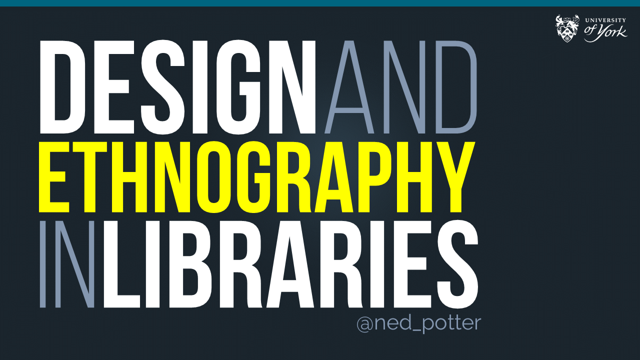
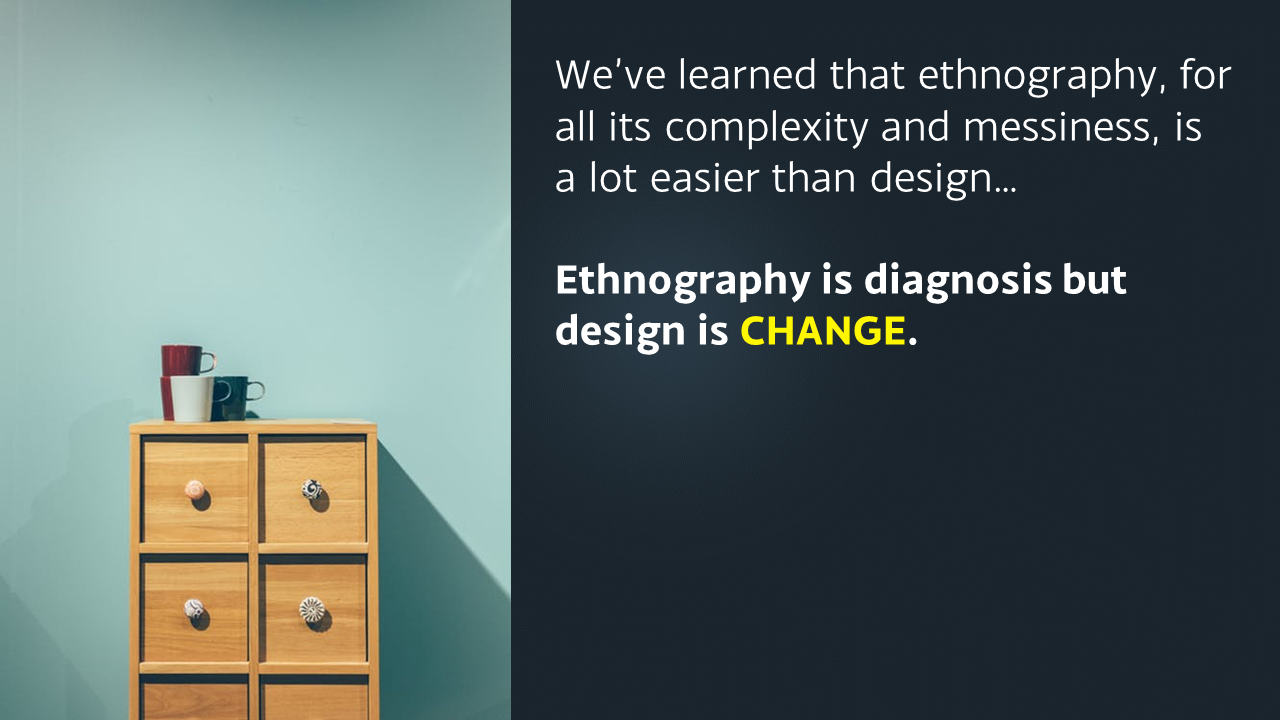
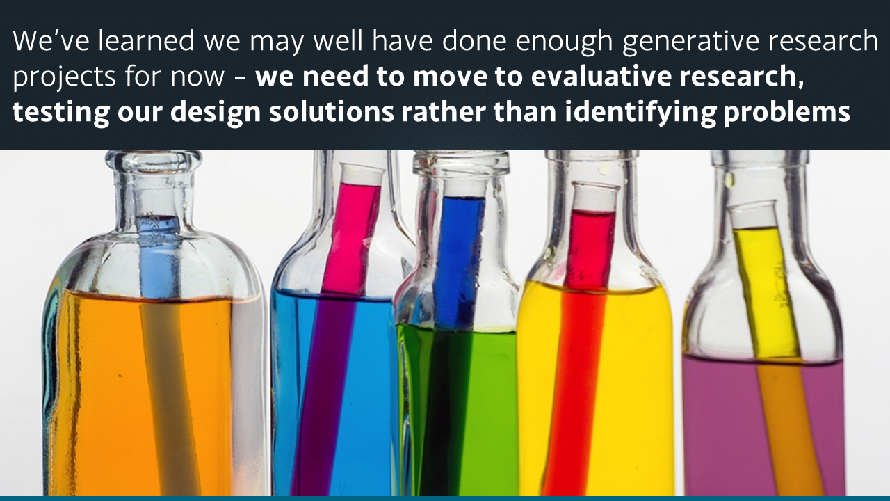
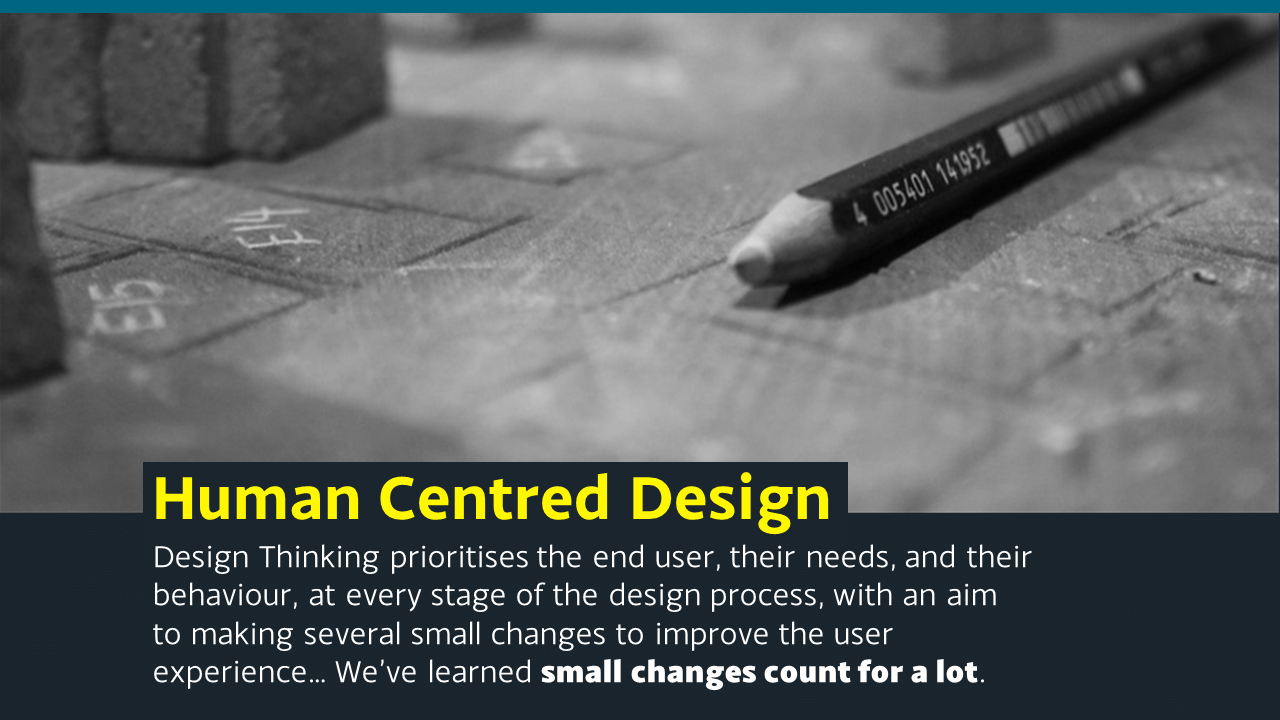
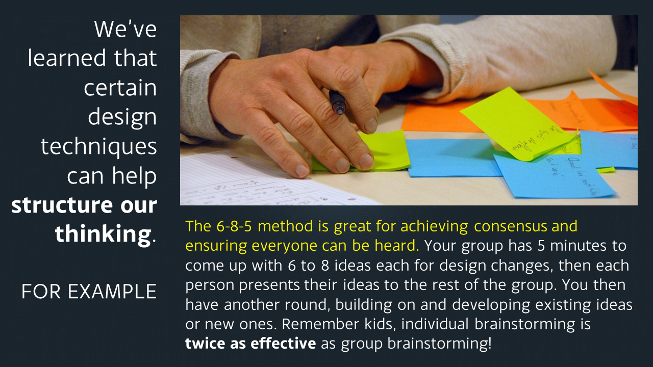
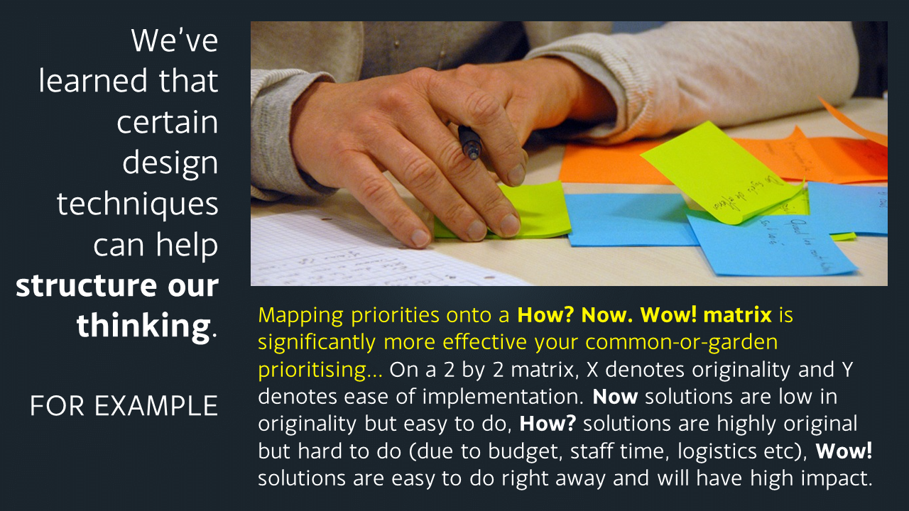
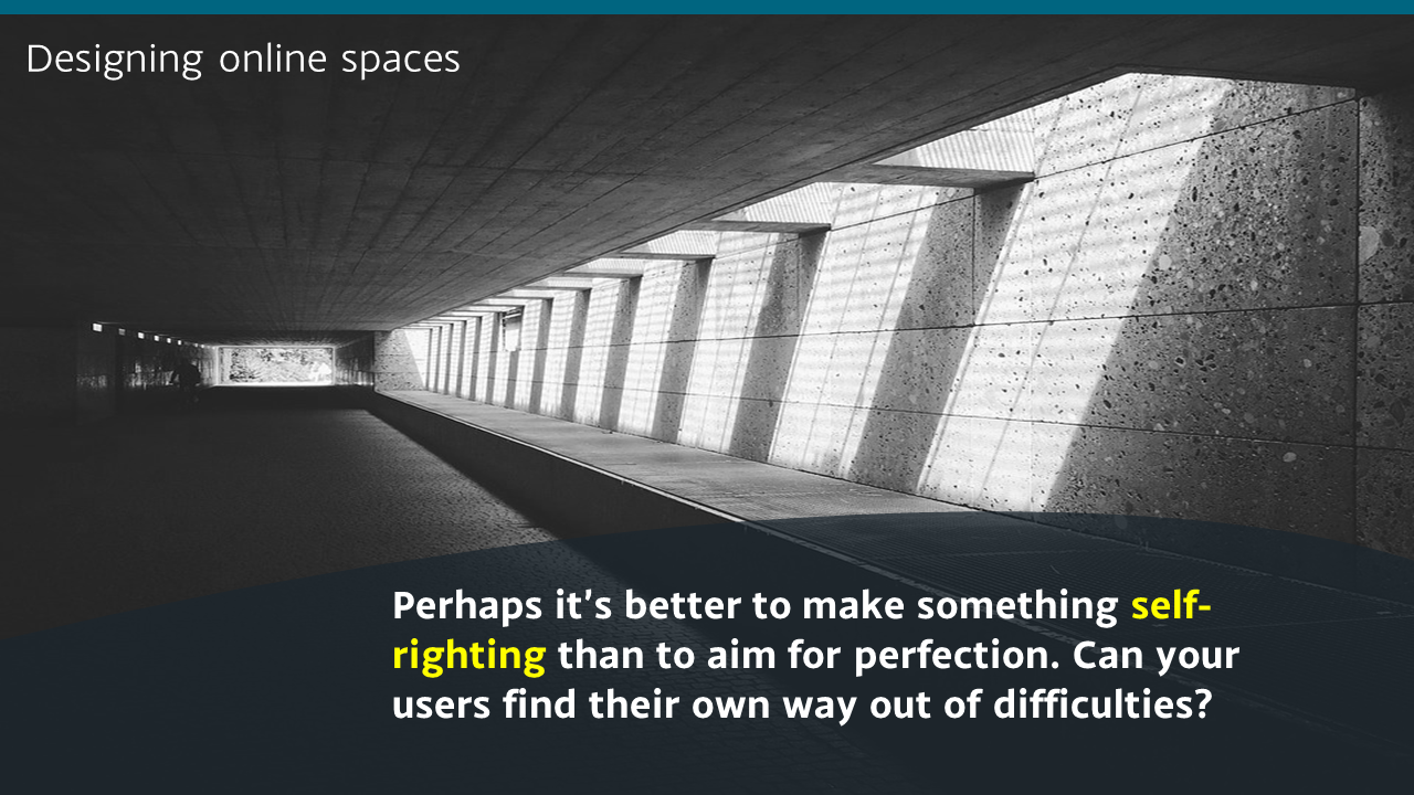
A slide from the Computer Sciences presentation:

Among many positive outcomes, that particular day ended up shifting our future approach to UX to a less generative and more evaluative research process, to us changing the way we deal with customer profiles and personas entirely, to us putting together a bid (still in progress) for an intensive design workshop, and to the Department kindly offering to allows us use of their eye-tracking software for future projects. We hope to speak to more non-library audiences in the future. Talking of which...

Audiences outside HE and libraries entirely

I was invited by the Good Things Foundation, a charitable organisation who do a lot of work around digital inclusion and with public libraries, to talk to their staff at their Sheffield HQ. It was a great opportunity to exchange views and experiences with a completely different group of people, facing different challenges.

And finally: Slideshare 

I used to love Slideshare as a dissemination method. Recently however it's gone from being brilliantly useful to rather more hit and miss. It's always great for uploading your slides for others to find, and that can lead to all sorts of opportunities. But until recently Slideshare would 'feature' around 10 slidedecks each day on its homepage - if your slides got selected for this it would boost the views by 20,000 or so. Because of this it has a reach that we can't hope to match by any other channel. We have a lot of methods listed above which are about reaching quite specific audiences; Slideshare was our way just to reach far and wide and hope some relevant people were among the inflated audience.

In the last year or so Slideshare have stopped regularly updating their homepage, so the chance to get featured has reduced almost to zero. The overview of our UX activities so far hich I presented at Northern Collaboration has not been featured, but nevertheless 3,200 people have viewed it at the time of writing. My slides from the LAM Awards event mentioned above DID get featured however, and in fact as still there on the homepage of Slideshare, four months later. As such they've now been viewed just over 400,000 times, which is ridiculous. Clearly only a small fraction of those people are relevant to us at York.

However, 2,400 people have downloaded the slides, suggesting they want to study what we've done a little closer. And these slides led directly to the invitation from the Good Things Foundation, as well as a visit to York from librarians overseas to discuss our UX work - so although Slideshare's reach is unfocused, it's still been relevant and useful for us.

6 Alternatives to Bullet Points


First things first: bullet points are not inherently bad. They can be very useful in written documents. When used in presentations, however, they stop your presentation being as effective. (They often turn presentations into written documents) In fact, your audience engages less, remembers less, agrees less and likes you less when you use bullet points in your PowerPoint presentations. (International Journal of Business Communication, 2015)

So why take that risk?

Usually the answer to that question is one of: 1) It's what I've always done, 2) It's the easiest way thing to do, or 3) Because what else would I do?

For me, 'we've always done it this way' is not a reason to do something. 'This is the best way to do it' is a reason to do something, and sometimes that overlaps with that we've always done, but not always. 

Presentations are often huge opportunities. You have a room full of people giving you your attention (with potentially thousands more online afterwards) and you're there to talk to them about something significant. So although bullets may be easy, why not make the most of the opportunity? Why not do everything you can to not only get your message across but to get it to stick in people's minds? And finally, the 'what else is there?' issue - well, here are five alternatives to using bullets.

(Subscribers, there's LOTS of images in here, some of them stacked up as slides. It's probably going to be a lot easier to view this on the website itself rather than in an email / feedreader - here's the link.)

1) Just put fewer words on the slide

An example of using fewer words without reducing the impact

An example of using fewer words without reducing the impact

An obvious and straightforward place to start. Take away everything you don't need - if it's surplus to requirements, if you can remember to say it out-loud, or if it doesn't really matter whether you say it or not, just get rid of it!

The example here is a slide I used in a recent workshop. I could of course have listed all the ways in which marketing is changing, using bullet points to separate them. But I felt the slide would have more impact with just a single sentence written on the screen, me listing examples out loud, and a visual metaphor as the background image.

2) Cascade the key messages across multiple slides

Rather than making four or five points on one slide (and risk your audience reading ahead and getting out of sync with you the presenter), make one point per slide over four or five slides. This gives each point room to breathe, and helps with signalling to ensure your audience understands and remembers you.

If you're making several points on a theme you don't have to make new slides from scratch for each one - just do the first slide, right-click and Duplicate it, then edit the text on the duplicated version. I've used this technique in the examples below (use the arrows to switch between slides):

If you've got the most recent PowerPoint you can use the Morph transition between the slides, which works really nicely.

People worry that this method will mean a longer presentation but this isn't the case - you take the same amount of time overall, but cycle more quickly through the slides.

3) Use colour to make lists readable, rather than use bullet points

An example of using colour to differentiate chunks of text

An example of using colour to differentiate chunks of text

There are times when you need several points on a slide - for example when you're showing an audience what you'll talk about, or are summarising something, or making comparisons. In these instances neither of the first two techniques are appropriate; you need all the text on one screen. So just write it out like you normally would, but get rid of the baggage and negative associations of bullet-points by not using them - and recreate the POINT of them (making text easier to read) by using alternating colours.

In the particular example shown here, I've actually built up to what you see over three slides. The first just says has the alternating colours text list much larger and in the centre of the screen, then the second is as you see above but with the Bodleian's reply hidden, and then lastly the slide you see here.

4) Highlight key sections of your slide, one by one

I do this a lot - sometimes by building the content of the slides one animation at a time, or by changing the colour to highlight each section, one at a time. Again it means you can have all the points on screen, but you're not using bullets and you're in sync with your audience.

In the example below I've got all three points on screen but each one is highlighted yellow (picking out the yellow from elsewhere on the slide) while I talk about it - again use the arrows to move between them:

5) Turn your bullet points into something visual

An example of using icons instead of bullets

An example of using icons instead of bullets

A fifth option is to basically use bullets without people thinking 'Aargh, bullet points, death by PowerPoint here I come' etc. Use icons (for example from iconfinder.com) as bullet points - the images will help your audience learn. A basic example is shown here.

6) Combine several of the techniques above

The final example below is how I introduce the timings for my Presentation Skills training days. It does what a single slide with bullet points would do, but uses colour and visual elements over three slides to introduce the information in a more engaging way. Part of the reason I bothered doing this is the slides allow me to talk about each part of the day in turn, whilst staying in sync with my audience, AND it allows the audience to see the full day's timings in one go on the final slide of the sequence.

So there you go! Several ways to avoid bullet points. It's really worth taking a small amount of time to rewrite presentations to avoid bullets: your audience will thank you for it...


You’ll find details of my Presentation Skills or PowerPoint workshops here: you can book an all-day or half-day session for your organisation, online or in person.

Starting small and scaling up, and what have we learned about Design? UX at York

In March I presented at the excellent Northern Collaboration event on UX, held in Huddersfield. Here are the slides from my talk, which was basically a timeline of our ethnographic and design adventures at York since we went to the first UXLibs conference in 2015:

I've blogged about the event and the other talks over on Lib-Innovation.

This week, as part of our approach to disseminating our UX work and talking (and listening) to as many different types of audience as possible, I presented to the Good Things Foundation in Sheffield. Good Things is a charity working around social inclusion and digital divide, and it was really interesting to hear about what they did, especially their work with public libraries. 

They were particularly interested in design, so the presentation consisted of an extended and adapted version of the one embedded above, with a more specific section on design added in. At the moment Slideshare is not playing ball so I thought I'd upload the design related slides as images here in the meantime, because I do think the design aspect of UX is the part we libraries struggle with most, and it's good to share what we've learned.

Just click the arrows on the image below to cycle through the slides (email subscribers, this'll work better live on the site - click here to view this post on ned-potter.com)

If you have any more tips on getting human centred design embedded as part of the organisational culture in libraries, do let me hear them! 

UX-led changes at York and beyond

Reblogged from Lib-Innovation

As anyone who has embarked upon User Experience work will have learned, ethnography is actually the easy part. For all its messy, complicated, time-consuming complexity, getting the go-ahead for fieldwork and undertaking it is relatively straightforward compared to designing (and getting approval to put into place) changes to our services. It is vital to have a cut off point where we as UX practitioners stop collecting data, bite the bullet, and move on to phase 2 of the process. After all, it's the design and service tweaks that make this UX - otherwise all we're really doing is ethnography.

I think it's really important to a) push as many small tweaks through as possible, and then learn from them and assess their impact, and b) make details of the changes publicly available so others can get not just inspiration but a use-case to push through their own change.

So - what have institutions been doing as a result of what they've learned from ethnography? I have several examples from the University of York and some from further afield too.

I thought it might be useful to group the examples of UX-led improvements into categories. In all these instances ethnographic fieldwork has either instigated the change or supported the change - it's interesting that often UX can be the trigger to get something done which library staff and users have been considering and / or suggesting for a while. Often the fieldwork is one source of feedback alongside a couple of others in the examples below, which combined to be a strong enough argument to make a change.

Catalogue improvements

At York we've made several small changes to Yorsearch, the (Primo-based) library catalogue, in addition to the full user-interface change which will arrive shortly.

  • The classmark for books now appear in the search results screen, rather than the user needing to click on a title to reveal its location. It's only a small change but we get around 25,000 views a day for Yorsearch - that's a lot of people now having to make one less click to get what they need. This particular change came from our first UX project with Postgrads, along with work from the Discoverability Group, and from seeing that that Imperial had successfully achieved the same thing with their Primo interface already, following their own UX work...
     
  • Talking of Imperial, they've made the full report of their 2016 UX work available for anyone to download [*applauds*] - have a read, it's fascinating and useful material.
     
  • We changed the terminology in the catalogue on the buttons you press to access books and ebooks - from Get It and View It, to Find in Library and View Online. Again this came out of several sources of feedback, including the Discoverability Group, and front-desk staff reporting that users simply didn't seem to get it when it came to View It and Get It.

Library space and environment improvements

  • We made a hot-water tap available 24/7. Our UX work revealed that particularly in winter  students from Asia like to drink hot water in the way that in the West a lot us like to drink chilled water; this gave more context to previous requests for a hot drinking water tap. One has now been installed alongside the chilled water fountain.
     
  • We made the Burton Library accessible 24hrs a day. Our library is open 24 hours, but previously only the main Morrell Building (the one with the books) and the Fairhurst (lots of study space) stayed open all the time; the silent reading room in the Burton closed at 10pm. Our UX work constantly demonstrated that the Burton was not as highly valued as we imagined it was - for example several students left it out of their congnitive map of the building, almost no students included it in their touchstone tours, and in our behavioural mapping we even observed students wandering up to the entrance, peering in to the stairwell that led up to the reading room, then just turning around and coming back, apparently not feeling like they wanted to cross the threshold. As part of the UX unstructured interviews we discovered that even some students who knew about the Burton didn't like using it because even if they had no intention of working past 10pm, they loathed the idea of setting up all their work and devices etc and then having to move them to another building at 10pm if they were still there at that time after all.

    So we upped our promotion of the Burton, it had a very nice re-design (although that wasn't directly related to anything we'd done with UX, it was happening anyway) and we made it accessible 24 hours a day. We're now monitoring the space as part of a new UX Project and the initial impressions are that it's already busier.
     
  • We've given the students blankets. A pile of blankets in a basket near the entrance - people can help themselves and deposit the blankets back there when they leave. I cannot tell you how popular this has been... There are examples of effusive tweets and feedback on our graffiti wall in the presentation below - it's so nice to do something simple but effective! Temperature is always a problem in libraries, and there's often a more or less even split between people who are too hot and too cold. My History of Art students came to me to say they found working in King's Manor (our City-centre site which is nearly 500 years old so not overly warm) really hard when it was so cold. So we managed to get Estates to get some more heaters, and we bought blankets - this idea came from some UX work undertaken at Cambridge in 2015. We also bought blankets for our main library and the Minster library too. 

    (Top tip: buy really drab and unexciting looking blankets. They keep people just as warm but are much less likely to go missing...)
     
  • Thanks to Ingela Wahlgren and Andy Priestner who gave me examples of their (current or former) institutions having changed the locations of digital screens as a result of behavioural mapping, in order to put the screens somewhere people will actually look at them. This could be displaying key info in areas where people have to queue, or it could be as simple as putting them in the direct line of site as students move forward through a space, rather than off to the side in people's peripheral vision.
     
  • Sometimes students describe an area as noisy even though it's ostensibly a silent study zone. Truly observing the space can often solve the mystery of why this is happening - Jenny Foster gave me an example of her institution realising the beep of the self-issue machine could be heard four floors up! So they found the volume and turned it down. At Cambridge they discovered there were loud hinges on office doors so they oiled them...
     
  • Like with the noise examples above, small changes really do add up. Carl Barrow told me some of the changes his HEI had made based on their fieldwork: additional signage (both analogue and digital), more printers, phone charge stations (why aren't we all doing these?) and a new coffee cart. Together all those minor tweaks will have a significant impact on the user experience, which is the name of the game after all.
     
  • UPDATE: At the #NCLXUX event I've just heard Carl say they also re-positioned digital screens, having noticed no one looked at most of them. One, which was positioned in the entrance as people came through the turnstiles, DID get looked at - so they used that exclusively to promote the Skills Team's workshops, and as a result saw a much bigger uptake for those sessions... I love this - a great example of the impact UX can have in unexpected ways...

Library service improvements 

  • At York we've moved academic staff onto our part-time package for borrowing books, giving them a little longer to return items without impacting too heavily on the rate of circulation overall
     
  • We've changed the way we run our annual review of subscriptions to allow for more time and stop it clashing with other key things in the academic calendar
     
  • We've changed the way we communicate key information to academics
     
  • We've used academics' detailed views on our current reading list system to inform the choosing and customisation of the new one
     
  • At Cambridge the FutureLib developed a whole app for finding study space

UX and Impact

I'm excited to hear a load more examples of UX-led change at UXLibs III (the third annual User Experience in Libraries Conference). The paper submissions we've had this year are fantastic, and the emphasis of the conference this year is on the impact of UX.

Finally, here are the slides from my Wales talk which mention a lot of the examples above, along with some next steps if you want to try ethnography at your own institution, and introductions to ethnography and design: