University of York Library

Step by step: making videos with Videoscribe

In September I made a new video to introduce the Library in 60 seconds. It was designed to be played in short Induction talks, and to be embedded in various online guides. The whole thing took around 4 hours to do (albeit spread across a couple of days) and it turned out pretty well - before we go through the step-by-step process here's the video:


It was made using Videoscribe, and they just published their 'Favorite VideoScribe videos of 2019' which, it turns out not only has videos from the BBC but also from our Library! The video above being featured on their list has reminded me to complete this blog post, which has been in the Lib-Innovation drafts folder for a while...

Step 1: Script-writing 

Because we were also producing a longer virtual tour, I knew from the start this would be only one minute long. This was surprisingly non-limiting in the end: once you accept you can't go into detail on anything, it becomes quite easy to write a friendly voice-over that introduces a number of key points in quick succession. The purpose of the video was to provide an overview, help students understand the basics, and encourage them to ask for help. So a brief script was worked up with that in mind, and I shared it with a colleague for a second opinion, then with the narrators. 

I wanted Yorkshire voices for this introduction to a Yorkshire library, and I wanted people who were friendly and informal, and I wanted it to be a man and a women ideally. Happily my first choice voice-over artists (Sarah Peace from IT and Martin Philip from Academic Liaison) said yes when I asked them to do it! 


Step 2: Voice-over recording 


The hardest thing about recording narration is finding a suitable acoustic in which to record. Even small meeting rooms in our building seem to be echoey, and although the Linguistics Department does have an audio booth we can get access to, it wasn't available in our time frame. In the end we chose quite a big room that has enough in it to absorb any resonance, leaving us with an acceptable sound quality. 

I recorded my narrators on my own laptop using Audacity, a freely available audio-editing tool, and an entry-level Blue Snowball mic I use for webinars. It took 40 minutes to record both this script and the Virtual Tour script, and the main issue was making sure the narrators were close enough to the mic. 

Audacity is incredibly simple to use. You can zoom right in on the visual representation of the audio-waves and easily identify what talking and what is not - for example, in-breaths before a word. Breaths and pauses can be selected, highlighted, and deleted. For this reason, there was absolutely no need to aim for a perfect take of the narration. Each narrator took their time delivering their section, re-running any sentence they weren't happy with. It then took me perhaps 20 minutes to edit the audio into one seamless narration, and export it as an MP3 file to add to the video.
The audio for the voice-over, as displayed by Audacity


Step 3: Creating the video with Videoscribe 

The process of creating a video with this software is to add objects to the canvas (a little bit like you might with Prezi) and then decide how they are animated, and when. So for example you can just type text in and have a hand or pen 'write' the text at the speed of your choosing, or you can add photographs which can either be 'drawn' or pushed into frame by a hand, or just appear. You put all this together, add music and a voice over you if you wish, and you have a video.

I've tended to always build towards a final picture that includes everything the viewer has just seen - so you see each section as it's added, and then at the end you zoom out to see everything at once. But you don't have to use this approach - you can stay buried in the detail if that helps you tell your story.

The VideoScribe interface looks like this:


The main part of the screen displays everything that will appear in the video, but the boxes along the bottom are how you dictate when objects arrive, how they enter the video, and in which order.

Here's a closer shot of that:


All those icons - the phone, the thumbs up, the wifi symbol etc - are from VideoScribe itself. There's also some writing, and (in the middle) a screengrab of the library catalogue.

Absolutely key to a good VideoScribe video, in my experience, is the 'Set Camera to Current Position' button I've highlighted here:


This allows you to control what the camera sees, meaning you can have multiple objects in the frame at once. For example at the end of the video there's a big smiley face and the #UoYTips text added: by default the camera would zoom in so these filled the frame, meaning you could only really see them. But by setting the camera to the same position for the last three sections of the video, you get to see the entire library map, AND the smiley face / #UoYTips in the same shot.

The whole process of creating the video took around 2 hours: trust me, this is REALLY quick for making video content!

Step 4: Exporting to YouTube 

I exported two versions of the video: one directly to YouTube, and one as an MP4 file to embed directly into the Induction PowerPoint presentation me and my colleagues would be using throughout the first week of term. 

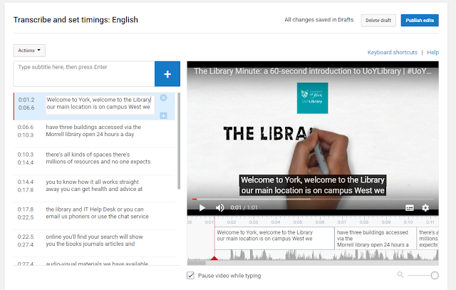
With the YouTube version there was probably around half an hour of faffing involved - writing the description, title, all the keywords, and so on, and editing the subtitles. YouTube's auto-generated subtitles are actually pretty good, but they contain no punctuation or capitalisation and sometimes get names or other words wrong - in screenshot below you can see it says 'you can get health and advice' which I had to edit to 'help and advice':


It's a relatively quick job and of course well worth doing to make sure your video is accessible. 

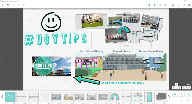
If you've watched the video above you'll have seen that the narration ends at least 10 seconds before the end - this is because I wanted space to link to another video (the more detailed virtual tour), a clickable thumbnail of which appears in the bottom left of the screen. This was achieved by inserting in YouTube itself, via the End Screens menu. As you can see below, the video itself is designed to receive the thumbnail in that exact position, with the arrow pointing to it. 


One final piece of admin was to create a custom Thumbnail for the Library Minute video itself. YouTube auto-generates three for you - normally none of them quite work as an encapsulation of the video, so you have to make your own (either from scratch or, more often in my case, just by taking a screenshot of the video at the best possible moment).


Step 5: Promotion

Even though the video is a piece of marketing, it still needed to be marketed... I saved a version for adding to Induction slides, and then created a slide in which it was embedded for everyone to add to their presentations.

We also tweeted it, put it on Instagram (where it did much less well than I expected, interestingly) and embedded it on key web pages such as our Info For New Students page.

And that's it! Videoscribe is a tool which we pay for on an annual basis - we don't often do this with so many great free tools available, but we feel it's worth it in this case. If you have any questions about the software or the video above, let us know in a comment... 

Brand and branding in the academic library

I have an uneasy relationship with the concept of ‘brand’ in the library context. On the one hand, I think it’s often misunderstood. I think it’s the kind of thing on which marketing consultants from outside the industry put far too much emphasis - on the list of things to fix about library marketing, I bet our users wouldn’t put ‘brand’ that high up… On the other hand, in the academic sector that I work in, most traditional marketing goals are already being fulfilled fairly successfully: academic libraries are often full, well-used, and well-regarded. So that allows us some time to consider some bigger questions - for example, what is our brand and what would we LIKE it to be?

Before we go any further let’s sort the definitions: ‘brand’ is not colours or logos or slogans.

Your brand is the perception of your library, your services and your collections in people’s minds. It’s how people think and feel about who you are as an organisation, and what you do.

Branding, on the other hand, is the process of trying to influence people’s perceptions of the organisation, and the way they regard your brand.

At my place of work I’ve been thinking about this a lot recently, as I’m attempting to sketch out some marketing principles for my library. Before I can create a strategy for what we want to say and how we want to say it, we first have to understand what we want to BE and whether that involves changing from how we are now, or not. It’s easy to get side-tracked into an existential crisis.

I also want to know how both students and staff at the institution view the Library. We know how they rate certain services, and our UX work tells us a lot about how they use our facilities. But as to how they would describe the library, how they perceive us, what they would say our brand is - I don’t know, and I’ll like to ask, but I’m not sure exactly how to go about it. (Any ideas for this gratefully received.)


Slides from #dffu2018 on Branding the Academic Library

I was honoured to give a keynote on this theme in Billund, Denmark, towards the end of last year. We discussed what brand was, what community was, and marketing strategy. The slides from the talk are below:

The UX Project mentioned in the slides above, Understanding Academics, is written up by my bosses Vanya Gallimore and Michelle Blake, here.

The trip to Denmark was an absolute pleasure, especially because we got to stay in the LegoLand hotel…

Thank you again to the Danish Research and Academic Libraries group for inviting me to speak, and to Christian Lauresen for his insight into Danish libaries, as well as to Jan Holmquist for his translation skills!

How do you truly embed UX at an institutional level?

At the glorious UXLibs IV Conference (more on which below), Michelle Blake and I presented on embedding UX at York. By this we mean, attempting to move the ethnography and design ideas / techniques / methods which sit under the User Experience in Libraries umbrella, from novel and niche to mainstream and, if you'll forgive the management-speak, Business As Usual. Part of the culture. 

We're not all the way there yet and don't profess to have completely nailed it, but it is something we've consciously tried to achieve in the Library and we're having come success with it. Some of what we've done is outlined briefly in the presentation below, to which I've added an explanatory sentence to most slides so they make more sense without us talking over the top of it.

I'd reccomend this post from Shelley Gullikson which nicely summarises several talks and sessions from UXLibs IV, and Andy Priestner's 50 Photos post gives a nice flavour of the conference as a whole.

Using screencapture software to make next-level PowerPoint presentations

I normally record talks I give at conferences, using my phone in my jacket pocket. I have a strict 'no critiquing myself during the talk itself' rule, so the recording allows me to listen back afterwards and pick up on things that I'd want to do differently next time, or things that worked well etc.

In the past I've also put a video up on YouTube, using Camtasia to record me moving the slides along with the audio of my talk at the LIASA conference in Cape Town. I don't think this worked that well because there was simply too many long periods where nothing changed on the screen - in real life that was fine because the audience looks at the speaker, but in a video - a visual medium after all - it just feels a little inert and uninteresting.

So for a recent talk I decided to try and make a version of the slides that would work as a proper video. I spoke at the CILIP PPRG Conference in January (more on that in a previous post) about our UoYTips marketing campaign - York won a Bronze Marketing Award which I was picking up at the event. I delivered the slides and recorded the talk in the usual way, but then set about creating a new version of the slides that had much more going on visually. The actual slides are here, if you're interested, and here is how they evolved for the video I came up with:

Now I've done this, I'm wondering why I can't just do more visually exciting slides anyway? This doesn't have to be just for YouTube. I've always wanted to use video in presentations more, and it's surprisingly easy to do as it turns out.

The tools

To make the video above I used three bits of software. PowerPoint, obviously, for the slides. Audacity to edit and play the audio (this is free). And Screencastomatic for both the screen-capture videos within the slides, and the overall screen-capture of slides plus audio you can view above. Screencastomatic is a great tool, which I found much easier to use than Camtasia. It's quick and intuitive. It can be used for free, but in order to record videos of more than 15 minutes, and record PC audio, you need the pro subscription - this costs 12 quid year which is pretty great value, I reckon.

Here's what the Screencast-o-matic interface looks like:

too.PNG

It's very easy to redraw the box around the exact part of the screen (or all the screen) that you want to record. You can pause and restart. You can also record PC audio as you go, or narrate into a mic. As you can see it gives you the option of recording from webcam at the same time if you wish, which happens in a smallish box at the top right of the screen.

It's really easy to use.

The techniques

In the video above there are a number of techniques (perhaps that's too grand a word!) employed to suit different types of information.

  • Actual video recorded on my phone. (This happens about 25 seconds in.) I recorded a video in the usual way, emailed it to myself, and went to Insert Video in PPT. You can make it full screen, or you can overlay the branding / visual identity from your PPT over the top. I think this is crucial to how easy this is to do - the video can effectively be the background of the slide, just like an image can. You then overlay it with text, shapes, images etc as normal.

  • Screencasting Google Earth. I really like this one, which happens here. How to have something dynamic on screen while I talk about the University of York? Type it into Google Earth then press record on the screencasting software, and return on Google Earth. It zooms all the way in and then, delightfully, spins round the building you've chosen for a bit. I'm going to use this in library induction sessions in the future, for sure.

  • Using gifs. There's a couple of examples of this, but here's the most interesting one. It starts off as a regular full-screen image, and then I used animation to first of all drop the text on top of the image at the appropriate time, and secondly to trigger the gif video beginning (having downloaded the gif from a gif site, and saved it as a video).

  • Regular PowerPoint animations and transitions. There's a few moments where things are added onto the screen one-by-one as I mention them, and there's this very long fade transition between two slides

  • Videos of websites instead of screengrabs of websites. There's an example here, and another example here. In the talk I just showed a screenshot of the thing I was talking about, but here it's a 15 second video of the site being used, which is much more interesting. I'm definitely going to reuse this technique.

The drawbacks

Really the only two drawbacks are that it takes time, and it takes space.

Of course, recording a clip on a website in use takes more time than just a screenshot, but it becomes surprisingly quick. Perhaps a minute to set-up, record and save / export 20 seconds' worth of screen-capture, so not too bad at all.

In terms of space - the videos are MP4 files and pleasingly small. Most brief captures were under 1 meg. The 22 second-long Google Earth zoom right at the start of the video was 12 meg. The overall final file - a 20 minute video capturing the whole thing, was 99MB. Video files are so huge, I think this is pretty reasonable.

So, I'd recommend giving this a try. And if you create a presentation with video and upload it anywhere (or you've already done this in the past) leave me a link in the comments...

The key to good library marketing is *campaigns*

The title of this blog post is the opposite of click-bait: it says everything. It's the tl;dr not just of this post, but of successful library marketing per se.

One-off marketing almost never works, because people seldom act on a piece of marketing the first time they see it. When you see an ad, even a good one, you don't rush out and buy / do the thing right away. If you have Netflix for example, think about when you got it. Was it the first time you saw an ad? Or did you become more and more aware over time, and then eventually circumstances were right and you signed up?

In Library marketing terms we have to try and achieve the same thing. Build awareness over time of relevant services. Appeal to people at the right time. If we just push out lots of different messages all the time, this is too much information and its too dispersed - there's nothing for anyone to hold on to, and think 'this is for ME'. So 9 times out of 10 (at least) the successful marketing, the things which have impact and make a tangible difference to the Library, are in the form of campaigns. What does this mean in practice?

Campaign marketing consists of delivering the same message, tailored across different platforms, for a sustained period of time.

So your users see the message once, and they register it. They see it again somewhere else and they decide to act on it. And then perhaps a week later they see it again and that's when they change their behaviour, and do something they weren't going to do before. You need a week or two of focus on the same message to make that change happen.

Examples of great campaign marketing

I was at the PPRG Marketing Awards Conference last month, and the one thing which united virtually all the award winners was campaign marketing. You can see all the presentations on the PPRG website but here's some key examples.

Hampshire Library Services. Hampshire undertook a really comprehensive campaign to promote the free digital magazines service they had, which wasn't being used enough. You can view their Prezi here - it's well worth a look. Here's an example of their campaign visuals:

Hampshire Library Services campaign visuals, taken from their Prezi linked above

Hampshire Library Services campaign visuals, taken from their Prezi linked above

The key thing about these four ads is the visual style is so striking, you'd easily associate one with the other if you saw them seperately. So again, perhaps the first time you see the ad you think 'oh that's great, free magazines at the library!' but that still isn't enough for you to ACT. Then you see the second one and it reminds you of the first one, you associate the two, and it's the second push you need to go and actually download an e-magazine.

And downloading e-magazines is exactly what people did based on this campaign. Here's a key stat:

Hampshire stats.PNG

That's the thing about campign marketing: it really, really works.

Another great example was from Islington Library and Heritage Services. Take a look at the #islington50s slides here. They had a one-month campaign, with a set number of social media outputs each day, a clearly defined set of objectives, and both a library-user and non-library-user audience in mind.

Here's the slide on the impact it had:

Click the pic to open the entire presentation in a new window

Click the pic to open the entire presentation in a new window

I love the details that their Local History Centre was rushed of its feet as the impact of the campaign spread through the community!

The final example is local to me - York won a bronze award for our UoYTips marketing campaign. We ran our academic induction as a marketing campaign in 2016, and it worked so well we've built upon it for 2017. There are all sorts of reasons why we did this and why it worked - but again the key thing is, it was a campaign. Key messages over a concerted period of time. Here's a video I made that has the audio from my talk, plus a more video-friendly version of the slides:

Or if you'd prefer, just the original slides...

Next steps

If you want to run a campaign, here are some things to think about.

  1. Your campaign needs to be the primary focus of your comms for a concerted period of time. It doesn't mean you don't talk about anything else, just that you keep talking about the subject of the campaign
  2. The same message needs to go out across multiple platforms, but it may work better when tailored for each - you wouldn't neccessarily use the same phrases, words or images for twitter, an email, a poster on the Digital Screens, and Facebook
  3. A strong call to action is important. It's not enough just to pique people's interest - they need to know how to easily take the next step to engage with your campaign (visit a website, come to an event, fill in a form, whatever it might be)
  4. Don't just measure outputs (tweets, posters etc) but outcomes - what happens as a result of your campaign? This takes time but it's worth it because you can build on what works