Information Professional

Using Kahoot in Library Induction and Teaching Sessions

A colleague at York, Tony Wilson, brought Kahoot! to our attention recently for possible use in teaching and orientation sessions: it's a really nice quiz tool. There is nothing new about using quizzes in library sessions and there's about a million and one tools out there for making them, but Kahoot differs in its execution of the idea. It's so much slicker and just more FUN than anything like this I've looked at before. And interestingly, it already seems to have currency with students:

One of the most useful aspects of a quiz is that people are asked to actively engage with the information rather than passively receive it. I'm absolutely convinced the students are remembering more this way than if we just presented them with the complete information.

4 reasons Kahoot works so well

It's really, really nice, for these reasons in reverse order of importance:

The music. It has cool retro sort of 8-bit music in the background.
The aesthetics. It has bright colours and looks generally nice. Here's what a question looks like:

An example of a question as it looks on the screen during the quiz

An example of a question as it looks on the screen during the quiz

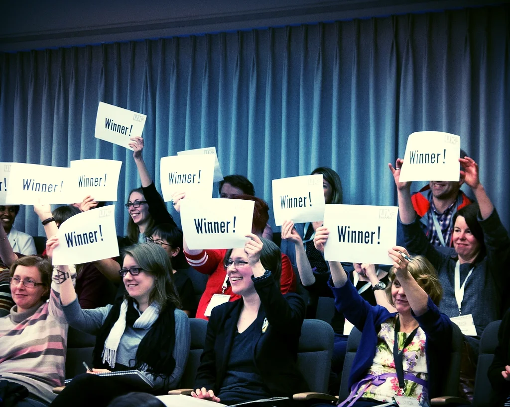
The leaderboard. Oh yes. It has a LEADERBOARD. This is the key thing, really: people put in their nicknames and after each question the top 5 is displayed (based on, obviously, how acurate their answers are but also how quick). Even completely non-competitive people get excited when they see their name in the top 5... I tweeted about using Kahoot and Diana Caulfied chimed in about the tension the leaderboard brings:

The mobile view from the student perspective

The mobile view from the student perspective

It's VERY easy to use. These things have to be SO simple to justify using them. In the case of Kahoot, you load up the quiz, and the students go to kahoot.it and put in the pin number the quiz gives you on the screen. It works perfectly on phones, tablets, or PCs. There's only one thing on the screen - the box to put the pin number in; and only one thing to do - put the pin number in. This simplicity and intuitive interface means everyone can get on board right away. There's no hunting around. 

You can also use it on an epic scale - one colleague just came back from using it with 95 undergraduates today, who responded really well, another used it with over 100 who were absolutely buzzing after each question. You can actually have up to 4,000 players at once.

Here's what the students are presented with when they go to the (very simple) URL:

An example from York

So here's the quiz I made for Induction, click here if you want to have a go. This particular link is (I think) in ghost mode, where you're competing with a previous group of players. So if you do the quiz now, you'll be up against my History of Art PostGraduates and will only show up in the Top 5 leaderboard if you get better scores than at least 25 of them! But normally in a session I'd use a completely blank slate.

Possible uses

In this example the questions I chose are basically just a way to show off our resources and services: it's all stuff I'd be telling them as part of a regular induction talk anyway:

My Kahoot quiz questions

My Kahoot quiz questions

The students I've used it with so far have really enjoyed it (as far as I can tell!). It's much more interesting than listing things, and, intruigingly, I think that asking people to guess between possible options actually seems the answer more impressive than just telling them the fact outright. So for example in the Google Apps question above, there were gasps when I revealed they get unlimited storage and the majority had chosen one of the lower options (the results screen shows how many people have chosen each option) - I'm fairly sure if I'd just told them they get unlimited storage, not one person would have gasped.

But there are plenty of other possibilities for Kahoot that are a bit more pedagogical in nature. Using it to measure how much of the session has sunk in at the end; using it at the start and end to measure a difference in knowledge; and using it to establish the level of student understanding:

There's also a Discussion mode rather than a Quiz mode. You pose a question and students type their answers in (rather than selecting from multiple choice) and their words come up on the screen. Anything rude or offensive can be deleted with one click. It would be a great way to find out what students felt unsure of or wanted to learn about, or to discuss the merits of a particular approach.

In summary

So I'd recommend taking a look at Kahoot and seeing if you can incorporate it into your teaching. As well as using it throughout Induction I'm planning on using different kinds of quizzes as part of infolit sessions and am excited to see how that works. You can easily incorporate your own library's images and videos and the tool is free, very easy to use, nicely made, and FUN. 

NLPN's Useful Resources

Just a very brief post to say check out the fabulous NLPN's Useful Resources page. They've brought together a list of professional library bodies, groups and networks, blogs, job sites, journals and databases and even institutional repositories. 

It's aimed primarily at New Profs but it's useful for everyone in interested in the wider profession. If I'd had this kind of curated list of useful stuff when I came into the profession I would have found it so much easier to understand the wider context and become part of a bigger conversation. You really could get through years of librarianship before you needed more than what NLPN've put together on this list. Get to it!

Click the pic to go to NLPN's site

Click the pic to go to NLPN's site

Type Genius: the joys of font-pairing

I'm a little bit obsessed with nice fonts - I love how they can impact on design and help tell your story. An aspect of design which is often undervalued is the combinations of fonts: pairing up fonts (or sometimes mixing groups of three fonts, ideally not more than three in one design) for posters, or social media campaigns, or PowerPoint presentations.

I've just found a great site called Type Genius that helps out with choosing fonts, more on which below.

Here are four font combinations I like, three of which I've used, and all the fonts for which can be downloaded individually from Fontsquirrel:

BEBAS NUEUE AND MONTSERRAT

The first combination is what is used for the blog and much of the rest of site. The blog title is Bebas Nueue and the body text is Monstserrat. (Whenever I use Heading 2 in the formatting that's also Montserrat, but in all-caps - the Heading 3 used in this post os back to Bebas Nueue again). I chose them mainly because when I rejigged the design of the site recently I wanted a thicker body text font, so chose Montserrat which I've been using since I saw Matthew Reidsma use it for his UXLibs I keynote. Bebas compliments it for titles because it a tall and narrow font in contrast with Montserrat being thick and more rounded.

LATO AND ROBOTO SLAB

The second combination I've not used at the time of writing, but got from Type Genius - which you can find at typegenius.com. You tell it what font you want to use, and it gives you a number of potential companions to pair with it (as it happens when you put in Montserrat it suggests Bebas Nueue, as used on this site).

In the case of Lato and Roboto Slab, I've actually not used the Regular Lato in the example above at all - I used Lato Thin for the first part and Lato Heavy for 'titles'. I do like the contrast of light and heavy.

RALEWAY AND... RALEWAY

Which brings us to the third combination, which isn't technically a pair as it's just Raleway used in three different ways. I love Raleway beyond all other fonts. As long as you have both Raleway Regular and Raleway Bold installed (although PowerPoint will try and Bold non-standard fonts when you highlight them and click the Bold button, it's not the same as actually installing the Bold version that the typographers intended) they work so beautifully together, especially in all caps. The intro to UX presentation I blogged about recently used Raleway in all possible combinations (Regular and Bold in both lower and upper case) with no other fonts involved:

The other joy of Raleway is it renders perfectly on Slideshare. Some other fonts, even when you save and upload your presentations as a PDF, go a bit blocky on Slideshare, for example my LIANZA Marketing Manifesto slides, which use Raleway along with ChunkFive Roman - the latter looked great at the conference but not so good on Slideshare, but Raleway was perfect in both situations.

MATHLETE BULKY AND CAVIAR DREAMS

I used this combination for my Tuning Out The White Noise presentation which became the most popular thing I've ever put on Slideshare (despite Mathlete Bulky not rendering properely on the site) and I use it in some of my training materials, so I've become slightly bored with it due to over-exposure! I also over-used Mathlete and have since changed it round so it gets much less use in my slides, because it's a little too quirky for any kind of long-term reading. I like the way it looks but usability has to come first.

Further reading

For more info and guidance on font-pairing, check out this article from CreativeBloq, and Canva's Ultimate Guide to font-pairing.

If you have a particular pairing you'd recommend I'd love to hear it in a comment below.

What is UX and how can it help your organisation?

User Experience - UX - is still relatively new to libraries. I've been writing about it a lot on here of late: there's now been 4 posts in the Embedding Ethnography series about what we're doing at York.

I thought it would be useful take a step back and create a slide-deck to introduce UX - ethngraphy and design - in this context. Here it is:

One of the most popular pages on this site is the Structured Introduction to UX and Ethnography and I wanted something to go on there, and also for a new blog from the University of York.

Introducing Lib-Innovation

The Lib-Innovation blog is an attempt to capture some of the more creative stuff we do at York, and especially as a channel to disseminate ideas and results around our UX activities.  I'm reposting my own articles from Lib-Innovation on here, but not those written by my colleagues: if you're interested in the results of the UX studies I've written about on here so far, the Head of Relationship Management at York, Michelle Blake, has written about the projects on Lib-Innovation. What we learned what absolutely fascinating and we've already started to make the changes to help both students and staff.

More on UX

Here is a (continually updated) list of the latest posts on this blog that feature User Experience in some way.

Planning and delivering an Intern-led UX Library Project (Embedding ethnography Part 3)

This post originally appeared on the Lib-Innovation blog.

Last time out, as part of the Embedding Ethnography series, Emma Gray wrote about what it was like to be a UX Intern here at York, and the techniques she employed while she worked with us. Next time I'll write about what the study discovered.

If it's in any way possible to get an intern to help out with your ethnographic project I'd highly recommend it, so this post is about our process for setting the project up and working with Emma.

Here's a summary of the project:

Recruiting an intern

This was the part of the whole project we struggled most with, and were fortunate in how it worked out.

Five of our staff went to the first UXLibs Conference in 2015, and came back wanting to immediately implement some of the things we'd learned. But we all had not nearly enough day-to-day time in our roles to do any serious amount of ethnographic observation and interaction. So I submitted a proposal to a University-wide Intern scheme - but despite making it attractive as a I could, all the applicants chose to go for other Internships on offer from the University. If anyone has any tips on writing a great UX Intern job spec and advert, I'd love to hear them in a comment below...

We then got an email from the Head of HR in the Library saying a student at Durham University who lived locally wanted to work for the library over the summer, and did anyone have any suitable work? Naturally I jumped at this and sent Emma the existing job spec, she agreed it looked interesting, and she came in for an interview.

Emma Gray talks to a colleague

Emma Gray talks to a colleague

It was a very informal interview, just me and my manager and Emma without a huge list of pre-prepared questions. Emma didn't have any UX knowledge prior to coming in, but that didn't matter. As it happened she did have experience of working in a public library but that wasn't essential either. For us, the essential qualities were to show some initiative (Emma ticked this box, having found my website and read my reviews of the UXLibs conference...) and above all to be a good communicator. UX work involves a LOT of dialogue with users, so if that isn't something you enjoy it's going to be a slog... Emma was naturally communicatory so we had no doubts about offering her the role. As it turned out she was much more brilliant than we could have anticipated.

Pre-arrival set up

As Emma's manager I set about doing several things before she started at the Library:

1) Putting together a resource list on UX in Libraries to get her up to speed with an area she was unfamiliar with - I made that publicly available here

2) Putting together a document that outlined the aims of the internship so Emma would know exactly what she was working towards - I've put this on Google Drive here for anyone interested. I've not edited this from the original so there's some York-centric language - also I said 'emoji' when I meant 'emoticons' so you'll have to forgive me. Here's a preview:

Part of the Aims of the Internship document I put together for Emma

Part of the Aims of the Internship document I put together for Emma

(It's worth noting that we didn't achieve some of the aims - for example visiting Cambridge and Sheffield Hallam, or trying out group interviews.) 

Essentially the thing that made this project different to future UX projects we'd undertake is this one was at least partly about understanding UX processes as well as our actual users - so Emma was tasked with setting up a UX Toolkit for our future use 

3) Sort out all the admin stuff associated with a new member of staff - entry card, username and password, where Emma would sit, PC she'd use, access to Google Drive folders etc etc 

4) Put together a timetable for the first week or so of her employment, after which she would become more self-directed. This included inviting Emma to a number of meetings and a couple of teaching sessions, so she could go away with a more rounded impression of what life in an academic library, and particular in the Academic Liaison Team, was like. We wanted it to be as rewarding and CV-enhancing as possible for her, as well as focusing on our project.

All of this took AGES. Any work you can put in beforehand is worth it though, otherwise it quickly takes up most of your job generating work and things to do for the intern. (This is something I've heard echoed across other sectors too.) 

[Feel free to re-purpose the reading list or the aims document if they help at your own organisation.]

Planning the project

As mentioned part of the aim was to build a UX toolkit - a suite of information and resources to call upon for future projects. As such as we decided Emma would use, as far as possible, all four of the interactive ethnographic techniques we'd learned (cognitive mapping, unstructured interviews, touchtone tours, love/break-up letters) with each participant, as well as doing behavioural mapping. My explanations of how to do these are in the 'Aims of the Internship' document, or see Emma's own post her description of each of these

This meant that a) Emma could start on the behavioural mapping and general observation while we recruited participants, and b) we'd need at least an hour of each participant's time. This would in turn mean a large amount of time spend interpreting and analysing the results; as a rule of thumb UX work takes 4 hours of analysis and reporting for every 1 hour of ethnographic fieldwork - a 4:1 ratio. 

The UX Team (the five conference attendees) met to discuss what sort of thing we should focus on in the project - I found this tricky because you want to provide a framework and guidance for an intern, but also part of the spirit of UX is to let the data tell you the story and not to go in with preconceptions to, or even seeking specific answers to questions. In the end we settled on using the project to better understand Postgraduate students simply because, during the summer holidays as this was, there were many more of them around. There were various things we hoped to learn - or various aspects we hoped to learn about - but we didn't put these into the project documentation or ask Emma to focus on them (or even tell her about them); we wanted the process to be as neutral as possible. 

We agreed that the five of us would meet during Emma's 6 weeks with us to discuss progress, look at the results, steer the further direction and so on.

During the project

Once Emma arrived and worked her way through the reading list, we started with observation and behavioural mapping. Observation is a great way for an intern to settle in because it's a relatively low pressure environment - it's a break from ingesting huge chunks of written information and a chance to be in your own head-space, and actually DOING ethnography where the stakes are much lower if you're not familiar with it yet. Not being sure about how to label a map of someone's path through the lobby is less intimidating than not being sure how to ask someone to write love-letter to a library service! 

The biggest problem we had was recruitment. We put requests for participants on social media, e.g.

.. and we put similar info on a giant whiteboard in the Postgraduate Lounge area. We also approached people face to face and left them with info about the project and Emma's contact details. All in all these approaches yielded just three participants.

So all the Academic Liaison Librarians emailed their PostGrad cohorts via Departmental administrators: this was much more successful and yielded lots of emails to Emma, most of whom went on to book appointments with her. 23 people in total were recruited this way. The students were a mixture of PGTs and PGRs, from a variety of Departments and a variety of nationalities.

As it happened this project would conform to the 4:1 analysis to field work ratio almost EXACTLY: Emma was with us for 125 hours in total, and engaged with 26 participants in that time for around an hour each, spending the other 99 hours doing everything else: analysing, interpreting, transcribing, and writing up (and getting to grips with UX in the first place). It must be said that Emma was an incredibly proficient transcriber, having done this kind of work before: for mere mortals (me, for instance) the 4:1 ratio would not be remotely possible with transcription included, and in fact transcription itself often comes with a 4:1 ratio of its own, before you even get as far as analysis.

In general we consider ourselves incredibly lucky to have got Emma as our first ever UX intern: she was extremely bright and showed a great deal of initiative and confidence, as well as working extremely hard. She produced a brilliant report detailing her experiences across the 26 participants, with the findings clustered around the areas of: study space, noise levels, the catalogue, the library building, and facilities. We learned more about those 26 students than we'd ever learned about any students before.

Working with an intern is a brilliant way to free up enough time to actually start the process of UX and ethnography, although it still takes existing staff time to manage the project.

Michelle Blake is going to blog about the results of this and the next UX project we did; I'll add a link here when this is online.

The next post on here in this series will be another guest slot from an Intern, Oliver Ramirez, so undertook our second UX project at York.