Presentations

The key to good marketing is to promote one thing at a time

If you've got a great idea, don't dilute it. Simplicity results in better traction for your idea. You need to give people one idea at a time, so they can grab onto it, digest it, and see how it relates to them. Not only that, but the simpler the idea, the more likely it is for people to share and pass it on. Think about the really successful online writers, like Seth Godin. He's made a career out of taking single concepts, focusing on them one at a time, and getting a bajillion hits to his blog as a result. Once people buy into his one-key-thing-at-a-time approach to ideas, they're then more likely to buy into him as a concept, and push his (more complex) books up the best-seller charts.

So, keeping things simple isn't dumbing down. It's providing people with an easy way-in. That's just good marketing. Much of marketing is to simply get people in the door - THEN you can give them a whole variety of reasons to say inside.

Most of the readers of this blog work in the information profession, like I do. This means we have a complex sell. Library services are myriad, but your promotion must be in bite-sized chunks. Libraries are complicated, but your marketing must not be. The secret to good communication is to market one thing at a time.

Here's an example of a poster promoting a library. In theory, it ought to be good. It looks okay, uses a nice font. But more importantly, it tells you about all sorts of amazing library services! What's not to like? How you can resist this?

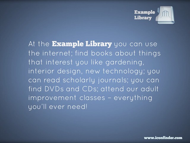
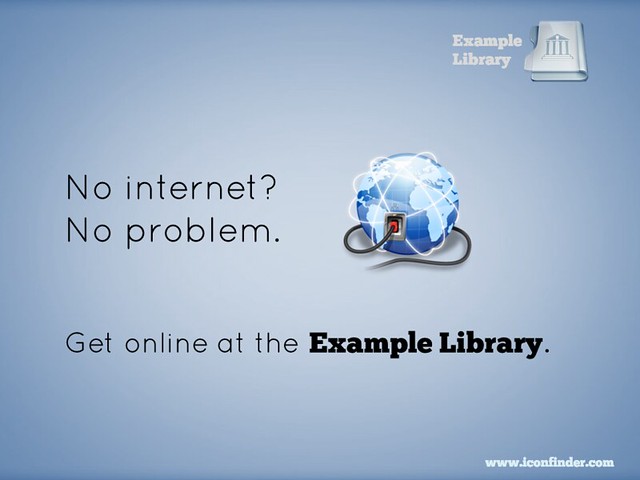
But actually, this poster doesn't work. There's too much going on, it does not provide an easy way in. You're relying on people grabbing on to the part that relates to them, and then taking an action (coming to the Library) because of it - in most cases, that's too big a leap of faith. You're much better off dividing that list up into individual posters, and putting them in the most relevant areas for their specific target groups. So for example this message, even though it's only one useful thing instead of many useful things, is a much more powerful piece of marketing:

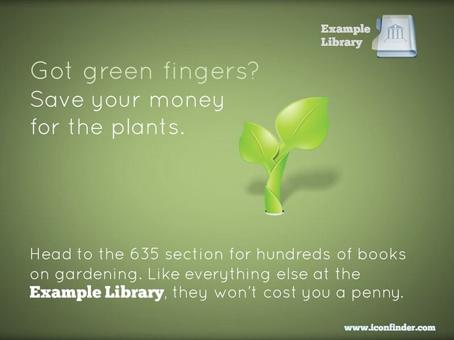
Then you make ANOTHER poster to cover another aspect of the original:

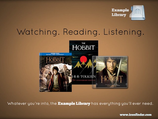
Or you can take multiple concepts but tie them together into one easily-digestible, relate-able, shareable package:

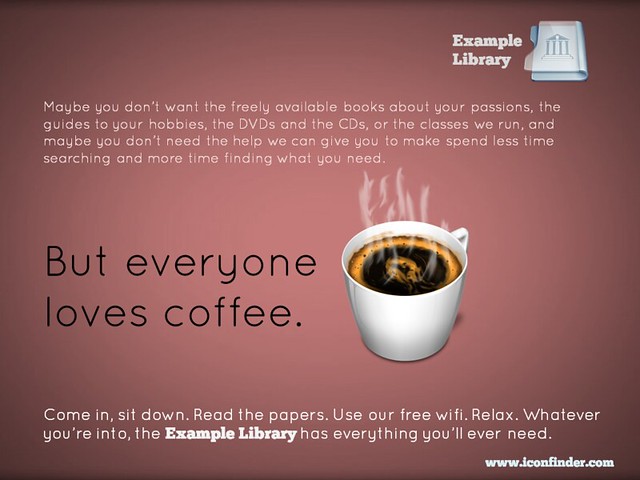
Finally, if you really want to put several library services into the same piece of promotion, you can do this and STILL have the one simple message for people to take away. In the example below, you're saying to people that the library is a welcoming place, that they can come in and use the wifi and enjoy the cafe, without being judged for not using the books and journals. But you're also listing all the other things they MIGHT do if they so desire. As I said above, much of marketing is to simply get people in the door - then you can give them a whole variety of reasons to say inside.

So remember, keep it simple. Market one thing at a time. It WILL yield tangible results.

(All of these posters are available on my Flickr account via an Attribution Creative Commons licence. Note that it's NOT a 'no-derivs' or 'non-commercial' license - in other words if you can find a use for these ideas, but want to change and adapt them to your own purposes, feel free to do so.)


Import your floorplans into Prezi to create an interactive map

A couple of years ago I wrote about some interactive maps we'd made of the Library, which we used for induction and teaching - they went down very well. The students are much more engaged by a slick Prezi than a tired PowerPoint, and it's also very practical to have information about the library geographically located in a map, rather than in linear slides. So the maps worked really well as stand-alone web objects to be viewed independently by students and staff, as well as actual materials for live presentations and workshops. You can read the post - Student Induction, Libraries, Prezi, and Interactive Maps - here; it also contains an embedded Prezi map, with which to compare the new version I've created below.

In 2012 we tried to improve the maps a little, including embedded a lot of videos in them - things like the virtual tour, but also information at the point of need, for example '1 minute on... how to photocopy and scan' next to where the printer/scanners are on the map.

This year, we did something I've wanted to do from the start, which is import floor plans to Prezi and create the maps based on those. Previously we simply didn't have good enough floor-plans in a format I could use - hence having an outline of the Library buildings (drawn by someone in the Digital Library team), somewhat awkwardly divided up by me using lines and boxes. Now though, we have a MUCH better interactive map, the basis of which is an imported PDF of our floor plans.

Here is the generic map we display on our Info for New Students page (as always I'd recommend going into Full-Screen mode to view this - press the Start Prezi button then once it loads, click the box icon in the bottom-right corner):

We experimented with various ways of representing the different floors: separate maps for each floor, or one map but with box-outs containing the other floors, for example. In the end we opted for making the ground floor plan of the overall building take up most of each ground floor, but with the other floors contained within the same space. (That doesn't make much sense; you'll see what I mean if you look at the map.)

Unexpected benefits

Once again the response from the students was really good. Quite a lot of our induction talks happen as part of wider introductions to the course, from academics, the Student Union, Careers office etc - just the fact that we aren't using PPT and they all are makes the students sit up and take notice. They've often not seen Prezi before so are impressed by the ability to zoom in on different parts of the Library and talk about them. It really does have more impact, and make people more aware of what you're saying about the Library, than a PowerPoint presentation. (And I say that as someone who still likes and uses PPT a lot, including for a lot of teaching.)

That is the expected benefit of using Prezi, but each year another benefit that occurs is the map instigates conversations with the academics. People from the Departments we're presenting in come up to us and want to talk about the Prezi - they're often impressed by it, and they appreciate the fact that the students took notice of it. I really do think I've found it easier to work with departments after they've seen me using Prezi; it serves as a jumping off point / builds bridges. (Bit of a mix of metaphors there but you get what I mean!)

If you want to try making your own interactive map, here's how

The process we followed at York was this:

  1. Open a new Prezi and edit the template so it reflected our branding
  2. Import the floorplans as a PDF. When you import as a PDF each page of becomes a seperate object on the canvas, to be manipulated: picked up, shrunk, stretched, etc
  3. Stretched the overall top-down view of the Library so it was absolutely massive - after all, everything else has to fit inside it
  4. Placed the individual building plans within the stretched top-down view
  5. Annotated the maps with further information by simply double clicking anywhere on the canvas to type
  6. Put in photographs to give the audience a better idea of where they were in the building
  7. Embedded YouTube vids at all appropriate places (this is very easy with Prezi - you just need the video's URL)
  8. Saved a copy - individual Academic Liaison Librarians then took the generic map and made bespoke versions for each department
  9. Made different versions, by copying the maps, to suit specific needs - so edited the 'path' (the order in which the Prezi moves through all the text and pictures on the canvas) to make e.g. 5 or 6 key points only for a 10 minute presentation, or every single thing on the map for the stand-alone web version ..

An example of a different version of the map (as in point 9) is this iteration I made for my History of Art PG students, with subject-specific information added and non-essential path-points taken out:

We also use Prezi for some teaching but not all. So for my History of Art 1st years, with whom I have an hour on Texts and an hour on images, I use PowerPoint for the Finding Texts session, and Prezi for the Finding Images. The latter was created using a Prezi template - these are really good if you need something nice looking in a hurry. It took me around 2 hours to turn my predecessors PPT into the Prezi you see there.

Non-York examples

Here are other takes on the interactive map:

If you have examples I can add me list, or any comments or questions, let me know below!

Making your message stick - presentation skills for information professionals

On Tuesday the 12th of November I'm running a workshop on presentation skills in London. So many of us have to do presentations now, and it makes a big difference if you feel confident about it, and know some tips and tricks to make presenting easier and more effective. I'm really looking forward to it - it's the first time of doing this outside the British Library, where it's gone down really well. We'll be covering how to make lovely PowerPoints (even if you have to use a dreaded template), how to make your audience remember the things YOU want them to, tips for presenting itself, an introduction to Prezi and a bunch of other stuff too. You can read some of the kinds of things we'll be talking about in this 10 non-standard tips for public speaking post  and this presentation on making presentations...

It's hands-on, at PCs. The details, including a booking form, are here.

UKeIG website picture

One of my favourite ever pieces of feedback came for this course (it was unsolicited, too):

What I enjoyed so much about the presentation workshop:

 1.      Expertise in the subject matter

2.      Relevant and highly useful information: presented and practiced

3.      Clear and engaging presentation style

4.      Professionalism with a great sense of humour, no hidden agenda

5.      Dedication to collaborative professional development, to high standards, to excellence

... so I promise it'll be good! :) Hope to see you there.

Ned

In praise of #bettakultcha (and a video about buying India a Library)

This post is about 3 things: the Buy India a Library project and my talk about it, the Bettakultcha event I did the talk at, and the generally sound principle of talking about library-related things at events which aren't remotely library-related...

Bettakultcha is ACE

Bettakultcha is a brilliantly simple concept - a night devoted to presentations of 20 slides, 15 seconds a slide, on anything you feel passionately about, and NO PITCHES. The fact that this works at all - that such a flimsy concept consistently produces a brilliant evening of entertainment - makes you positively giddy with delight when you're part of one. People talking about their passions is pretty much ALWAYS interesting - even if the passion itself isn't overly interesting to anyone else, or the presenter isn't a natural speaker. It's a very supportive environment in which to public-speak. The talks are only 5 minutes long anyhow so you never get bored; I've enjoyed every talk I've seen at a Bettakultcha event. I've been entertained, moved, fascinated. It's quite an intimate thing, to talk about your passions to an audience of strangers (my previous Bettakultcha talk was about Captain Fitzroy of the Beagle, with whom I'm somewhat obsessed - normally people have to know me quite well before they get the delights of me discussing his tragic life at great length) and it means you get a connection with people, you effectively jump ahead in your relationship. I've met people at Bettakultchas who have become my friends, and who I keep in touch with not just online but in person too. Bettakultcha really is ace.

Here are a couple more talks from the event I recently attended in York - Paul Smith making his passion for coffee properly entertaining,  and an amazing talk by a 14 year old on organ donation! Here's one I missed but I wished I'd seen - my friend Helen doing a completely silent presentation. There are musical talks, theatrical talks. Anything as long as it's not a pitch - often the simplest concepts result in the most creativity.

They run all over the North of England - if there's an event anywhere near you, I can't recommend it highly enough. Check out some other talks on YouTube, or search Twitter for the hashtag to find out more. The main website is here.

My #BuyaLib 20/20 talk

At the June Bettakultcha I gave a talk about Buy India A Library  - it's all about how we crowd-sourced $4000 in 2 weeks in order to fund a Library build for a school in Mysore. Here's the talk:

As mentioned above the format of the talk was that you have 20 slides which each move on automatically after 15 seconds (often known as the Pecha Kucha format, which is probably what the phrase 'Betta Kultcha' is referencing, must ask the organisers) - in my experience the key to doing this type of talk is a: to practice it the day before and b: DO NOT WAIT FOR THE SLIDES! People slip-up in 20/20 style presentations when they stop talking - it's best to plough on with a narrative, and have the slides provide a complimentary narrative, in their own time, underneath...

The audience were much more responsive than I thought they'd be - it was a really fun talk to do.

(By the way, the librarian blogger I mention near the start was @jaffne - sorry not to credit you by name, Jaf!)

The Echo-Chamber Escape revisited

A couple of years back Laura Woods and I did a lot of talking and writing on the subject of librarians escaping the echo-chamber.

We've stopped now because quite honestly we got quite sick of our own thoughts and voices on the matter! But it's still an important concept - we need to write for non-librarian audiences, talk at non-library events, and generally get out there. It's fun, too.


Marketing Libraries: What the not-for-profits can learn from the lots-of-profits!

A couple of weeks ago I presented a webinar for WebJunction on marketing libraries. Part 1 of this post is all the information from the presentation, including a video archive of it, and Part 2 is about the process of presenting in a webinar, for anyone interested in that side of things.

Part 1: Marketing Libraries

The webinar covered marketing principles (several ways to start thinking like a library marketer) - and marketing actions (ways to communicate including Word of Mouth, the website, social media etc). There are various ways you can access the content.

If you want a brief overview:

Here are the slides, with a couple of bits of info added in so they make sense without me talking over the top of them.


If you want the full detail:

You can view the full Archive (combined archive of audio, chat, and slides) - this requires JAVA and is a bit more technically complicated than the options above and below, but you get the full experience of the slides, me narrating them in real time, and the chat happening in real time, where you'll find lots of good ideas.

If you want a version you can watch on any device:

Here is the YouTube vid of the webinar - the good thing is you can watch this on a phone etc, the downside is some key points are missed where it skips or the live-streaming briefly went down, and it's hard to read the chat that added so much to the presentation. (You can, however, download the  chat (xls) to read in Excel as you go along.)


When I get a bit of time I'm going to break this down into smaller videos on each topic.

Part 2: Presenting a Webinar

Presenting a webinar is an inherently odd experience because you can't see the faces and responses of your audience. I rely on this a lot to know what is working and what isn't - a presentation is all about communication, after all. Not only that but it's a much bigger audience than for a normal talk - there was nearly 600 people watching this as it happened.

A picture of a desk with PC, iPad etc

Above is what my desk looked like - iPad to monitor tweetstream (which I didn't have the wherewithall to actually do), landline phone to speak into (I had it pressed against my ear for the first half hour before realising there was nothing to actually hear), G&T to drink (later decanted into a glass with ice, don't worry), iPhone to live-tweet pre-written draft tweets from (it was too stressful to do this well, so I sort of tweeted them in clumsy groups), PC to present from and clock to keep to time by.

I asked for some advice on Twitter about what makes a good webinar - much of it was about good presenting generally, but the web-specific stuff centered around making it as interactive as possible (the technology limited how much I could do this, but I tried...) and giving people time to catch up (I think I pretty much failed to do this). Very useful advice from Jennifer at Web Junction included not putting any animations on the slides because these don't render well in the webinar environment (if I wanted stuff to appear on a slide as I went along, I made two versions of the slide and moved between them). The particular platform we used meant I had to dial in with a phone - a PHONE! - and talk into that whilst manipulating the slides, that was very strange. I had a practice run the night before and I'm glad I did - in essence I found out I just cannot present sitting down, I need the energy that comes from pacing around, so I ended up using my slide-clicker so I could wonder about my house without having to be too close to the PC... The downside to this is I couldn't monitor the chat nearly as well as I wanted to, to respond to questions, because I often wasn't close enough to read the small text.

This was the first time I'd done one of these solo - previous webinar experience had been as part of a panel. As is often the case, as soon as I've done something properly and learned how it works, I want to do it again but much improved based on what I now know. So I'm hoping to work with WebJunction again next year (I find their site a really useful source of information and expert opinion). But the feedback from this one was great, some really nice comments in the chat and even a reference to my accent via private message...

I enjoyed this whole thing, and clearly live-streaming and web-based events are going to be more and more important. They're very convenient for attendees, less so for presenters (I had to banish my family upstairs for example!) but I did get to wear shorts for a presentation for the first time, and even drink Gin & Tonic during it, and that was ace.