5 UX insights for library web-design

For the last few months I’ve been leading a project to completely redo my library’s website from scratch. It has been full-on, and rewarding, and most importantly the new site is live as of midday today.

I’ll post about the project process later, but for now I want to focus on what the UX fieldwork with our users told us, as these insights will hopefully be useful for anyone redesigning their org’s website.

I’d love you to go to york.ac.uk/library (opens in a new window) and take a look, then come back here and tell me what you think!

This post focuses on the organisation of the site; part 2 will be on the content.

Use colour with intention

As you can imagine, we’re working within the limits of the University CMS (Content Management System) and don’t have a lot of control over colours - most of the content types are white, but several can be set to cream, teal or dark blue. I must admit when I first started designing the pages, I just used colour to mix things up a bit and add some visual interest - a strip of colour here, a nice accent there. But the users told us in the UX sessions that they wanted the colours to mean something - they expected consistency across the pages (for example opening times always one colour, as shown below; quotes from students always another colour) and in particular they wanted the darker colours to signify something especially significant - a call to action, or really essential information.

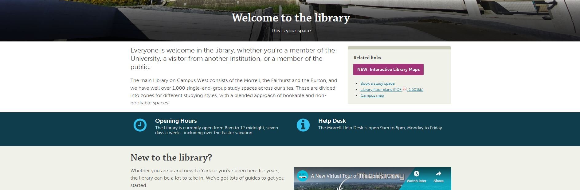
The teal strip showing opening hours. The fact the Help Desk opening hours are on there too, and the fact that the Easter vacation is explicitly mentioned even though the hours aren’t changed, are both as a direct result of student suggestions during the UX.

Topic based organisation beats audience based navigation

A perennial debate for designing anything for users, websites included, is: do we organise things by theme, or by who is accessing information? Do we say ‘PGs go here, UGs go here’ or do we talk about space on one page, resources on another?

In a literature review carried out at the start of the project, my colleague Alice Bennett wrote, on the topic of a particular study finding topic-based organisation to be significantly preferable: “This is potentially a more inclusive approach, as it better allows for intersectional user identities and better accommodates search behaviour, with users typically searching for specific information, rather than looking to find themselves in the menu.”

This was really borne out by the UX. I asked one distance-learner where all the distance-learning information should sit in the new structure. They said “I wouldn't separate it. Because you don't like to treat yourself as a second class [citizen] and just look for, okay, where is the info for the distant learner people?” And to Alice’s point about intersectionality, we also had an International Students guide - many of our distance learners are also international students, so where do they look? And of course the contents were extremely similar. In the end we have a nice ‘basic introduction to the library essentials’ page which is for everyone: universal design wins again.

Your users will tell you which compromises are worth making

Compromise is inevitable in this sort of process - library websites have too much complex information and too many responsibilities to our users to just make a super slick, neat website. The top-level navigation is one of the biggest changes between the old site and the new - the old site had about 15 overlapping ways in to the info down the left of the screen; the new one has just six top-level landing pages.

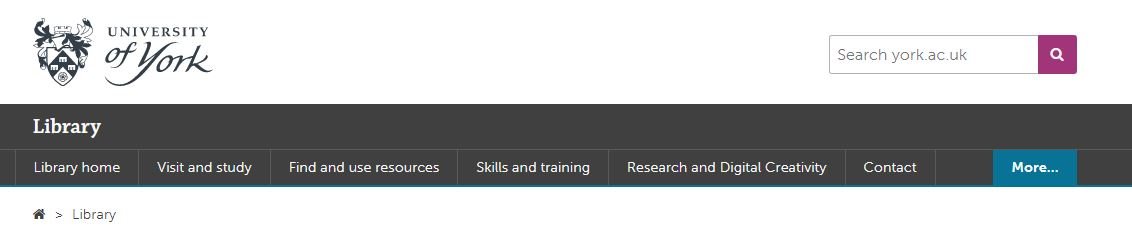
The top-level navigation of the new site

We thought loooong and hard about how to group the information - we spent weeks planning this before we even had access to the CMS. But still we changed it during the UX process, because our users told us the compromise we’d made wasn’t the right one.

Our info for Researchers was split across the Skills & Training page you see listed above, and a Facilities page. The Facilities page has loads of useful info, but no flow and no cohesion - and more importantly when we spoke to Researchers in the fieldwork we set them tasks to find Open Access info, and they couldn’t do it. The split of info which had internal logic for us simply didn’t make sense for the user, and they couldn’t get to what they needed.

So we now have Research and Digital Creativity. This too is a compromise because that pairing isn’t as natural as the others (skills & training, for example) but those are two important aspects of the library offer that are really easy to find, so it’s a better way to go.

KnowING it’s important to invert the pyramid isn’t enough!

We all know about inverting the pyramid, right? I talk about it all the time. But knowing how important it is and ruthlessly acting on it turned out to be two different things… Even when I actively tried to do it with the website, I wasn’t doing it enough. One participant in the UX literally said ‘this page is upside down’… It’s so tempting to try and set the scene and lead people through the information, but they just want the important stuff at the top and that’s what we should be doing.

So: invert the pyramid, and invert it hard. (And then come back later and check it’s still fully inverted.)

Pictures have more than cosmetic valuE

“I’m never going to read that.” This a common refrain from students when faced with dense, lengthy text. We tried to simplify and reduce where possible, but sometimes in libraries there just IS detail - so breaking that up with images really helps. It’s not just that the images can help illustrate what you’re talking about, it’s that they make the user more likely to read even long passages of text because it’s broken up into chunks. It makes it manageable.

We also made sure to use the same image for thumbnail links to pages, as you find at the top of the pages themselves when you click the links. This reassures the user that they’ve clicked the right thing, and creates a sense of familiarity which helps make the info less intimidating.


A part 2 post detailing what the users told us about the Content of the site will be coming soon!

Library Marketing for Library Marketers Podcast

I had a great time on Katie Rothley’s Library Marketing podcast recently, guesting with Angela Hursh and Mark Aaron Polger, both of whom I’ve read a lot by and been fans of for ages.

Here’s the epsiode.

It was so good to talk with like-minded people about a subject I’m so passionate about, especially as we go on to talking about UX too, which I can talk about forever… Anyway, have a listen if you’re interested and thanks again to Katie for inviting me.

Where should libraries go if Twitter becomes a wasteland?

Elon Musk has bought Twitter, he’s all but guaranteed to make terrible decisions about how to run it, and high-profile users are already leaving the platform due to the already-significant increase in hate-speech and misinformation. Of course this has wider implications for the world at large, but where does it leave libraries seeking to connect with users on the platform? Should we stay, or find a new home?

tl;dr - in a way it doesn’t matter what we want to do, we have to follow the lead of our communites. If they stay put then so should we; if they fragment then it becomes a lot more complicated.

Should we simply leave Twitter on principle?

A quick disclaimer is that I’m focusing on organisational accounts here. When it comes to us as individuals, there’s certainly an argument that we should be getting out - but this post is about libraries, not librarians.

Ultimately, my view is that libraries leaving Twitter on principle is self-defeating and too selective. Facebook is so incredibly problematic and has been for at least a decade, so if we’re leaving Twitter we should probably be leaving FB, right? And they own Instagram so we should leave that too. Which means we’re left with TikTok, which is hardly a bed of ethical roses and is especially problematic around data.

So do we leave all of them on principle? You could certainly make a case for it - but I don’t think most of us will because it would destroy our ability to interact with our communities. So if the answer is ‘no we’re not leaving all of them,’ then leaving just Twitter seems like a misstep: if you’ll forgive the extended metaphor, it’s like cutting off your unethical nose to spite your face, when the cheeks, eyes, chin and mouth are equally guilty.

What are the alternatives? Is Mastodon an option?

There are a few alternatives to Twitter and sadly I’m yet to see any of them as a truly workable solution. The one currently garnering most attention due to a record number of downloads and new members is Mastodon, which is very Twitter-like indeed. Visually and functionally it’s very similar to Twitter but the problem is, we’re not REALLY on Twitter because of the functionality; we’re there because our communities are.

Unlike Twitter’s single giant network, Mastodon is spread across several different servers with different subgroups. There are regional spaces, queer-friendly spaces, climate-activist spaces - and they all stress they welcome everyone (e.g. you don’t have to be from New Zealand to join the mastadon.nz space). The issue with this diffuse approach is no one group is especially big: so there are 5,000 people on the Australian community server at the the time of writing, versus 3.7 million Australians on Twitter. You can interact with people on different servers, but the way it’s set up we could put an enormous effort into Mastadon but not influence enough people in any one place to see any tangible rewards. However I’ve set up an account for myself @nedpotter@mas.to get to know the platform in case it becomes a viable option for the library later.

The same goes for Discord, another platform often cited as a Twitter alternative in recent days - it focuses on several smaller communities, rather than one massive one. This makes it all but impossible to use efficiently as a library.

As things stand, I don’t see a viable alternative to Twitter. That may change, and it will vary according to sector - so for example if a LOAD of health professionals join Mastodon, it could become a useful platform for Health Libraries to have a presence on. But right now, it isn’t.

If we’re staying, what should we do differently?

One of the key things you can do if you haven’t already is mute more. Go to Settings and Support > Settings and privacy > Privacy and Safety > Mute and block and finally Muted notifications. On the resulting screen you can mute default-profile-pic accounts, or unconfirmed accounts, meaning you’ll be less exposed to mass-produced trolling or bots.

Ticking a few of these will probably help

You can of course mute individual words and block accounts too, or even Lock your account - from a comms point of view though that’s a pretty drastic step to take for an organisational account.

One other thing to note is don’t conduct any kind of sensitive conversation via DMs. You can’t trust Twitter with your data, so don’t DM your users and ask for anything you or they wouldn’t want to Twitter to know - just DM them and tell them you’ll be in touch via email instead…

[Hey while you’re in Settings, why not also take the opportunity to revoke access to third-party apps that don’t need access anymore. It’s good practice to do this on a regular basis anyway. And if you’ve got the patience for it, check out this guide for getting rid of a lot really annoying things about the way your Twitter timeline currently works - no more suggested posts, woohoo!]

Should libraries pay $20 a month for the blue tick?

Hell no.

So what happens next?

The slightly frustrating truth is our next steps as organisations has to be: wait. We have to wait and see what our communities do, and be guided by them. If they move en masse, we can move with them. If they don’t, we should probably stay where we are.

In the meantime it’s worth considering things by sector.

  • If you’re a law library, pharma library, or other special library, you can potentially use LinkedIn to connect with almost every relevant person in your potential audience, and ditch Twitter if you truly wish to

  • If you’re a school library you can definitely get by without Twitter if you choose to

  • If you’re a Health Library or an Academic Library keep an eye on the conversations your audience are having on where they might go - Mastadon may become an option worth investigating in time, you never know

  • If you’re a public library… I just can’t see any sort of alternative on the horizon for now. At least Facebook is the really key platform in that sector!

If anyone else has advice, guidance, or thoughts on what you might do with your library’s social media presences, let me know in a comment below. Good luck out there, everyone.

Academic Library Social Media: podcast interview

I was invited to be on Andy Hurt’s podcast about libraries recently, and we had a great time discussing library social media in an academic library context. Andy asked such great questions, I really felt like we got onto all the intersting stuff - personality, humour, tone, trends… Have a listen:

Thanks again to Andy for having me on. She works at University of Melbourne Library and their social media is really, really good - check out their Twitter here and their Instagram here.

A Beginner's Guide to Instagram Reels, Stories, & the Grid: what to post where

Instagram is a fun place to market a cultural org, but it’s also a complicated space in which to work. It has so many layers and ways to post, and to a certain extent they all work together - which just makes it even more confusing to people trying to get the most out of the platform! It all makes Twitter seem very straightforward by comparison.

It is worth trying to do Instagram well, however. It’s worth taking the time to familiarise yourself with what each facet of it does, and then craft content for your audiences.

Before we go into the details, let’s look at how an Instagram account is displayed to its audience.

Screenshot @NYPL on Instagram, overlayed with contextual info. PROFILE PIC. It’s worth keeping this consistent. People tap it to view your Stories. THE GRID. The photos and videos people see when they view your profile.

(Click the pic to open a larger version in a new window)

So, what do you post, and where should it go? At the time of writing, there are four ways to post Instagram content.

The Grid

The Grid is the bread-and-butter, the ‘main’ posts you put on your Instagram account. It can be photos or videos. It’s what people see when they click on your profile. You might post a few times a week to the Grid, even if you post more often to Stories.

In the library world, it’s photos of interesting things that do well here, rather than incredible photography per se. A perfect shot of a book, taken on an expensive camera, will reach fewer people than a nice picture of your library’s interior taken on your phone.

Remember: pictures of Words do not work! Shots of library interiors seem to do really well, as to shots of library exteriorsArchive photography is always popular. It’s worth noting that not all your posts have to be about your library: images of the geographic location you’re in are often popular, as in this Liverpool Uni Library example.

Shots of objects from Special Collections often get engagement, like this one from the BL.

Stories

Stories are 15 second videos (or a longer video broken into 15s chunks) or a 7 second-long still. They’re orientated as portrait rather than landscape or square. because they’re only really intended to be viewed on phones. They can have music and gifs and animations and - crucially - links, added to them, natively in Instagram. They do NOT appear on your grid; they’re found when people click your profile pic. They disappear after 24 hours - but they can be pinned in themes to be found later by the more curious among your followers. And the more you use them well, the more your account will grow and the greater your engagement will be with your audience… Got all that? Just in case anyone is still scratching their head, the next post in the Instagram Mini Series will be All About Stories in more detail.

Reels

Reels are a brilliant opportunity for all of us. There’s a whole post on Reels coming up, but in essence they are portrait videos, maximum 90 seconds long, and massively favoured by the algorithm. They’re shared waaaay more widely than any other type of Instagram post - the reach will be several times that of a regular video or image. (Confusingly, Reels also appear on your Grid unless you disable this, but let’s not dwell on that now!)

Here’s the kind of content that seems to suit Reels well - firstly the Book Sorter POV video which I made by literally blutacking a GoPro to a book! It’s not serious, it’s a bit silly, but it’s also introducing people to the Book Return machine by stealth…

Music is important in Reels, so the second video with shots of the library cut to fit with the music behind it, is a type that can work well.

Instagram TV

Instagram TV is almost not worth worrying about at all. It use to be IGTV and was the home of any videos longer than 1 minute. It didn’t really work, no one watched it, so they rebranded it to Instagram TV at the end of 2021 and now all your videos go there, regardless of length - except Reels. It’s really little more than filter now - people can click on the relevant tab on your profile and see all your videos (except your Reels!) in one place - but they can find them all on your Grid anyway. The thing about regular videos - rather than Reels - is that they simply do not get seen. Instagram doesn’t share them. So even brilliant videos won’t find an audience.

The tl;dr is, focus your energies on the Grid, Reels, and Stories.


This is Part 6 in the Instagram Series. Read Parts 1 - 5 if you’re interested.