How to

Blogging to publicise research


Yesterday I gave a talk to some Music Technology students about blogging. They're using blogs as part of their course, and I wanted to convince them to get the most out of the opportunity, and carry on after their Masters is done, because I think blogging is a fantastic thing.

I wanted the tips below to apply to anyone in academia who blogs, but hopefully also to libraries and librarians and other non-profits who want to get more out of it too.

This isn't the exact presentation I gave to the students - I've annotated it so it makes sense without me talking over the top of it. It covers building a readership, embedding multimedia, using the analytics, and a couple of other things too.

In case you're interested, here's a link to the Twitter Tips and Tricks post, of which there's a screen-shot in the presentation above.

#UxLibs 4: Ethnography You Can Try At Home


Post 4 about the UXLibs Conference. This one is about the actual ethnography we went there to learn about. If you're interested, there's a post about the conference organisation and format here, plus a post about the Usability keynote here, and a post about the Ethnography and Design keynotes here.

But first, the Conference badge. This genuinely was the best user experience I've ever had from a badge. The attention to detail was symptomatic of the whole approach to the conference, I felt - it was designed to be a good experience. Timetable, maps, where your accommodation is, which parallel sessions you were in, name, institution, Twitter name, the conference hashtag AND it was reversible so it could face either way and still be useful. All little things but together they made a real difference.

Badge magique!

Badge magique!

Before attending this conference my knowledge of ethnography was limited to having read about it. I'd not done any. I knew it was useful, and I knew why I felt we needed to make use of it - but if someone had caught me by surprise with the question 'So what IS ethnography in libraries?' I would have crumbled... But not anymore!

Here are some of the techniques we learned about ethnography - in the final post next time I'll cover the process of designing a service or product off the back of what you learn.

Cognitive Mapping

I've put this one first because it's my favourite. I didn't actually get to do this one (on Team Space Grey we all went to different workshops, and mine was the Observation one), but I really loved the results of it. If you're reading this thinking "I did do this and you've misunderstood it" then correct me in a comment!

Cognitive Mapping is in essence asking your subject (student, staff or whoever) to draw a map of the library - or, ideally, of their wider learning landscape - in order to understand how they perceive the space, what they actually use, what they value and see as most important and so on. Often the subject is asked to change colour of pens every 2 minutes, for a total of 3 colours over 6 minutes, so you can later see which order the items were drawn in, an indicator of their importance.

Here's a map which Team Space Grey got one of our students to draw (thanks for sending me this Kristin!):

We got two maps overall - what was particularly interesting for us is that one of them mentioned the basement area of the library as being dark and scary, and another didn't put the basement on the map at all! This was a big part of the idea we later pitched (which I'll cover in the next post).

There are some examples from Donna Lanclos of congitive maps, here.

What we didn't really have a chance to do at the conference itself was code the findings. To quote library anthropologist Andrew Asher - one of only two people to hold that position in libraries, the other being Donna Lanclos - here's how you might go about it:

Coding these images basically involves counting the elements drawn in order to construct two indexes: a identification index, which is the number of times that an element is drawn divided by the total number of individuals participating (i.e. the percentage of the time the element occurs), and representativeness index, which is the number of times an element is drawn divided by the number of times that category of element is drawn (e.g. the number of times a study room on the first floor is drawn divided by the number of times all study rooms are drawn) (See Colette Cauvin’s “Cognitive and cartographic representations : towards a comprehensive approach” for additional discussion). I also constructed a temporal index for each element by coding the three colors in order (1 = Blue, 2 = Green, 3 = Red) and calculating the mean value for each element (you could do more complicated things by combining the indexes if you are mathematically inclined, however, I’ve found that these three get at most questions).
— Andrew Asher | www.andrewasher.net

Observation

Observation is exactly what it sounds like - you occupy a space in the library or wider campus and you note exactly what's going on and how people use the space. In our workshop we were encouraged to focus on the location itself, the pathways users took through it, the interactions they had (both with other people and the objects and machinery), and the tools they used.

I drew a heat-map, or rather a behavioural map, using the Paper app on my iPad - tracing the lines of every single user who came through the library over a set period of time. You quickly get a picture of how people move through the space. (Not a single person went down to the basement...)

I can't draw at the best of times, and this was done using my finger - so my handwriting which is usually terrible is now completely unusable, and the weird mass of colours near the bottom left is me repeatedly trying to get the action right to bring up the colour selection tool - but I really enjoyed making this!

The idea of course is to build an understanding of how the space is used, and then adapt the space to better suit the reality for the users. For example, at Judge Business School they moved the digital display screens so they were easily viewable from the 'desire line' - the path most students took through the library. There's more on this in slides 13 - 19 of Andy Priestner's deck here. (That presentation is also a great introduction to ethnography generally.)

Interviews

The key thing about interviews in this context (as opposed to the more traditional focus group methods libraries often use) is asking completely open ended questions. I mentioned this in my post about Donna's keynote: if you ask how a student writes an essay, you get a potentially more illuminating answer than if you ask 'what library resources do you use for an essay' or 'how do you use the library'. All of this makes the data you get messy and harder to process, but ultimately in my view more worthwhile.

Touchstone Tours

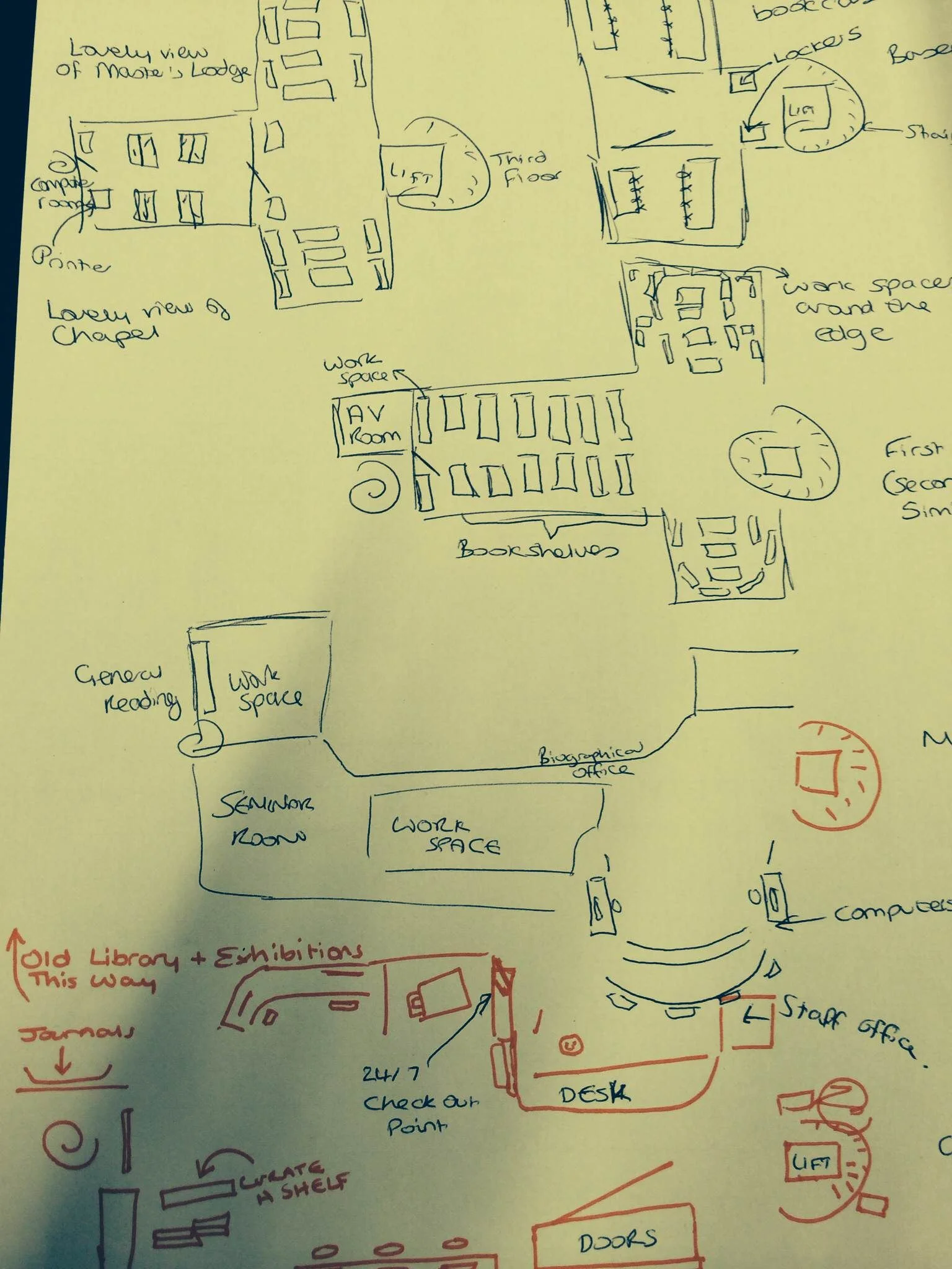
Just as the Cognitive Mapping gets the user to draw the map rather than view the library's own, Touchstone Tours ask the user to take the librarian on a tour of the library, rather than the other way around. By the user telling you how the tools, systems, building and spaces work, you get to truly understand how it feels to be a user without the in-built knowledge and understanding we have as library staff. (Our tour subjects didn't take us down to the basement because, for them, it really didn't matter.)

Love-letter / break-up letter

I'm reluctant to try and describe this one in too much detail as I wasn't in the relevant session and we didn't end up using it in my team. But it involves writing a love-letter to the library if you like it, or a break-up letter if you don't. When it works well it gets to the heart of the user experience, and helps understand the emotions Matt Reidsma talked about in his Keynote on usability.

There is more info on interview techniques, touchstone tours, and the love letters, in Georgina's workshop slides.

Anything I've forgotten, let me know!

Australia! I am in you in April, running some marketing workshops...

Phil Bradley always said you could travel the world on a library degree, and that seems to be coming truer and truer. 

In April I'm running some workshops on marketing libraries, in Australia. If this is a side of the information profession you're interested in, I'd love to see you there! The dates and cities are:

  • April 20th: Melbourne
  • April 22nd: Sydney
  • April 24th: Brisbane

The training company who've asked me over to do these has put together a pretty comprehensive brochure detailing what we'll cover. You can see more info as well as booking details over on the PiCS site, and I've embedded the leaflet below.

Twitter Hashtags: The Rules


Last week I was creating a slide for a workshop aimed at academic staff and research Postgrads, entitled Twitter for Improvers. On the slide I was attempting to explain what worked with hashtags, and what didn't - for example putting in punctuation causes the hashtag to break.

Then I thought, it would be better to actually do these as tweets (show don't tell!) - I did so just with the idea of print-screening them and deleting them, but lots of people joined in with replies and RTs and I added some ranty opinions on hashtag use as well as the factual and logistical stuff...

So here, in Storify form, is what works and what doesn't: The Laws of Hashtags!

(If you can think of any more leave me a comment.)

Creative Commons header image by GeoBlogs.

Two More Twitter Changes: Group DMs and In-Tweet Analytics

Following on from my post on the excellent new Twitter video, there's a couple of other things Twitter have introduced in the last couple of weeks.

The first is group Direct Messaging, where you can set up a group of people (up to 20) and privately message them collectively. The conversations can include pictures and be about specific tweets. This is potentially very useful for taking a problematic conversation or dispute out of the public eye but staying within the platform. From the point of view of libraries, that's great. From the point of view of librarianship, I'm not so sure.

The second feature is and tweet-by-tweet analytics within the mobile app. I mentioned in my previous post about Twitter's new Analytics how what the stats really show you is how few of your followers see each tweet (it's around 11%, and that's assuming it's not part of a conversation or at a weird time of day in which case it's much less, or if it's RT'd in which case it's a bit more). The ability to click on each tweet in the mobile and app and see the stats right away just reinforces this - here's a tweet linking to my last post, which got ReTweeted 21 times, and was still only seen by a number of people which amounts to just over half the total number of followers I have.

Twitter11.PNG

I'm not totally convinced the link clicks figure is accurate though - not just because it seems really low! But because it doesn't correspond with my website's own statistics or Google Analytics, which attributes a lot more click-throughs to this particular tweet.

But the total number of impressions I do trust. So what do we take from this as libraries? If something's important, you have to tweet it more than once! And it's also worth tweeting at the peak times for when your followers are online - this is usually around 11am and 3pm, but you can find out more specifically using Tweriod, which I'd recommend you do.

[Edit: Since I wrote that I checked Tweriod and it seems to have gone to a paid-only service, which is a real shame - FollowerWonk should tell you when your followers are most active though, so use that instead.)