The User Experience in Libraries Conference is looming next week, and I've got a series of UX related posts (not all by me!) lined up for this blog. (Read post 2, A UX Intern writes... here.) Apart from writing about last year's conference, and creating the UX Resource List for anyone interested in an introduction to the area, I've not really talked much about ethnography on here, but I've been doing a lot.
Apparently someone recently asked Andy Priestner (UXLibs Chair) what 'the next fad in libraries will be after UX'! To me this totally miscasts what User Experience in libraries is all about. Purely and simply, UX is an umbrella term for a suite of methods to help us understand our uses better, and design changes to that service so it works more successfully for those users. That is not a new or faddish need. It isn't going to go away. The methods may be new to libraries (in the UK at least; they're more established in the US and Scandanavia particularly) but there is a growing community of libraries and librarians getting amazing understanding and insight with them, so we'll continue to use them. More and more info pro jobs are starting to get elements of UX in the job description. This stuff is here to stay not because it is fashionable, but because it works.
The posts over the next two or three weeks will cover three projects undertaken at the University of York, including guest posts from UX Interns we had for two of them. The first covered Postgraduate students, the second covered specifically just Postgraduate Researchers, and the third, still ongoing at the time of writing, focused on academics. All of them have been fascinating and rewarding, but by no means plain sailing...
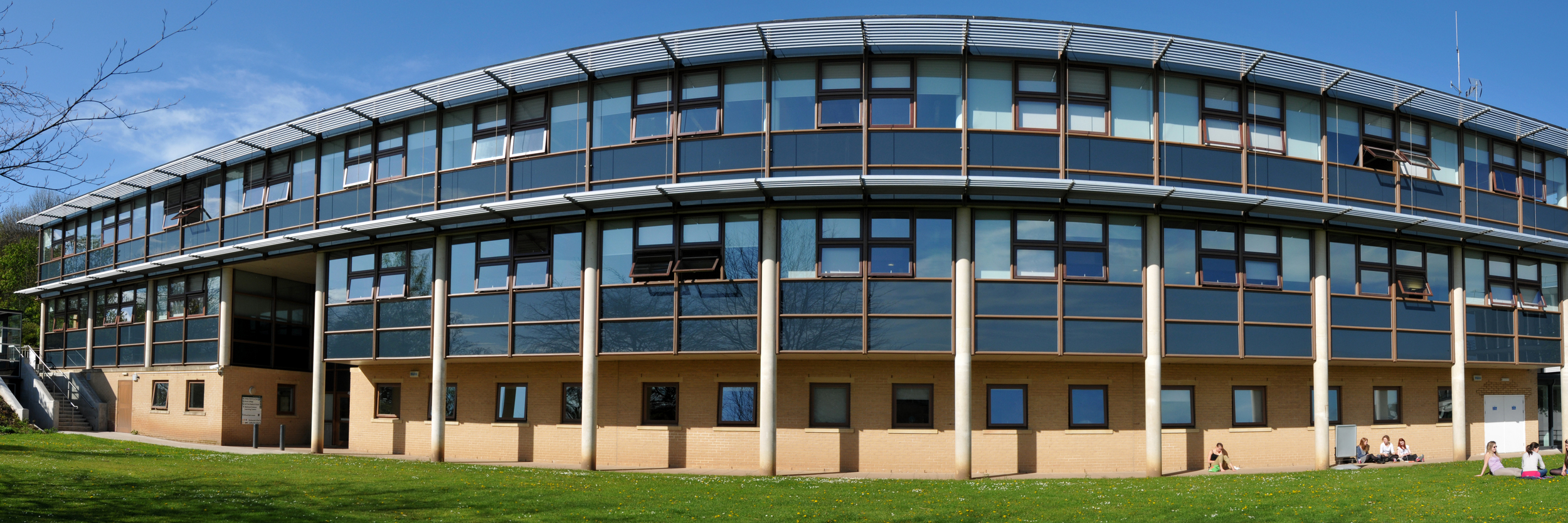
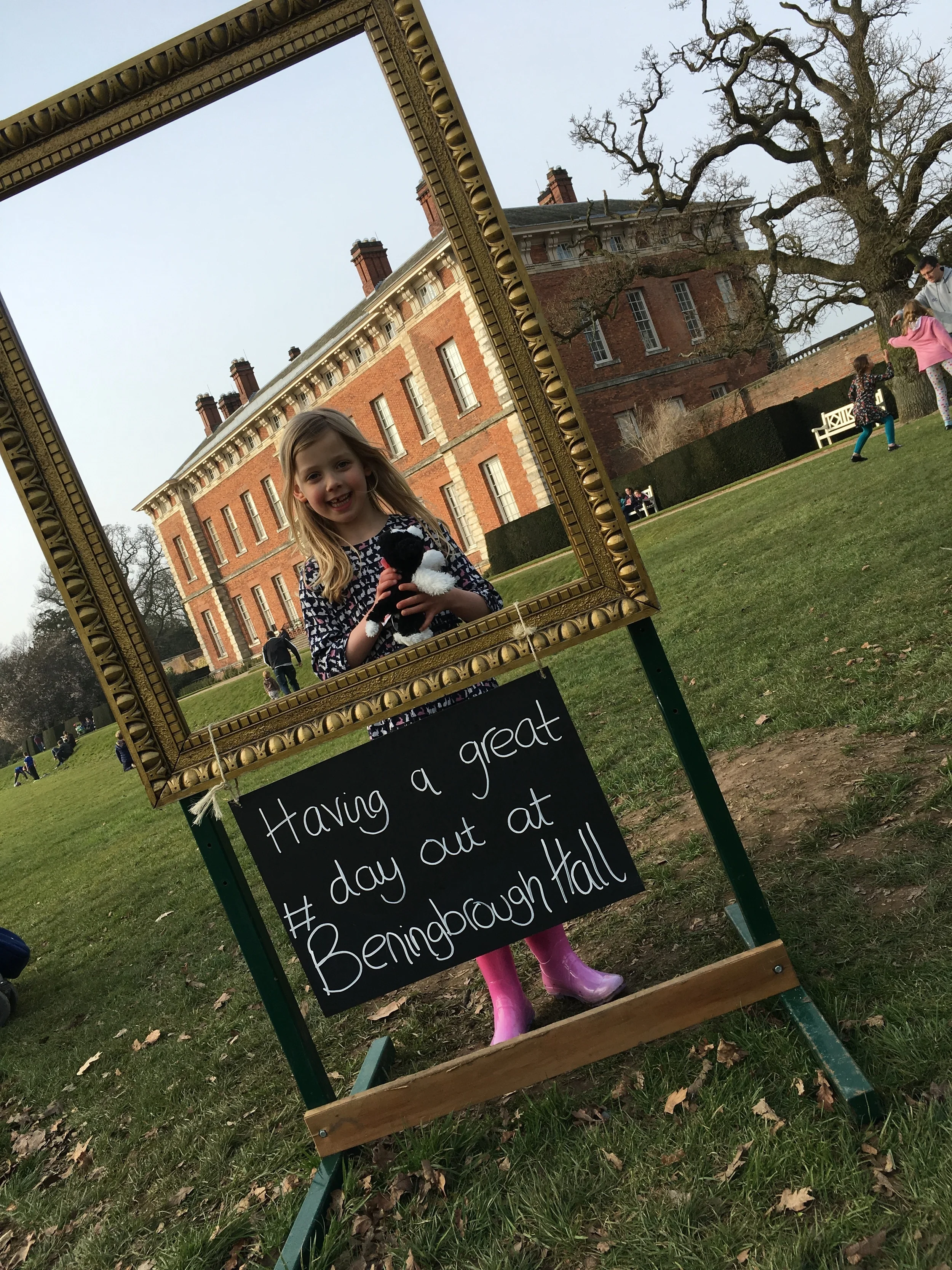
The Fairhurst Building at the University of York, the HQ for all our UX projects. Photo used by permission, copyright of Paul Shields.
UX at York: project overviews
I'll go into more detail in subsequent posts but here's an introduction to each project.
- Project 1: Summer UX. This was a 2 month project with the aim of building a UX Toolkit - essentially understanding the UX techniques and methodologies in a York context, see how they worked, what we could learn etc. We had an intern working part-time during the 2 months, and we used 5 ethnographic techniques across a total of 25 participants. These were all Postgraduates, both PGRs and PGTs, from a mix of disciplines.
- Project 2: PGR-UX. The second project also featured an intern, and was more focused - we spoke to fewer people, and the participants were all Research PGs. We targeted people from specific departments, and really only used three of the ethnographic techniques.
- Project 3: Understanding Academics. This project is absolutely huge and still on-going. It involves everyone in Academic Liaison, will last several months, and involves academics from every single Department at York. We have spoken to around 100 people in total for this, and used two ethnographic techniques. The analysis has just started.
Embedding ethnography
The key to our approach at York has been to try and integrate ethnography into our regular routine right from the start, rather than having a little UX silo where UX projects happen in isolation. We now try and utilise UX wherever appropriate in the Library, although quite honestly we've been better at embedding the ethnography than we have at the design-thinking / human-centred design aspect that completes (or continues) the UX-cycle, but that side of things is coming. We aim to consistently supplement our existing data collection methods with a nuanced UX approach, and because of the amount of work involved in ethnography and the sheer amount of time it takes, we target specific groups and areas we want to know more about and use ethnographic techniques with them. Each time we do, we learn more about that group of users then we've ever known about a group of users before. It's fantastic.
The five of us who attended UXLibs set ourselves up as available to be brought in on any wider projects happening in the library, to provide advice and guidance of if, where and how ethnography might be useful. So although the first project listed above, Summer UX, was primarily a way to try out UX in a York context, the subsequent two have been existing projects which have been deemed suitable for ethnographic input, and we've been brought in to advise on how best to go about it.
Next time will be the first guest post in a very long while on this blog - our first ever UX Intern, Emma Grey, has written about her experiences working with us when completely new to both libraries and User Experience, and the five ethnographic techniques she employed, including how she refined them as she went along.
Header pic by the Library Photographer at the University of York, Paul Shields. Used with permission.