University of York Library

Universities need to get better at using Instagram – here’s how

I wrote an article for the Times Higher all about University use of Instagram. I think Insta is absolutely the most important social media in Higher Education at the moment now Twitter has become unusable, and this article sets out why that is and what to do about it.

It contains some stats, some useful links, and above all guidance on how to use it well!

Screenshot. Text reads: Instagram is the most effective social media channel to engage students, argues Ned Potter. In this resource, he outlines ways to produce successful content and increase reach

The article is free to read - click the image or the link above go to the post on Times Higher Education site


Getting UX Done

It’s here! bit.ly/GettingUXDone.

I’m currently at UXLibs 7, so this is good timing. My colleague Paul Harding and I presented at the last User Experience in Libraries conference, in 2022, and then wrote the paper up as a chapter in the 2023 UXLibs Yearbook, which I’d highly recommend you buy for your library… The link at the top of the page is to an Open Access copy of our chapter in the White Rose repository, and you can see lots of other OA stuff (including previous UXLibs year book pieces) on my Publications page.

Ask not what your organisation can do for UX; ask what UX can do for your organisation.

The title of the chapter refers to our central thesis, that we need to spend less time talking about the concept of UX in our organisations, and more time focusing on the results. Sell by doing. Save the library money and give UX the credit afterwards…

We have lots of tips in there about how to truly embed UX, and a case study about the YorSearch Improvement Project, a UX-led piece of work to usher in the new UI for our catalogue. That particular piece of work had a fairly profound ongoing effect on the way we approach User Experience at York, and the ‘three rounds of five’ approach to the fieldwork (detailed in the article) is one we use all the time, including in the recent Website Improvement Project.

Anyway, have a read of the article and let me know if you have questions or would like to discuss any of it in more detail.


A structured introduction to UX in libraries is a whole page of this website, recently revamped, and it displays posts about UX work we’ve done at York. It also features a new quote from Andy Priestner (UXLibs founder and chair) about what UX really is:

At their core, UX methods are all about making sure that the user is at the centre of what you do. They are about accepting that library services should not be built around staff agendas, convenience, assumptions or gut feelings, but instead around what your users really need and really do. This naturally requires that you regularly connect with, empathise with, involve, and understand your users.

A myriad of UX research techniques are available to explore user activities and needs: attitudinal techniques such as semi-structured interviews, cognitive mapping and photo studies; and behavioural techniques such as observation, behavioural mapping and usability testing. These approaches should always be conducted in balance so you are researching both what people say they do and think they need (attitudinal), and what they actually do and really need (behavioural).

The UX Process begins with user research, continues with data analysis and concludes with the ideation and testing of prototypes. The end result should be investment in more valuable and relevant user-centred services and initiatives, which have been generated from, and tested with, your users.
— Andy Priestner, May 2023

5 more UX insights for library website content

This is the second post of three covering the process of completely rewriting my library’s website from scratch. Here’s part one: 5 UX insights, and here is the new site itself: york.ac.uk/library.

Don’t try and sell the library.

In the prototype version of the site the homepage started with a section called ‘Plan your visit’, with opening times and other details. One student told us ‘It feels like I’m a visitor not a member, or like an Open Day rather than something for current researchers and students. You’re selling the library, rather than making it usable [for the people already here].’ I loved this. Because I was finding the line between ‘information dump’ and ‘promoting the library’ a really hard one to judge, and she told me where I wasn’t getting it right.

In the University context specifically, a lot of the website is external facing rather than inward facing. It’s aimed at potential users rather than existing ones. This means that the way the website is set up and designed to be used, and the language we’re encouraged to employ, is often better suited to external comms too - and we have to be aware of this and resist it, to ensure we’re speaking to OUR audience as they wish to be spoken to. Of course, the audience I’m aiming this website at is external too - but it is primarily internal. So: no more ‘plan your visit’ (but the opening times are still really easy to find!).

anticipate needs, and make it clear you’ve done so.

On the subject of opening times, the banner at the time we did the UX work said ‘the library is open 8am to midnight’. A problem with the previous site is it mentioned opening hours on multiple occasions all over the place, and rarely would we get them all up to date at once when the times changed. In the new version, there’s one banner and it’s mirrored onto the Visit & Study page - so we only edit in one place for the whole site. Much better.

The UX took place just before Easter, and I was planning to change the banner during Easter itself to say ‘the library is open as usual over Easter’ but students wanted this info to be present already. They said we can see the opening times now but what about the bank holiday? So now, our opening times banner tries to anticipate and answer follow-up questions - so for example right now it says ‘The Library is currently open 24/7 until midnight 3 June.’

No one knows what ‘Collections’ means.

We have changed our Collections pages to Featured Collections pages because people didn’t know the difference between the significant books or groups of books that we wanted to make a song and dance about, and just All Our Stuff. We used the word ‘collections’ to mean quite a few different but closely related things, and it confused everyone. So now we’ve tried to remedy this and use the word with intention, or not at all.

Students want bridges.

A perennial problem for all library marketing is we’re too close to what we’re promoting, so we assume other people get why it’s important. We list features not benefits. Our student intern who worked with us on this project said they wanted bridges so that our resources were more explicitly connected with their academic work. “For example the large collection of exam papers - it would be a big help to students if there were some guides on how to make the most of these, how to use and learn from them. Don’t assume that that departments are providing this information or help.” So now we’ve got guidance on how to use exam papers, rather than just a list of them - and we’re trying to incorporate more bridges going forward, so our site is not just ‘here’s what we have’ but ‘here’s what we have and how you can use it’.

Don’t link to the catalogue, embed it.

A simple one, this. We had a mixture of links to the catalogue and embedded search boxes. The students assumed there must be a good reason for this, and that one method would offer one function while the other method would offer something else - so we asked them which we should keep to make things simple, and the embed was the preferred option (see the Where to start in the library’ section of this page for an example).

Part 3 will be about the way we organised the project. As always, any comments and questions are welcome below!

Academic Library Social Media: podcast interview

I was invited to be on Andy Hurt’s podcast about libraries recently, and we had a great time discussing library social media in an academic library context. Andy asked such great questions, I really felt like we got onto all the intersting stuff - personality, humour, tone, trends… Have a listen:

Thanks again to Andy for having me on. She works at University of Melbourne Library and their social media is really, really good - check out their Twitter here and their Instagram here.

Everyone is posting pictures of words to Instagram... and nobody should

Part 5 in the Instagram Series. Read Parts 1 - 4 are here. If you want. No pressure.

If there’s one social media rule that is universal across platforms, industries and sectors, it’s this:

Learn what your audience likes, and do more of it.

The other side of this coin is, of course, to do less of what your audience doesn’t engage with. It’s incredibly easy to follow these maxims; you don’t need pay for any tools or be an analytics guru. Just click on your posts and compare their views / reach / impressions and you’ll quickly learn what works for your community, and what doesn’t.

With that in mind, cultural orgs please, please, please:

Stop posting pictures of words to instagram

I see it happening all the time and it never gets engagement - which means, essentially, almost no one sees the message. You know the sort of thing - photos of book covers, or motivational quotes, or graphics, or photos of signs, or ‘resource of the week’ posters. And in every single case, there’s a massive drop in Likes compared to when they post ‘captured’ images (rather than created ones) of buildings, or spaces, or interesting objects.

If you visit any Instagram profile on a PC (rather than on your phone) you can hover over a post to see how many Likes it has so you can see for yourselves. Go to literally any library, HE or museum Insta account and do some hovering. A new account still finding its feet might get 20 Likes for a picture of a building, but only 4 Likes for a Picture of Words. A really, really successful account with a big following might get 200 Likes for a Picture of Words! But hover over the captured picture of the interior of their building next to it, and you’ll see that has 780 Likes. It’s the same everywhere.

Why does it matter?

In short: if you want a message seen, it needs engagement from your followers because Likes equal Reach.

Instagram is not as straightforward as Twitter. If you follow me on Twitter and I post at 1pm and you’re online at 1pm, you’ll see my post. Instagram is a lot fuzzier, and will not just show your posts to your followers in a simple way - the more people engage initially, the more of your followers will see it.

Likes, Comments and Shares are vital as the more you get, the more people Instagram’s algorithm will show your post to. A really important message about the library closing early simply won’t reach anyone if it’s just a screenshot of the words ‘the library is closing early today’ because no one will hit Like. So no one knows you’re closed early!

Have a look at this comparison from my library’s Insta account. This isn’t quite a full ‘pictures of words’ because we don’t post any, but it’s an example of an unsuitable picture for Instagram and shows you the impact engagement has on reach. For various reasons that I won’t bore you with now, I posted a picture of a case that I absolutely knew wouldn’t get much engagement. It’s a great photo but it’s not OF the kinds of things our audience respond best to, so as a result it got a very low number of Likes. Next to it is a more regular post, of our buildings looking dramatic at night, which got many more Likes.

A briefcase pic with 15 Likes and reaching 392 accounts. A building pic with 95 Likes, reaching 834 accounts.

The heart symbol represents Likes, the Quote symbol is Comments, the Arrow symbol represents people Forwarding the post, and the Bookmark symbol is people saving the post to their Favourites.

The key thing to look at is of course Accounts reached: 392 for the case, and 834 - over twice as many - for the building. So it’s not just a bit of a shame we didn’t get more Likes for the briefcase post; it’s ineffective communication that is only getting to a fraction of the target audience.

We all have key messages. We all have things which we need our audiences to hear. Not all of them have suitable visual metaphors. So how do you get those messages out?

Use Stories Instead

Option 1 is to take the words and put then into a Story.

Words work fine in Stories, people expect them. Especially anything time-sensitive, pertaining to events that day - just use a Story to spread the news.

The more you use Stories (for the kinds of things you might use a tweet for) the more your audience comes to expect you to use them and looks out for them.

When we ask our students how they get updates from the Library, every single undergraduate - every one - says Instagram Stories.

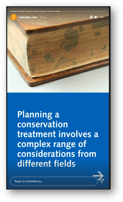
Screenshot: planning a conservation treatment involves a complex range of considerations

Here the BL are using several Stories in a row for a larger narrative - most users are happy to tap through a few Stories in a row if your message is too long to fit in one screen

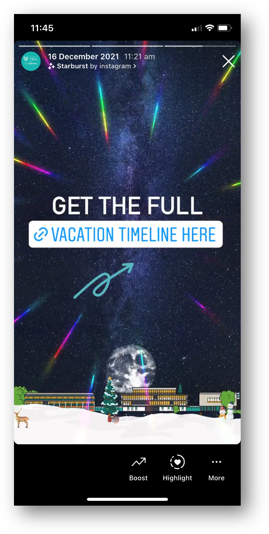
Remember Stories can have URLs in, unlike Grid posts - so you can post a few words and a link to more information

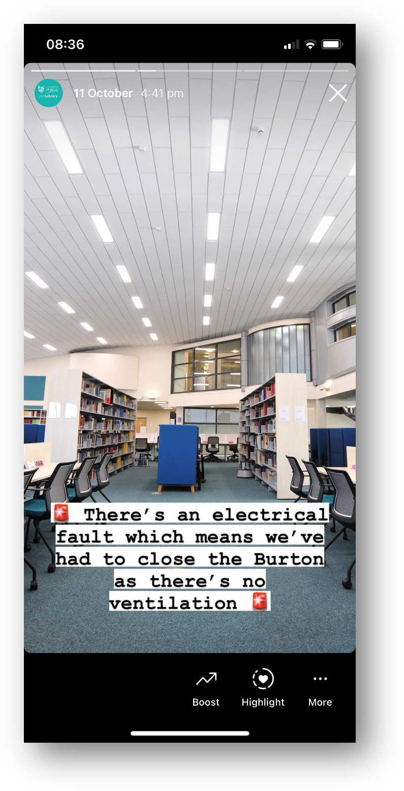
Screenshot of a Story - picture of a library interior, with 'there's an electrical fault so we've had to close the library' written across it

A classic Not That Interesting But Still Important post, which wouldn’t work on the Grid but is perfect for Stories

Use the caption

Option 2 is simply to pair the message with a good picture and more people will see it. Obivously Instagram is a visual medium but you can use the caption for detailed info if the situation warrants it - just phrase it in an engaging way!

Does the picture have to match the news in the caption? No it doesn’t. It’s better if it does, but it’s not essential - what’s essential is choosing a pic people will Like, so more people get the news you need them to hear.

Here’s an example from my library of using a pic for reach, but the caption to deliver important messaging. I was so pleased with this picture when I took it - the colours were just good that day with the bright sun and blue skies and green grass - that I didn’t post it right away, I saved it for exactly this kind of situation where we needed Reach.

Post multiple images, and keep the words of the ‘front cover’…

Option 3 is to get creative by smuggling Pictures Of Words in as part of a post with multiple images. Here’s an example of this - I took a nice picture of the library in the sun, and then used multiple further pictures with words on, and the caption, to tell the audience the info I needed them to know. It got lots of Likes and so lots of people saw it - which absolutely would not have been the case if I’d just posted the Zones-related graphics.

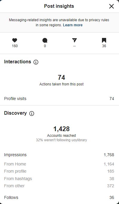
Here are the Insights for that picture. As you can see the accounts reached figure is higher than the previous examples - 1,428 - because of the higher levels of engagement. It’s not just the 160 Likes, it’s the fact that 36 people Bookmarked it, 74 people visited our profile after viewing the picture.

You can also see that 32% of the views were from people who weren’t following us, and that 36 people followed us directly as a result of seeing this post - so Reach helps you find users who didn’t yet know you were on Instagram, as well as ensuring as many existing followers see key messages as possible…

Insights, showing 1,428 accounts reached, 160 Likes, 36 Saves, 36 new follows

I really hope I’ve convinced you not to post ‘created’ images or pictures of words from now on! If you’ve been doing so up till now don’t feel bad, because EVERYONE does it. But do yourself a favour, reach more people, and do more of what your audience likes.


I’ve run a lot of in-house workshops for various cultural organisations, in which I audit their social media and come up with recommendations, working with staff on what they feel comfortable implementing. If you’d like to discuss social media training, get in touch!