How to

Universities need to get better at using Instagram – here’s how

I wrote an article for the Times Higher all about University use of Instagram. I think Insta is absolutely the most important social media in Higher Education at the moment now Twitter has become unusable, and this article sets out why that is and what to do about it.

It contains some stats, some useful links, and above all guidance on how to use it well!

Screenshot. Text reads: Instagram is the most effective social media channel to engage students, argues Ned Potter. In this resource, he outlines ways to produce successful content and increase reach

The article is free to read - click the image or the link above go to the post on Times Higher Education site


Upcoming Power Hours on UX and Marketing

Two of my favourite people in Libraryland, Phil Bradley and Val Skelton, are running Power Hours on a Friday lunchtime. The idea is a packed hour of useful CPD, with space for discussion afterwards, for £35 a session. I’ve done one of these already and it was great, with loads Chat back-and-forth; they have sessions coming up on Canva, AI and more - plus three in the diary between now and the new year, hosted by me!

I hope to see you at one or more of them. Here’s what we’ve got coming up.

Introduction to UX in Libraries: November 17th

Libraries using UX are discovering rich and often fascinating data on their patrons, which is proving a nuanced feedback method to complement traditional surveys and focus groups. We'll explore what ethnography really is and why you might want to use it, then look at specific examples of techniques to try out. We'll also look at examples of changes libraries have made to their services based on UX projects.

More details of the UX In Libraries session on Eventbrite


Jargon free introduction to Library Marketing

This session will focus on how to approach marketing libraries in all sectors. How do we frame messages so they have the most impact? What actually matters to our audiences? How do we keep things simple without dumbing down?

This works as a stand-alone session, but can also work as an introduction to the Strategic Marketing session below.

More details on the Intro To Library Marketing on Eventbrite.


Strategic Marketing in Library Campaigns

Library marketing becomes hugely effective when it is coordinated and joined up. In this Power Hour we'll explore marketing strategically and in campaigns. We'll work on segmenting audiences and tailoring messages for each group, before tying everything together in a strategic marketing plan.

This session works as a stand-alone session, but also picks up where the Intro To Marketing, above, leaves off, if people want to take them as a pair.

More info on the Strategic Marketing Power Hour on Eventbrite.

5 UX insights for library web-design

For the last few months I’ve been leading a project to completely redo my library’s website from scratch. It has been full-on, and rewarding, and most importantly the new site is live as of midday today.

I’ll post about the project process later, but for now I want to focus on what the UX fieldwork with our users told us, as these insights will hopefully be useful for anyone redesigning their org’s website.

I’d love you to go to york.ac.uk/library (opens in a new window) and take a look, then come back here and tell me what you think!

This post focuses on the organisation of the site; part 2 will be on the content.

Use colour with intention

As you can imagine, we’re working within the limits of the University CMS (Content Management System) and don’t have a lot of control over colours - most of the content types are white, but several can be set to cream, teal or dark blue. I must admit when I first started designing the pages, I just used colour to mix things up a bit and add some visual interest - a strip of colour here, a nice accent there. But the users told us in the UX sessions that they wanted the colours to mean something - they expected consistency across the pages (for example opening times always one colour, as shown below; quotes from students always another colour) and in particular they wanted the darker colours to signify something especially significant - a call to action, or really essential information.

The teal strip showing opening hours. The fact the Help Desk opening hours are on there too, and the fact that the Easter vacation is explicitly mentioned even though the hours aren’t changed, are both as a direct result of student suggestions during the UX.

Topic based organisation beats audience based navigation

A perennial debate for designing anything for users, websites included, is: do we organise things by theme, or by who is accessing information? Do we say ‘PGs go here, UGs go here’ or do we talk about space on one page, resources on another?

In a literature review carried out at the start of the project, my colleague Alice Bennett wrote, on the topic of a particular study finding topic-based organisation to be significantly preferable: “This is potentially a more inclusive approach, as it better allows for intersectional user identities and better accommodates search behaviour, with users typically searching for specific information, rather than looking to find themselves in the menu.”

This was really borne out by the UX. I asked one distance-learner where all the distance-learning information should sit in the new structure. They said “I wouldn't separate it. Because you don't like to treat yourself as a second class [citizen] and just look for, okay, where is the info for the distant learner people?” And to Alice’s point about intersectionality, we also had an International Students guide - many of our distance learners are also international students, so where do they look? And of course the contents were extremely similar. In the end we have a nice ‘basic introduction to the library essentials’ page which is for everyone: universal design wins again.

Your users will tell you which compromises are worth making

Compromise is inevitable in this sort of process - library websites have too much complex information and too many responsibilities to our users to just make a super slick, neat website. The top-level navigation is one of the biggest changes between the old site and the new - the old site had about 15 overlapping ways in to the info down the left of the screen; the new one has just six top-level landing pages.

The top-level navigation of the new site

We thought loooong and hard about how to group the information - we spent weeks planning this before we even had access to the CMS. But still we changed it during the UX process, because our users told us the compromise we’d made wasn’t the right one.

Our info for Researchers was split across the Skills & Training page you see listed above, and a Facilities page. The Facilities page has loads of useful info, but no flow and no cohesion - and more importantly when we spoke to Researchers in the fieldwork we set them tasks to find Open Access info, and they couldn’t do it. The split of info which had internal logic for us simply didn’t make sense for the user, and they couldn’t get to what they needed.

So we now have Research and Digital Creativity. This too is a compromise because that pairing isn’t as natural as the others (skills & training, for example) but those are two important aspects of the library offer that are really easy to find, so it’s a better way to go.

KnowING it’s important to invert the pyramid isn’t enough!

We all know about inverting the pyramid, right? I talk about it all the time. But knowing how important it is and ruthlessly acting on it turned out to be two different things… Even when I actively tried to do it with the website, I wasn’t doing it enough. One participant in the UX literally said ‘this page is upside down’… It’s so tempting to try and set the scene and lead people through the information, but they just want the important stuff at the top and that’s what we should be doing.

So: invert the pyramid, and invert it hard. (And then come back later and check it’s still fully inverted.)

Pictures have more than cosmetic valuE

“I’m never going to read that.” This a common refrain from students when faced with dense, lengthy text. We tried to simplify and reduce where possible, but sometimes in libraries there just IS detail - so breaking that up with images really helps. It’s not just that the images can help illustrate what you’re talking about, it’s that they make the user more likely to read even long passages of text because it’s broken up into chunks. It makes it manageable.

We also made sure to use the same image for thumbnail links to pages, as you find at the top of the pages themselves when you click the links. This reassures the user that they’ve clicked the right thing, and creates a sense of familiarity which helps make the info less intimidating.


A part 2 post detailing what the users told us about the Content of the site will be coming soon!

A Beginner's Guide to Instagram Reels, Stories, & the Grid: what to post where

Instagram is a fun place to market a cultural org, but it’s also a complicated space in which to work. It has so many layers and ways to post, and to a certain extent they all work together - which just makes it even more confusing to people trying to get the most out of the platform! It all makes Twitter seem very straightforward by comparison.

It is worth trying to do Instagram well, however. It’s worth taking the time to familiarise yourself with what each facet of it does, and then craft content for your audiences.

Before we go into the details, let’s look at how an Instagram account is displayed to its audience.

Screenshot @NYPL on Instagram, overlayed with contextual info. PROFILE PIC. It’s worth keeping this consistent. People tap it to view your Stories. THE GRID. The photos and videos people see when they view your profile.

(Click the pic to open a larger version in a new window)

So, what do you post, and where should it go? At the time of writing, there are four ways to post Instagram content.

The Grid

The Grid is the bread-and-butter, the ‘main’ posts you put on your Instagram account. It can be photos or videos. It’s what people see when they click on your profile. You might post a few times a week to the Grid, even if you post more often to Stories.

In the library world, it’s photos of interesting things that do well here, rather than incredible photography per se. A perfect shot of a book, taken on an expensive camera, will reach fewer people than a nice picture of your library’s interior taken on your phone.

Remember: pictures of Words do not work! Shots of library interiors seem to do really well, as to shots of library exteriorsArchive photography is always popular. It’s worth noting that not all your posts have to be about your library: images of the geographic location you’re in are often popular, as in this Liverpool Uni Library example.

Shots of objects from Special Collections often get engagement, like this one from the BL.

Stories

Stories are 15 second videos (or a longer video broken into 15s chunks) or a 7 second-long still. They’re orientated as portrait rather than landscape or square. because they’re only really intended to be viewed on phones. They can have music and gifs and animations and - crucially - links, added to them, natively in Instagram. They do NOT appear on your grid; they’re found when people click your profile pic. They disappear after 24 hours - but they can be pinned in themes to be found later by the more curious among your followers. And the more you use them well, the more your account will grow and the greater your engagement will be with your audience… Got all that? Just in case anyone is still scratching their head, the next post in the Instagram Mini Series will be All About Stories in more detail.

Reels

Reels are a brilliant opportunity for all of us. There’s a whole post on Reels coming up, but in essence they are portrait videos, maximum 90 seconds long, and massively favoured by the algorithm. They’re shared waaaay more widely than any other type of Instagram post - the reach will be several times that of a regular video or image. (Confusingly, Reels also appear on your Grid unless you disable this, but let’s not dwell on that now!)

Here’s the kind of content that seems to suit Reels well - firstly the Book Sorter POV video which I made by literally blutacking a GoPro to a book! It’s not serious, it’s a bit silly, but it’s also introducing people to the Book Return machine by stealth…

Music is important in Reels, so the second video with shots of the library cut to fit with the music behind it, is a type that can work well.

Instagram TV

Instagram TV is almost not worth worrying about at all. It use to be IGTV and was the home of any videos longer than 1 minute. It didn’t really work, no one watched it, so they rebranded it to Instagram TV at the end of 2021 and now all your videos go there, regardless of length - except Reels. It’s really little more than filter now - people can click on the relevant tab on your profile and see all your videos (except your Reels!) in one place - but they can find them all on your Grid anyway. The thing about regular videos - rather than Reels - is that they simply do not get seen. Instagram doesn’t share them. So even brilliant videos won’t find an audience.

The tl;dr is, focus your energies on the Grid, Reels, and Stories.


This is Part 6 in the Instagram Series. Read Parts 1 - 5 if you’re interested.

Everyone is posting pictures of words to Instagram... and nobody should

Part 5 in the Instagram Series. Read Parts 1 - 4 are here. If you want. No pressure.

If there’s one social media rule that is universal across platforms, industries and sectors, it’s this:

Learn what your audience likes, and do more of it.

The other side of this coin is, of course, to do less of what your audience doesn’t engage with. It’s incredibly easy to follow these maxims; you don’t need pay for any tools or be an analytics guru. Just click on your posts and compare their views / reach / impressions and you’ll quickly learn what works for your community, and what doesn’t.

With that in mind, cultural orgs please, please, please:

Stop posting pictures of words to instagram

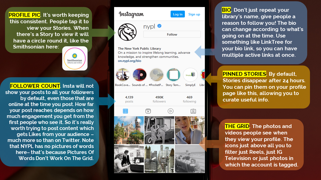
I see it happening all the time and it never gets engagement - which means, essentially, almost no one sees the message. You know the sort of thing - photos of book covers, or motivational quotes, or graphics, or photos of signs, or ‘resource of the week’ posters. And in every single case, there’s a massive drop in Likes compared to when they post ‘captured’ images (rather than created ones) of buildings, or spaces, or interesting objects.

If you visit any Instagram profile on a PC (rather than on your phone) you can hover over a post to see how many Likes it has so you can see for yourselves. Go to literally any library, HE or museum Insta account and do some hovering. A new account still finding its feet might get 20 Likes for a picture of a building, but only 4 Likes for a Picture of Words. A really, really successful account with a big following might get 200 Likes for a Picture of Words! But hover over the captured picture of the interior of their building next to it, and you’ll see that has 780 Likes. It’s the same everywhere.

Why does it matter?

In short: if you want a message seen, it needs engagement from your followers because Likes equal Reach.

Instagram is not as straightforward as Twitter. If you follow me on Twitter and I post at 1pm and you’re online at 1pm, you’ll see my post. Instagram is a lot fuzzier, and will not just show your posts to your followers in a simple way - the more people engage initially, the more of your followers will see it.

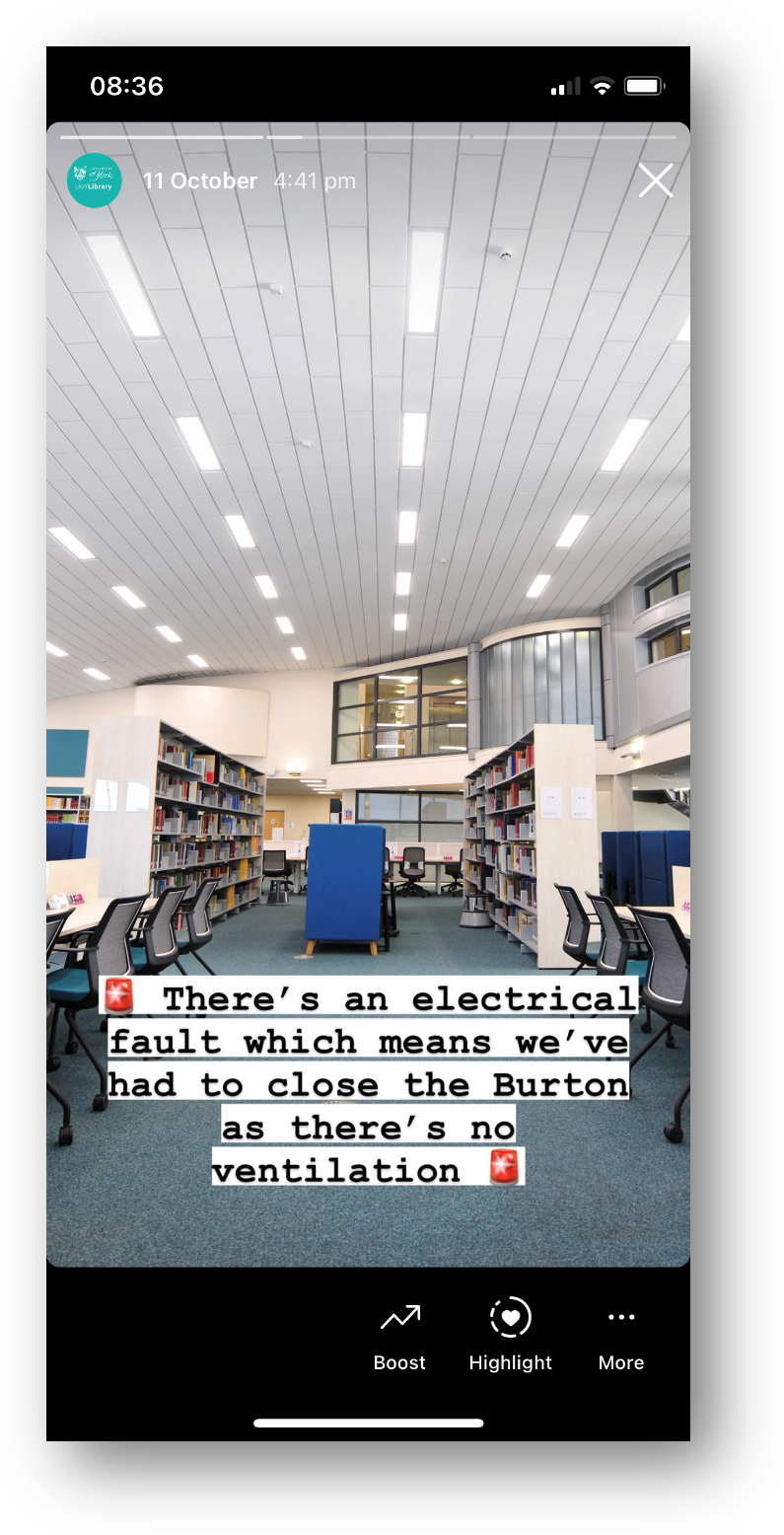
Likes, Comments and Shares are vital as the more you get, the more people Instagram’s algorithm will show your post to. A really important message about the library closing early simply won’t reach anyone if it’s just a screenshot of the words ‘the library is closing early today’ because no one will hit Like. So no one knows you’re closed early!

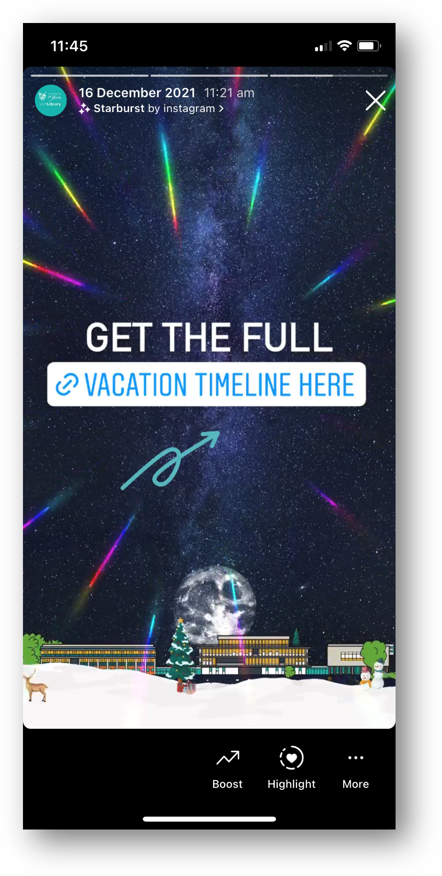
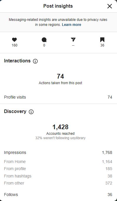
Have a look at this comparison from my library’s Insta account. This isn’t quite a full ‘pictures of words’ because we don’t post any, but it’s an example of an unsuitable picture for Instagram and shows you the impact engagement has on reach. For various reasons that I won’t bore you with now, I posted a picture of a case that I absolutely knew wouldn’t get much engagement. It’s a great photo but it’s not OF the kinds of things our audience respond best to, so as a result it got a very low number of Likes. Next to it is a more regular post, of our buildings looking dramatic at night, which got many more Likes.

A briefcase pic with 15 Likes and reaching 392 accounts. A building pic with 95 Likes, reaching 834 accounts.

The heart symbol represents Likes, the Quote symbol is Comments, the Arrow symbol represents people Forwarding the post, and the Bookmark symbol is people saving the post to their Favourites.

The key thing to look at is of course Accounts reached: 392 for the case, and 834 - over twice as many - for the building. So it’s not just a bit of a shame we didn’t get more Likes for the briefcase post; it’s ineffective communication that is only getting to a fraction of the target audience.

We all have key messages. We all have things which we need our audiences to hear. Not all of them have suitable visual metaphors. So how do you get those messages out?

Use Stories Instead

Option 1 is to take the words and put then into a Story.

Words work fine in Stories, people expect them. Especially anything time-sensitive, pertaining to events that day - just use a Story to spread the news.

The more you use Stories (for the kinds of things you might use a tweet for) the more your audience comes to expect you to use them and looks out for them.

When we ask our students how they get updates from the Library, every single undergraduate - every one - says Instagram Stories.

Screenshot: planning a conservation treatment involves a complex range of considerations

Here the BL are using several Stories in a row for a larger narrative - most users are happy to tap through a few Stories in a row if your message is too long to fit in one screen

Remember Stories can have URLs in, unlike Grid posts - so you can post a few words and a link to more information

Screenshot of a Story - picture of a library interior, with 'there's an electrical fault so we've had to close the library' written across it

A classic Not That Interesting But Still Important post, which wouldn’t work on the Grid but is perfect for Stories

Use the caption

Option 2 is simply to pair the message with a good picture and more people will see it. Obivously Instagram is a visual medium but you can use the caption for detailed info if the situation warrants it - just phrase it in an engaging way!

Does the picture have to match the news in the caption? No it doesn’t. It’s better if it does, but it’s not essential - what’s essential is choosing a pic people will Like, so more people get the news you need them to hear.

Here’s an example from my library of using a pic for reach, but the caption to deliver important messaging. I was so pleased with this picture when I took it - the colours were just good that day with the bright sun and blue skies and green grass - that I didn’t post it right away, I saved it for exactly this kind of situation where we needed Reach.

Post multiple images, and keep the words of the ‘front cover’…

Option 3 is to get creative by smuggling Pictures Of Words in as part of a post with multiple images. Here’s an example of this - I took a nice picture of the library in the sun, and then used multiple further pictures with words on, and the caption, to tell the audience the info I needed them to know. It got lots of Likes and so lots of people saw it - which absolutely would not have been the case if I’d just posted the Zones-related graphics.

Here are the Insights for that picture. As you can see the accounts reached figure is higher than the previous examples - 1,428 - because of the higher levels of engagement. It’s not just the 160 Likes, it’s the fact that 36 people Bookmarked it, 74 people visited our profile after viewing the picture.

You can also see that 32% of the views were from people who weren’t following us, and that 36 people followed us directly as a result of seeing this post - so Reach helps you find users who didn’t yet know you were on Instagram, as well as ensuring as many existing followers see key messages as possible…

Insights, showing 1,428 accounts reached, 160 Likes, 36 Saves, 36 new follows

I really hope I’ve convinced you not to post ‘created’ images or pictures of words from now on! If you’ve been doing so up till now don’t feel bad, because EVERYONE does it. But do yourself a favour, reach more people, and do more of what your audience likes.


I’ve run a lot of in-house workshops for various cultural organisations, in which I audit their social media and come up with recommendations, working with staff on what they feel comfortable implementing. If you’d like to discuss social media training, get in touch!